The network for creativity
Join 1.25M professional creatives like you
Connect with clients, get discovered, and run your business 100% commission-free
Creatives on Contra have earned over $150M and we are just getting started
Back to feedPost
Taste Test


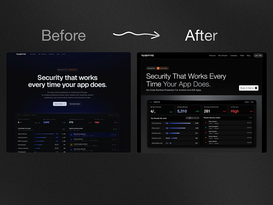
Designing the hero section for a freelance finance app.
Which hero design would make you download the app?
30 voted
64%
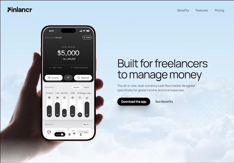
17 voted
36%
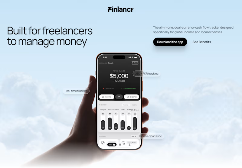
47 votes
Closed

Side-by-side feels super balanced!
THank you Celia! I was thinking the same, but a bit confused to chose one 😁

Side by Side mate
Thanks Progress! Appreciate

The centered looks too scattered and badge visibility is too low.
Thank you for your valuable suggestion Leena! 😊

Side by side🔥
Thanks Amina! The side-by-side layout definitely lets the copy breathe and gives room for the preview. Glad you like it!


Lovely design !
Thank you so much, Sahil! Really appreciate the kind words man 🙌. Did one layout stand out more to you - the centered hero or side-by-side?"

personally I'd choose centered one, attracts better and focused than side by side
Spot on. Thanks Daxesh! The centered view direction all the attention directly to the phone mockup without distractions Thanks for sharing your take!

centre forces to focus on main product so it's good
Thanks Arman! 😊

Side by side looks more engaging
Good to see your feedback :) Thanks

Nice work as usual! Offering both light and dark states gives mobile product systems maximum usability.
Totally agree, having that balance between light and dark modes makes a huge difference in real daily use. Thanks Delight!

The side-by-side is better because it is bold for me to see from a distance
Good catch on the readability from a distance! That extra visual separation really helps. Appreciate the feedback, Daniel!

Premium look !
Thanks so much, Sujon! Really glad you like the Premiumness🙌

Side-by-Side for me. The darker background makes the app screen pop and the headline feels more confident. Centered feels a bit safe for a fintech app.
Spot on observation, Tabish! And that's actually the exact goal, since it’s a fintech app website, moving away from that 'safe' corporate look

side by side is better.
Thanks for the vote and input, Sandaruwani! Much appreciated 🙏

The side by side gives the visuals a premium feel
Glad that premium vibe came through! It gives the product preview plenty of room to shine. Thanks Sekinat!

looks great 👍
Thank you Pranto! Really appreciate

Thanks Sahil!

Thanks Shruti for your feedback 🙌

The winning option splits the layout weirdly. Centering the text usually drives much better focus and conversion on web hero sections.
Agreed Saud! You are right! Thanks for your input

side by side looks great
Thank youuu! I really appreciate on providing your valuable feedback.

Thanks Hunain for your input:)


The right one 🎀

Side by Side Mate!

this look great

For a finance app, I’d go with the hero that communicates value instantly and has a clear, action-focused CTA. Clean hierarchy matters more than visual complexity here. 👌
Thanks Nikita! Love your point

side-by-side all success!

Great stuff! I will go for the side-by-side arrangement, it looks more balanced.

Side by side rad assymetry!

The network for creativity
Join 1.25M professional creatives like you
Connect with clients, get discovered, and run your business 100% commission-free
Creatives on Contra have earned over $150M and we are just getting started





Related posts




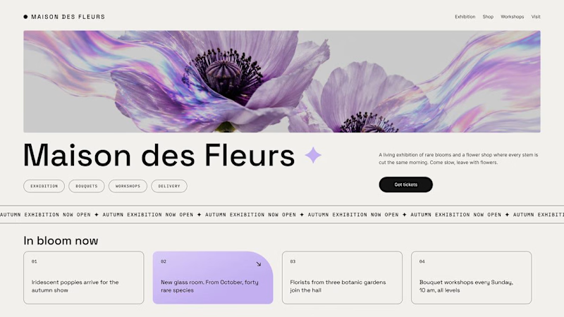
Should a flower shop ever go black and white?
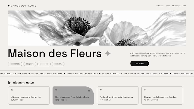
Same flower house, same layout. We only took the color out.
1. Full color. The iridescent petals do the selling: lilac, pink, a little shimmer. The photo is the brand, and every accent on the page borrows from it.
2. Monochrome. No color at all. Shape, texture and typography have to carry everything, and the page suddenly reads like a gallery catalogue.
Color sells the flower. Monochrome sells the exhibition.
Which one would get you through the door?
67 voted
91%
7 voted
9%
74 votes
Closed

The problem with monochrome is that, throughout computer history, it has conditioned users to associate gray and monochrome with being disabled, dysfunctional, or something to ignore and avoid.


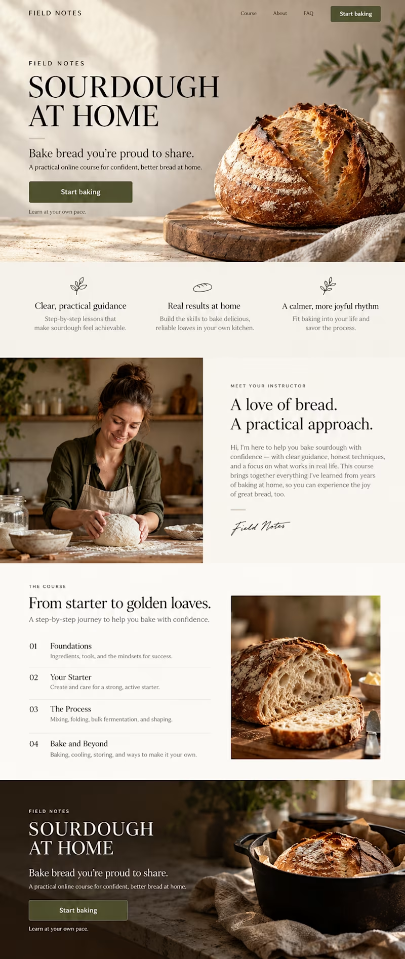
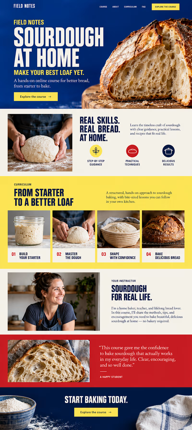
Which direction would you choose for a sourdough course sales page in Kajabi?

34 voted
59%
24 voted
41%
58 votes
Closed