The network for creativity
Join 1.25M professional creatives like you
Connect with clients, get discovered, and run your business 100% commission-free
Creatives on Contra have earned over $150M and we are just getting started
Back to feedPost
Taste Test

One fintech brand. Two different hero experiences. 🖤
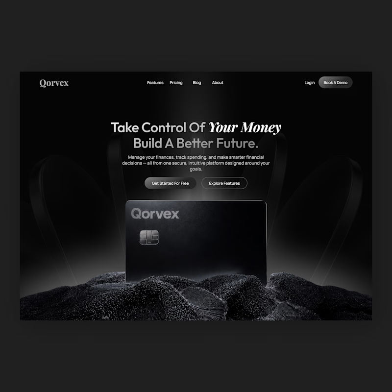
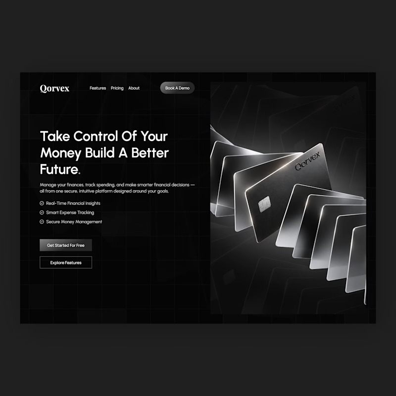
I designed two homepage hero concepts for Qorvex, a modern fintech platform, exploring two different ways to create a strong first impression.
Both concepts use a dark, premium visual direction with monochromatic tones, but each takes a different approach to presenting the brand.
Option 1 — Bold & Minimal
A centered hero layout with a strong headline, cinematic product visuals, and a clean, focused composition.
Option 2 — Modern & Structured
A split-screen layout with a bold headline, clear feature highlights, and a striking visual showcase of the fintech cards.
Which hero design would you choose for a premium fintech website?
Vote for Option 1 or Option 2 and tell me why in the comments. I'd love to hear your feedback!


3 votes
Ends in 1d
The network for creativity
Join 1.25M professional creatives like you
Connect with clients, get discovered, and run your business 100% commission-free
Creatives on Contra have earned over $150M and we are just getting started


Related posts

Hero section exploration for Oldhand
Framer MCP + claude doing magic


The dotted heads against such a clean hero is a nice touch. How much of the layout did you have to fix by hand after Claude?

Landing page for B2B search analytics platform.
For startups, converting users is extremely crucial.
You might have 3~5 seconds to get the user's attention, so it's very important how the design looks and feels.
Premium design + animation like this helps turn users into sign-ups. Proud of this one.

Nice work

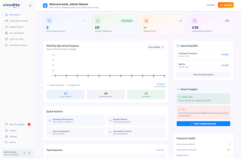
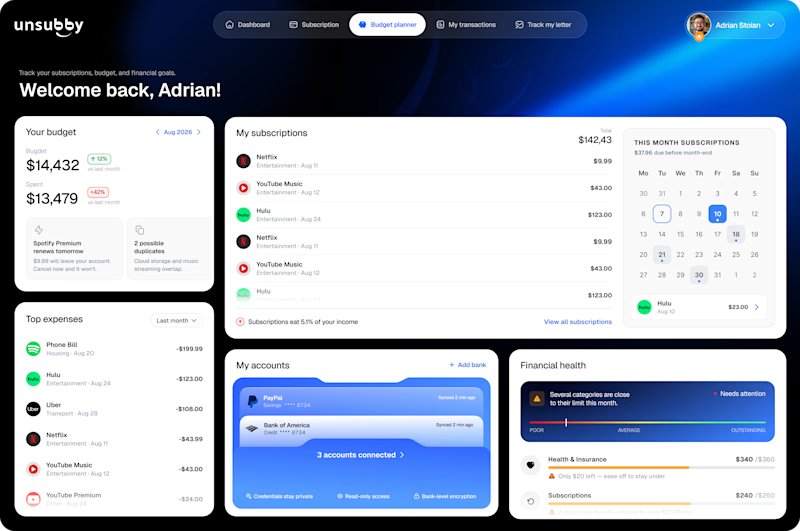
On the left is the original design. On the right is the redesign by Lunis Design Lab.
Which version would you prefer to use, and why? 👇🏻
1 voted
10%
9 voted
90%
10 votes
Closed
