The network for creativity
Join 1.25M professional creatives like you
Connect with clients, get discovered, and run your business 100% commission-free
Creatives on Contra have earned over $150M and we are just getting started
Back to feedPost

Landing page for B2B search analytics platform.
For startups, converting users is extremely crucial.
You might have 3~5 seconds to get the user's attention, so it's very important how the design looks and feels.
Premium design + animation like this helps turn users into sign-ups. Proud of this one.


"See how AI models see your brand" lands in one read, and a single CTA keeps the hero focused. Did you try the button in a lighter color so it pops harder against the deep blue?
Great question!
I actually have 2 variation for this landing page. On that particular landing page I tried lighter color to keep the CTA focused more.
Will reveal soon!

agree on the few seconds you get to win someone. motion done well actually helps you understand the product faster, not just look nice
Couldn't agree more

Nice work
Thanks!

Couldn't agree more!

good work!!
Thanks!

Thanks!


"See how AI models see your brand" is such a strong headline. It immediately grabs your attention because it addresses a very modern problem for businesses. The blue gradient background makes the white text pop perfectly.
Thanks for the detailed feedback!

love the design layout
Thanks Nathan!
The network for creativity
Join 1.25M professional creatives like you
Connect with clients, get discovered, and run your business 100% commission-free
Creatives on Contra have earned over $150M and we are just getting started






Related posts


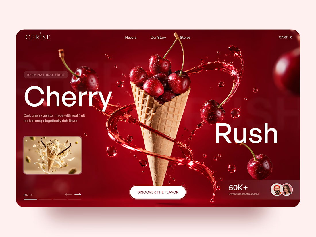
Very juicy. Didn't you feel like having some berries while working?


Love the direction! Feels clean and the product offering comes through nicely.


The color palette works so well here 🪙