The network for creativity
Join 1.25M professional creatives like you
Connect with clients, get discovered, and run your business 100% commission-free
Creatives on Contra have earned over $150M and we are just getting started
Back to feedPost
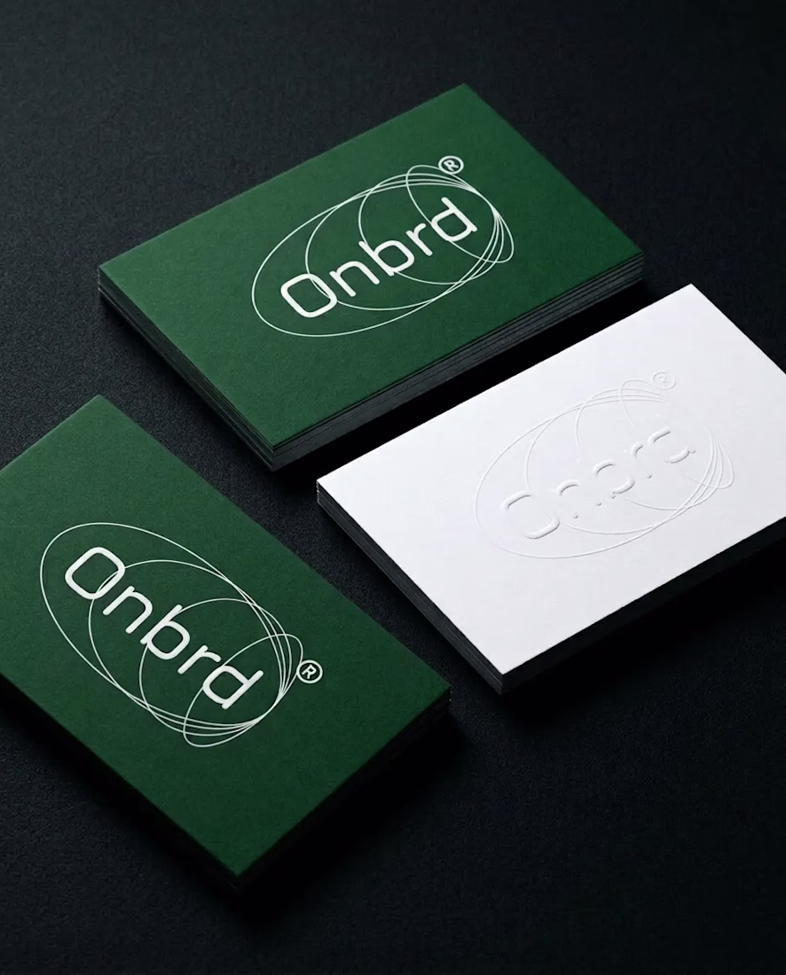
Taste Test
Which one is your preference and why?
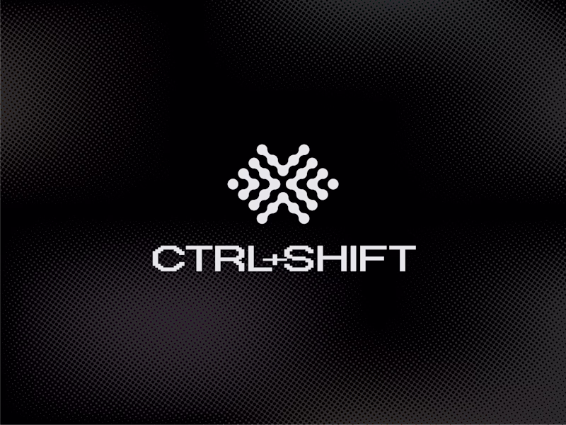
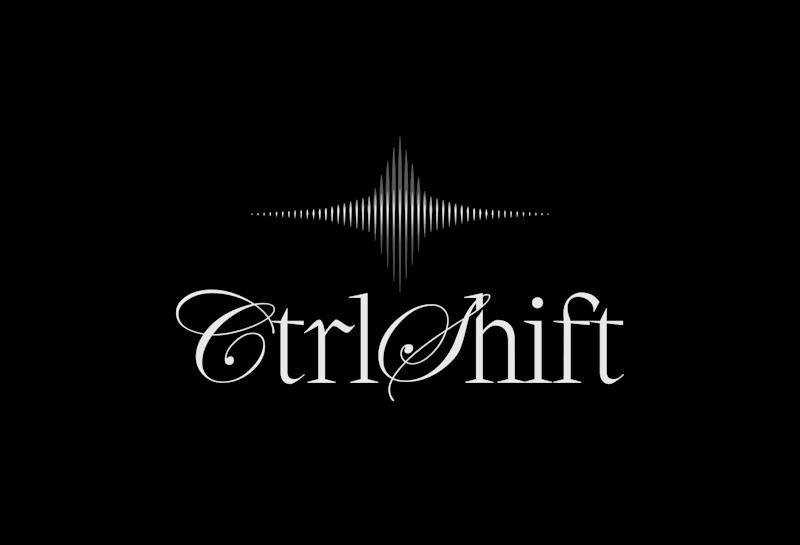
Context:
1. The logo represents an abstract and thoughtful brain symbol featuring interconnected geometric dots representing both left and right hemisphere of the brain, as a progressively pulsing neutrons resembling ideas generations as part of the creative intelligence.
2. The logo features a modern, intelligent logomark built around a three-phased star symbolizing curiosity, signal throught the noise, and transformation. Constructed from sharp vertical lines with varying stroke weights, it creates a subtle optical illusion that reflects the brand’s core idea of clarity emerging from complexity. The three phases are conceptually tied to the brand name - Ctrl, Shift, and the final outcome: taste.
33 votes
Ends in 22h
Option 1 wins - the geometric approach mirrors the systematic thinking behind keyboard shortcuts. The script in #2 fights against the tech metaphor. Your brain symbol concept is brilliant, but pair it with typography that reinforces computational intelligence rather than softening it.
1
Thank you!
You are always welcome
Excellent work. It's clear a lot of thought went into both the strategy and the visual execution and of course 1 is special!
Thanks, appreciated!
i love both, but 1 caught my eye first & held my attention longer. not only are its features & lines bolder which allow them to stand out more, i feel like the 'clarity from complexity' is mirrored in your pairing the chosen font with the rippling out of the waves. super unique,...
Thanks!
That's a super good insight ✨
1 - feels more coherent and unique.
Thank you!
WOw Awesome WOrk
Much appreciated
logo is much more elegent to the eyes and both are sooo sooo good !
Thanks, appreciated!
Both have lovely type treatments - #1 has more digital presence to me and I love the brain concept behind the logo mark as well so that's my fave!
Thanks Jessie, appreciate your input!
Thanks!
I'd go with 2 just for the logo. I kinda feel like the font doesn't capture the whole vibe of the logo
The network for creativity
Join 1.25M professional creatives like you
Connect with clients, get discovered, and run your business 100% commission-free
Creatives on Contra have earned over $150M and we are just getting started
Related posts
I was on a call with the owner of a major architecture firm in New York.
The founder spent the first 20 minutes talking about their philosophy and abstract concepts.
He was looking for a way to capture the soul of a space in their projects. They had a problem with the agencies they worked with. They'd spent large budgets only to receive logo proposals with stylized ancient temples, roofs, or building parts.
They hated this literal approach.
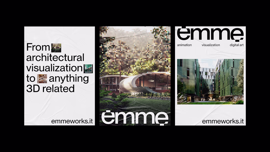
Architects and technical professionals often communicate conceptually. When this happens, it's better to bring the conversation back down to earth. So I shared my screen and showed him the identity I designed a few years ago for Emme.
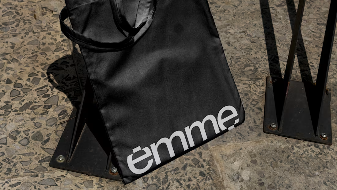
Emme is an Italian 3D architectural rendering studio I created the visual identity for. I showed him the action built into the typography. The letters are made of pixels simulating a render's calculation process.
It's an approach that conveys deep abstraction without relying on trivial symbols.
The founder suddenly stopped and said: "You managed to show what they do in a single word."
That was exactly what they were looking for.
Seeing that logotype was enough for him to understand I could turn an abstract idea into specific typography. The company's action and soul made visually tangible.
Trust clicks the second a client realizes you can translate their philosophy into a visual system that works.
This looks clean and well thought out. How long did it take you to bring everything together?
Awesome branding as always!
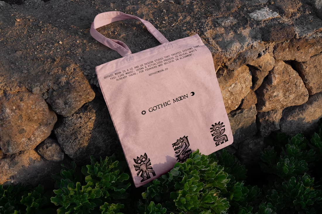
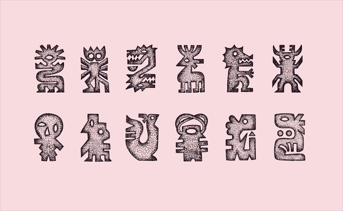
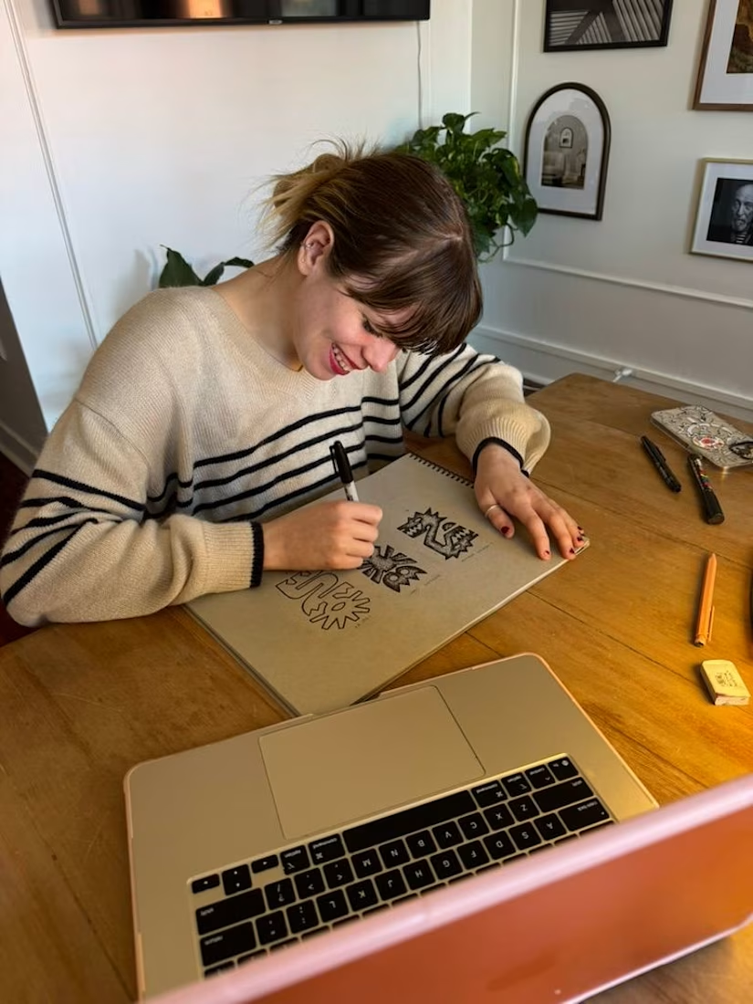
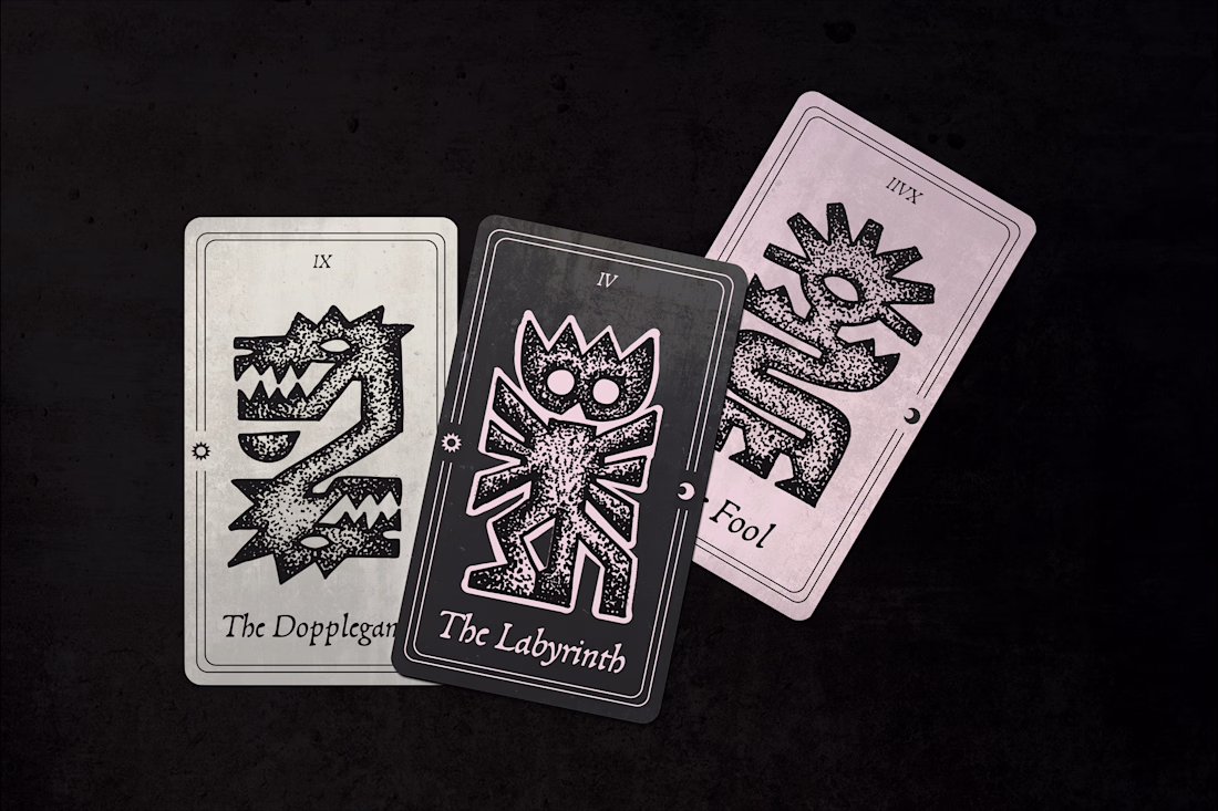
Stippled Illustrations and Identity Design for Gothic Moon, a a UI and UX design studio. Work done through Anchovies Agency within my role as Illustrative Art Director.
This looks clean and well thought out. How long did it take you to bring everything together?
Trending
Claude
Claude has entered the design space. How are you using Claude Design?
Contra University
Learn from expert creatives how to earn more using next-gen AI tools.
creativeaiflow
Creative AI workflows are evolving. What tools do you use, and what are their strengths and weaknesses?
portfolioreview
The best portfolios tell a story, not just show a grid. Share yours for feedback.
freelancerlife
Freelancer life is wins, pivots, and everything in between. What’s yours right now?