The network for creativity
Join 1.25M professional creatives like you
Connect with clients, get discovered, and run your business 100% commission-free
Creatives on Contra have earned over $150M and we are just getting started
Back to feedPost
Taste Test
Which one is your preference and why?
Context:
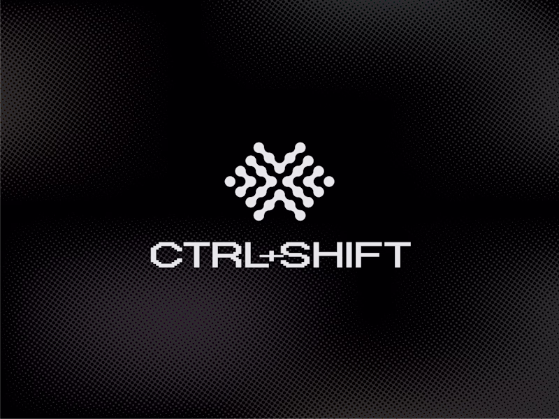
1. The logo represents an abstract and thoughtful brain symbol featuring interconnected geometric dots representing both left and right hemisphere of the brain, as a progressively pulsing neutrons resembling ideas generations as part of the creative intelligence.
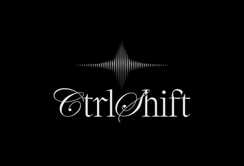
2. The logo features a modern, intelligent logomark built around a three-phased star symbolizing curiosity, signal throught the noise, and transformation. Constructed from sharp vertical lines with varying stroke weights, it creates a subtle optical illusion that reflects the brand’s core idea of clarity emerging from complexity. The three phases are conceptually tied to the brand name - Ctrl, Shift, and the final outcome: taste.
29 votes
Ends in 1d
logo is much more elegent to the eyes and both are sooo sooo good !
1
Thank you!
You are always welcome
Excellent work. It's clear a lot of thought went into both the strategy and the visual execution and of course 1 is special!
Thanks, appreciated!
i love both, but 1 caught my eye first & held my attention longer. not only are its features & lines bolder which allow them to stand out more, i feel like the 'clarity from complexity' is mirrored in your pairing the chosen font with the rippling out of the waves. super unique,...
Thanks!
That's a super good insight ✨
1 - feels more coherent and unique.
Thank you!
WOw Awesome WOrk
Much appreciated
Both have lovely type treatments - #1 has more digital presence to me and I love the brain concept behind the logo mark as well so that's my fave!
The network for creativity
Join 1.25M professional creatives like you
Connect with clients, get discovered, and run your business 100% commission-free
Creatives on Contra have earned over $150M and we are just getting started
Related posts
Energy Central case study now live! If you would love a closer look go Check it out 😃
Super fun logo animation!
A minimalist brand mark designed for a private stay in the Peruvian jungle. This symbol merges the concept of a key with architectural stairs, representing the access to a unique and remote experience.
It bridges clean, modern lines with the natural beauty of a rainforest escape.
Amazing 😍
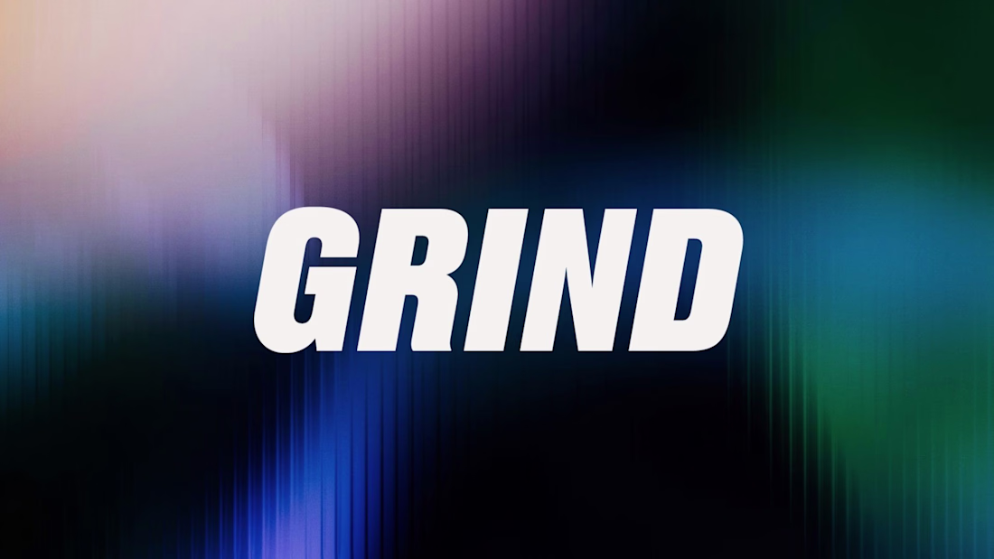
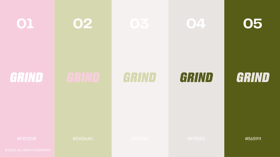
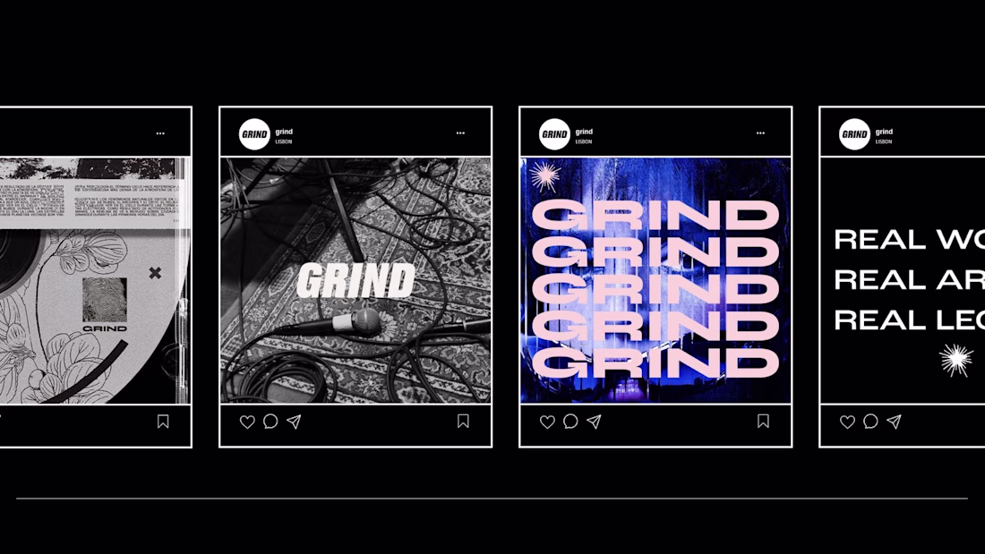
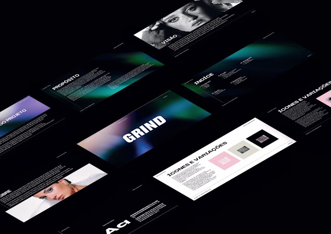
I design the full brand identity and social media system for GRIND, a Lisbon-based artist management and music label.
The scope covered logo design, icon system, color palette, typography, stationery, and a complete set of social media templates all built around a consistent visual language that works across every touchpoint.
The aesthetic sits at the intersection of street culture and industry credibility, bold type, high contrast. Built to stand out in a feed and hold weight in a boardroom.
This branding goes hard! Really like how it feels bold and expressive.
Trending
Claude
Claude has entered the design space. How are you using Claude Design?
Contra University
Learn from expert creatives how to earn more using next-gen AI tools.
creativeaiflow
Creative AI workflows are evolving. What tools do you use, and what are their strengths and weaknesses?
portfolioreview
The best portfolios tell a story, not just show a grid. Share yours for feedback.
freelancerlife
Freelancer life is wins, pivots, and everything in between. What’s yours right now?
