
Ellis Ferrére
Creative Director | Brand, Events & Digital Experiences
New to Contra
Ellis is ready for their next project!
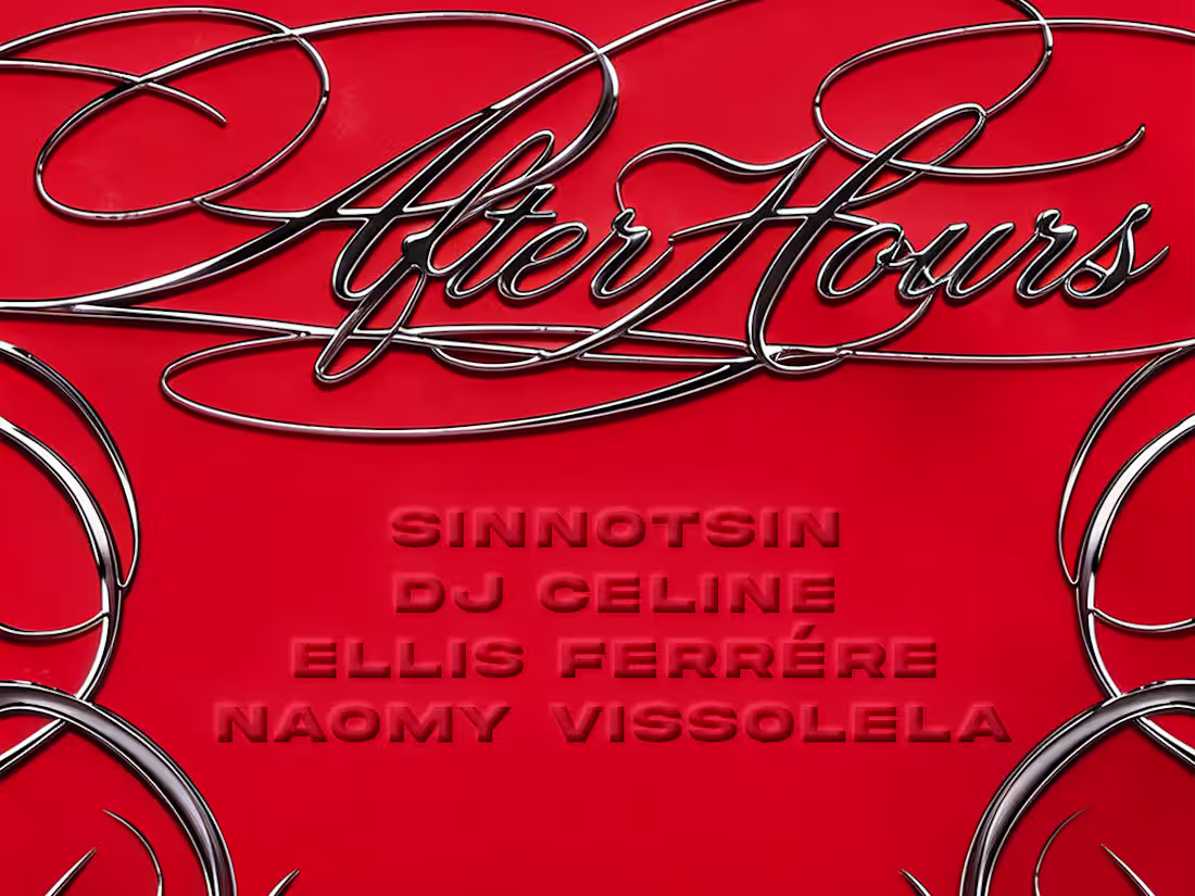
After Hours — Event Identity / Flyer Design
Four colorways, one visual system. The After Hours flyers were designed around a single idea: chrome ornamental filigree as the main graphic element fluid, sculptural, almost jewellery-like framing the information without suffocating it. The aesthetic language borrows from luxury fashion and Y2K sensibility simultaneously, which felt right for a women centered night that wants to feel exclusive.
The chrome scrollwork does the heavy lifting. It creates a sense of enclosure like you're being invited into something, not just informed about it. The After Hours logotype in cursive chrome script reinforces that register: elegant, slightly indulgent, unapologetically feminine without leaning into cliché.
0
33
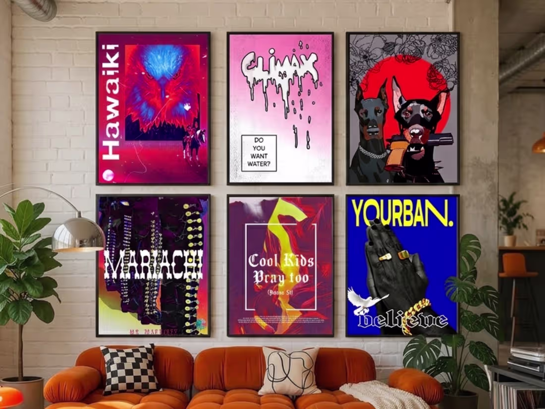
Personal Work - Creative Exploration
These four pieces exist outside any brief. They are visual experiments built at the margins of commercial work, where pop culture, spirituality, and irony share the same frame.
From Hawaiki to Climax, each piece is built around a different tension: between the mythic and the contemporary, between the handcrafted and the digital, between the devout and the irreverent. What connects them is a refusal to be merely decorative every poster has something to say, even when it says it quietly.
Color, texture, and typography are not communication tools here. They are language.
1
1
48
BAULANE — AI Video Concepts
Two prototype videos developed in direct response to BAULANE's content brief, demonstrating the visual standard, camera language, and editorial direction the brand is looking for across social media.
Both were produced entirely through AI video generation with full art direction and prompt engineering.
1
43
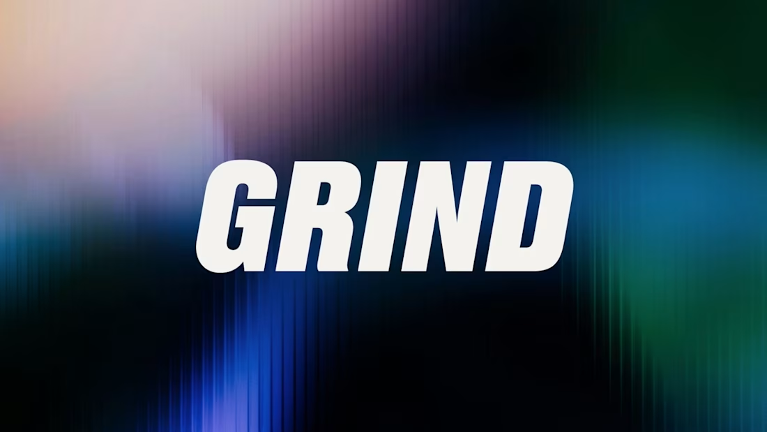
I design the full brand identity and social media system for GRIND, a Lisbon-based artist management and music label.
The scope covered logo design, icon system, color palette, typography, stationery, and a complete set of social media templates all built around a consistent visual language that works across every touchpoint.
The aesthetic sits at the intersection of street culture and industry credibility, bold type, high contrast. Built to stand out in a feed and hold weight in a boardroom.
20
25
497
Mr. Martinez — Echoes of Silence Graphic tee drop with a dark, hyper-real visual language. Chrome robotic hands holding a cracked metallic heart — rendered with depth and texture to sit between editorial illustration and streetwear graphics. Designed as both a standalone poster and a wearable piece.
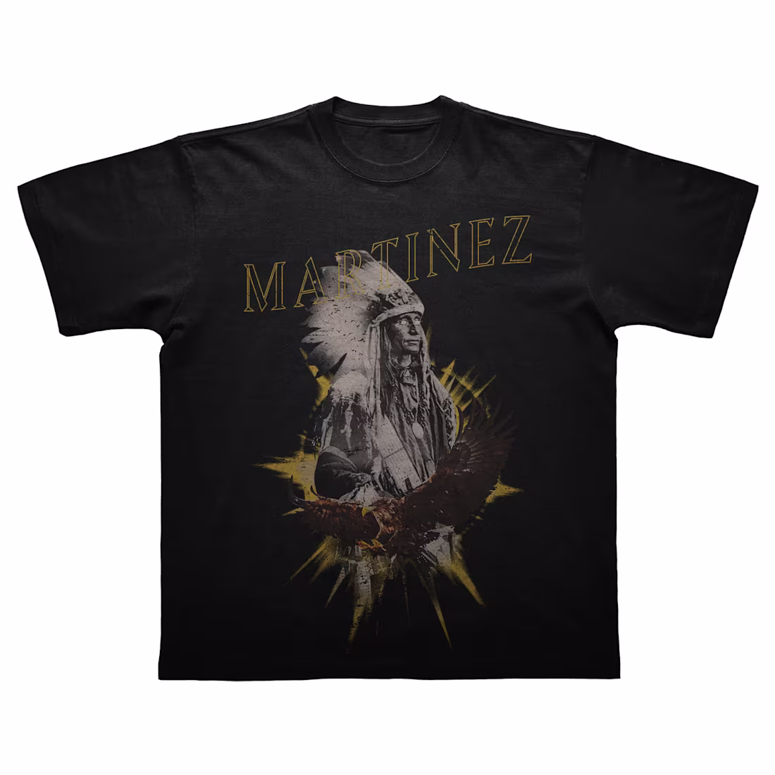
4. Mr. Martinez — It's a Long Way to the Top Vintage-influenced graphic tee drawing on western and Americana references. Layered composition with a halftone-treated archival figure, eagle, and gold burst — printed as an all-over placement on black. Raw, cultural, deliberately referential.
0
44
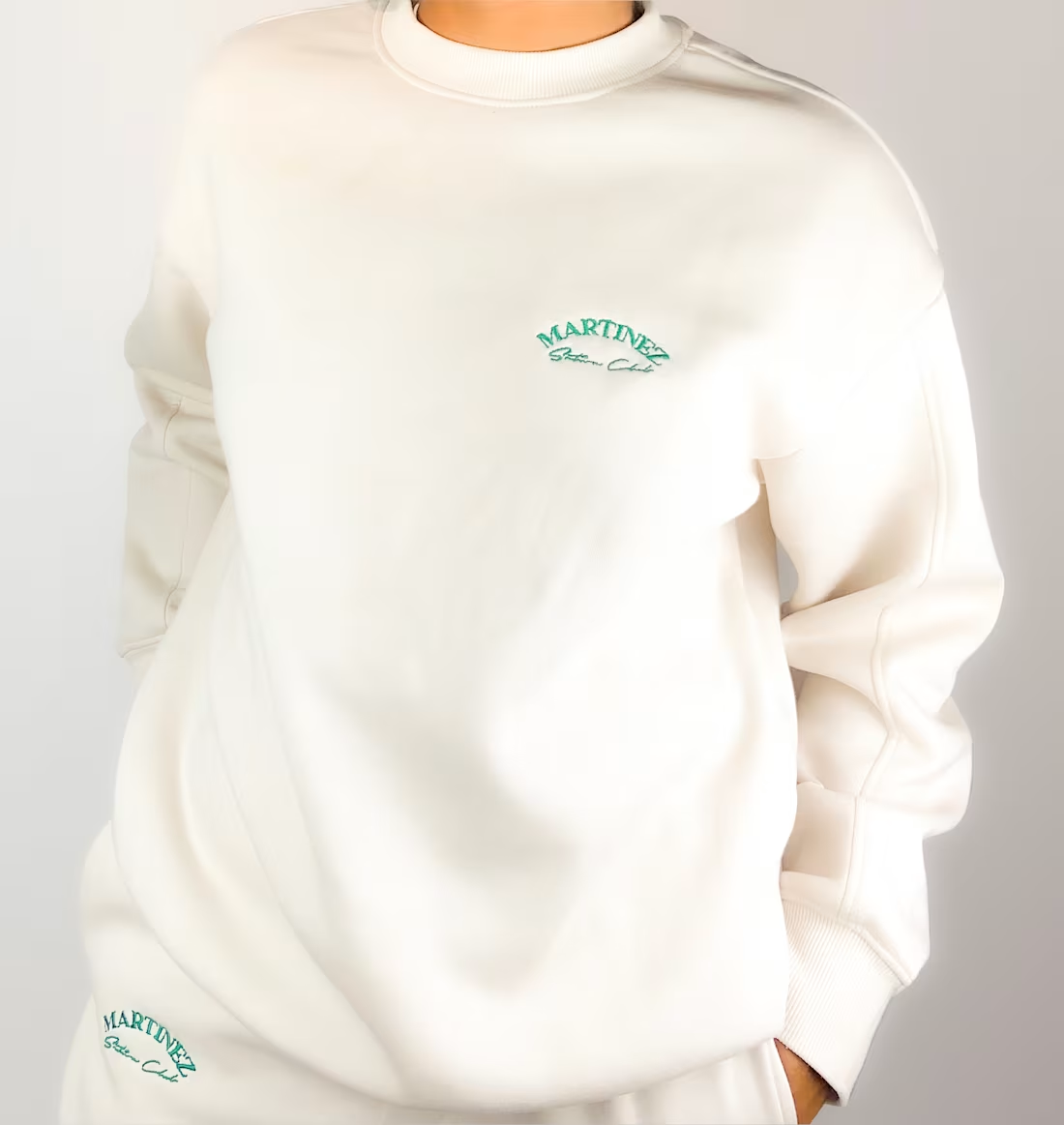
For Mr. Martinez
Skate Club Embroidered apparel drop built around a minimal, premium aesthetic. Cream garments with forest green embroidery across joggers and crewneck, designed as a matching set with a quiet, confident identity. Placement, typography, and construction were defined from scratch as part of a broader brand system for Martinez.
4
7
130
A collection of brand identities spanning music, nightlife, food, and fashion each built from scratch to fit its own universe. From acid green butterfly symbols for electronic music projects, to gothic calligraphy for a Lisbon nightlife series, raw streetwear type for an artist management label, a greek runner delivering a burger, botanical illustration for an Angolan bikini brand, and handcrafted typography for a homemade organic banana brand.
1
92
I had the pleasure to write and direct a social media content for Guarda_Mor, a Lisbon-based restaurant. Scripted and directed in a mockumentary format inspired by The Office, turning a classic French dessert into a character-driven short. Part of an ongoing content series designed to build brand personality and drive organic engagement on Instagram.
2
137