The network for creativity
Join 1.25M professional creatives like you
Connect with clients, get discovered, and run your business 100% commission-free
Creatives on Contra have earned over $150M and we are just getting started
Back to feedPost
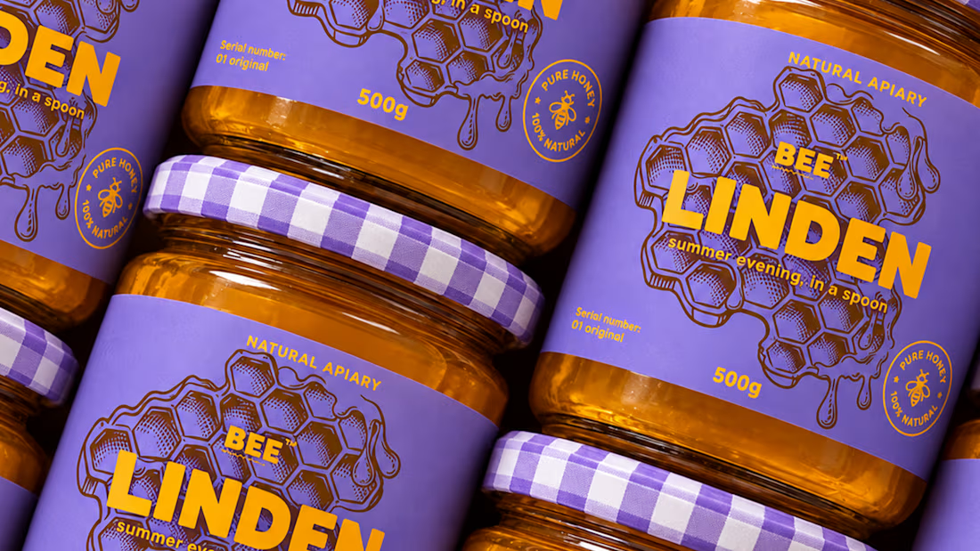
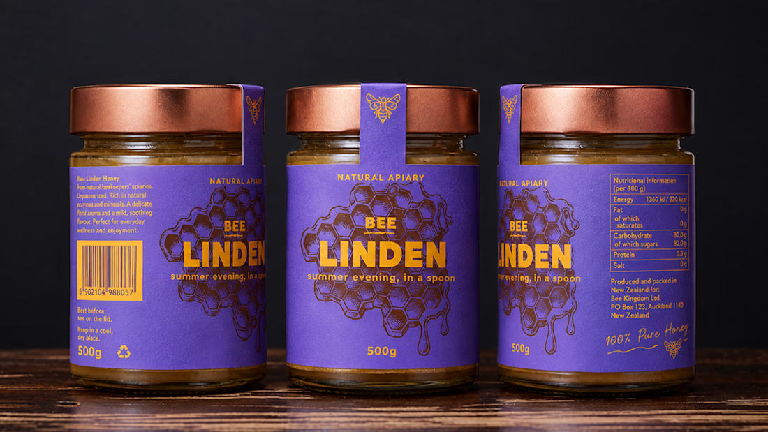
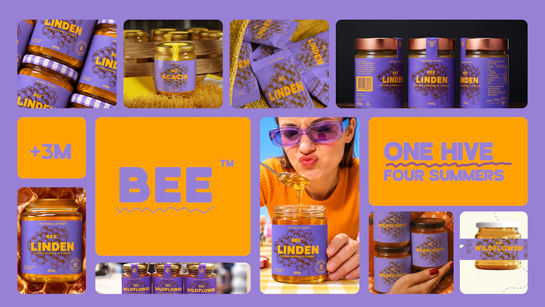
Honey should taste like somewhere 🍯
Spent the past week designing BEELINE, a single-apiary honey brand built on one idea: every jar comes from a specific place and time, so the packaging should show it.
No hexagons, no cartoon bees, no wooden crates. Just one thin line, the flight path of a bee from hive to flower, drawn short and direct for acacia, long and tangled for buckwheat. Four varieties, four colors, four routes. 🐝
Sometimes the most honest thing a jar can say is where it’s been.



Love the colors!

Thank you!

loveeeeee this color combo!
Thank you!

Ye le Jani is honey brand wali post ke liye:
Love this philosophy Marta! "Honey should taste like somewhere" — such a beautiful line. And you're so right, avoiding the hexagons and cartoon bees cliché makes it so premium. That single thin line idea sounds super elegant. Would love to see the full packaging! 🍯
I hope someone will notice me too and want to bring such products into their life :D

amazing visual design
Thank you!

nice design.

The purple and amber combo is such a good call for honey. How did you land on the Linden name?
To be honest, I don't really remember completely myself, I remember that I was looking for something related to nature, I was writing down various words, and somehow names came out of the pieces :)


Love the storytelling behind this packaging. Turning each bee’s flight path into a visual identity is such a clever touch.
When I was working on this project, I was just drawing lines for a university project, and that's when I came up with the idea of creating this campaign :D
Damn, and it all started with drawing random lines? Sometimes the best ideas really do come out of nowhere. Unbelievable
YUP! It seriously started with just simple lines :D

Love this idea! Making each variety tell its own story through a simple flight path is such a thoughtful approach to packaging. The little details make the brand feel so much more personal!
Thank you!

The color palette is so joyful🎉🎉

Wow

The bee flight path pattern works well

Amazing work

Outstanding brand identity — modern, distinctive, and versatile.

The vibrant colours and packaging look amazing!
The network for creativity
Join 1.25M professional creatives like you
Connect with clients, get discovered, and run your business 100% commission-free
Creatives on Contra have earned over $150M and we are just getting started











Related posts




Aryna, that golden symbol pops so nicely against the plum background ✨

Behind the scenes of the Treal Studio brand film.
Built in one week, from creative direction to sound design.


Love the overall feel, looks amazing 👌🏼

It’s been a minute since my last post here on Contra.
While my main focus usually lives in photo editing and digital design, I was digging through the archive recently and thought it’d be fun to share a couple of branding projects from the past:
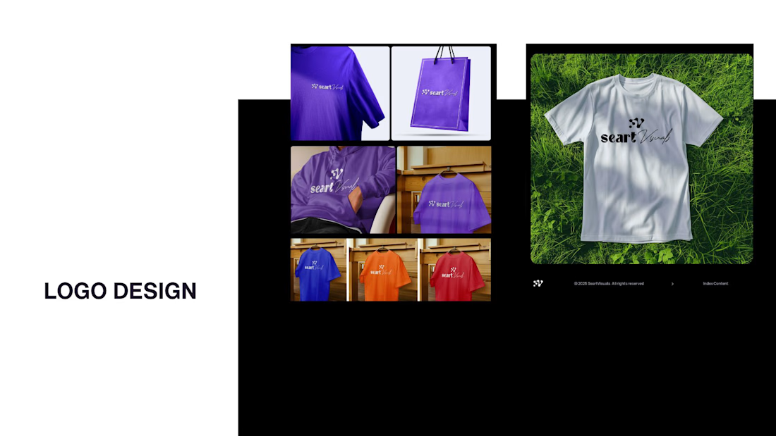
Slide 1: Seart Visuals apparel & merchandise branding (1 year ago)
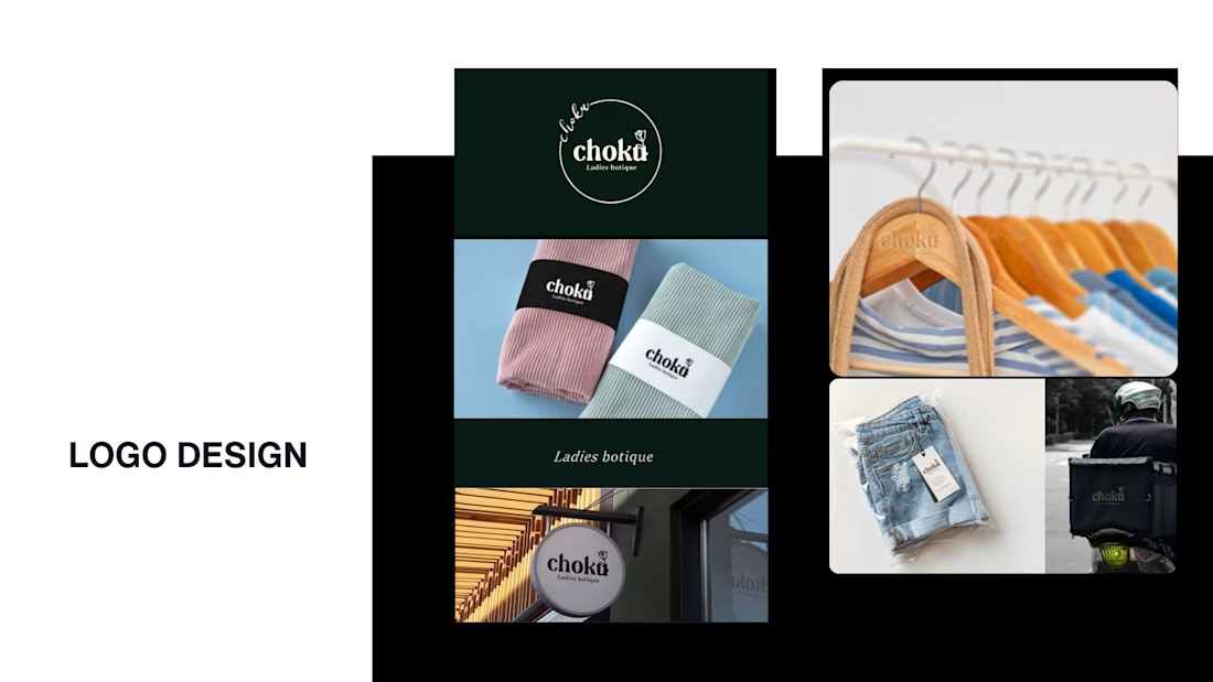
Slide 2: Choku Ladies Boutique identity and mockups (2 years ago)
Brand identity isn't my everyday lane, but tackling projects like these taught me a lot about visual consistency across different mediums. I’d love to hear your thoughts or see any feedback from fellow designers. Great to connect with the community again.

That's really great typography logo design❤️❤️