The network for creativity
Join 1.25M professional creatives like you
Connect with clients, get discovered, and run your business 100% commission-free
Creatives on Contra have earned over $150M and we are just getting started
Back to feedPost


How do you turn a brand mascot into a visual system people actually remember?
🐆 Our lynx represents sharp thinking, curiosity, and attention to detail.
For this motion experiment, we pushed the mark into a softer, unexpected direction - rebuilding it with different textures.
Same identity, different emotion.
Which texture fits the Lynksen identity best - flowers, grass, or something else? 👇✨


I personally love the soft blue and white version the most. Nice to scale it into the brand campaign or ad video 😃
Your words are so sweet, thank you ✨✨

Fire logo designs 🔥 😍 🚀
We know what we're doing 😉🔥


wooow! Amazing animation and 3D 😍
Thank you soo much! 🥰🤗

My favourite is white and blue combination 🤍💙
Nice to hear you liked it! 🥰

Nice work!
Thank you!

These are beautiful!
Tysm! 🚀

The motion and texture exploration make the mascot feel more alive. It’s a nice reminder that a brand system can have many moods while staying recognizable.
Appreciate your words! 🙌

Awesome!
Thanks!

These are so cool 🚀
Tysm 🚀

I realy love it 😍
We glad you liked it 🔥

Great work

One of the best designs I’ve seen today. Really solid work 👏 keep pushing. Translating these unique asset textures directly into a dynamic landing page experience would look absolutely insane
Thank you so much, your words mean a lot to us 💖

Awesome experiment! 🐆
Definitely! Thank you 🙌

I like silver
Nice choice! 🙌

The chrome liquid version is my pick, it makes the lynx feel alert and almost predatory which lines up with sharp thinking better than grass or flowers would. The floral one is gorgeous but reads more like a seasonal campaign asset than the core identity.

Good Job

Thank you 😊


Very cool! How did your human touch coming into play here? Keen to know!

Dont want to be the party pooper but thats a logo not a mascot!
The 3D looks great tho!
The network for creativity
Join 1.25M professional creatives like you
Connect with clients, get discovered, and run your business 100% commission-free
Creatives on Contra have earned over $150M and we are just getting started











Related posts

I’ve been working on a bold, modern-retro logotype and can’t decide between these two options.
🆘 Which one feels more aesthetically pleasing to you?
11 voted
26%
31 voted
74%
42 votes
Closed

CAPITAL is great but SMALL is unique great job Nawras 🔥🔥

How can branding make people feel part of a community?
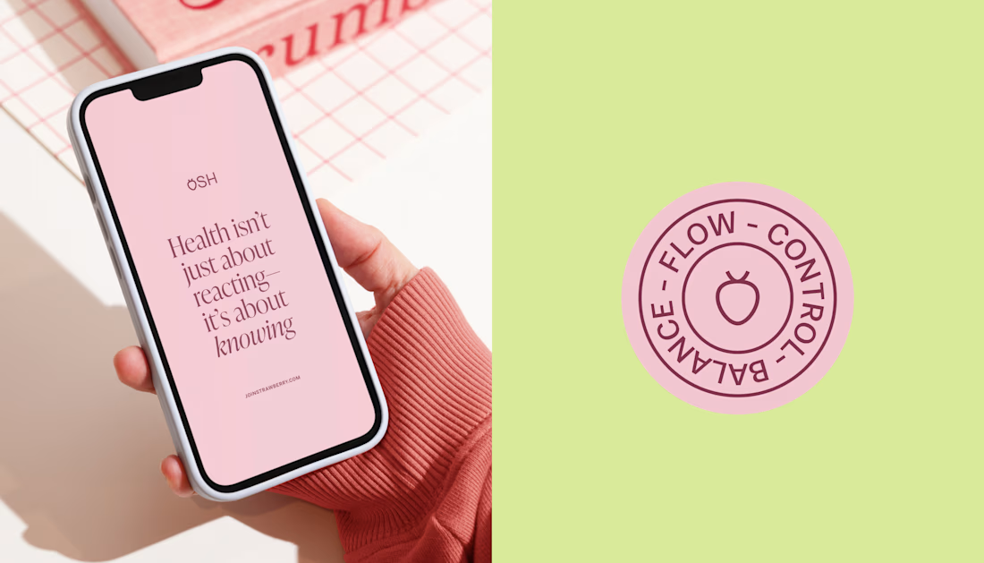
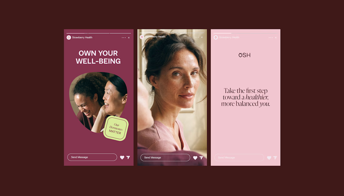
When working on Strawberry Health, we explored how visual identity could make women’s health feel more approachable and collective.
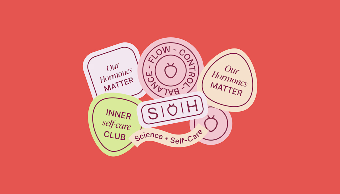
One of the ways was through supporting brand elements: stickers, badges and phrases that could live beyond the logo and become expressions of belonging.
These elements turned the identity into something people could interact with, share and make their own.
It’s a small detail, but I think it’s an important part of building brands around communities: the identity shouldn’t only identify the brand. It should give people something to identify with.
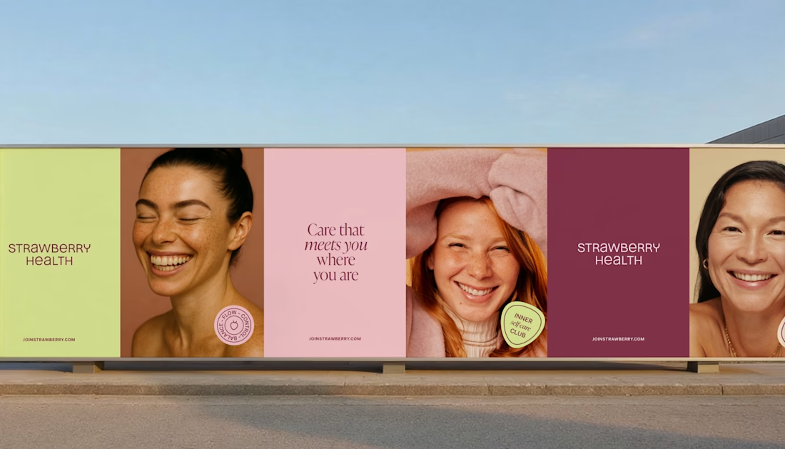

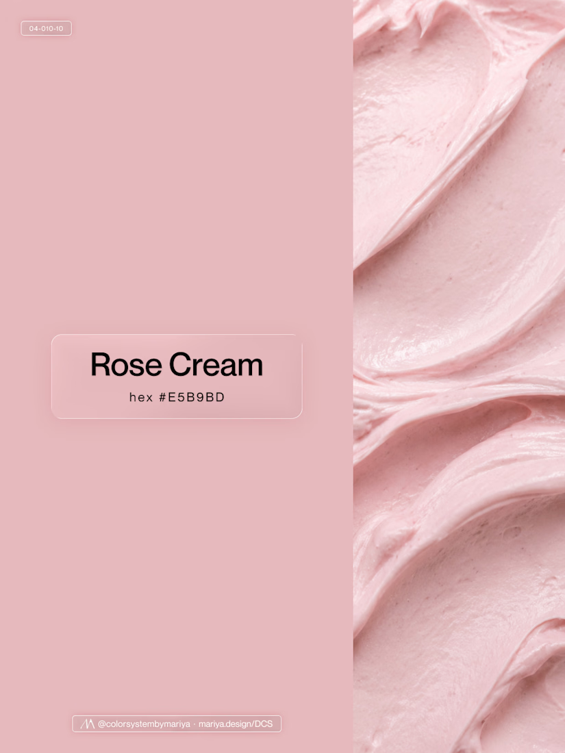
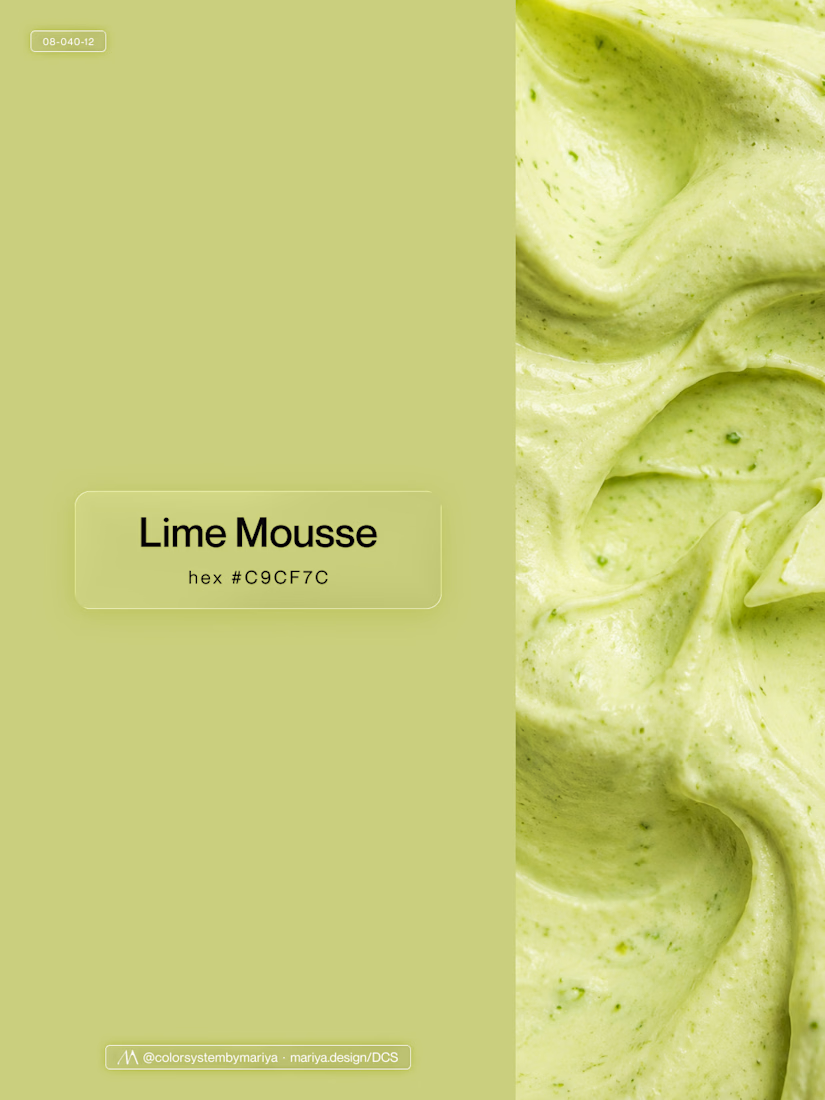
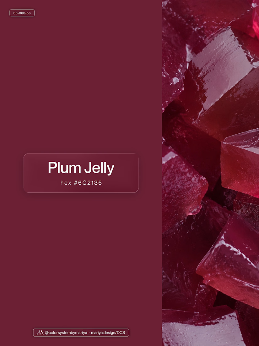
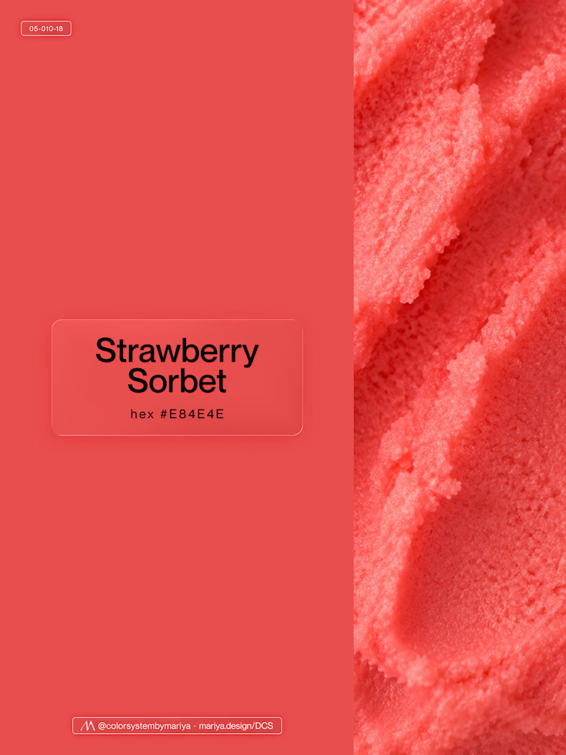
Love, love, love the colors. My mind goes: Rose Cream, Lime Mousse and Plum, hmmmm, which Plum... Plum Jelly. And of course, Strawberry Sorbet.
Let me match the vibe using my delicious swatches 😊


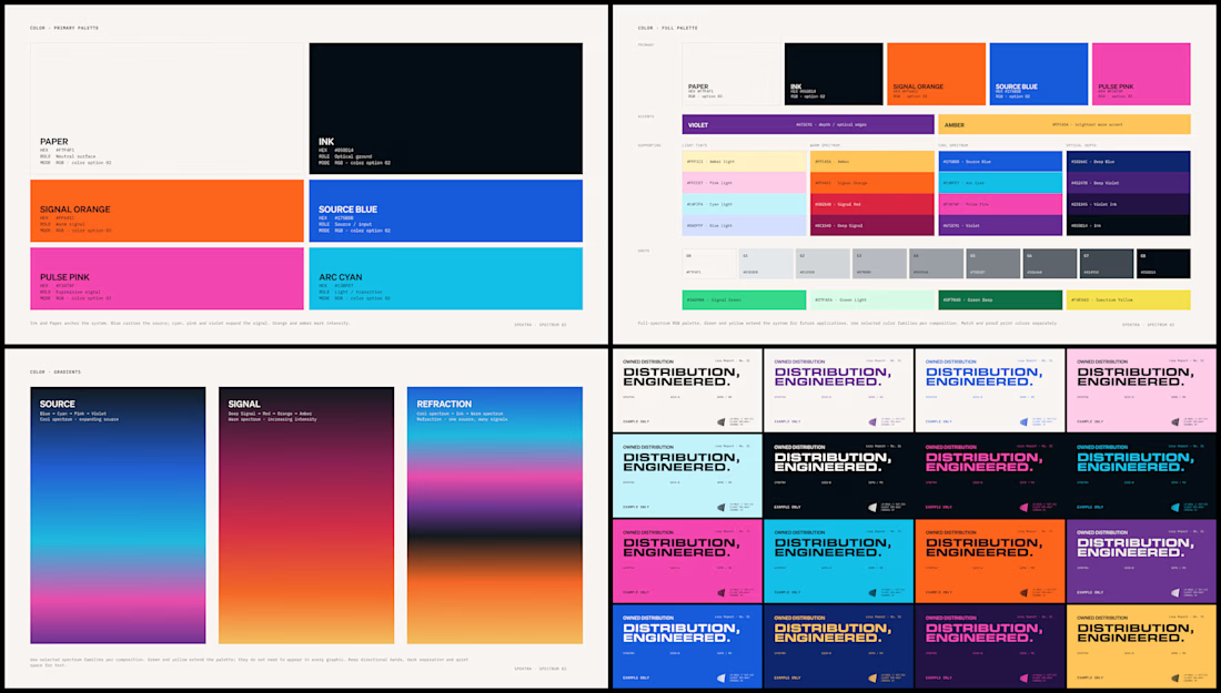
Spektra's founder had a practical question during the identity work: if the team needed green one day, would there be a green that belonged?
So I defined every color in the system, including green, with shades and pairings for each. When that day comes, the green is already there.