The network for creativity
Join 1.25M professional creatives like you
Connect with clients, get discovered, and run your business 100% commission-free
Creatives on Contra have earned over $150M and we are just getting started
Back to feedPost
Currently putting together the full case study for Viafide, and this was a big one for Sydelle Creative.
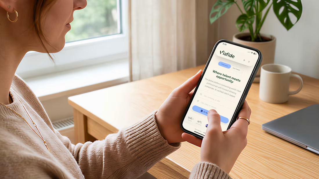
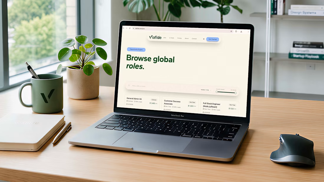
We had the opportunity to build the brand from the ground up, from positioning and naming through to the full visual identity, digital system, icons, templates, and brand applications.
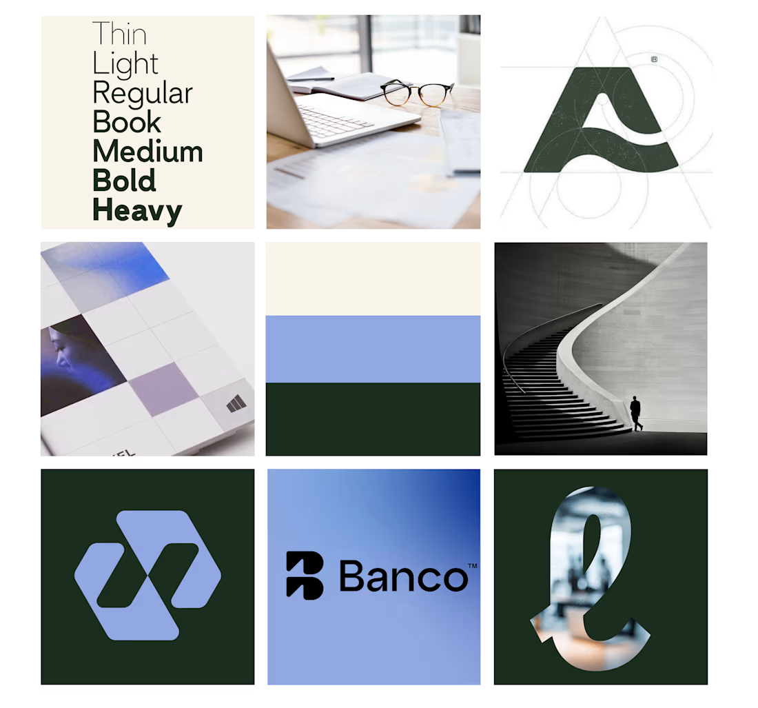
One of my favourite parts of revisiting a project is going back to the original moodboard and seeing how those early ideas translated into the finished brand.
I always love seeing a moodboard beside the final result. If you have a moodboard → final brand comparison of your own, share it in the comments, I’d love to see it!
Full case study coming soon.

Clean work!

Thanks so much!

I really like how you built the brand from start to finish.
Thanks 🙌


Awesome
Thanks!

Thanks so much!

This is cool
Thank you!

Thanks!!!


Nice work 👏
Thank you!

This is so creative. Well done
Thank you! Much appreciated!


Amazing work👏🔥🔥
Thanks so much!

Love this!
Thank you!

Thank you so much! Excited to share the full case study soon 😊

Looks great!
Thanks!

The moodboard to final brand comparison is honestly one of the most useful things a studio can share publicly, it shows the reasoning instead of just the polished output. Looking forward to the full case study.
Thank you! I love sharing the thinking behind the final direction, not just the finished work. Excited to share the full case study soon!

Love seeing the process behind it 👏
Thank you! Always fun sharing a bit of the process behind the work 😊

Incredible work
Thank you!
The network for creativity
Join 1.25M professional creatives like you
Connect with clients, get discovered, and run your business 100% commission-free
Creatives on Contra have earned over $150M and we are just getting started
Challenges
View all


Related posts



This looks great

Client’s choice vs. Designer’s choice 👀
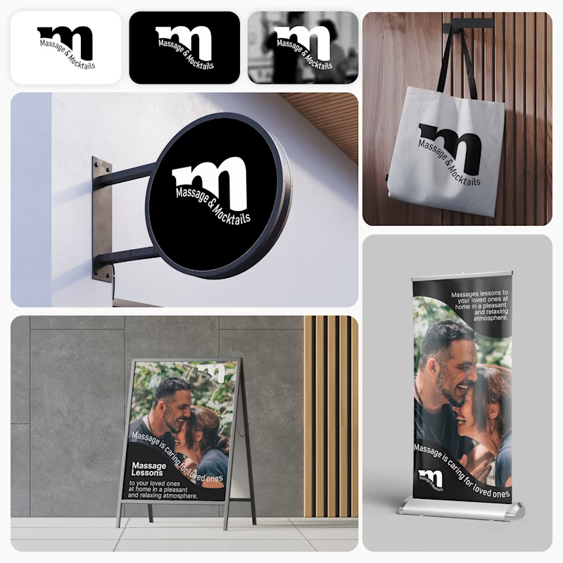
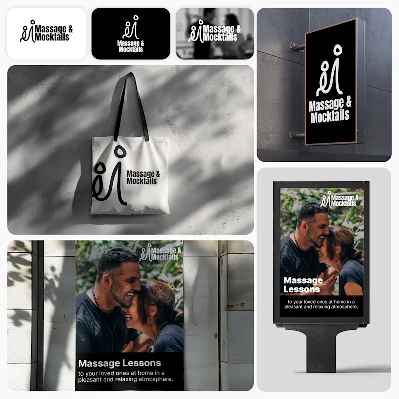
I’m currently working on a branding project for Massage & Mocktails — a concept built around couples learning massage together in a relaxed, social atmosphere.
These are two early, black & white directions from Stage 2 of my branding process, before moving into color, typography, and the full visual system.
The interesting part?
My client chose Concept 1. I chose Concept 2.
Now I’m curious what other creatives think.
Which direction would you choose — 1 or 2? And why?
Sometimes the most interesting part of branding is seeing how differently a client and a designer respond to the same brief.
21 voted
44%
27 voted
56%
48 votes
Closed

Concept 2 for me. That interlocking figure mark reads as two people meeting, which is the actual brief here, so it gives you more to build a system on. Concept 1 is the safer, more literal pick, which is usually why clients reach for it.

“We started with just a name and some vague ideas. They left us with a brand.” That’s how our client described their experience working with us on The Growth Fit.
There was no existing identity to refine. Our job was to take an early-stage idea, understand what the brand needed to stand for, and turn it into a visual system with enough clarity and character to grow with the business.
That meant exploring, challenging our own decisions, and going back to the drawing board when something wasn’t landing well. The result was a system built around one central idea: the right fit, carried consistently through the identity, motion and brand touchpoints.
The complete project is live. If you’d like to see how the idea developed into the full identity system, you can explore the case study here: The Growth Fit


I love the colors!