The network for creativity
Join 1.25M professional creatives like you
Connect with clients, get discovered, and run your business 100% commission-free
Creatives on Contra have earned over $150M and we are just getting started
Back to feedPost
Taste Test

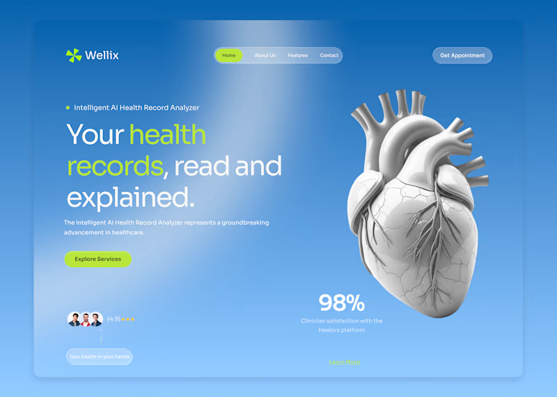
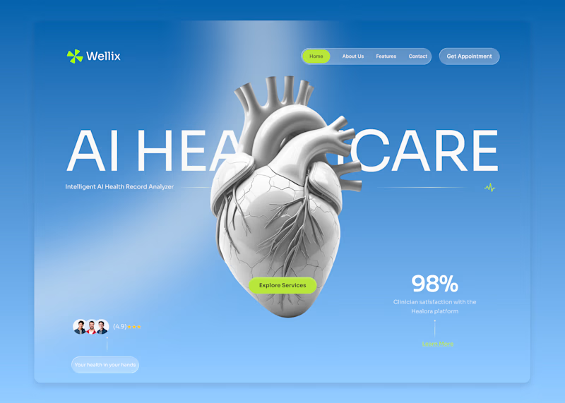
Wellix two homepage directions. Which one would you pick?
Wellix is an AI tool that reads health records and explains them in plain language lab results, scans, and charts turned into something a person can actually understand without a medical background.
Same brand, same palette, same illustration just two different ways of arranging the hero.
Which one would you go with, A or B? Drop a comment I'd like to hear which one lands better for you.

31 votes
Ends in 1d

For me Option B is better, which one do you prefer here?

Version. A does the job


In healthtech, clarity equals trust. Direct, plain-language positioning removes cognitive load instantly building user confidence before they even begin to scroll.


the heart image is cool. which homepage do you like more?

My preference is to go with version A. Looks more clean and impressive.

Nice design !

A gives you more valuable information

I like B

version A is clean, clear and everything is visible clearly

Upgoating version A

Version A looks way better and properly guides the visitor

So creativity design

B looks visually appealing but A has better clarity. I'd improve text readibility on both and neon color on blue background is almost invisible for the 'Learn More'

Version A is much cleaner. What are your thoughts on the CTA and text contrast though? That light green button learn more button and also the text pills feels like it gets a bit lost against the blue background in both versions.

I’d pick A. The hierarchy feels stronger and the message is much clearer.

So inspiring! 😍

I lean toward B—the benefit-led headline communicates the value faster, while the consistent palette keeps the comparison feeling like one product.
The network for creativity
Join 1.25M professional creatives like you
Connect with clients, get discovered, and run your business 100% commission-free
Creatives on Contra have earned over $150M and we are just getting started
Trending
retrofuturism
Share your favorite designs from the past exploring the distant future. Or your own take on the aesthetic 🚀
halftone
Dots. Texture. Grain. Let's see your designs using the halftone technique.

Midjourney
Creatives are showing off what they're making with Midjourney.
colorgrade
Video editors sound off: How do you enhance the mood of your video in color grading?
Related posts

Which flow seems more natural to you?
In the first option, the user opens the app and is offered a general selection of films. If the user wants to get unique recommendations, they can do so separately.
In the second option, the app first asks about current preferences and then offers personalized recommendations.
13 voted
33%
26 voted
67%
39 votes
Closed

i'm big on option 2!

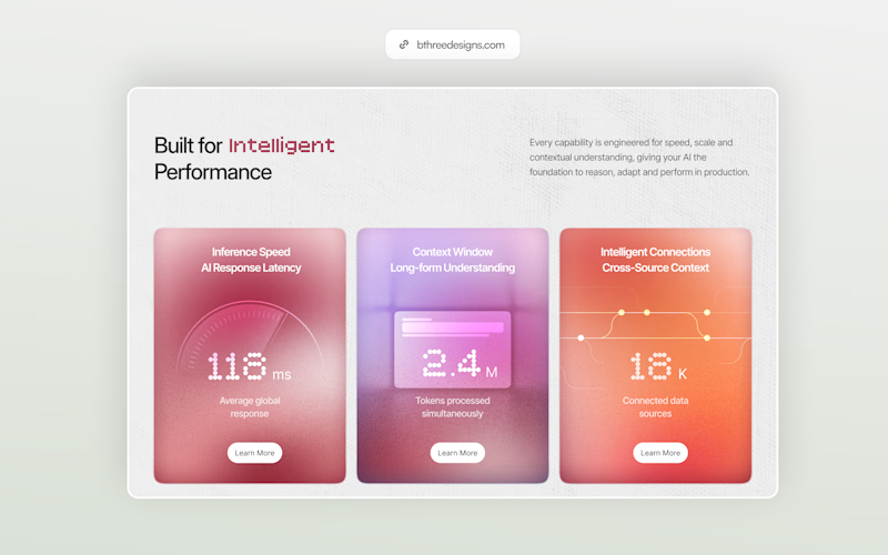
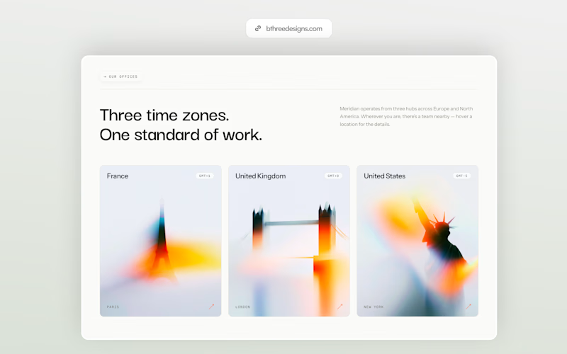
Pushing my color comfort zone a little. Left or right?
5 voted
45%
6 voted
55%
11 votes
Closed
Both feel great, just with completely different energy.


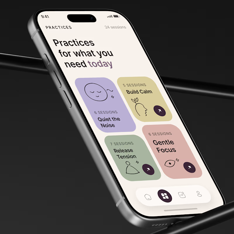
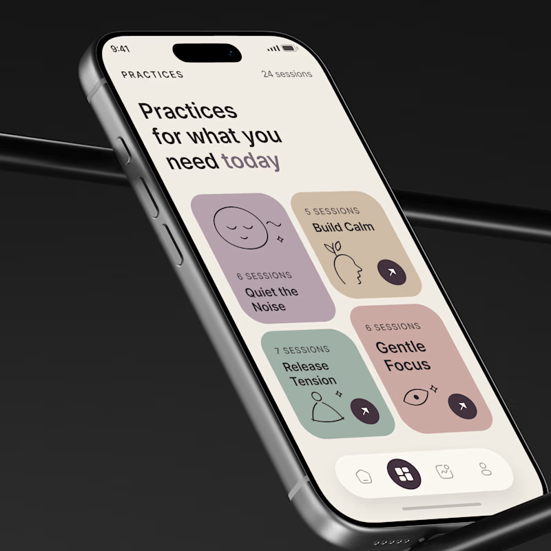
Tasty Test 03/30: Which palette makes the next choice feel easier?
Same wellness app. Same UX. Same content. Different visual system
A 🌿 Calm Choice
Soft lavender, sage, butter, and rose with equal visual weight.
B 🎯 Focused Choice
Warmer muted tones with stronger hierarchy and directional emphasis.
The question is not:
Which looks prettier?
It is
Which one reduces decision friction?
In wellness products, users often open the app already stressed, tired, or overloaded
So color can become part of the decision system
I would test:
Time to Confident Choice
Practice Selection Rate
Session Start Rate
💡 Growth Insight 03
A wellness interface should not only look calm.
It should make the next decision feel easier.
Which one would you choose?
A 🌿 or B 🎯
#MobileAppDesign #MobileUX #AsolDesign

67 voted
87%
10 voted
13%
77 votes
Closed
Calm