The network for creativity
Join 1.25M professional creatives like you
Connect with clients, get discovered, and run your business 100% commission-free
Creatives on Contra have earned over $150M and we are just getting started
Back to feedPost
Taste Test
Tasty Test 03/30: Which palette makes the next choice feel easier?
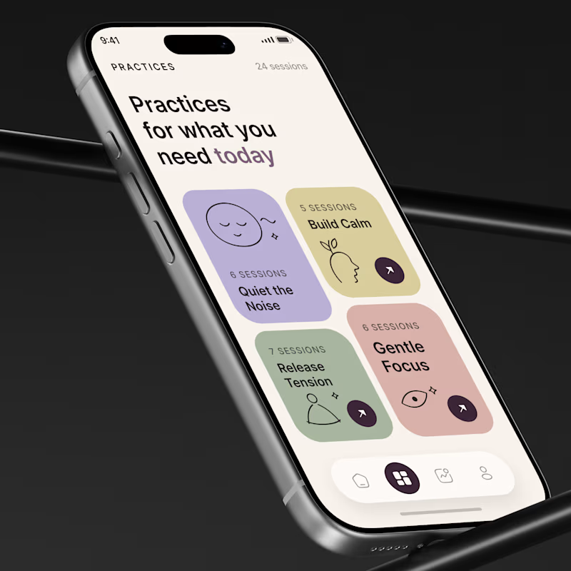
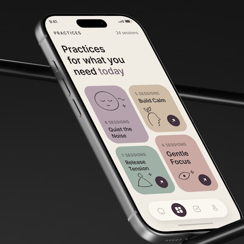
Same wellness app. Same UX. Same content. Different visual system
A 🌿 Calm Choice
Soft lavender, sage, butter, and rose with equal visual weight.
B 🎯 Focused Choice
Warmer muted tones with stronger hierarchy and directional emphasis.
The question is not:
Which looks prettier?
It is
Which one reduces decision friction?
In wellness products, users often open the app already stressed, tired, or overloaded
So color can become part of the decision system
I would test:
Time to Confident Choice
Practice Selection Rate
Session Start Rate
💡 Growth Insight 03
A wellness interface should not only look calm.
It should make the next decision feel easier.
Which one would you choose?
A 🌿 or B 🎯
#MobileAppDesign #MobileUX #AsolDesign

67 voted
87%
10 voted
13%
77 votes
Closed

Calm one for me!


😍 😍 😍

One of the best designs I’ve seen today. Really solid work 👏 Breaking down why screen grids build trust vs hero shots gives such great case study insight.
Thanks😍

Calm
😍 😍 😍


😍 😍 😍

😍 😍 😍

Calm

calm has my vote!

Calm obviously but if we talk about focused one it is not that focused tbh we can use just outlines for the focus or maybe dark theme.
Thanks 😍 😍 😍

Calm Choice for me
Thanks

Great job

The calm choice
😍 😍 😍


B for me anna, the warm tones make the buttons easier to find

Calm Choice
😍 😍 😍

Focused...

calm one have more vibrant color which suits it


Amazing work🔥👏👏
Thanks😍

Calm
😍 😍 😍

Focused

Could barely sight the differences tho
Fair point 😄 The difference is intentionally subtle I wanted to test how small palette shifts can change the overall feel without touching the UX. Thanks for the feedback!
You are welcome


Option A win here, love it !
Same here 🙌 Option A feels stronger to me too, glad it’s getting your vote!

Option A for me
Nice choice 🙌 A definitely feels a bit more energetic while still keeping the calm mood.

Calm choice 👍
Exactly 🙌 That calmer direction feels more aligned with the product mood.

A
😍


I will go with Design B
😍


nice work
The network for creativity
Join 1.25M professional creatives like you
Connect with clients, get discovered, and run your business 100% commission-free
Creatives on Contra have earned over $150M and we are just getting started







Related posts

Friday app: Loopin
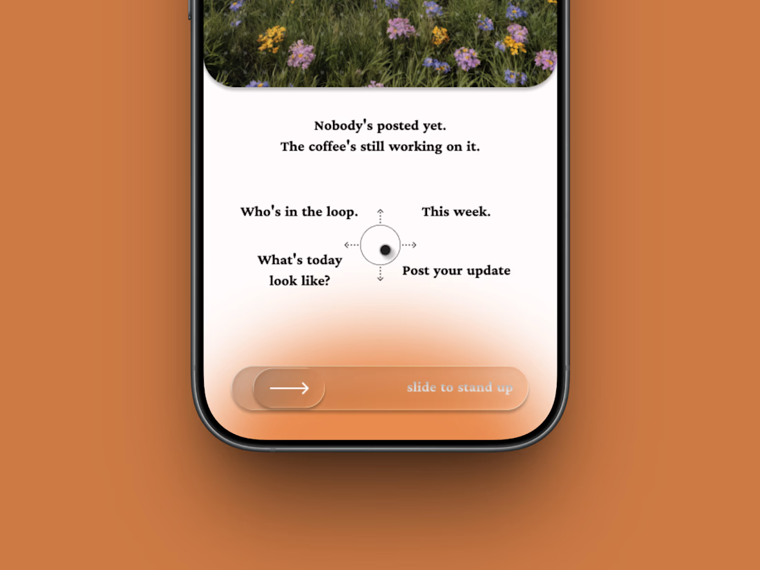
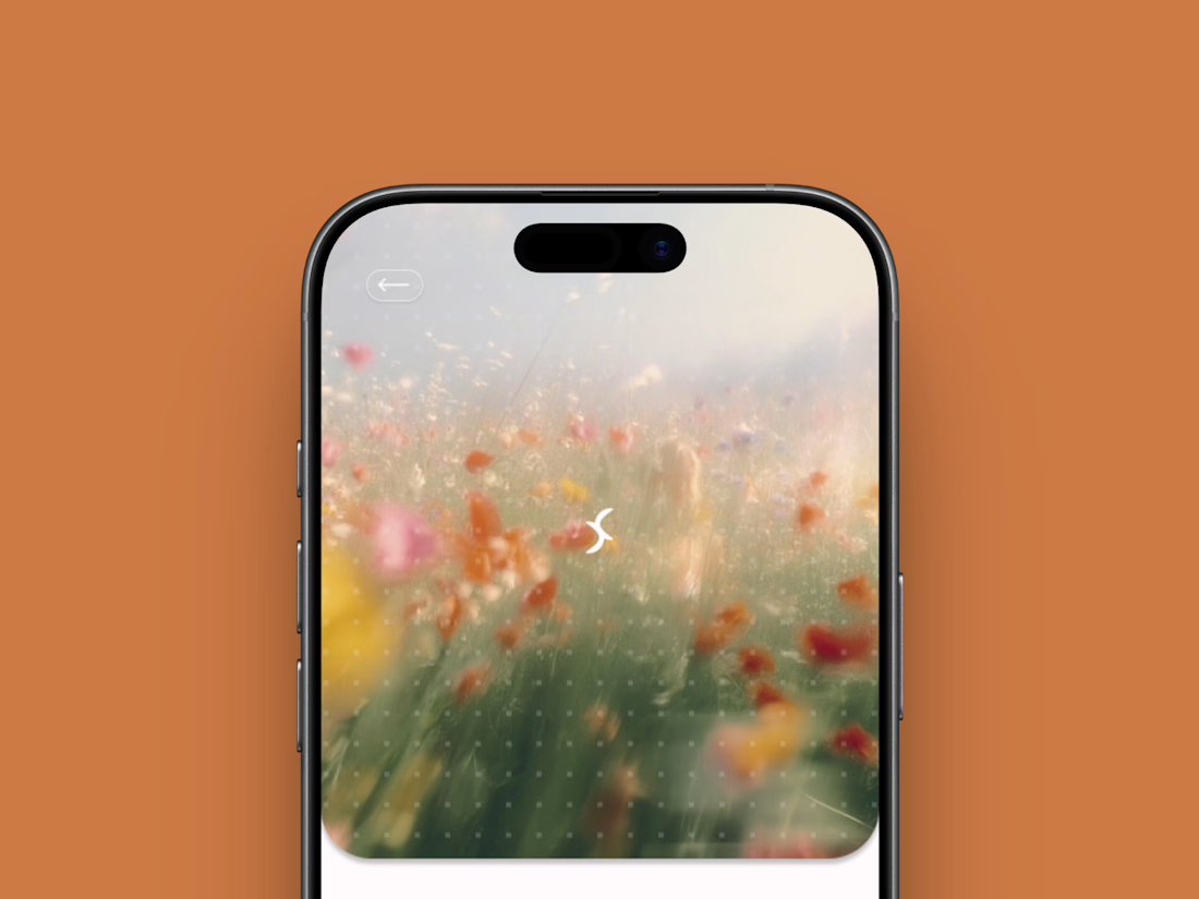
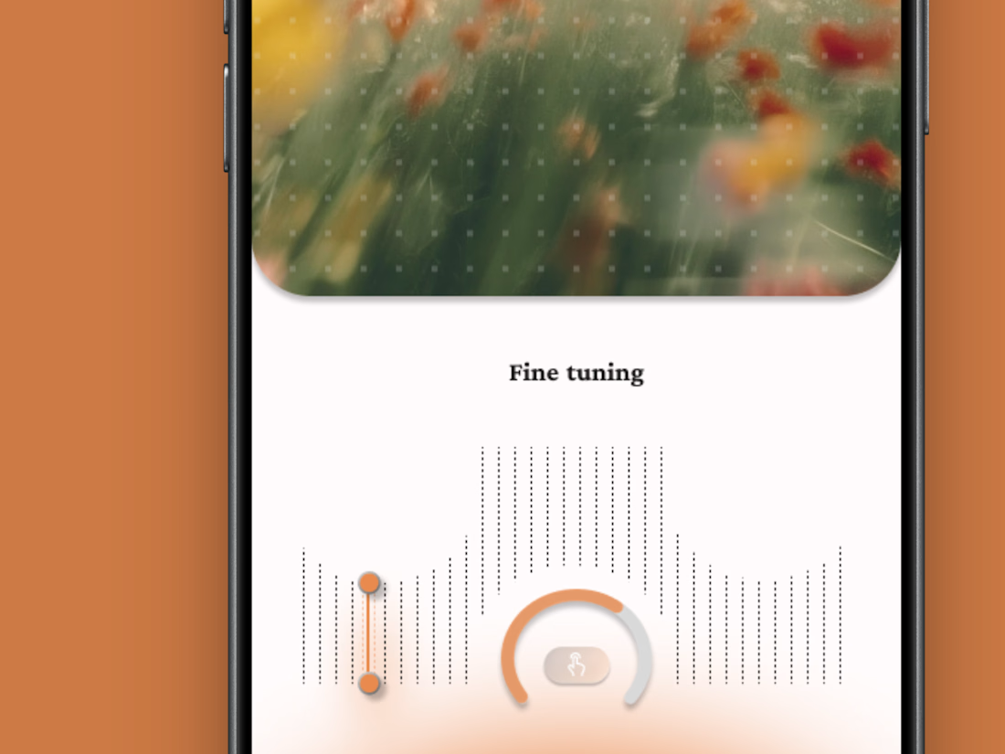
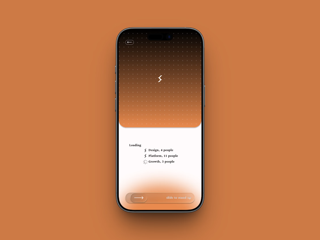
A fictional async standup app where the meeting is one gesture: slide to stand up.
Film-photo window up top, a four-way compass below, and a loading state that resolves your team one row at a time.
Concept project.


🌸 A little more calm, a little less noise.
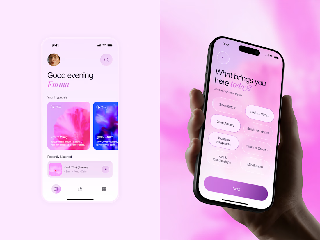
Meet Inner Bloom — a hypnosis app concept designed to help people sleep better, reduce stress, and feel more confident.
For this project, I explored a softer visual direction with dreamy pink and lilac tones, frosted glass, and floral imagery to create a calming experience that feels warm and personal.


Great concept with soft colors ❤️🎉

Same collection. Two different experiences.
Would you choose the bold, playful catalogue or the calm, architectural gallery?
Both complete websites are free to download — source code, assets and animations included.
Grab the kit: https://contra.com/products/FNrYmtZe-stillform-two-animated-landing-pages
10 voted
53%
9 voted
47%
19 votes
Closed