The network for creativity
Join 1.25M professional creatives like you
Connect with clients, get discovered, and run your business 100% commission-free
Creatives on Contra have earned over $150M and we are just getting started
Back to feedPost
Taste Test


THE BEST APP ICON MAY NOT EXPLAIN THE PRODUCT.
It may trigger the next open.
Same pet app. Two behavioral cues.
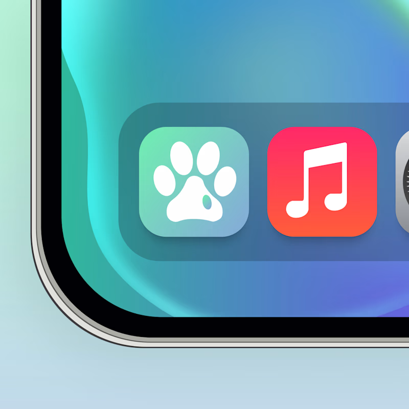
🐾 A creates instant recognition. The brain connects the icon with the pet before processing a feature or task.
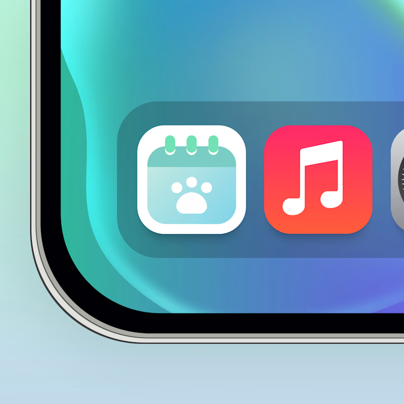
📅 B creates functional context. It signals there is something to remember, check or manage.
Both work, but for different parts of retention
Recognition builds familiarity. Context creates a reason to return.
The real growth question:
Which cue is stronger once the user already understands the product?
🐾 A Emotional recognition
📅 B Functional intent
👇 Which one would make you reopen the app?
👉 BOOK A MOBILE APP STRATEGY SESSION
https://calendly.com/asol_design/book-diagnostic-call-linkedin-clone
106 voted
67%
53 voted
33%
159 votes
Closed


Actually B looks more interactive and engaging in my opinion while option A look better overall. What distorts B from being flawless is the white background in my opinion. Just giving my ideas; You can zoom out the full calender structure and move the green springs all the way...

Nice work!
I would have picked B but I prefer A because it doesn’t have white space around it.

I think B is the better option, though it could use a little more contrast. A feels too generic, if my Paws & Palms became an app, its icon could end up looking very similar to A and get confused with other apps. Something more unique and instantly identifiable would help it stand out.

well said....
imma go with A because it wont fail on smaller sizes

Gorgeous!!

I'd click A more than B

I would go for A. A looks is looking exactly like what it meant to portray and also it's very playful.

icon don't have to explain the product sometimes, sometimes they make people to trigger

A is more visible and clear to read.

Excellent App Icon Design!!

Very cute


A for me, no thinking required


B easily


Definitely Option A! The paw print creates instant emotional connection and muscle memory on the home screen. A calendar icon feels a bit too task-heavy for a pet app. 🐾🚀


I love option A

A actually looks really cool
The network for creativity
Join 1.25M professional creatives like you
Connect with clients, get discovered, and run your business 100% commission-free
Creatives on Contra have earned over $150M and we are just getting started
Trending
retrofuturism
Share your favorite designs from the past exploring the distant future. Or your own take on the aesthetic 🚀
halftone
Dots. Texture. Grain. Let's see your designs using the halftone technique.

Midjourney
Creatives are showing off what they're making with Midjourney.
colorgrade
Video editors sound off: How do you enhance the mood of your video in color grading?
Related posts

Which would perform better? 🍩
I created both of these visuals with AI for a client project, and I’m curious what the Contra community thinks.
The goal is not necessarily to choose the “prettier” image, but the one that would be more effective for a food/dessert brand on social media.
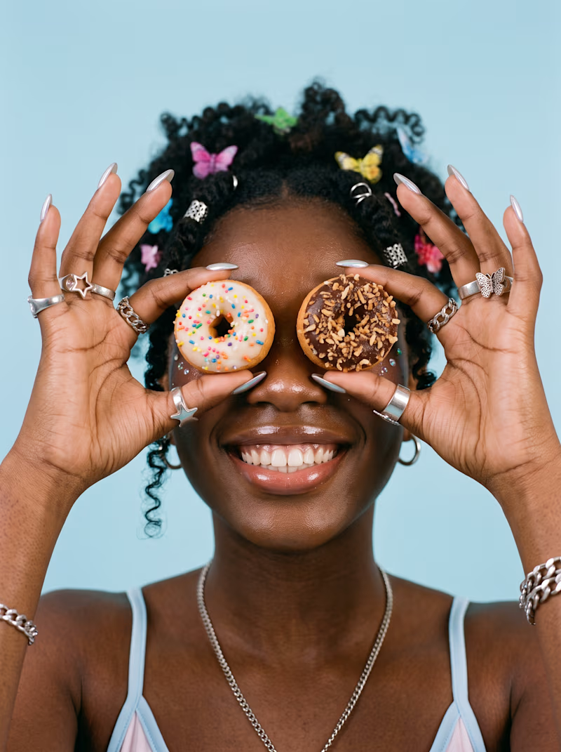
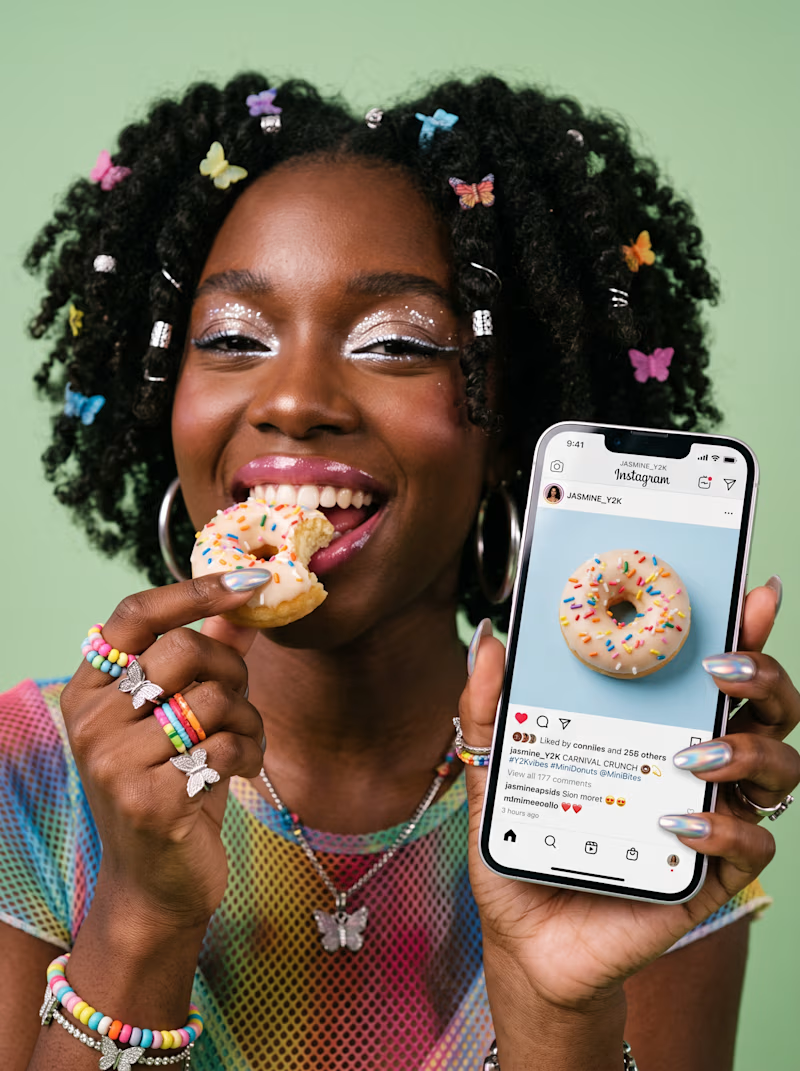
A: Lifestyle-focused, with the product being consumed + an Instagram/social proof element B: More playful and product-focused, using the donuts as the main visual hook
If you were choosing one for a paid social campaign or organic Instagram content, which one would you bet on?
And if you have second, I’d love to know why. Is it the composition, visual hook, product appetite appeal, storytelling, or something else?
Both are AI-generated, so I’m also curious whether that affects your perception of the creative.

32 voted
67%
16 voted
33%
48 votes
Closed


Option A is a total winner for paid ad performance! Lifestyle storytelling combined with a social proof hook instantly builds trust and drives conversions, whereas Option B is great for top of funnel organic feeds. Both look amazingly seamless for AI visuals 🍩✨

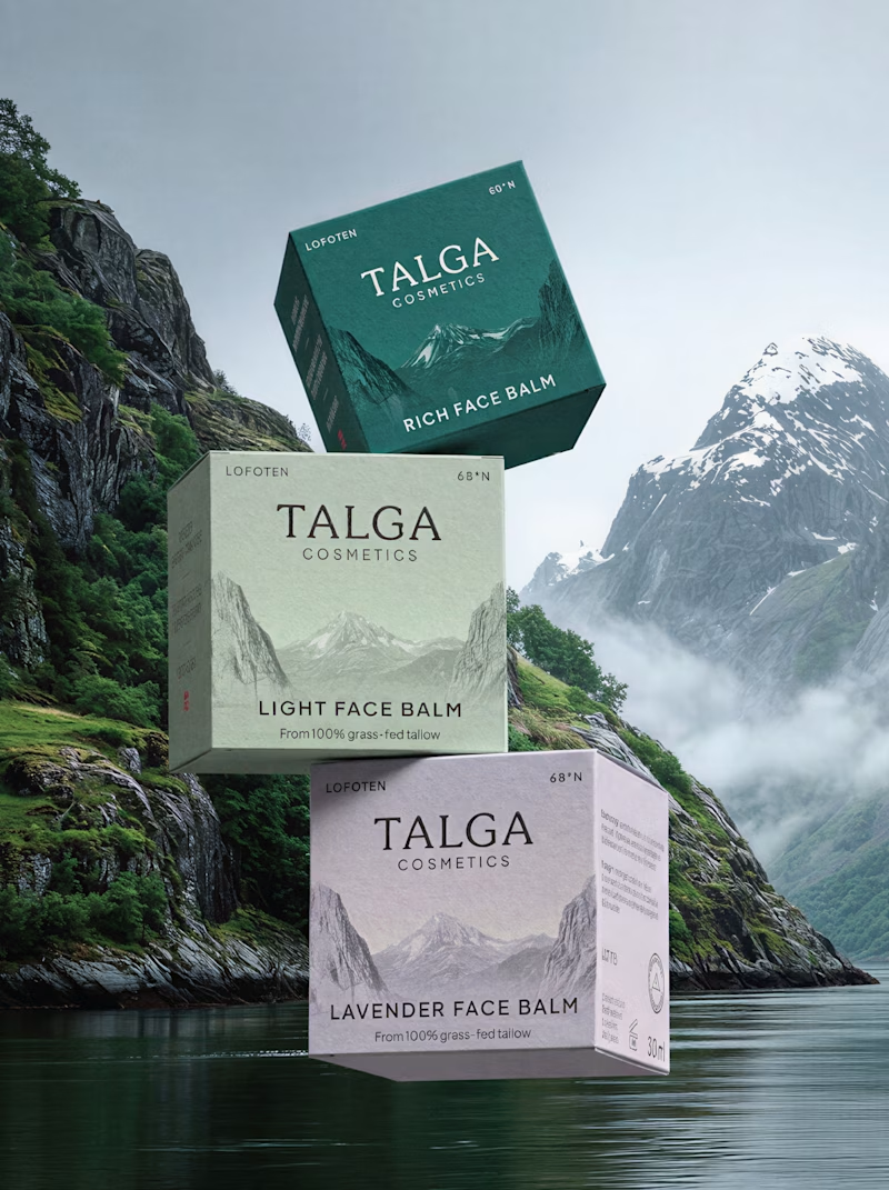
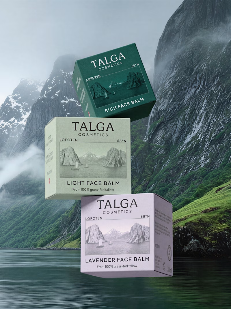
A small packaging design test:
Two versions of the same packaging — the only difference is the front label. In the first version, the fjord image is used as a background. In the second, the image is framed like a postcard.
Would love to hear what makes one work better than the other.
40 voted
59%
28 voted
41%
68 votes
Closed

From a product perspective, the postcard option has the front face of the box lit and the side face darker, this helps the box perspective to feel closer to a real product.
The box design feels more integrated as a background to me, I would just put some work on making sure...

Taste Test 👀
Same brand.
Same color palette.
Same subject.
Two completely different design directions.
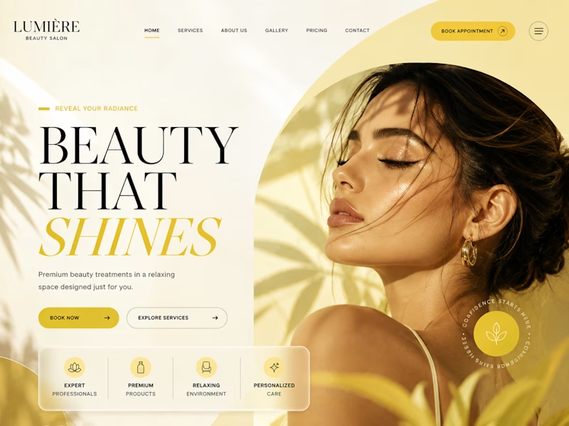
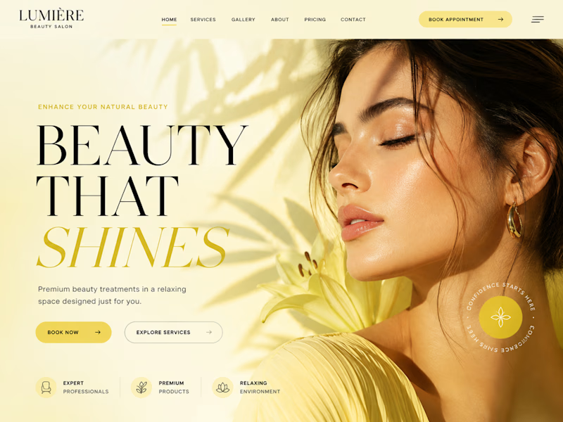
I designed two hero sections for the same beauty salon to see which one creates a stronger first impression.
A or B?
Which one would you choose and more importantly, why?
I’m curious to see what the design community prefers. 👇
#WebDesign #UIDesign #LandingPage #DesignInspiration #CreativeDirection #UXDesign #DesignCommunity


10 voted
30%
23 voted
70%
33 votes
Closed

I'm torn on this one honestly, A feels warmer and more editorial while B leans a little more retail-catalog. What made you land on testing this pair specifically instead of two totally different concepts?