The network for creativity
Join 1.25M professional creatives like you
Connect with clients, get discovered, and run your business 100% commission-free
Creatives on Contra have earned over $150M and we are just getting started
Back to feedPost
Taste Test

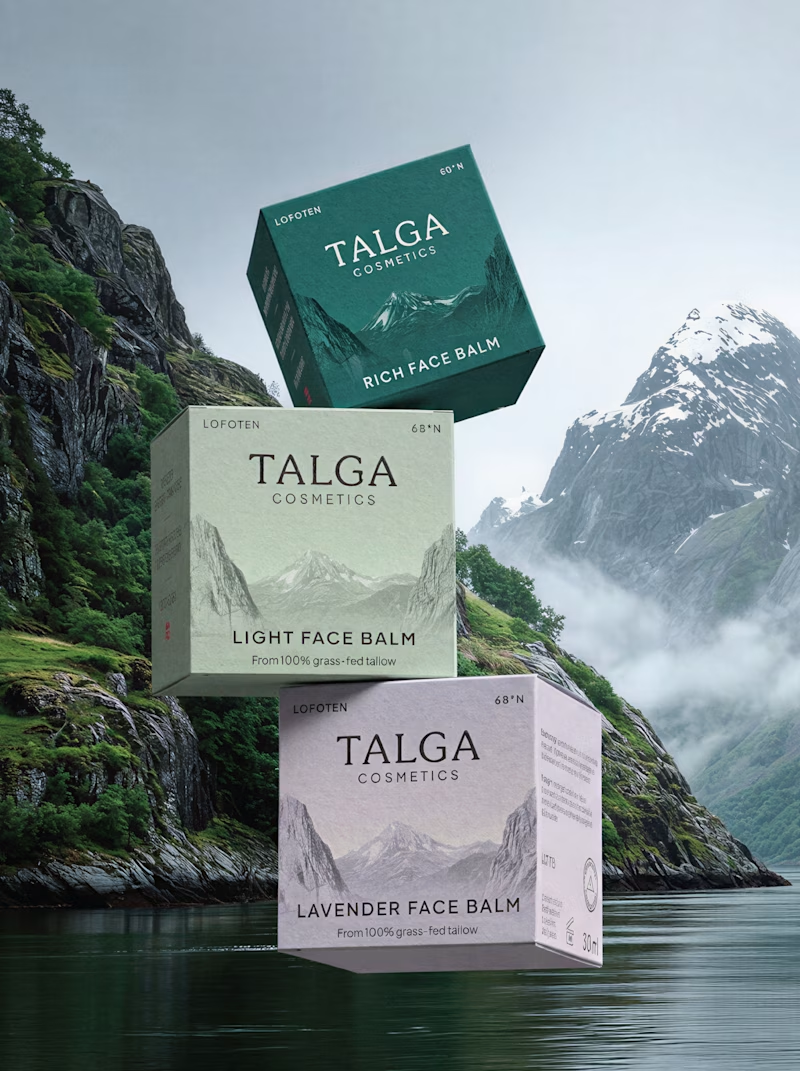
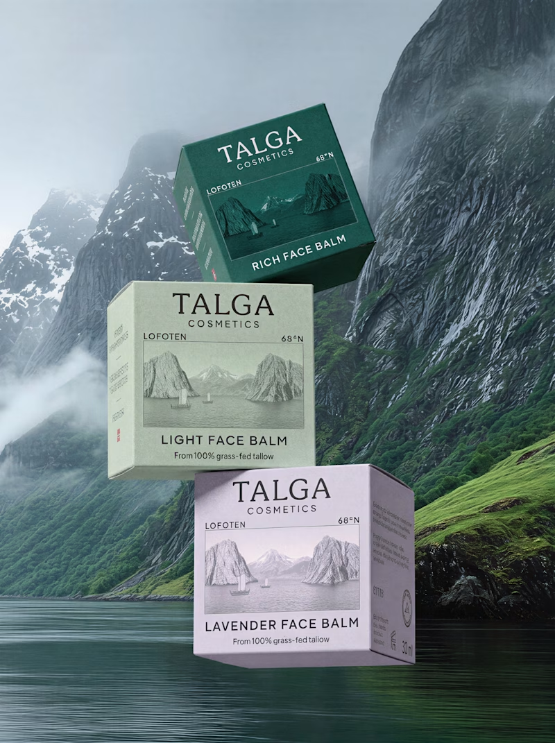
A small packaging design test:
Two versions of the same packaging — the only difference is the front label. In the first version, the fjord image is used as a background. In the second, the image is framed like a postcard.
Would love to hear what makes one work better than the other.
40 voted
59%
28 voted
41%
68 votes
Closed

Both are a good way to go but the background version is pulling me more into it, due to more white space and depth that it adds.

From a product perspective, the postcard option has the front face of the box lit and the side face darker, this helps the box perspective to feel closer to a real product.
The box design feels more integrated as a background to me, I would just put some work on making sure...

Background one

Nina, Both are great😊

I really like both directions. The postcard version feels a bit more polished and cohesive.

The way that the background and middle ground are set up create a more dynamic composition in my opinion. The light sky also create a nice contrast with the forest green packaging which leads your eye through rest of the variants.
Good work!

The background version is cleaner and more modern, but the postcard version has an old school charm to it too, I guess because its cosmetics the minimal version is a better fit, if it was a product that had any kind of history attached to it the postcard would be the best choice!


I’d go with the postcard one. Feels more unique and memorable.

Postcard works better than the background own

Super in with the Postcard one!

Both look good, but I prefer the background.

This looks really cool

I'll prefer background option. This is very clean and pro.

Background!!

I think the background should be an abstract blend, in contrast with product design colors.
you can generate using AI or can do a simple color blend in Adobe photoshop. The purpose is to have a radiant and bright look. You can also turn the existing background into somehow blurry image with green highlights.

Don't know both look great to me


background !

I agree with the poll results, using the image as a background looks and feels more natural and cohesive with the rest of the design. The postcard design definitely can work but the rest of the design would need some complimentary changes along with it. But as it stands, great work with the designs, love them!

Oops, I got late to vote on this one but it's such an amazing work that I had to leave a comment!🙌
My vote is for the one that already won. It just feels more natural with the product sitting in the scene.
The network for creativity
Join 1.25M professional creatives like you
Connect with clients, get discovered, and run your business 100% commission-free
Creatives on Contra have earned over $150M and we are just getting started











Related posts

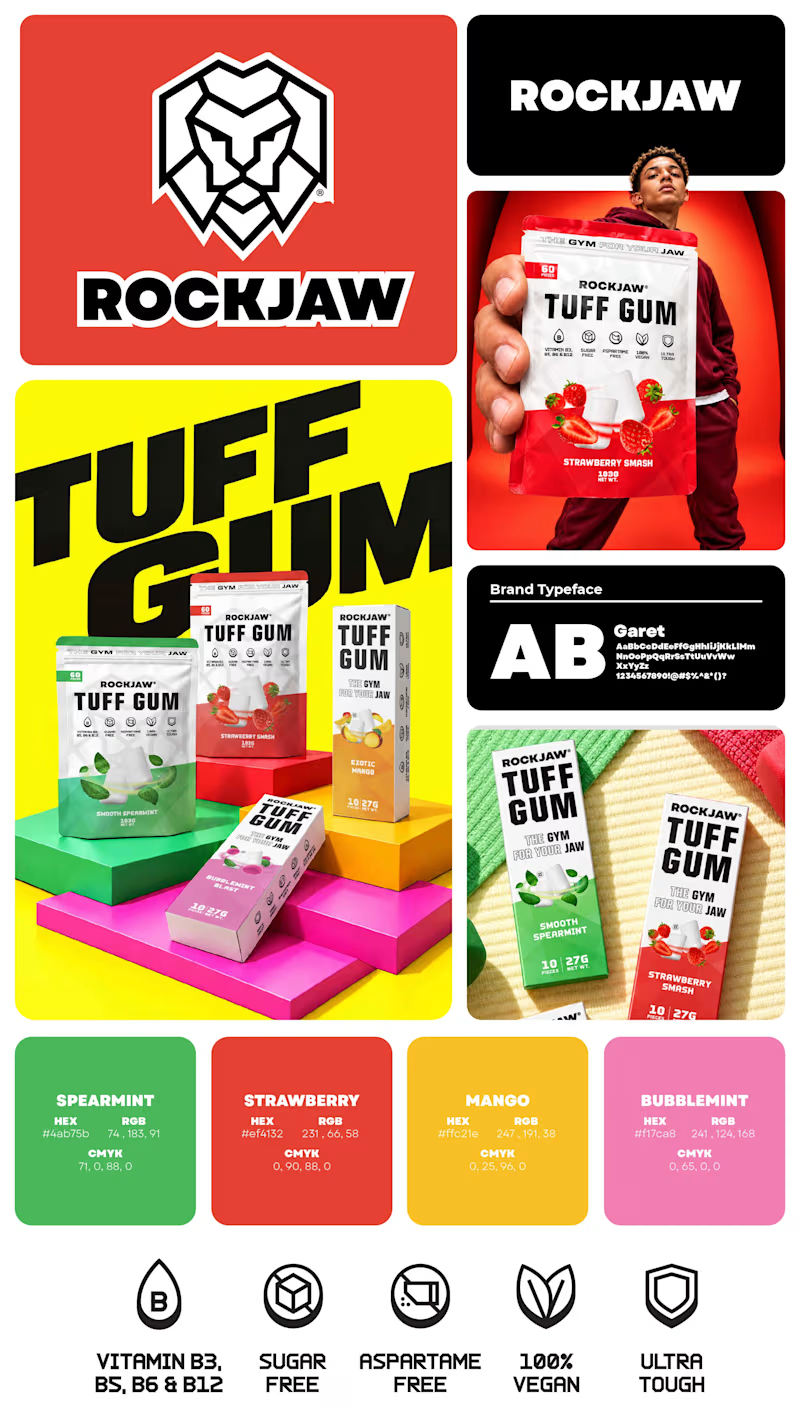
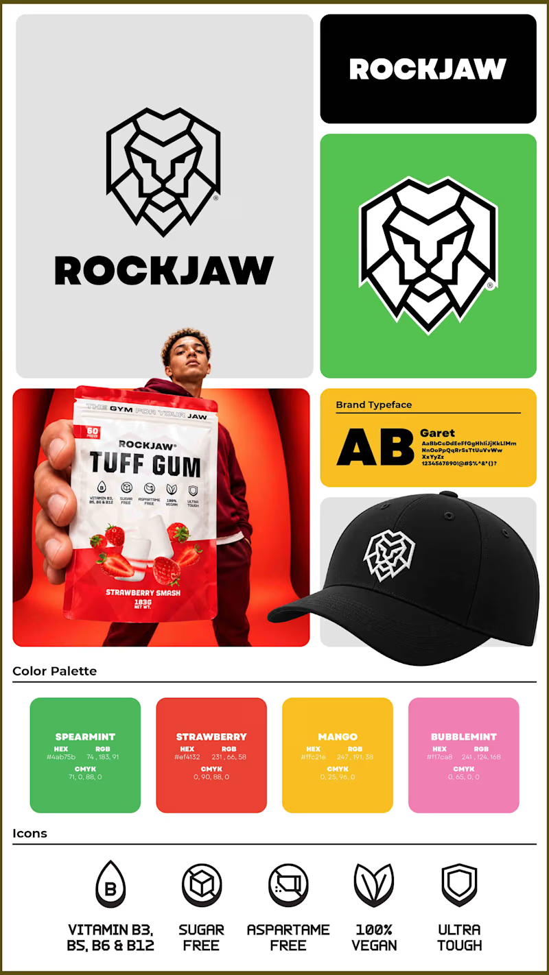
Which version of the image do you like the most? In one, I have focused more on merch and the logo, whereas the other one focuses on hero shots of packaging variants.
5 voted
63%
3 voted
37%
8 votes
Closed

Voted Option 1. The colorful TUFF GUM packaging shots pop more and the lion logo still works.

Brand identity exploration
Which one do you think it fits better?
36 voted
77%
11 voted
23%
47 votes
Closed

Cobalt is great Gold is unique 🎉🎉🔥🔥
Same content, different experience. A few thoughtful design choices can completely change how a presentation feels, flows, and communicates. Which version would you choose?

11 voted
31%
24 voted
69%
35 votes
Closed
Verde Vista 1 is more modern and futuristic specially with blue colors and robotic hand❤️
Great job Rasid🎉🎉🔥🔥