The network for creativity
Join 1.25M professional creatives like you
Connect with clients, get discovered, and run your business 100% commission-free
Creatives on Contra have earned over $150M and we are just getting started
Back to feedPost
Taste Test

Working on two versions of the hero section for AgroLoop - a platform that helps farmers track soil, yield, and water use in real time.
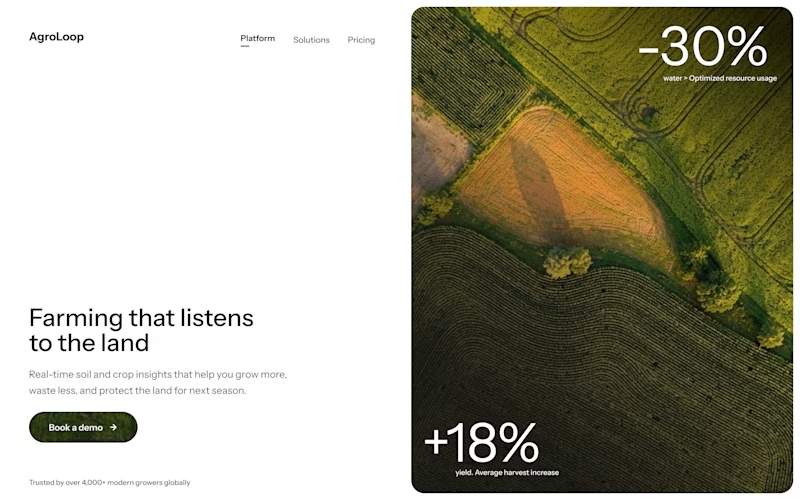
Split layout - text on the left, a big field photo on the right.
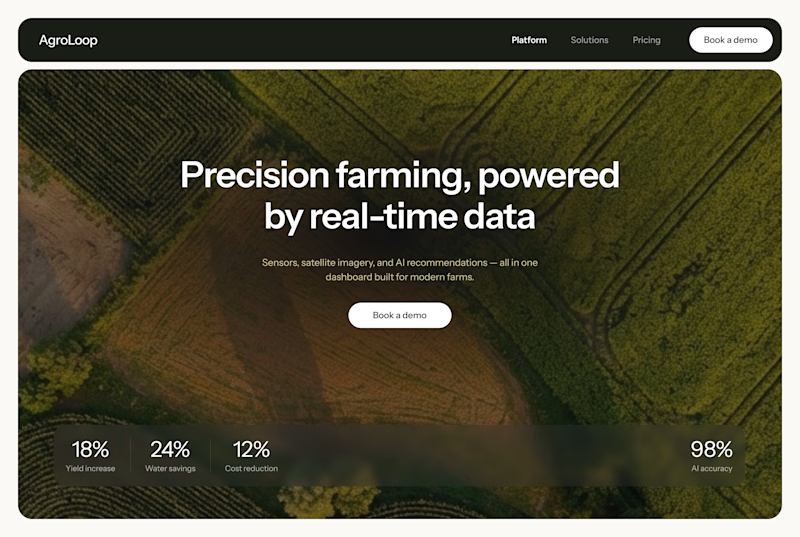
Full-width layout - one large field photo behind the headline, with a dashboard card overlapping the bottom.
Which one do you like more?

27 voted
39%
42 voted
61%
69 votes
Closed

For me, Split layout has it

Agreed!
Split layout looks cleaner. Less visual load.

Full width has a clearer nav and looks more premium to me

Split layout!


the +18% field result is cool. which layout will you pick?

i preffer full width layout..

Full width layout is easier on user’s eye but the split layout has different information in different areas in the layout which makes it harder on user’s eye


The full width is beautifully composed

i like the split layout

Adorable design! Fresh and vibrant!

Full width

split layout feels more cool and creatvie

Full width layout is clean

Full width layout🔥


The full width is the best to go for

Both work really well, but the full-width layout has a stronger visual impact.


Split layout gets my vote. Showing the actual stat overlays like +18 percent and -30 percent right in the hero does more to sell the product than a headline over a pretty photo.

The two designs are great, but the full-width layout looks better.

I think that in the split layout the colors of the picture shift visual weight on one side making it unbalanced, otherwise it would have worked better if you find a workaround. I like the concept and the idea that I think you were going for, that is the thing I think that makes the full-width layout the better choice.

option 2
The network for creativity
Join 1.25M professional creatives like you
Connect with clients, get discovered, and run your business 100% commission-free
Creatives on Contra have earned over $150M and we are just getting started





Related posts


Collage

This year, I worked on a mental health app where I explored using water to represent brainwaves and quality sleep.
I think it communicates the idea much better than the typical green energy orb. 🌊
What do you think?
27 voted
43%
36 voted
57%
63 votes
Closed

Love the energy orb. which one is your pick here?
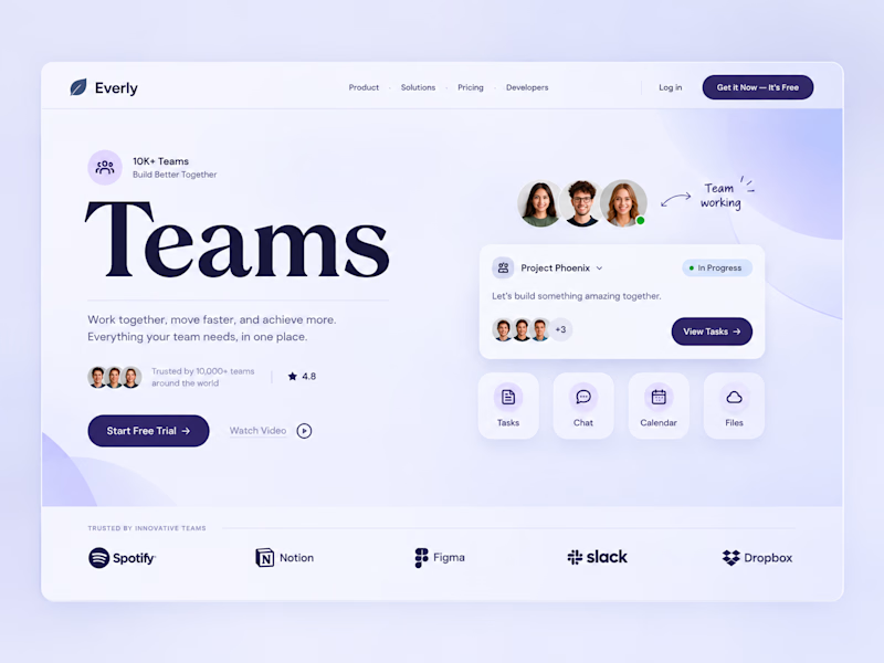
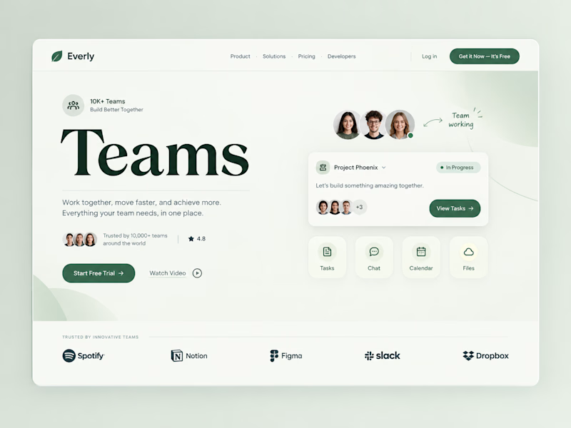
Two color directions, same team-collab pitch.
Sometimes the "safe" color isn't the smarter choice.
Which color would make you trust this tool with your team? 👇
1 voted
9%
10 voted
91%
11 votes
Closed

Both are amazing work; it's hard to choose one. Which one do you personally like?