The network for creativity
Join 1.25M professional creatives like you
Connect with clients, get discovered, and run your business 100% commission-free
Creatives on Contra have earned over $150M and we are just getting started
Back to feedPost
Taste Test

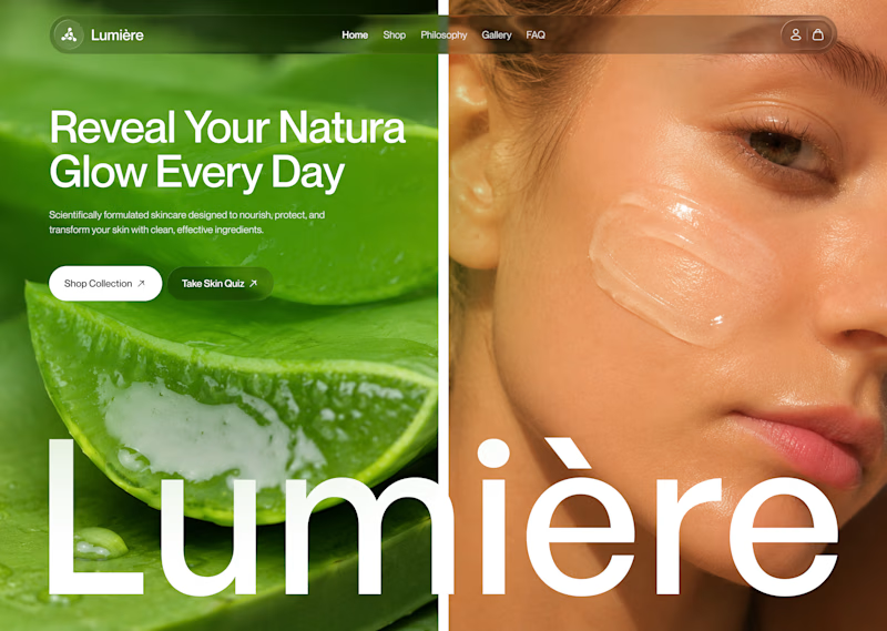
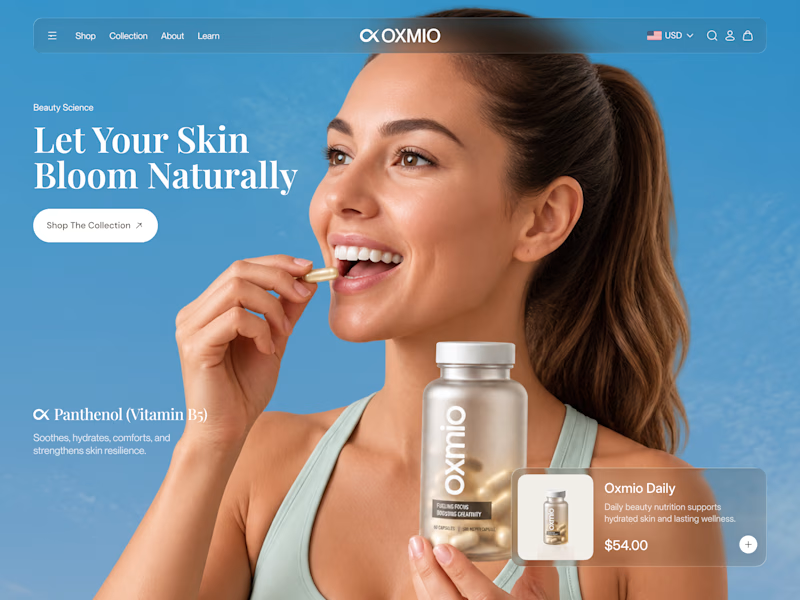
Your design has 3 seconds to earn attention. Which skincare brand wins?
A leads with confidence, energy, and aspiration. B builds trust through nature, freshness, and simplicity.
Great design doesn’t just look good. It makes people feel the brand before they read a word.
A or B? Which would make you stop scrolling?


30 voted
52%
28 voted
48%
58 votes
Closed

Both look great, but the visual direction in A feels instantly captivating!

Such a great example of how color psychology shapes brand perception. A feels bold, while B feels calm and organic.


B without questions


vote for B

It really depends on the audience, but I’d lean toward B for skincare. A clean, natural look can build trust quickly, especially when people are choosing products for their skin.

B for me. For skincare, that fresh and natural feel builds trust at first glance.

The useful distinction here is the positioning behind each direction: aspiration versus a calmer, nature-led promise. I would test both with the same product claim and audience, then compare recall as well as first-click preference. That would help separate visual appeal from how clearly the brand communicates its offer.

A grabs attention, but B builds a different kind of emotional connection. Interesting contrast!

A due to colorful visuals😊

Went with B. The product shot makes it clear what they sell right away, and the blue feels fresh.

I go with B for it's clear visual direction

i'd like A

A feels bold and energetic, while B feels fresh and aspirational. My pick is A! 👀


A makes me stop scrolling, but B makes me curious about the product. Interesting contrast!

b option looks clean.

B for suree

both are great honestly

B looks better.
Great designs, Juice.

B. I scanned through it in a second

A look creative and different than usual layout for hero section

B looks clear


A for skincare. B earns attention faster, but A communicates a safer, more considered choice, which matters when someone is deciding what to put on their skin.
The network for creativity
Join 1.25M professional creatives like you
Connect with clients, get discovered, and run your business 100% commission-free
Creatives on Contra have earned over $150M and we are just getting started


Related posts



hard pick, both are clean

Very close to finish a website project! Help me out!
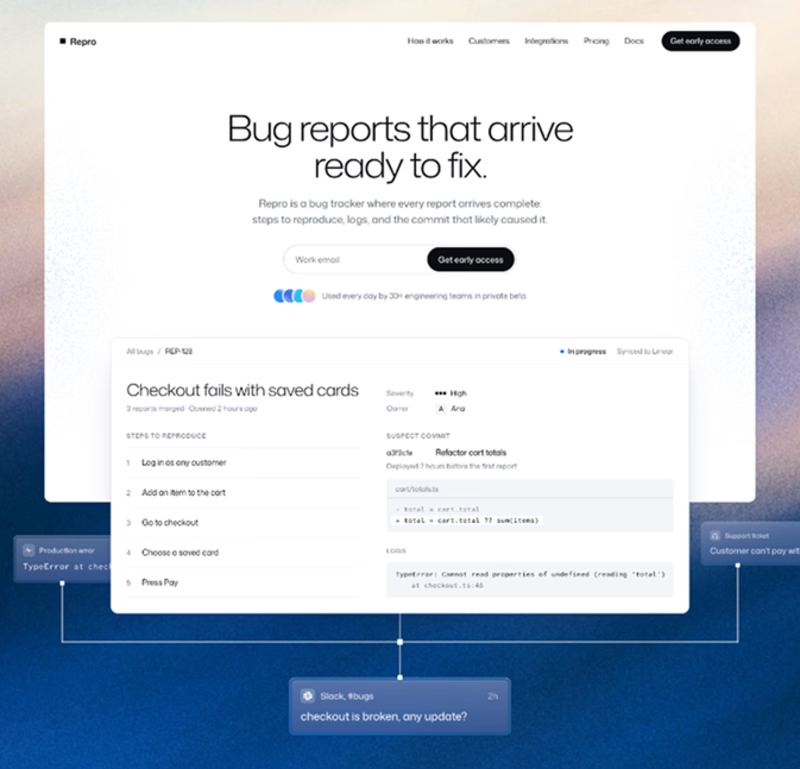
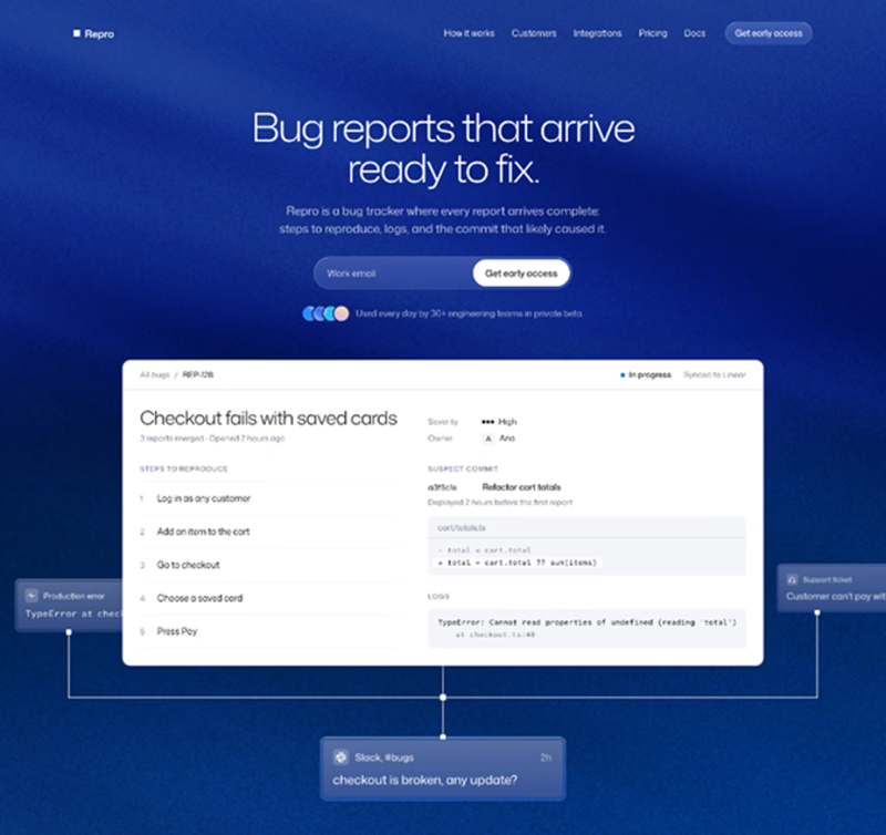
Blue or orange scheme?
38 voted
47%
43 voted
53%
81 votes
Closed

The orange scheme was stunning 😍

Which one could win here?
A/B testing for a Landing page for B2B search analytics platform.
For startups, converting users is extremely crucial.
Rather than judging on your own, let the numbers tell you which one can help you get more users.
#landingpage #abtesting #b2b #aisearch #businessanalytics
19 voted
44%
24 voted
56%
43 votes
Closed

Light blue. For a B2B analytics tool, showing the actual dashboard in the hero does the selling before anyone reads the copy. “Win in AI search” lands better with the product right beside it. Would be curious to see a second test on the CTA too, “Start Free Analysis” vs something tied to a result.