The network for creativity
Join 1.25M professional creatives like you
Connect with clients, get discovered, and run your business 100% commission-free
Creatives on Contra have earned over $150M and we are just getting started
Back to feedPost
Taste Test

Two takes on the same landing page. Which one lands better for 'Picnic'?
.
.
Follow along for more tests like this: x.com/rightnextstep

84 voted
71%
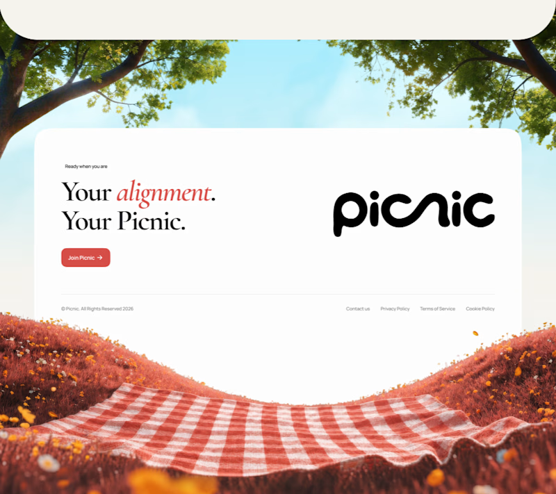
34 voted
29%
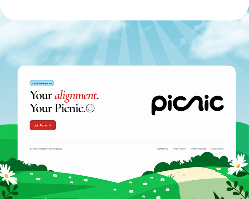
118 votes
Closed

I'd go with 1, looks more natural
Thanks

Footer one
Appreciate the input

Definitely 2
Thanks


the big picnic wordmark feels friendly. which version got more clicks?
Thanks, V1 got more clicks

1 for mee, it fits the idea better. Footer 2 somehow gives me those fresh milk ad vibes 😂
😂

I’d pick Footer 1. The photography gives it more personality and makes the picnic concept feel more inviting.😍
Footer 2 is playful, but the real image feels more engaging to me. 👏
Thanks for sharing your perspective.

Footer 1. I think the photography creates a stronger emotional connection and gives the layout more depth.
Thanks

i love version 1 🍂, like autumn theme
Much appreciated

Footer 2🔥
Thanks

It is tough to choose when both takes are executed this well. The visual contrast between the two moods is super interesting.
Thanks for weighing in.

Footer 1 by far. The realistic, warm photography makes it feel cozy which matches the name Picnic so much better than the cartoon vibe in 2.
Much appreciated.

Footer 2!
Thank you.

I’d pick Footer 1. It feels warmer, more natural, and memorable.
Thanks.

Footer 2
Thanks

Footer 2's illustration feels warmer for a picnic brand, but I'd bet Footer 1 holds up better once someone's already scrolled that deep into the page. Are you tracking anything besides the vote count, like scroll depth or time on page, or is this mostly a gut check for now?
Yeah, for now it’s mostly a gut check. We’re not tracking scroll depth or time on page yet, but that’s definitely something we could look at if we want more data behind the decision.

Footer 1 feels more grounded. The photo puts you in the moment right away, which is exactly what a brand called Picnic should do.
Yeah, totally agree. The photo gives it a much more natural, feel, which fits Picnic really well.

i like both but i choose footer 1. i dunno i just like to see the view i guess
tho the footer 2 looks strong balance and dynamic. seeing the mountain behind the footer gives it importance which looks strong
thanks
your welcome men

Footer 1 for me. The gingham blanket and tree canopy make “Picnic” feel like a real place, and the white panel gives the copy room to breathe. Footer 2 is playful too; I’d choose it if the rest of the brand uses illustration consistently.
Thank you for your input.

Appreciate the input.

Running the footer as its own separate vote instead of bundling it with the hero choice is the right call — two variables in one poll would've made it impossible to tell which change actually moved people.
Thanks.

Professional and impressive design work ! Good job
Thanks

Footer 1 embodies the picnic scene more
Thanks

I think the "checkered picnic blanket" fits awesome, although both would do the work! 👍
Appreciate the input.

Footer 2 😍
Thanks

I like footer 1 better with the photo instead of the illustration, but I miss the green grass.
Thanks
Both directions feel polished; the right concept has especially strong visual contrast.
Thanks

Thank you

Footer 1

The second its looks more exceptional and communicates that picnic vibe
Thanks

footer 1
Thanks
The network for creativity
Join 1.25M professional creatives like you
Connect with clients, get discovered, and run your business 100% commission-free
Creatives on Contra have earned over $150M and we are just getting started











Related posts


this is really nice 100%. nice job

Poster Club turns a simple event template into your own print. I built two working Flutter versions and recorded the same editing flow in each.
Print Room: calm, editorial, with a mounted canvas and bottom tools.
Cutout Playground: bold, playful, with loose prints and tools at the edge.
Which one would you rather use?
What made the difference?
Grab it for free:
https://contra.com/products/cUHBysMu-poster-club-free-flutter-ab-ui-kit


37 voted
60%
25 voted
40%
62 votes
Closed
Print Room looks great!!

Two camera distances for the same Movable Ink cut. One leans in, one shows the whole layout. 1 or 2.
10 voted
50%
10 voted
50%
20 votes
Closed

2 is more stunning the animations feels unique and that's unbelievable 🎉🎉🔥🔥
great job Blahomyr❤️❤️