The network for creativity
Join 1.25M professional creatives like you
Connect with clients, get discovered, and run your business 100% commission-free
Creatives on Contra have earned over $150M and we are just getting started
Back to feedPost

Elegant line art logo design for a skincare brand. The design focuses on simplicity, beauty, and femininity to reflect the brand's identity and commitment to self-care.


The network for creativity
Join 1.25M professional creatives like you
Connect with clients, get discovered, and run your business 100% commission-free
Creatives on Contra have earned over $150M and we are just getting started
Related posts

Inspired by, I'm sharing one of my own concepts that wasn't chosen for the final design, but that I absolutely love.
This idea is so good! We all have concepts hiding in our drafts that never get to see the light of day. I think they deserve their moment, too. ✨
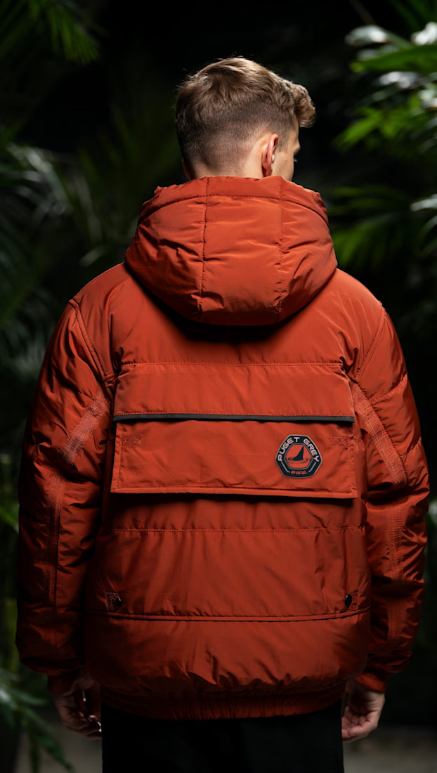
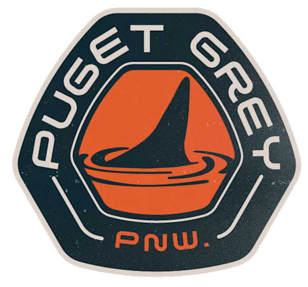
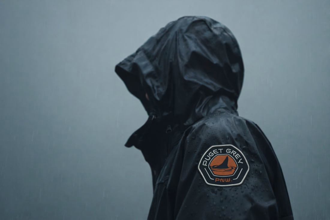

How many concepts die in your drafts folder? 💀
In the spirit of Inktober, a digital sketch that never saw the light.
This was a lettering-inspired brandmark...


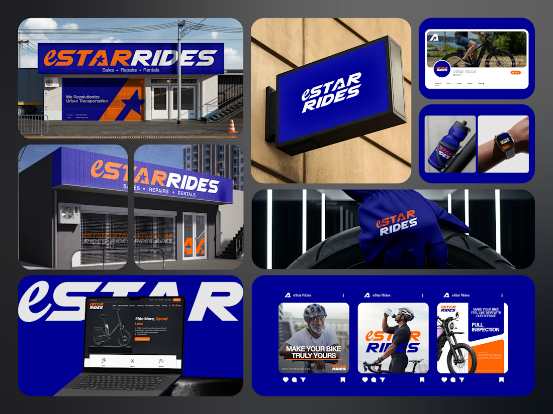
If you sell e-bikes, repairs and rentals, your brand should feel energetic before the customer even walks into the shop.
That was the challenge behind eStar Rides.
The brand needed to feel modern, confident and instantly recognizable across both physical locations and digital touchpoints.
So the identity was built around:
🟠 High-energy orange for visibility and impact
🔵 Deep electric blue for trust and technology
⭐ A bold star-led symbol for direction and recall
🔤 Custom typography with a strong, performance-driven feel
📱 A visual system designed to stay consistent everywhere
Then the identity was carried across:
Storefront signage
Retail environments
Website
Social media
Merchandise
Water bottles
Wearables
Campaign graphics
Digital applications
The goal was not just to make eStar Rides look modern.
It was to make the brand feel established, distinctive and ready to compete.
Because strong mobility branding should communicate:
Energy.
Freedom.
Confidence.
Reliability.
Before a customer even starts comparing options.
eStar Rides
Built for the ride.
What gives the brand the strongest presence?
A. The orange + blue palette
B. The custom wordmark
C. The storefront applications
D. The complete visual system
Drop A, B, C or D below.
If you are building a mobility, automotive, e-bike, transportation or tech-driven service brand and your visuals still feel generic, send me a message.
I help businesses build identities that feel more recognizable, credible and commercially ready.
#BrandIdentity #MobilityBranding #AutomotiveBranding #VisualIdentity #LogoDesign #RetailBranding #CreativeDirection #TransportationBranding



e bikes need branding with this kind of energy,, most of them look like appliance brands

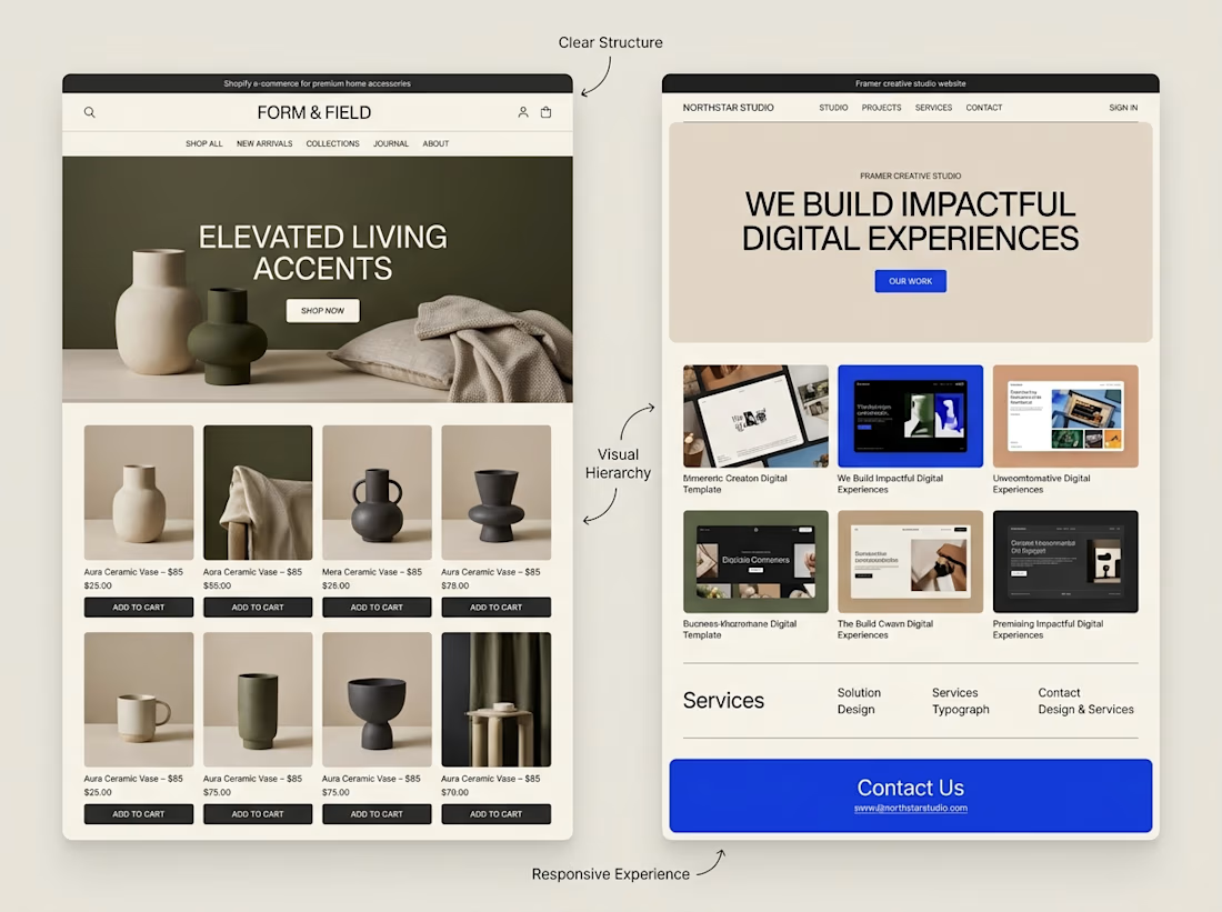
A website can look beautiful and still be difficult to use.
That's something I keep in mind when exploring both Shopify store design and Framer website design.
Although the platforms serve different purposes, some design principles apply to both:
→ Clear navigation helps visitors find their way.
→ Strong visual hierarchy makes important information stand out.
→ Thoughtful page structure creates a natural flow.
→ Responsive layouts help the experience work across screen sizes.
→ Clear calls to action help visitors understand what to do next.
The goal isn't simply to make a website look impressive.
It's to make the experience clear, useful, and easy to navigate.
I'm continuing to explore how these principles can be applied across different types of websites and projects.
What matters most to you when visiting a website, its visual design, its usability, or a combination of both?



Well said. Usability first, then visuals. Clear navigation wins me every time. 🙌