The network for creativity
Join 1.25M professional creatives like you
Connect with clients, get discovered, and run your business 100% commission-free
Creatives on Contra have earned over $150M and we are just getting started
Back to feedPost
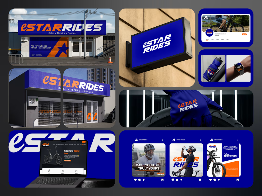
If you sell e-bikes, repairs and rentals, your brand should feel energetic before the customer even walks into the shop.
That was the challenge behind eStar Rides.
The brand needed to feel modern, confident and instantly recognizable across both physical locations and digital touchpoints.
So the identity was built around:
🟠 High-energy orange for visibility and impact
🔵 Deep electric blue for trust and technology
⭐ A bold star-led symbol for direction and recall
🔤 Custom typography with a strong, performance-driven feel
📱 A visual system designed to stay consistent everywhere
Then the identity was carried across:
Storefront signage
Retail environments
Website
Social media
Merchandise
Water bottles
Wearables
Campaign graphics
Digital applications
The goal was not just to make eStar Rides look modern.
It was to make the brand feel established, distinctive and ready to compete.
Because strong mobility branding should communicate:
Energy.
Freedom.
Confidence.
Reliability.
Before a customer even starts comparing options.
eStar Rides
Built for the ride.
What gives the brand the strongest presence?
A. The orange + blue palette
B. The custom wordmark
C. The storefront applications
D. The complete visual system
Drop A, B, C or D below.
If you are building a mobility, automotive, e-bike, transportation or tech-driven service brand and your visuals still feel generic, send me a message.
I help businesses build identities that feel more recognizable, credible and commercially ready.
#BrandIdentity #MobilityBranding #AutomotiveBranding #VisualIdentity #LogoDesign #RetailBranding #CreativeDirection #TransportationBranding



Nailed the brief! The brand feels exactly what you described - energetic and modern before even entering the shop.
Love the bold blue/orange contrast and how consistently it works from storefront signage to digital. Super recognizable system. Great execution!

Appreciate it brother


e bikes need branding with this kind of energy,, most of them look like appliance brands
Exactly. A lot of e-bike brands still lean too hard into the technical side, so they end up feeling more like appliances than lifestyle products. I wanted eStar Rides to feel more energetic, recognizable and something people would actually want to be associated with.
The network for creativity
Join 1.25M professional creatives like you
Connect with clients, get discovered, and run your business 100% commission-free
Creatives on Contra have earned over $150M and we are just getting started



Related posts

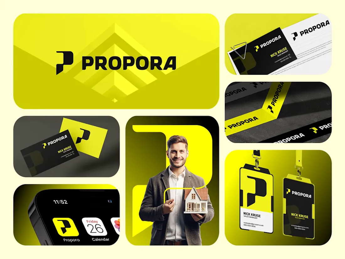
Propora: Brand Identity for a Modern Real Estate Company
Propora is a real estate brand built to feel confident, modern and trustworthy. I designed a complete visual identity that helps it stand out in a market full of safe blues and generic house icons.
The concept
The logo mark is a bold, geometric "P" with a notch cut into its stem. It reads as a rooftop, a doorway and a forward arrow at once, suggesting property, access and progress. It is paired with a heavy, wide wordmark that feels strong and approachable.
Color and tone
Electric yellow-green brings energy and optimism, and makes the brand instantly recognizable.
Deep black adds authority and contrast, so the yellow always pops.
White keeps layouts clean and professional.
What I delivered
Primary logo, icon mark and app icon
Color palette and typography guidelines
Business cards and stationery
Employee ID badges and lanyards
Branded packaging tape
Mobile app icon and home screen mockup
Social and marketing visuals
The result
A flexible, high-contrast identity that works across print, digital and physical touchpoints, and gives Propora a distinctive presence from a business card to a phone screen.
Tools: Adobe Illustrator, Photoshop, Figma, Corel Draw
Tip for your Contra post: Add a one-line tagline at the top, like "A bold identity for a real estate brand built on trust and momentum." Lead with your best mockup, which is the large logo on the yellow background.
I can also write a shorter version for your bio or a client-facing case study if you'd like. Brand design and pakeging Design Product Design


Wow, I love the design and the color combination. Amazing work 😍


☕ Meet DAYLO - A minimalist coffee branding concept featuring bold typography, warm neutrals, and soft colors designed to make every cup feel a little more special. 🤎
Explore the full project on my Contra profile and let me know your thoughts!