The network for creativity
Join 1.25M professional creatives like you
Connect with clients, get discovered, and run your business 100% commission-free
Creatives on Contra have earned over $150M and we are just getting started
Back to feedPost

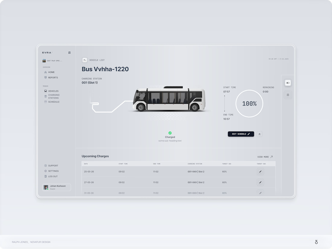
A glimpse into a 12-week sprint on one of the most complex projects I've ever tackled—an AI-powered EV platform that secured seven figures in funding in Sweden.


Impressive work, Ralph! Tackling a 12-week sprint for such a complex EV platform is no small feat. The clean execution of the dashboard definitely reflects why it secured that level of funding. It’s a great example of design driving real business value. Kudos! 🚀


S tier work

Amazing the layouts and the image choices
Thank you so much!

Verry correct, Daniel. S tier work


Seven figures and a 12 week sprint is serious work.
The UI feels calm for such a complex system, especially the charging overview. Would love to hear what was the hardest constraint to solve.

Great example of clean structure and visual hierarchy. The way information is organized makes it easy to understand and interact with. Strong layout design, whether digital or physical, plays a major role in guiding user behavior and engagement.

impressive! want to partner in it for my learning as well.

nice design

incredible work !

Its cool

This is superb!


Super work

Its cool

Clean one

Great work 🔥

12 weeks for an AI-powered EV platform is incredible! The UI looks super clean. What were the biggest design challenges?

That's great to hear! I can feel that grind in your words @Ralph Jones

Great work

damn, love this one!

A, that is impressive work and B, what a fantastic business idea, I can see it work in almost every country.

@Ralph Jones - I have questions.
1. How you made a decision to keep the sidebar starting from 20% of the screen & not stretching to top. What's the information inside ?
2. A better place for the "Charged" status and the battery icon (if it is relevant to the vehicle) shouldn't be in front...

wonderful design! I love it!

this EV platform looks incredible! 12 weeks and you pulled off something amazing

very impressive UI. Elegant and Sophisticated

Nice work, I can't take my eyes off it

Great work

Minimalist design ++

Innovative work

Like the stats process!


Fleet management and charging schedules for an EV platform is genuinely hard to design well. There's so much data to show at once but it has to stay calm and readable. The vehicle detail screen looks like it handles that well. 12 weeks for something that got seven figures is a great outcome.
The network for creativity
Join 1.25M professional creatives like you
Connect with clients, get discovered, and run your business 100% commission-free
Creatives on Contra have earned over $150M and we are just getting started
Related posts

E-learning mobile app screen timelapse from wireframe to final screen design
👉 Duplicate the Figma file for free here: https://learning.atheros.ai/figma-components/e-learning-app-home-screen


Clean and strong mark 👌
Really like the balance between simplicity and character — feels very intentional. Great work 👏


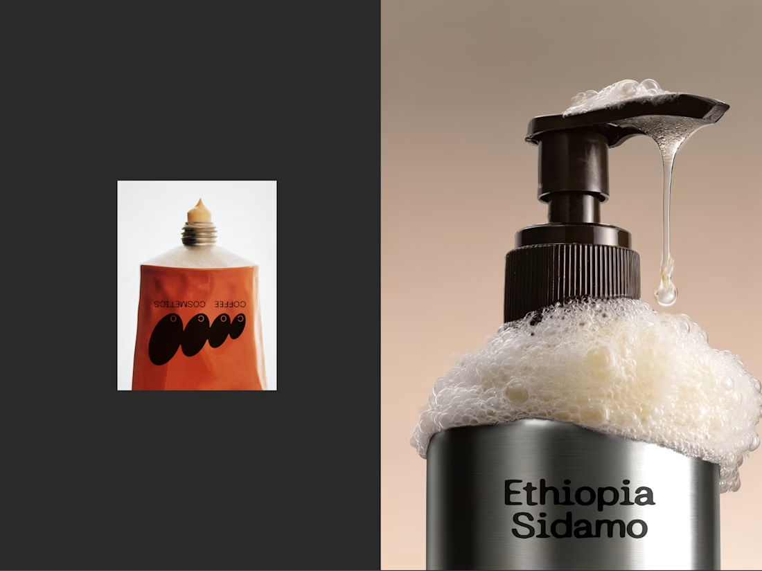
What if minimalism isn’t less — but more intentional?
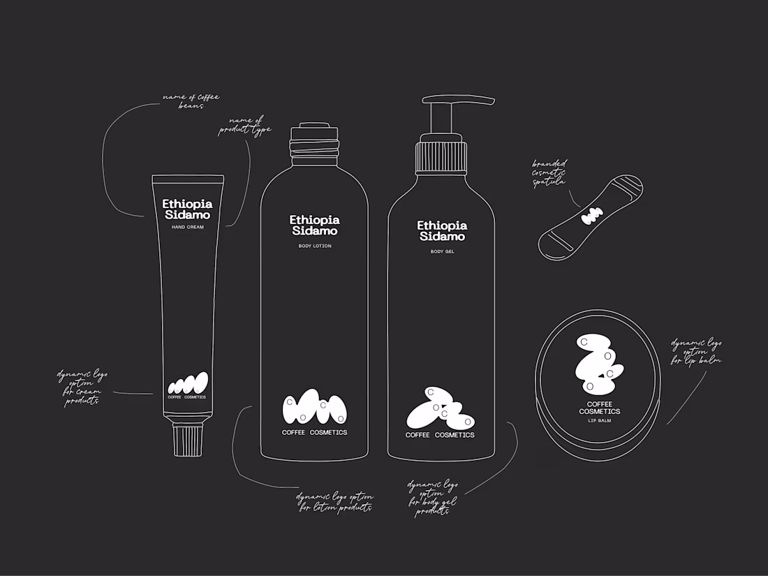
This is COCO — a finished packaging system built on restraint.
Clean hierarchy, deliberate typography, purposeful whitespace,reduced elements.
But the key shift is here:
→ material becomes the design.
→ The aluminum isn’t just a container
it defines the color, the light, the presence.
A few intentional decisions:
1. Removing everything that didn’t carry meaning
2. letting hierarchy guide instead of decorate
3. treating material as the primary visual layer
For me, minimalism is not less design —
it’s more attention to every detail.

Great!!


Trending


Notion
Notion isn’t just where you work, it’s starting to work for you. What agents are you building?
portfolioreview
The best portfolios tell a story, not just show a grid. Share yours for feedback.
brandguidelines
Brand guidelines are becoming living systems, not static documents. What are you building for your clients?
aivideo
AI video tools are moving at warp speed. Which ones are you experimenting with?
freelancerlife
Freelancer life is wins, pivots, and everything in between. What’s yours right now?