The network for creativity
Join 1.25M professional creatives like you
Connect with clients, get discovered, and run your business 100% commission-free
Creatives on Contra have earned over $150M and we are just getting started
Back to feedPost
Taste Test

Need your eye here!🦩🕶️
Option A – Soft pink
Option B – Bold dark
What's your vote?
15 voted
24%
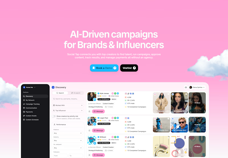
47 voted
76%
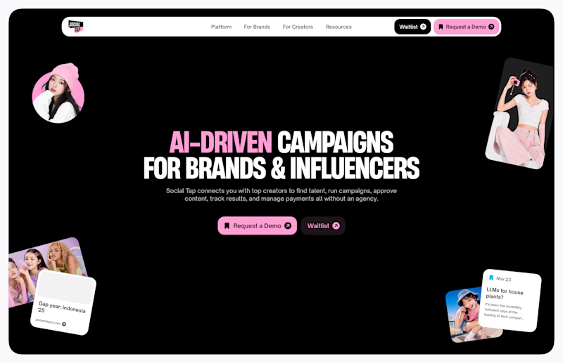
62 votes
Closed


like the contrast in option b

Option B is striking

huge on option b! something in it has a bit of a call to the 'riot grrl' aesthetics as we've seen them repurposed in modern day, which is so bold & fun.

Bold dark, no contest. It makes the AI-driven messaging feel more premium, while the pink version reads a bit closer to a generic marketing template to me. Does that color choice actually track with how your audience converts, or is this more of a gut check before you commit?

not sure who picked option A 😄


Amazing design! Everything feels polished.


Voted A to support couple of people but I'd pick B personally haha

Will go for Option B


A is good but somehow the readability suffers there

Will go for Option A

Boldddd everyday ahah

Option B looks great!

Awesome design !

Option B gets my vote. In option A the white text against the light pink background doesn't have enough contrast for easy reading and that bright blue button feels a bit out of place with the rest of the palette.

Option B


fan of B man

I perceive pink as a loud color that's meant to be used subtly

So creative work

I prefer B lol
A is a bit harsh for the eye


A feels creative, B feels dull with just black background and some img attach on hero
The network for creativity
Join 1.25M professional creatives like you
Connect with clients, get discovered, and run your business 100% commission-free
Creatives on Contra have earned over $150M and we are just getting started
Trending
retrofuturism
Share your favorite designs from the past exploring the distant future. Or your own take on the aesthetic 🚀
halftone
Dots. Texture. Grain. Let's see your designs using the halftone technique.

Midjourney
Creatives are showing off what they're making with Midjourney.
colorgrade
Video editors sound off: How do you enhance the mood of your video in color grading?





Related posts

which one feels better? ✏️
15 voted
52%
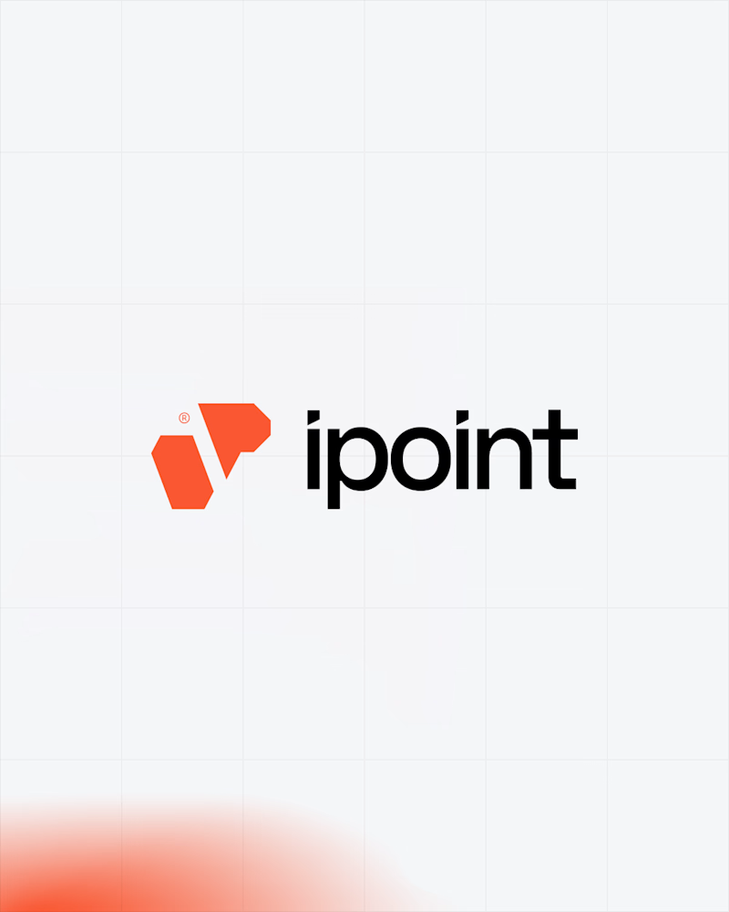
14 voted
48%
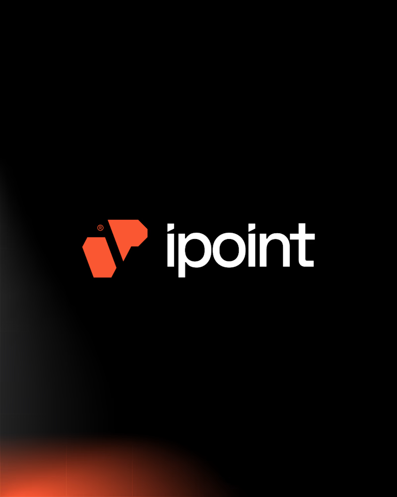
29 votes
Closed
dark wins for me,


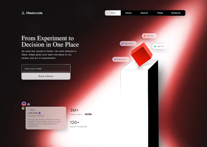
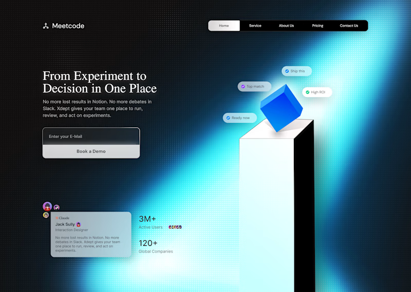

The blue is giving more clarity

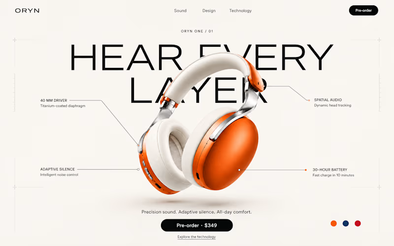
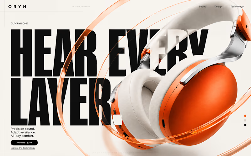


Direction 1 grabs immediate emotion, but Direction 2 hits that sweet spot for technical buyers who want to inspect build quality before committing. Hard choice, but 2 feels like it would convert higher for an audio enthusiast product!