The network for creativity
Join 1.25M professional creatives like you
Connect with clients, get discovered, and run your business 100% commission-free
Creatives on Contra have earned over $150M and we are just getting started
Back to feedPost
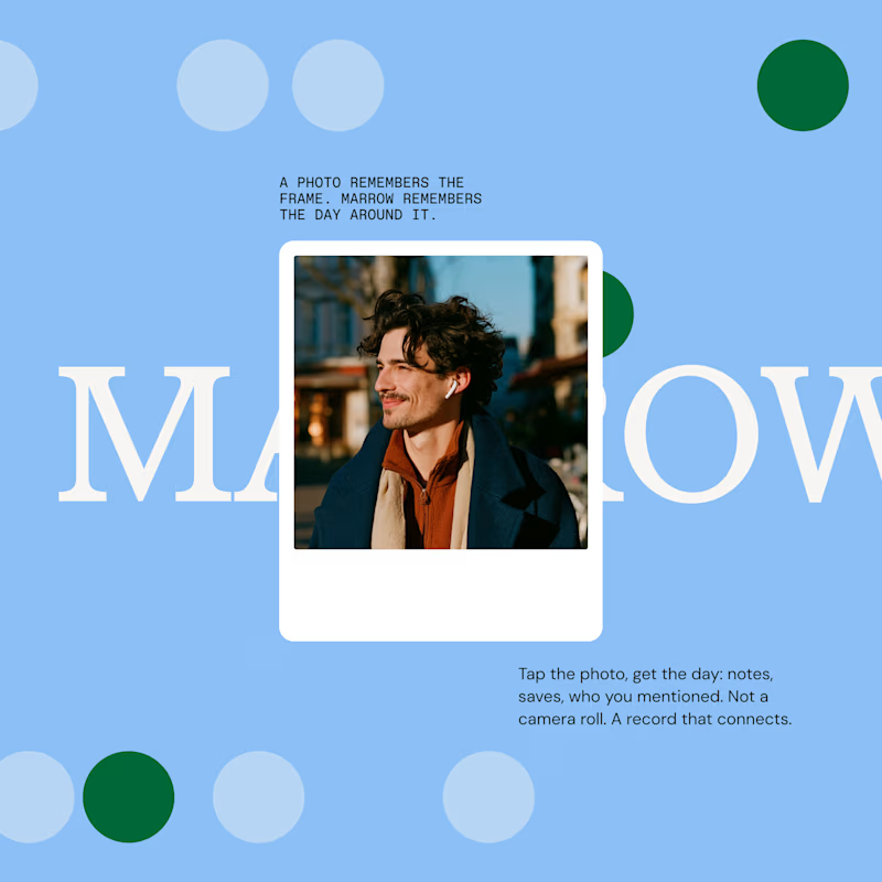
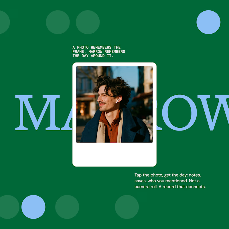
Taste Test
which one feels better? ✏️
15 voted
52%

14 voted
48%

29 votes
Closed


thanks, the spacing felt cleaner

Light
light crew is winning so far

true, that contrast hits hard

Dark looks amazing!
dark mode never misses honestly

Light for sure.
appreciate the light vote


light
another one for team light

dark!
dark squad represented finally
dark side 4 life

The light version 🔥
glad it landed for you

Both are really good but im going to go with the light option.
balanced pick, much appreciated

dark wins for me,
dark side well represented
yess

Going with the dark option
bold move, respect the dark

Both look good, but I’d go with the light version. It feels more balanced overall.
balanced take, exactly the goal

It looks better on the dark background.
the contrast really does it

light one is better!
light team keeps stacking up

Light🔥
that fire emoji says it all
The network for creativity
Join 1.25M professional creatives like you
Connect with clients, get discovered, and run your business 100% commission-free
Creatives on Contra have earned over $150M and we are just getting started







Related posts

Which one is the best to show as sample?
3 voted
43%
4 voted
57%
7 votes
Closed

Video 1 is more cinematic

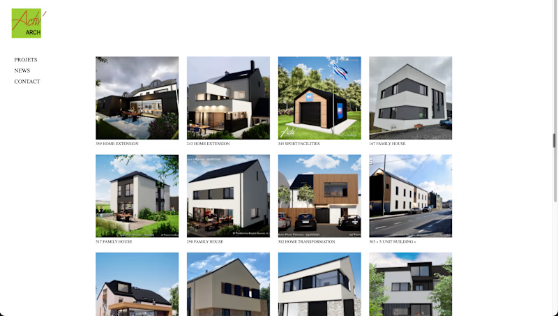
After look best

Brand exploration. Which one speaks to you?
12 voted
50%
12 voted
50%
24 votes
Closed
