The network for creativity
Join 1.25M professional creatives like you
Connect with clients, get discovered, and run your business 100% commission-free
Creatives on Contra have earned over $150M and we are just getting started
Back to feedPost
Taste Test

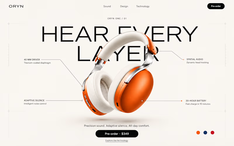
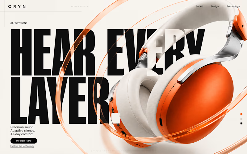

Creative work


I'd pick 1. Nice work🔥

Great work #1🔥

I LOVE option 2!! I'd just give a bit more attention to the CTA. Maybe, remove the 3 liner body text and increase the size of the CTA.
I also posted an A/B test. Would love to see which one you’d pick 🙌🏻

I like 1 better, 2 is a biiiit too crazy for me haha!! 😊

2 feels overdone, 1st feels perfect

One of the best designs I’ve seen today. Really solid work 👏 Direction 1 has incredible visual impact, but Direction 2 really speaks to tech buyers inspecting build quality.

Direction 2 is the best

2 looks great!


1 for me

1st works for me as it looks clean and not messy

The minimalism on Option 1 just does it for me.

Direction 2 is the best 😊

I'd pick 1.😍


2

Option no. 1 I know it's kinda over used and not much unique as option 2 but it still gets the work done and look beautiful while option is unique but not very practical.

Option 1 for me

1 wins


I like 2

Number 1 layout looks better.

2 wins on visual impact and brand hype, but 1 does a much better job answering buying questions right away.

Number 2: clean and tech it´s better

Number”2” is better because it gives you space to do a scrolling effect and make the page more interactive. The other one is seems basic. The only feedback I have is the visibility of the text in both designs (need to make it more clear”

I think both are good. Depending on what the client wants, you choose first if the brand is bold and active and second if its more sophisticated and elegant. I personally like the 1 moreit's because it fits my style better: clean and elegant.
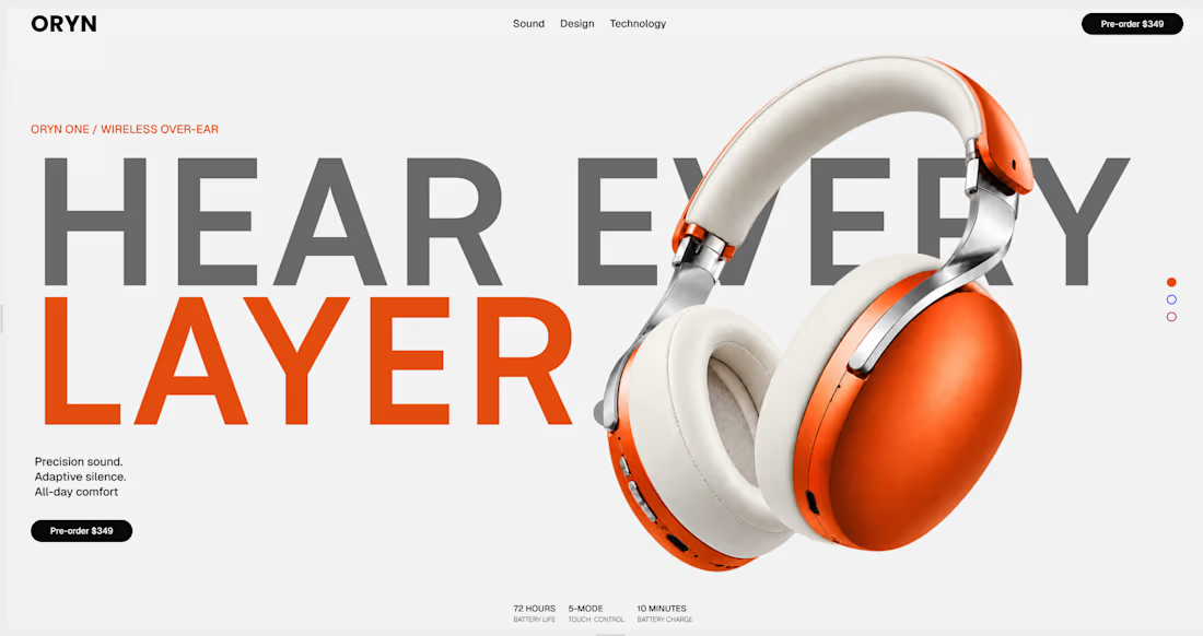
A combination! Good one

Wow! So beautiful and professional work!👌
The network for creativity
Join 1.25M professional creatives like you
Connect with clients, get discovered, and run your business 100% commission-free
Creatives on Contra have earned over $150M and we are just getting started











Related posts

Same content, different experience. A few thoughtful design choices can completely change how a presentation feels, flows, and communicates. Which version would you choose?

11 voted
31%
24 voted
69%
35 votes
Closed

Verde Vista 1 is more modern and futuristic specially with blue colors and robotic hand❤️
Great job Rasid🎉🎉🔥🔥

Two camera distances for the same Movable Ink cut. One leans in, one shows the whole layout. 1 or 2.
10 voted
50%
10 voted
50%
20 votes
Closed
2 is more stunning the animations feels unique and that's unbelievable 🎉🎉🔥🔥
great job Blahomyr❤️❤️

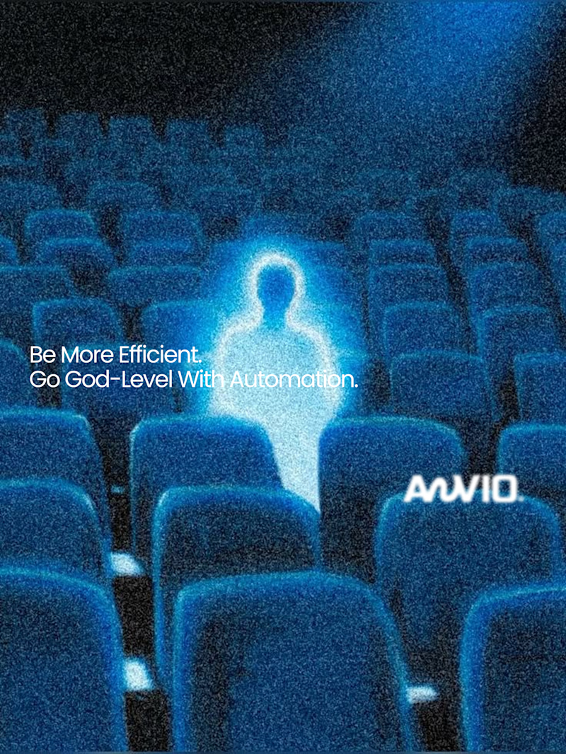
Which creative direction better communicates a Tech-Forward AI Brand Identity for anvio.online ?
25 voted
44%
32 voted
56%
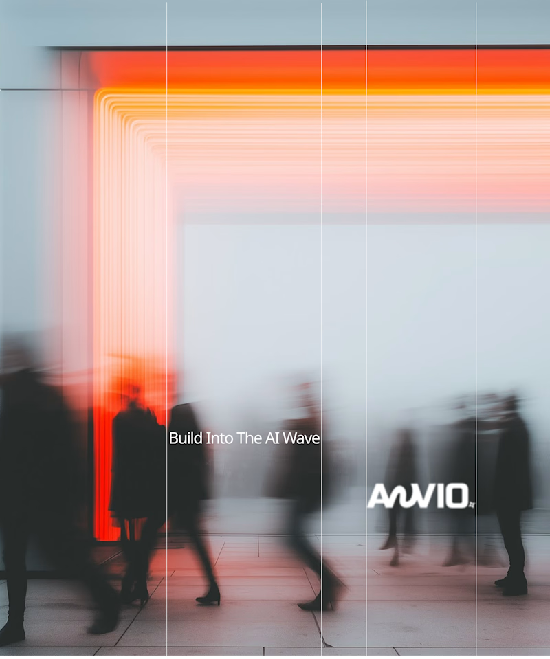
57 votes
Closed

Fast vibrant energy gets my vote. The warm glow feels more human, which is nice for an AI brand.