The network for creativity
Join 1.25M professional creatives like you
Connect with clients, get discovered, and run your business 100% commission-free
Creatives on Contra have earned over $150M and we are just getting started
Back to feedPost
Taste Test
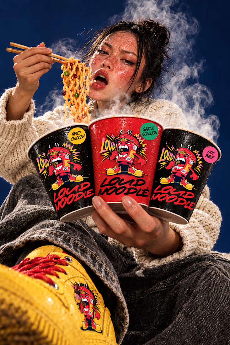
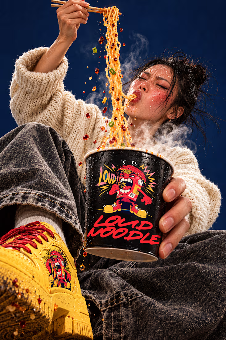
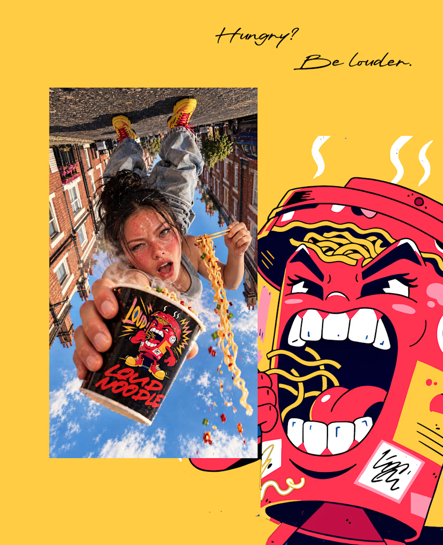
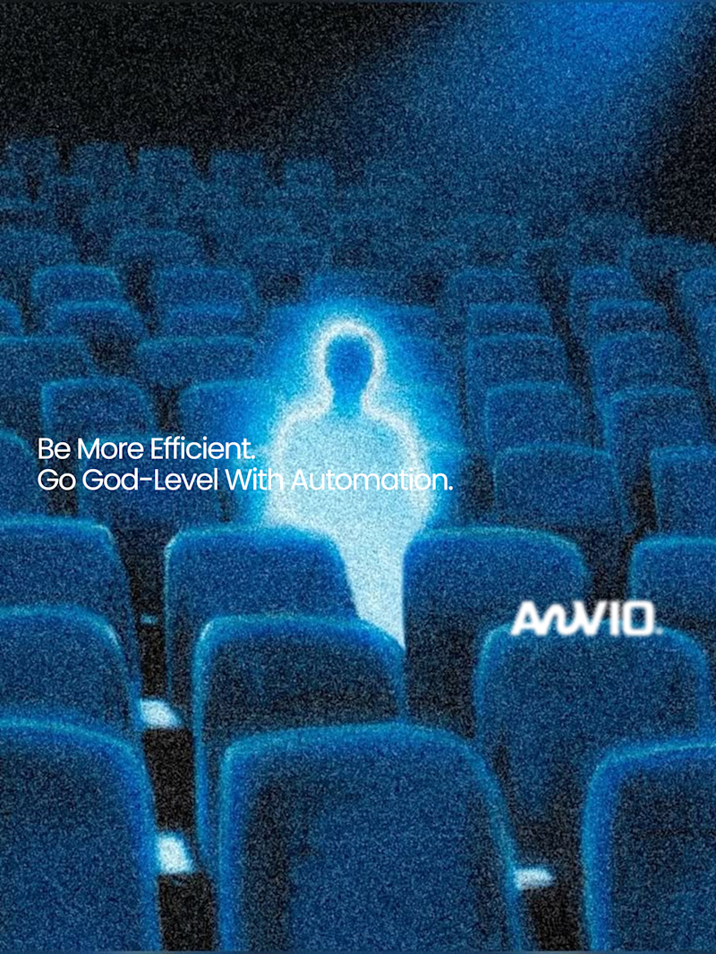
Which creative direction better communicates a Tech-Forward AI Brand Identity for anvio.online ?
25 voted
44%
32 voted
56%
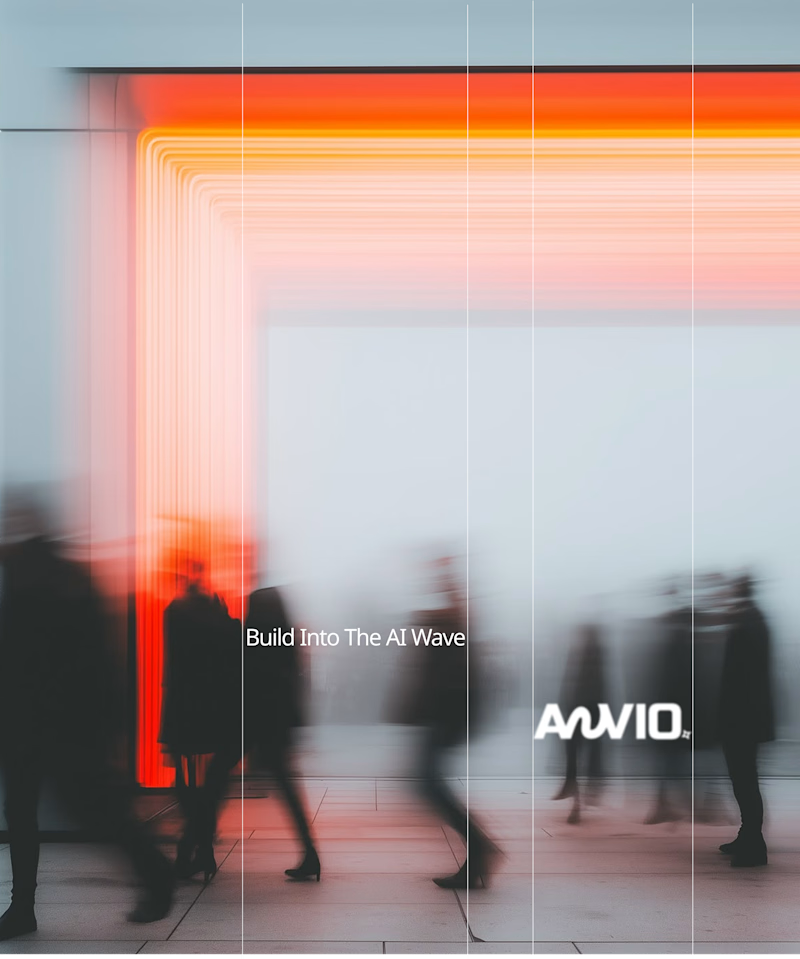
57 votes
Closed

Personally I would go for the cool futuristic blue

Thanks for sharing your thoughts! Really appreciate your perspective on this.

The fast vibrant one looks really good!
Thanks for sharing your thoughts! Really appreciate your perspective on this.

Thanks for sharing your thoughts! Really appreciate your perspective on this.

Fast vibrant energy
Thanks for sharing your thoughts! Really appreciate your perspective on this.

Atin, the way you framed the taste test — cool futuristic blue versus fast vibrant energy — is exactly the kind of real-direction call that shows whether a brand identity will land. For a tech-forward AI site like anvio.online, the cooler blue track has the quieter confidence...
Thanks for sharing your thoughts! Really appreciate your perspective on this.
Appreciate you taking the time to read through it, Atin. It's a solid split either way — the cooler blue does land that quiet, high-trust AI tone, so the final pick really comes down to what voice anvio.online needs to carry long-term. Happy to hear which direction you end up moving with.

Thanks for sharing your thoughts!

Seeing their website, i'd pick fast and vibrant energy.
Thanks for sharing your thoughts! Really appreciate your perspective on this.

Fast vibrant energy gets my vote. The warm glow feels more human, which is nice for an AI brand.
Thanks for sharing your thoughts! Really appreciate your perspective on this.

it's very hard to choose between both, because both look very good. Right now feeling that vibrant energy.
Thanks for sharing your thoughts! Really appreciate your perspective on this.

The Cool Futuristic Blue direction hits the tech-forward AI narrative much better! It creates that high-trust, intelligent automation vibe that enterprise AI brands need. The orange feels more like a lifestyle brand.
Thanks for sharing your thoughts! Really appreciate your perspective.

I will go for the fast vibrant energy, it goes with the brand tagline

Fast vibrant energy does it for me.

My vote goes to the cool futuristic blue. It reads unmistakably tech-forward, and the cool tones pair well with an AI identity.

cool futuristic blue for sure


fast vibrant energy reads more ai to me, cool blue already feels like every fintech logo

“The fast, vibrant version looks great!”

Went with the blue. The empty theater feels more like AI to me, the orange one reads more like a creative agency.

Modern work❤️
The network for creativity
Join 1.25M professional creatives like you
Connect with clients, get discovered, and run your business 100% commission-free
Creatives on Contra have earned over $150M and we are just getting started



Related posts


Which brand showreel preview design would you choose - Silver & Ropes or Purple Stones? ⚡
Lynksen is cooking something fire...
and we need your expert eyes on this one 🔥😎
Vote and tell why! 👇


12 voted
24%
37 voted
76%
49 votes
Closed
Going with Purple Stones. It feels more distinctive and memorable for a showreel, Silver & Ropes is clean but a bit safer.

What do you do with a brand that’s 80% done and nobody asked for it?
I have a whole folder of them.
A name here, a palette there, a few campaigns that never saw daylight.
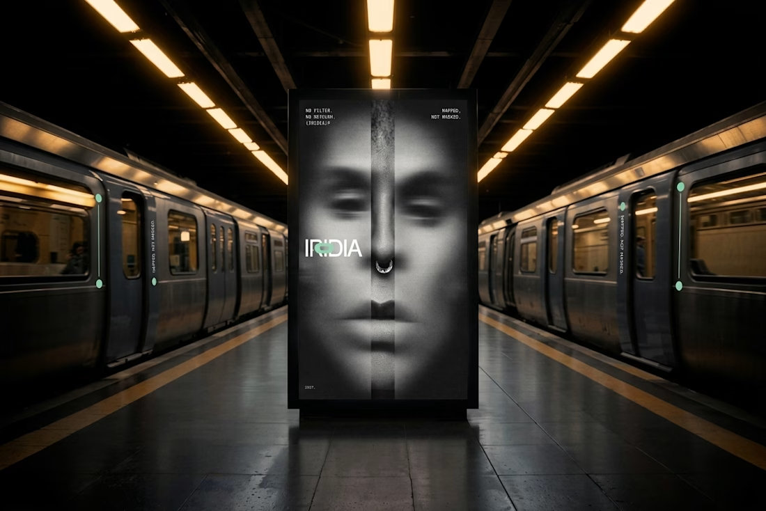
One of them finally got the full treatment. The Iridia case study drops soon.
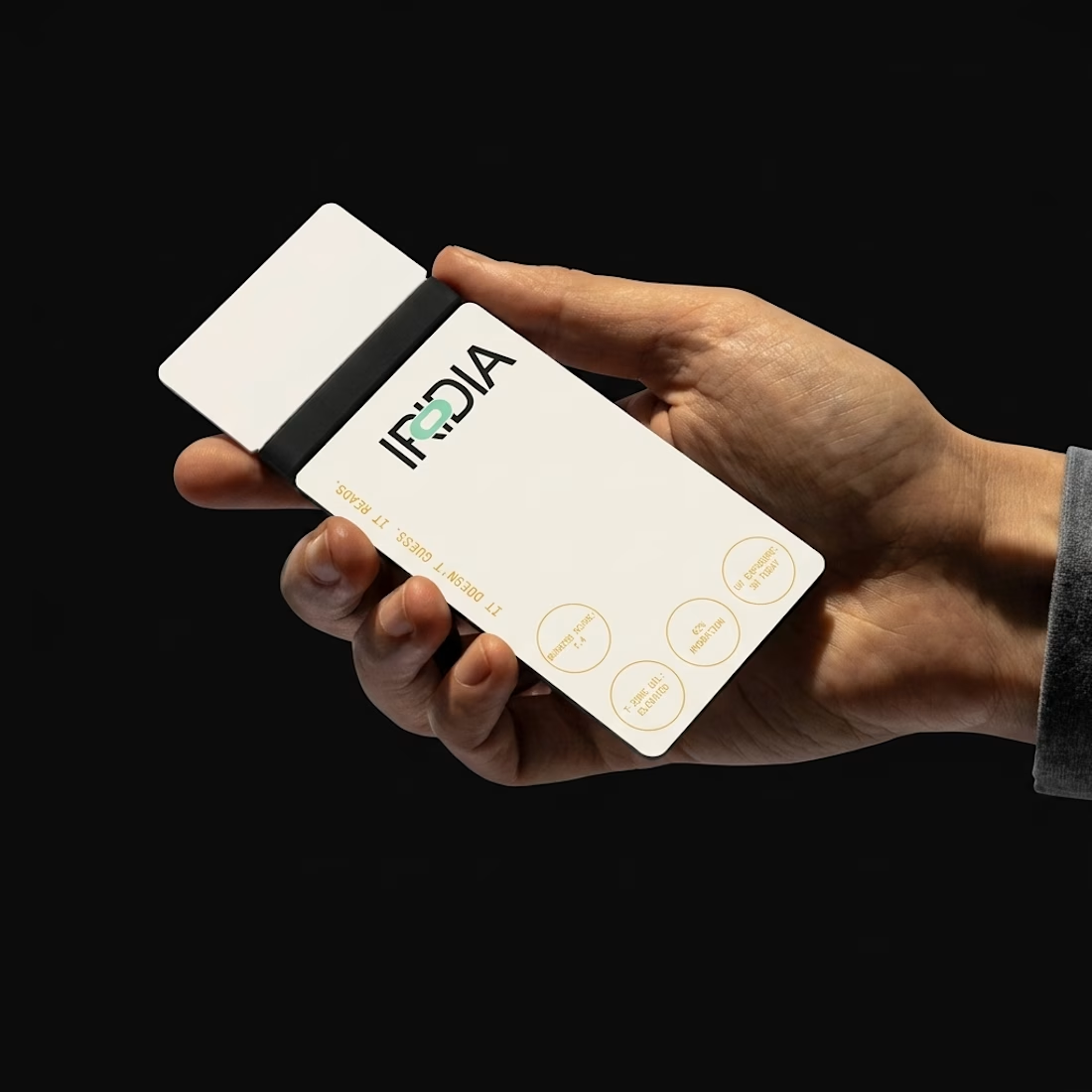
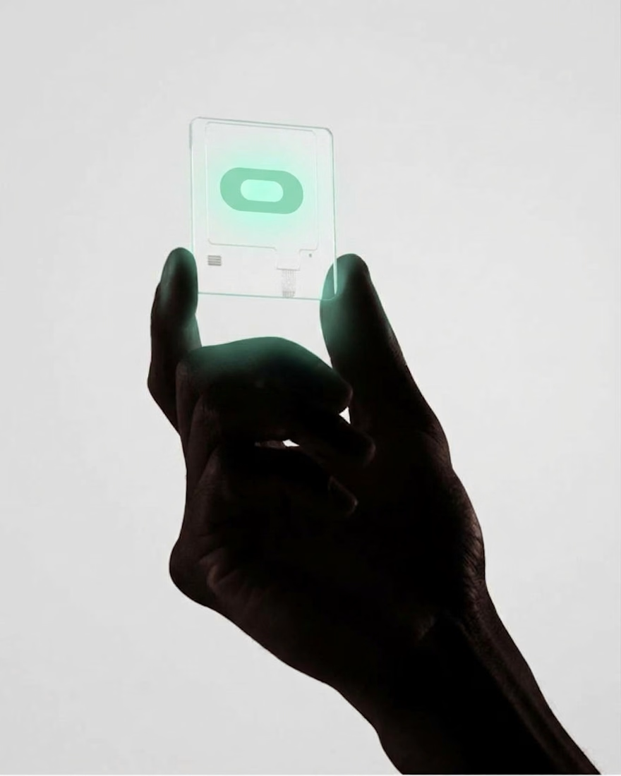
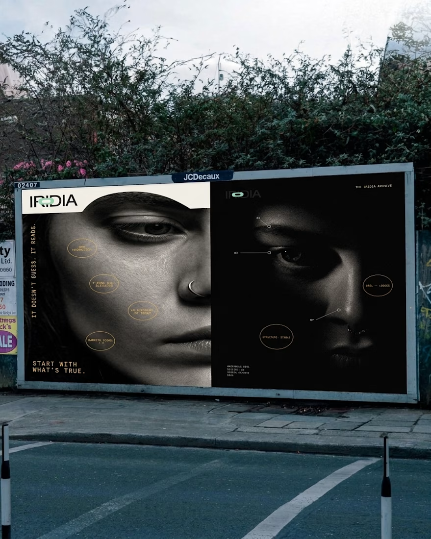
What if your instant noodles were louder than your neighbors? 🔥
LOUD NOODLE is a brand with a big mouth, a red-hot palette and zero chill. The full case study is almost here.