The network for creativity
Join 1.25M professional creatives like you
Connect with clients, get discovered, and run your business 100% commission-free
Creatives on Contra have earned over $150M and we are just getting started
Back to feedPost
Taste Test
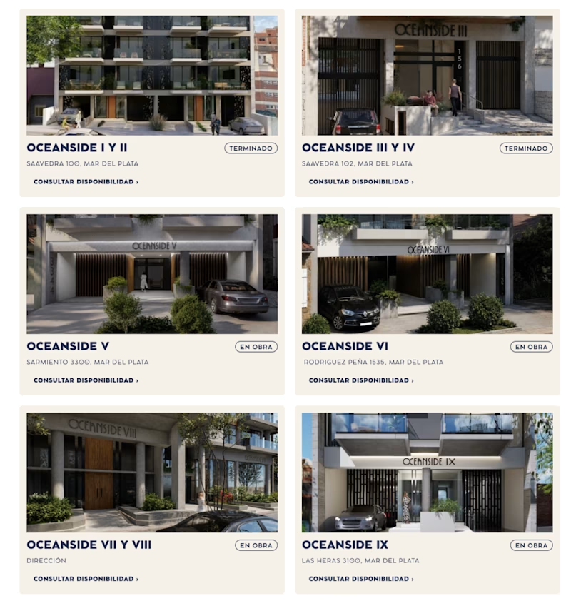
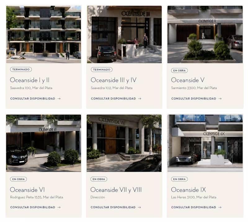
Testing this Oceanside project layout. Same content, two totally different feels. 👀
Version A: bold, all-caps, tighter grid. It feels more corporate and structured.
Version B: softer typography, more breathing room. It feels more premium and editorial.
Small typography and spacing choices change how trustworthy and high-end a project reads.
Which version would make you click "consultar disponibilidad"?
5 votes
Ends in 13h

oddly enough, i have to go with bold! i usually love the thinner, more editorial-looking fonts, but readability is definitely a huge factor here, & something about the tighter-grid boldness also reads like a headline might to me.

i choose bold too! thanks for sharing!

Okay had to translate the whole thing first, phew.
Softer for me. 🙌
The extra breathing room and elegant typography is making the properties feel more high-end and easier to trust.
I'm sorry, you need to translate it. I took it from a Spanish project. We're on the same page. Thanks for sharing!
I also posted a lil A/B test just today. Would love to see which one you'd pick 🙌
on my way!

I Like the Bold one because of the arrangement
The network for creativity
Join 1.25M professional creatives like you
Connect with clients, get discovered, and run your business 100% commission-free
Creatives on Contra have earned over $150M and we are just getting started
Trending
retrofuturism
Share your favorite designs from the past exploring the distant future. Or your own take on the aesthetic 🚀
halftone
Dots. Texture. Grain. Let's see your designs using the halftone technique.

Midjourney
Creatives are showing off what they're making with Midjourney.
colorgrade
Video editors sound off: How do you enhance the mood of your video in color grading?


Related posts

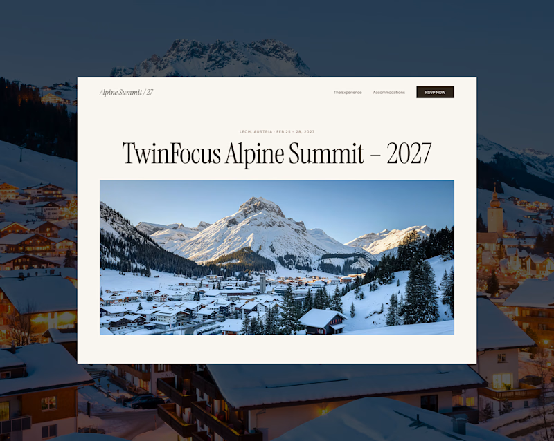
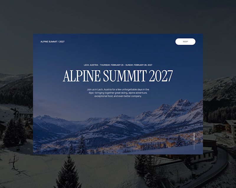
I’m exploring two homepage hero directions for the Alpine Summit website I’m working on and testing which visual direction feels stronger.
Both concepts are built around the same event: a premium alpine gathering in Lech, Austria for the 2027 TwinFocus Alpine Summit.
Direction 1 feels more refined, editorial, and invitation-like.
Direction 2 feels more immersive, cinematic, and destination-driven.
That’s the tradeoff I’m thinking through:
Direction 1: elegant, editorial, refined
Direction 2: immersive, cinematic, atmospheric
Since this site is for a luxury alpine event, the hero needs to feel premium while still making the destination feel exciting.
Which direction feels stronger for an event landing page?

47 voted
57%
35 voted
43%
82 votes
Closed
White one stands out and feels fresher. The dark one is nice too, just a bit more expected.

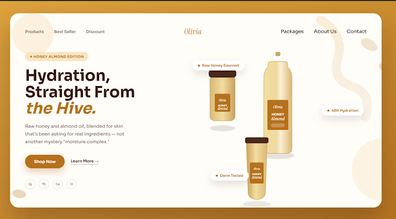
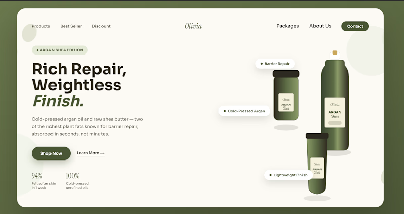
Same brand. Same product line. Two completely different moods.
I designed two hero sections — same layout structure, same goal, but each one built around a different product in the line:
🅰️ — warm, golden, cozy. Feels like something you'd reach for in winter.
🅱️ — sage green, mirrored layout, clean and minimal. Feels more clinical, more "skincare-routine" than "self-care ritual."
Both use real ingredient-driven color palettes (not random brand colors) and floating product badges instead of a wall of text.
Which one would make you stop scrolling and actually click "Shop Now" — A or B? Drop your pick below, curious which mood wins.

5 voted
36%
9 voted
64%
14 votes
Closed
A would probably stop my scroll first, but B feels more believable for skincare. I’d actually be curious which one converts better, because the one that grabs attention isn’t always the one that feels most trustworthy 👀

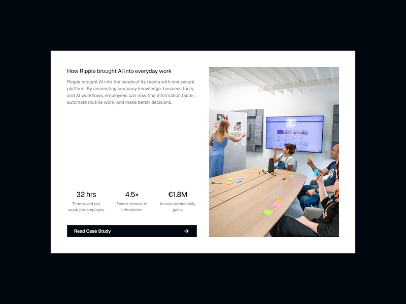
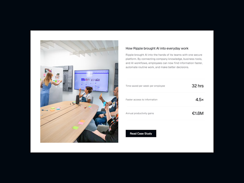
Which Layout do you like?
Version 1 : Editorial Grid
A more dynamic composition that gives the story, metrics, and visual equal emphasis.
Version 2 : Balanced Split
Clear separation between the visual and content, making the case study easy to scan.
3 voted
60%
2 voted
40%
5 votes
Closed

Editorial grid looks super premium