The network for creativity
Join 1.25M professional creatives like you
Connect with clients, get discovered, and run your business 100% commission-free
Creatives on Contra have earned over $150M and we are just getting started
Back to feedPost
Taste Test

I’m exploring two homepage hero directions for the Alpine Summit website I’m working on and testing which visual direction feels stronger.
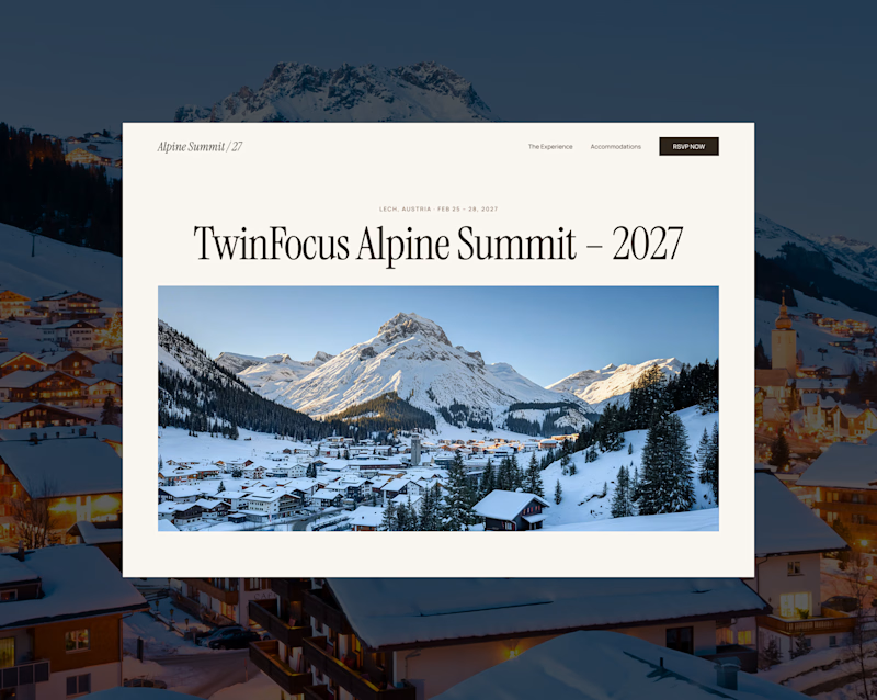
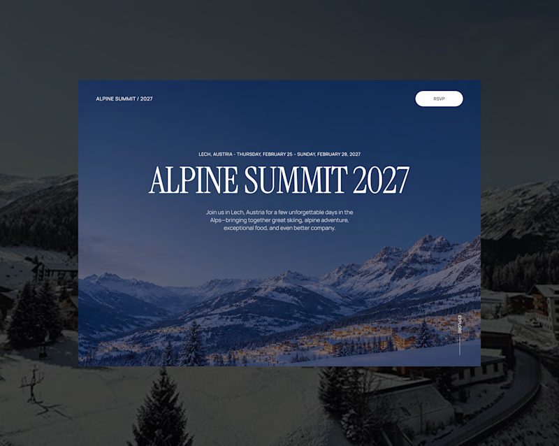
Both concepts are built around the same event: a premium alpine gathering in Lech, Austria for the 2027 TwinFocus Alpine Summit.
Direction 1 feels more refined, editorial, and invitation-like.
Direction 2 feels more immersive, cinematic, and destination-driven.
That’s the tradeoff I’m thinking through:
Direction 1: elegant, editorial, refined
Direction 2: immersive, cinematic, atmospheric
Since this site is for a luxury alpine event, the hero needs to feel premium while still making the destination feel exciting.
Which direction feels stronger for an event landing page?

47 voted
57%
35 voted
43%
82 votes
Closed

Direction 1 it is
Thank you! Direction 1 definitely feels more refined and premium, which fits the private event feel really well.

I love Direction 1 🔥
Thank you! I ended up choosing Direction 1 too — it felt like the better fit for a premium private event.
Exactly ...You chose right, Luis


I’d lean toward Direction 2. The cinematic feel makes the destination feel much more exciting.
I agree, Direction 2 definitely has a stronger cinematic feel. The client ended up choosing Direction 1, which made sense for the event because it feels more refined and invitation-like.

Good point. Direction 1 does feel more editorial and photography-led, which fits the refined event direction the client wanted. Direction 2 definitely feels more cinematic and destination-focused.

1 is super appealing!
Thank you! Direction 1 was the final pick too. The client liked that one better.


Direction 2
Thank you! Direction 2 definitely felt more cinematic and destination-driven. The client ended up choosing Direction 1, but D2 had a strong atmosphere.

Direction 1! and expanding the image to full screen on scroll will look super elegant and at the same time give the design an immersive, cinematic feel.
Exactly — I was thinking the same thing. Direction 1 has the refined/editorial feel, and a full-screen image moment or subtle parallax effect could add that immersive cinematic layer.

Both are good
Thank you!

direction one feel better
Thank you! Direction 1 was the final pick too — it felt more refined and fitting for the event.

Voted the dark full-bleed hero. For an exclusive alpine gathering, the night-mountain immersion sells atmosphere and prestige in a way the framed daytime photo in the editorial layout cannot. My one note is legibility: keep a gradient scrim under that serif headline so it stays crisp over the busy mountain image.
Great point. Direction 2 definitely sells the atmosphere and prestige more directly. Ultimately the client liked version 1 more so we went with that. https://alpine-summit-27.webflow.io/

Direction 2 has it
Thank you! Direction 2 definitely had that stronger cinematic atmosphere. The client ended up choosing Direction 1, but D2 was a strong option for making the destination feel more immersive.

White one stands out and feels fresher. The dark one is nice too, just a bit more expected.
Good point. Direction 1 feels fresher and more unexpected, while the dark version feels more cinematic but a bit more familiar. Here is the live site before adding animations if you want to see it. https://alpine-summit-27.webflow.io/
This is going so good. Would love to see once you're done with the animations too.
Ive got an A/B poll up too. Would love to see which one you'd pick :)
Yea i will


d1 for me, editorial fits lech
Agreed — the editorial direction fits Lech really well. It feels refined, fresh, and more invitation-like for the event.

D1 🔥
Thank You 🙏

Direction 2's immersion sells the destination, but for an invitation-only gathering, Direction 1's restraint might read as more exclusive — full-bleed cinematic can slip toward "tourism ad" once the audience already knows they're going.
Great point. Direction 2 sells the destination more, but Direction 1 feels more restrained and exclusive. For an invitation-only gathering, that editorial approach fits better — and that’s the direction the client chose. https://alpine-summit-27.webflow.io/

Direction 1🔥
Thank You 🙏

I love the direction 1 because the image and the text is clear and the best part that you can use videos as well instead of image but the direction 2 it looks boring to me and hard to give attention. one advice try to make the main CTA as part of the hero not only in the nav to improve the conversion
Great feedback. I agree — Direction 1 feels clearer, and the image area could work well with video too. Good point on the CTA also. Bringing it into the hero would make the action more obvious and help with conversion.
Yes definitely
Quick update: I moved forward with Direction 1 and built it out in Webflow.
You can see the live version here:
https://alpine-summit-27.webflow.io/
It’s always interesting seeing how a direction feels once it moves from static design into the browser.


Looks great !

Direct 1 looks more appealing!

Direction 2 offers a more immersive, premium, and modern aesthetic for an event like an Alpine Summit, while Direction 1 provides superior readability and a clean, editorial layout.


Direction 1, the layered card sitting on top of the photo does more to signal invitation and exclusivity than a full bleed hero usually can.
I voted Direction 2 for the cinematic pull, but for a luxury event Direction 1 is the safer conversion play: the lighter frame lets the peaks breathe and keeps the date and CTA legible. Ideal might be Direction 2 mood with Direction 1 restraint on the type.


tough call, love direction 1


Both directions feel strong, but I’d lean toward Direction 2 for a luxury alpine event. 🏔️✨ The cinematic atmosphere makes the destination feel more aspirational and creates an immediate emotional pull, while still leaving room for a premium, refined layout. Great exploration of the two approaches! 👏

like the first one.
It didn't let me click on it to vote

I vote for Direction 1! The lighter layout lets the photography pop and keeps the whole page feeling clean, elegant, and fresh
The network for creativity
Join 1.25M professional creatives like you
Connect with clients, get discovered, and run your business 100% commission-free
Creatives on Contra have earned over $150M and we are just getting started

Challenges
View all


Related posts

Working on the homepage for Still Blooming, a wedding and floral studio, I explored two different layout directions for the hero section. Same brand, same copy, just a different structure and visual rhythm.
Option 1 : Left Aligned. Text sits on the left with supporting content beside it, giving an editorial, asymmetrical feel.
Option 2 : Centered. Everything is stacked and centered, giving a clean, balanced, more classic hero layout.
Would love your honest UX/UI take which direction feels more elegant, functional, and true to a wedding/floral brand, and why?
22 voted
41%
32 voted
59%
54 votes
Closed

Great Design :)

Working on a hero section for GenZz, a bold Gen Z eyewear and fashion brand. Testing two color directions for the landing page and honestly torn between them.
Version 2 has a mint to teal gradient background. Version 1 shifts it to a sky blue gradient. Same layout, same typography, same energy, just a different mood in the backdrop.
Which one pulls you in more and why. Curious if the mint feels more playful and on brand for Gen Z, or if the blue reads cleaner and more premium.
Would love your honest take before I lock this in with the client.

10 voted
59%
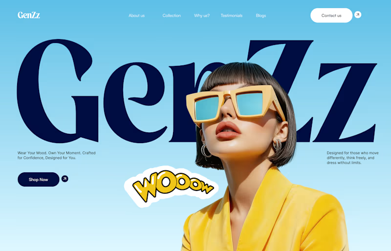
7 voted
41%
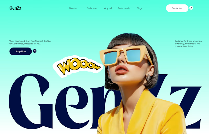
17 votes
Closed


cool, dmytro stands out. how long did this take?