The network for creativity
Join 1.25M professional creatives like you
Connect with clients, get discovered, and run your business 100% commission-free
Creatives on Contra have earned over $150M and we are just getting started
Back to feedPost
Taste Test
Same brand. Same product line. Two completely different moods.
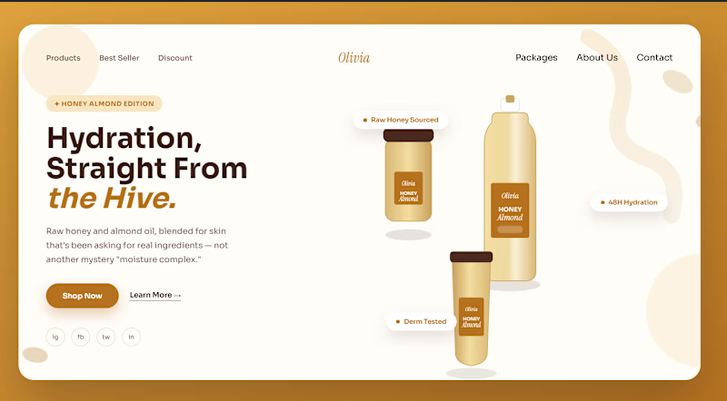
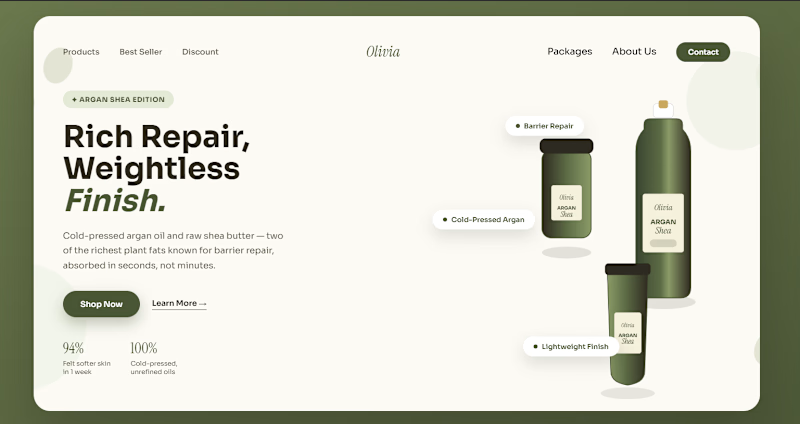
I designed two hero sections — same layout structure, same goal, but each one built around a different product in the line:
🅰️ — warm, golden, cozy. Feels like something you'd reach for in winter.
🅱️ — sage green, mirrored layout, clean and minimal. Feels more clinical, more "skincare-routine" than "self-care ritual."
Both use real ingredient-driven color palettes (not random brand colors) and floating product badges instead of a wall of text.
Which one would make you stop scrolling and actually click "Shop Now" — A or B? Drop your pick below, curious which mood wins.

5 voted
36%
9 voted
64%
14 votes
Closed


I’d pick A. The warm, cozy feel makes me want to click through more.


For A colour combination is amazing

Thanks.

A would probably stop my scroll first, but B feels more believable for skincare. I’d actually be curious which one converts better, because the one that grabs attention isn’t always the one that feels most trustworthy 👀
Actually, I’m also curious which one will gets the highest votes
Same 😅 I’ve got a little A/B poll up to. would love to know which one you’d pick there!
Ohh sure, wait a sec, let me see.


Great design !
Thanks!

Definitely A! 🍯 The warm, golden palette instantly feels more comforting and inviting for a product line.
Love the approach of driving the color choices directly from the ingredients rather than forcing static brand colors. Clean layouts on both! 🔥
Thank you!

Really like how the exact same structure feels like a completely different brand just through color, product styling, and mood. B gets my vote, the sage green feels a bit more distinctive and premium.

The network for creativity
Join 1.25M professional creatives like you
Connect with clients, get discovered, and run your business 100% commission-free
Creatives on Contra have earned over $150M and we are just getting started





Related posts


Twenty-five years of credits, finally on a website that looks the part.
Just take a look at what kind of web we create ✨👇
Reflection of the brand history with taste, precision, and premium branding.
Scroll responsibly: https://productionportugal.com 😉🔥


Wow! Nice setup 🎥

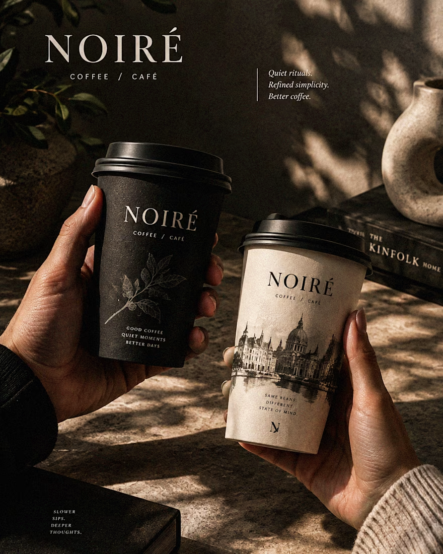
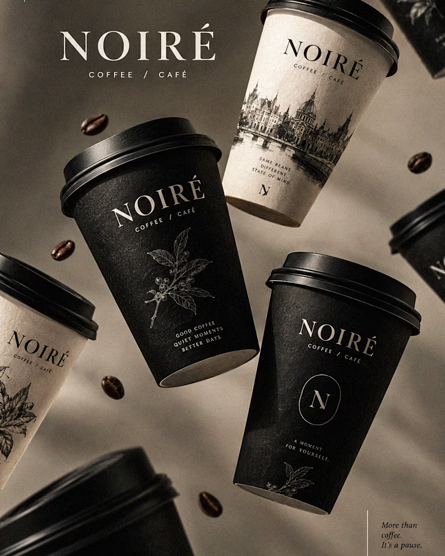
I Just Created NOIRÉ 🔥
A Coffee Brand Built Around the Pause.
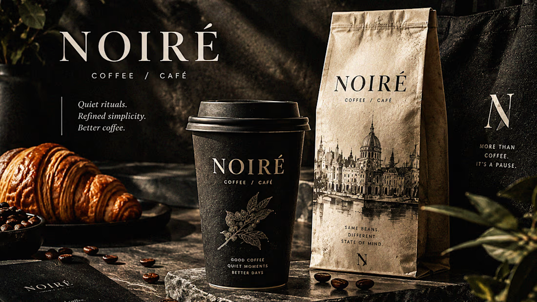
NOIRÉ is a premium café brand built around a simple idea:
Great coffee should feel like a moment of pause, not another part of the
routine.
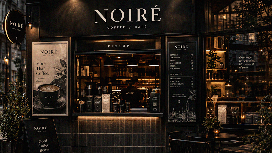
The project explores a complete visual identity, packaging
system, takeaway cups, coffee bags, tote bags, menu design, café applications and lifestyle campaign direction.
Instead of relying on the usual loud coffee aesthetics, I
built NOIRÉ around deep charcoal, warm ivory, soft graphite, refined
typography, subtle botanical illustrations and quiet editorial compositions.
The visual language is intentionally dark, tactile, and understated - giving every touchpoint the feeling of a slow morning, a quiet table, and coffee worth taking your time with.
From the cup in your hand to the café around you, every detail was designed to make the brand feel like a ritual.
Waiting for your thoughts in the comments 🙌🔥
branddesignertastetestBrand DesignGraphic DesignPackaging DesignAdobe IllustratorAdobe InDesignAdobe Photoshop




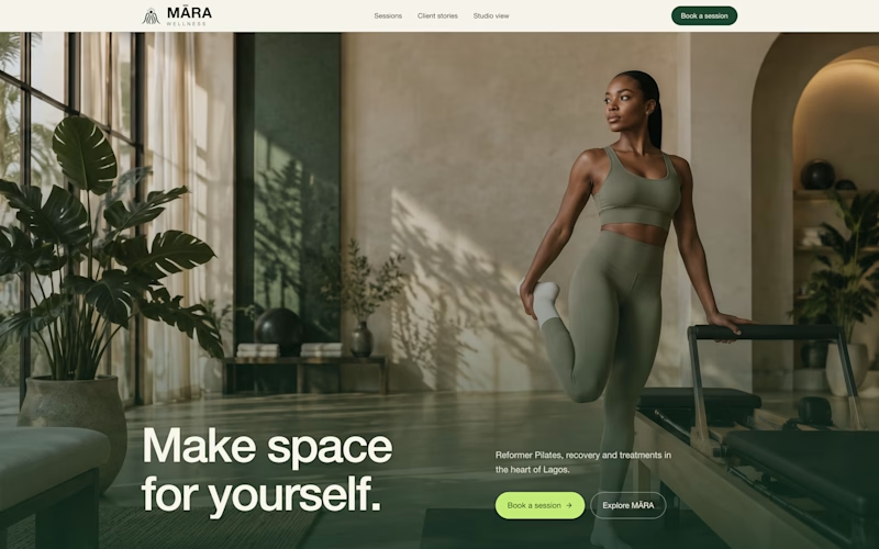
exploring some visual directions, which of this hero design looks better?
4 voted
40%
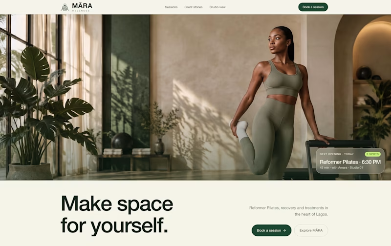
6 voted
60%
10 votes
Closed

Option 1 looks cleaner and more balanced. The layout feels more spacious and premium. ✨