The network for creativity
Join 1.25M professional creatives like you
Connect with clients, get discovered, and run your business 100% commission-free
Creatives on Contra have earned over $150M and we are just getting started
Back to feedPost
Taste Test

Which Layout do you like?
Version 1 : Editorial Grid
A more dynamic composition that gives the story, metrics, and visual equal emphasis.
Version 2 : Balanced Split
Clear separation between the visual and content, making the case study easy to scan.

3 voted
60%
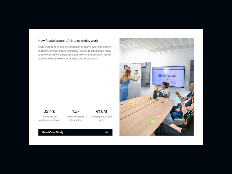
2 voted
40%
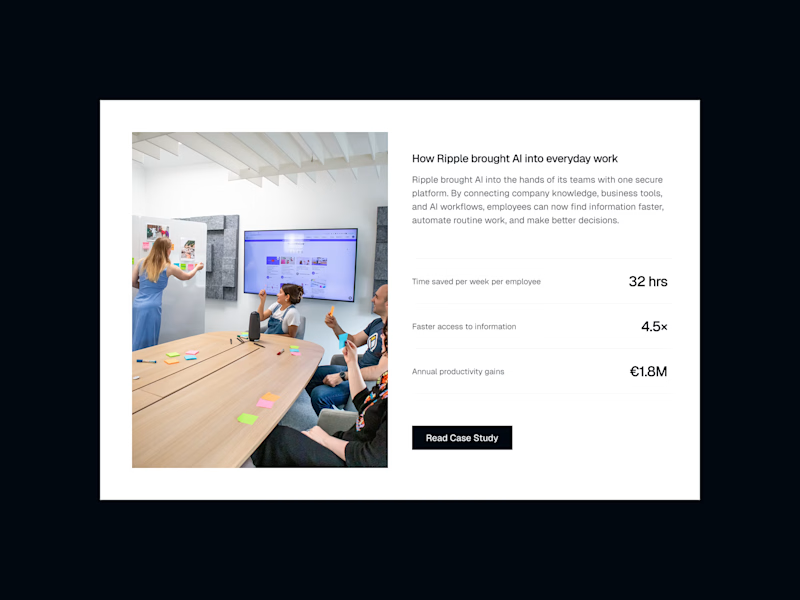
5 votes
Closed

Editorial grid looks super premium
Thank you!
Most welcome. was it for areal client?😊

Thank you!

Editorial is great! You can try the CTA in the bottom of image. It will give the metrics some space
Good suggestion. Thanks!


I’d go with V1. It feels more dynamic and gives the case study more personality.

Editorial Grid 🙌 it feels more like a story than just a layout. But I’m curious, did you test both with a longer case study? I feel like the split version might hold up better once there’s a lot more content.
The network for creativity
Join 1.25M professional creatives like you
Connect with clients, get discovered, and run your business 100% commission-free
Creatives on Contra have earned over $150M and we are just getting started

Challenges
View all


Related posts



A feels more professional ❤️

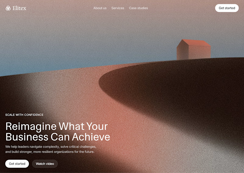
My first preloader code component for Framer became a huge hit and ranked #1 in the paid Loaders category on the Framer Marketplace. I received so many sales from it in just a few days, so I decided to create another one.
As usual, I packed multiple options into a single code component. This time, you can choose from 4 different preloader styles.
These are 2 of the 4 options. Which one is your favorite? Check out the live preview here
14 voted
50%
14 voted
50%
28 votes
Closed

Wave on image is svg filter ?

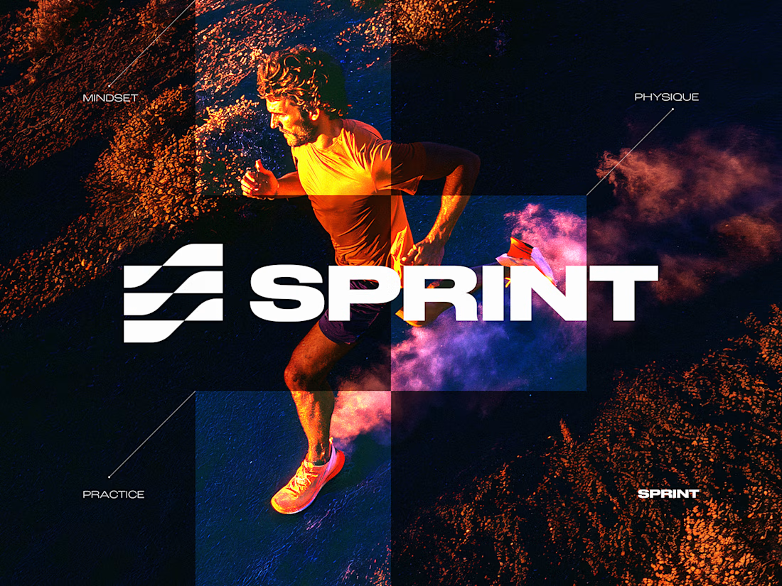
SPRINT — Experimental Brand Visual
A visual experiment built around an unused logo concept from a recent branding project.
The design was created manually, while exploring how AI-driven aesthetics are increasingly influencing contemporary visual language, even when AI itself isn’t part of the design process.
Logo design, art direction and visual exploration.