The network for creativity
Join 1.25M professional creatives like you
Connect with clients, get discovered, and run your business 100% commission-free
Creatives on Contra have earned over $150M and we are just getting started
Back to feedPost
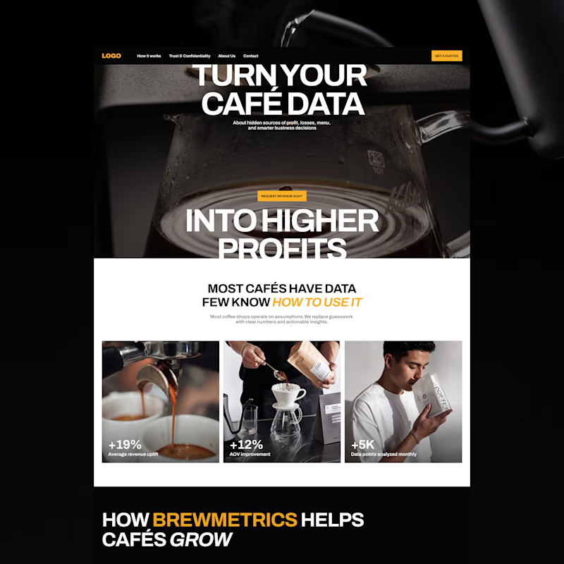
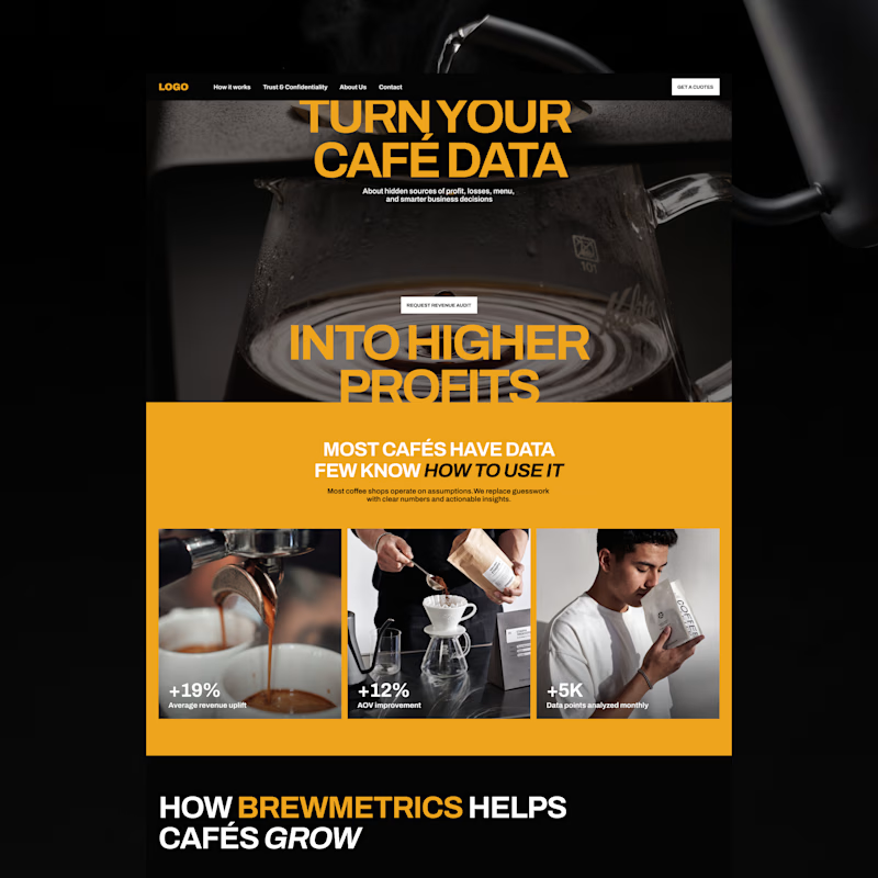
Taste Test
Exploring two color palette directions. Which one are you going for? 👀

14 votes
Ends in 1d

the bold gold of b is a winner by me!

Thanks! I’m leaning towards that one too

B is vivid
Agreed! B definitely feels more vivid 🙌

The contrast on Option A makes the typography pop.
That’s a great point about the typography. Thank you!

I liked opt B the most,
More power to you Ella!
Thank you so much! 😊
My pleasure Ella!

Leaning B too. The stronger contrast gives you a clear accent for buttons and key actions, which A would struggle to do.
Totally agree!
The network for creativity
Join 1.25M professional creatives like you
Connect with clients, get discovered, and run your business 100% commission-free
Creatives on Contra have earned over $150M and we are just getting started



Related posts

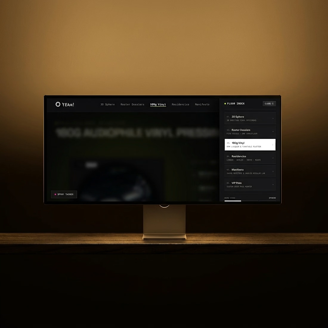
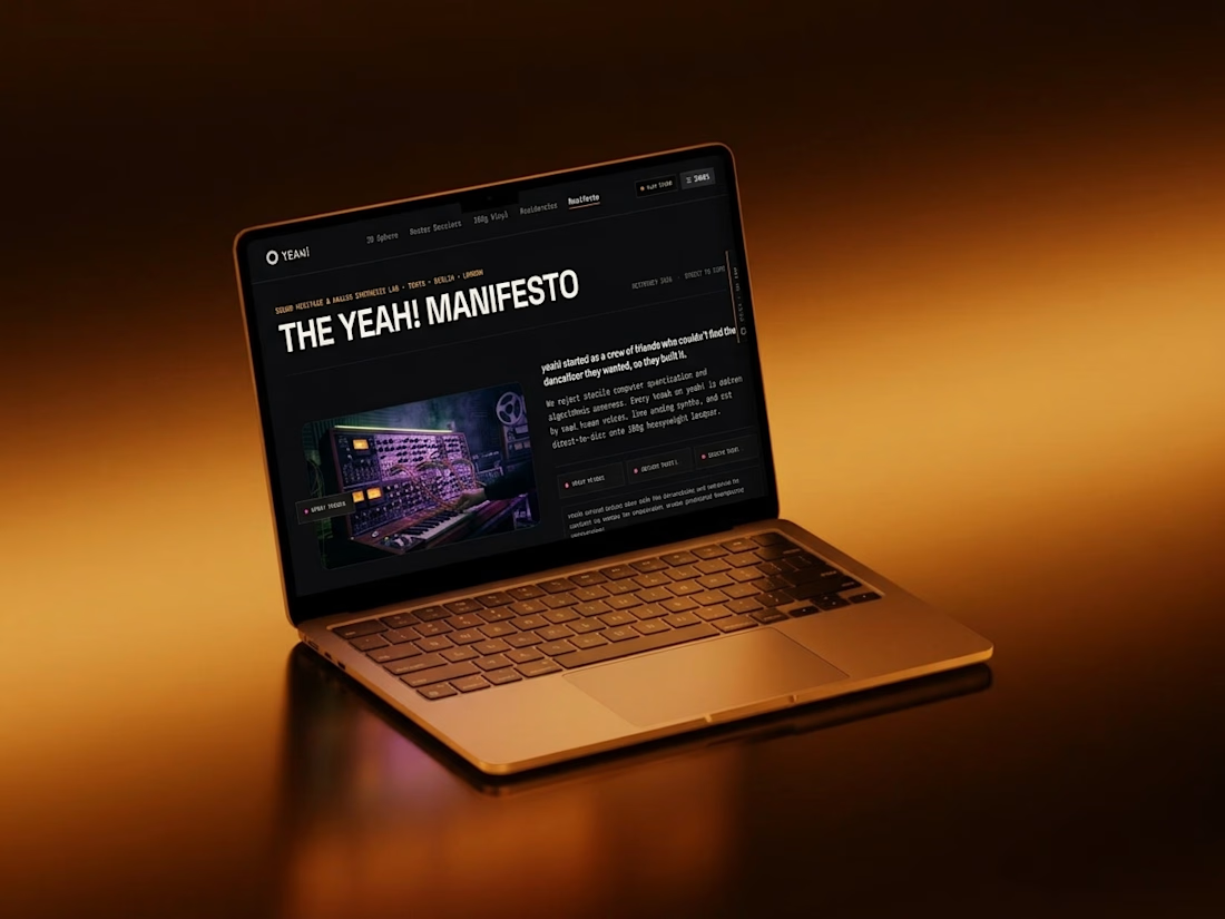
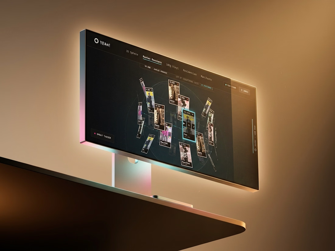
The yeah! website is a roster you can spin.
Artist cards float in a sphere, a floor index runs the nav, and a spray tagger sits in the corner waiting for you to leave a mark.
Dark room, amber glow, one loud shout.


Amazing work🔥👏👏
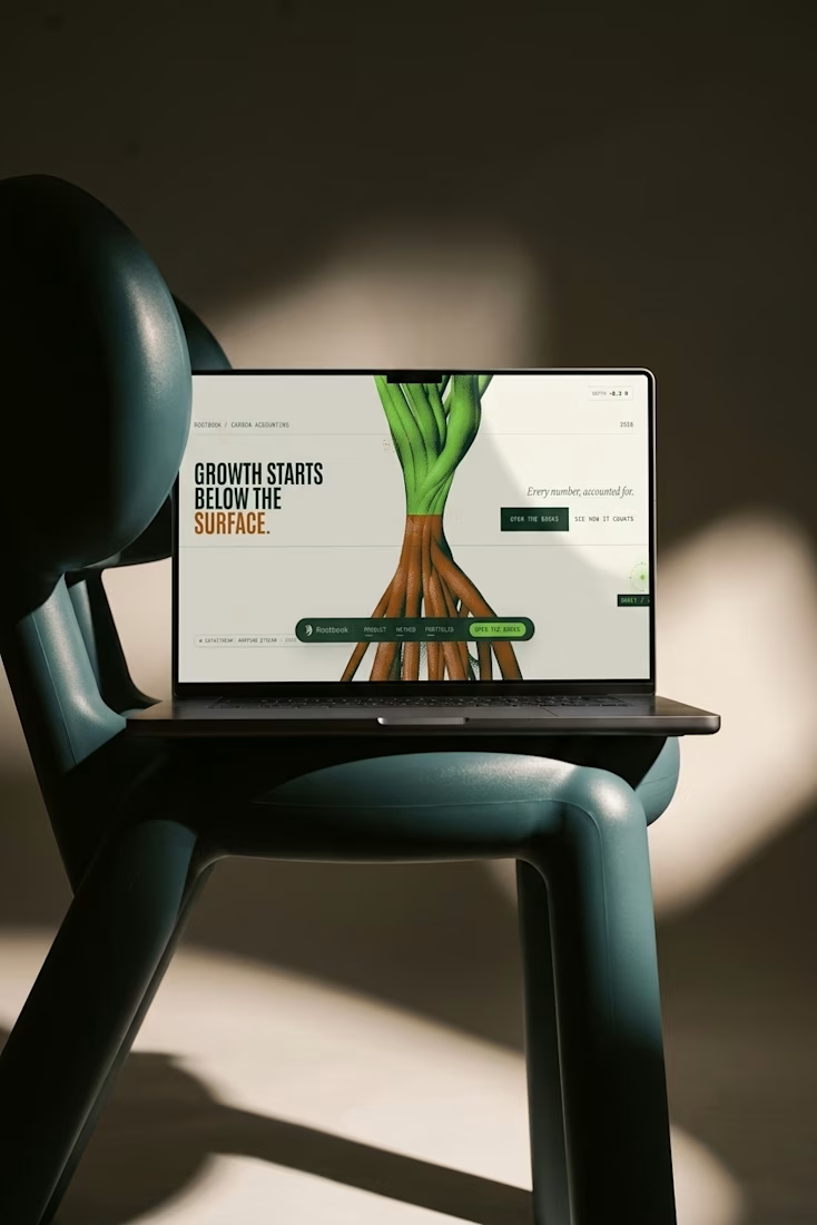
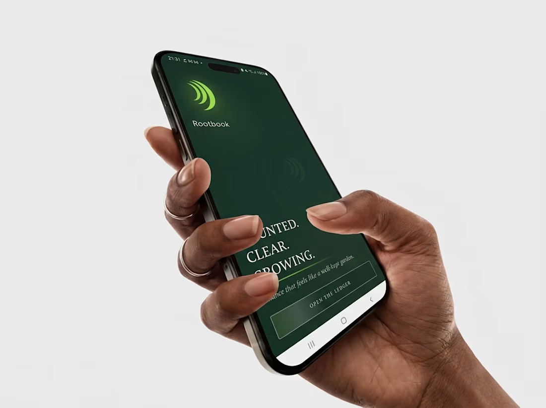
Carbon accounting looks like a spreadsheet and sounds like a press release.
So I built Rootbook: one ring mark, a poster system, a site and an Android app. Every number shows its working.
Finance that feels like a well-kept garden.
Live here