The network for creativity
Join 1.25M professional creatives like you
Connect with clients, get discovered, and run your business 100% commission-free
Creatives on Contra have earned over $150M and we are just getting started
Back to feedPost
Taste Test
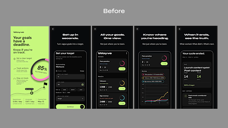
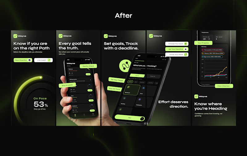
Just wrapped up a client's App Store screenshot redesign.
The original screenshots showed the app, but they weren't really communicating why someone should download it.
The UI was there, the product was there, But the story wasn't.
So I reworked the screenshots to make the value clearer, give each screen a purpose, and make the whole listing feel more like one experience.
Here’s the Before vs. After
Which one would make you stop and explore the app?

3 voted
14%
18 voted
86%
21 votes
Closed

After one is more polished and clean

Yeah same here, Thank you

I second you on that
Thank you

After
I appreciate that man
Thank you

Well done🔥
Thank you Sekinat


i appreciate that


The after feels much stronger. It actually tells the story instead of just showing the UI. Nice work!
exactly the aim, thank you Kabir


After
I appreciate that Dera

You did a Great Job
Thank you man

After is Best!
I will go with that too, thanks man

Thank you for the Goat Runo 🎊

For me the After wins because you led each frame with the value instead of the interface. That reorder is what turns an App Store listing from a UI tour into an actual reason to download.
Yes, that's the goal of my redesign to communicate value, Thank you Asif
you can also view the full casestudy here
https://contra.com/p/7PeEvYgk-wayve-app-store-screenshot-redesign?referralExperimentNid=DEFAULT_REFERRAL_PROGRAM&referrerUsername=blissdezigns

Absolutely agree—screenshots should sell the story, not just show the UI. What’s the first thing you look for when judging an app listing?

great work
Thanks man

Excellent work!!!
I appreciate
Leading with the reason to download instead of the interface is what most store screenshots miss, and your after set nails it in the first two frames. The value carries the decision before anyone reaches the UI.
Thank you for this,
i appreciate

Very nice!
Thank you Ferrando
The network for creativity
Join 1.25M professional creatives like you
Connect with clients, get discovered, and run your business 100% commission-free
Creatives on Contra have earned over $150M and we are just getting started

Challenges
View all


Related posts

My previous poll showed unexpected results (I am very grateful to everyone who took the time to vote and comment 🤍).
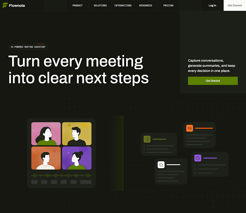
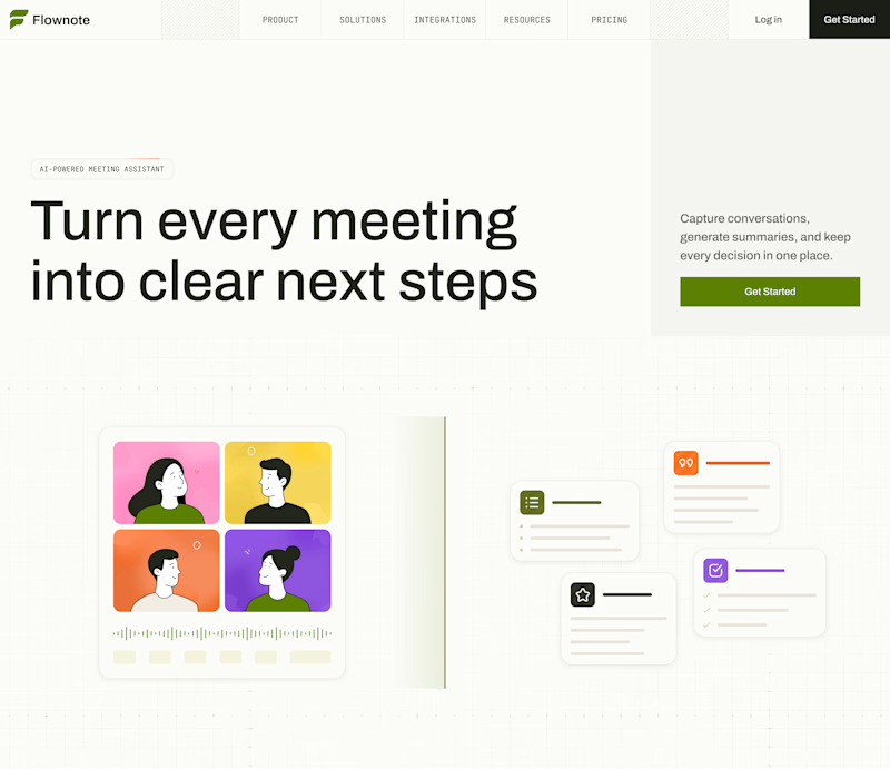
Now I am curious about your opinion on the color mode for this hero section. I definitely like a light theme. What about you?
By the way, I made a nice animation for this design. You can see it on my profile
28 voted
54%
24 voted
46%
52 votes
Closed

To be honest the dark mode looks really good

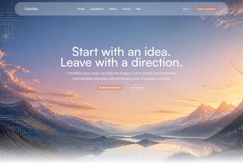
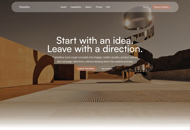
Explored two different visual directions for the same SaaS landing page.
The structure stays consistent, while the imagery, mood and art direction shift the overall brand feel.
Interested to know which direction feels stronger.
11 voted
73%
4 voted
27%
15 votes
Closed

Woww... What a precious design priyansh bro.😍 💯 🔥 🎉


HOW MUCH GUIDANCE DOES A PASSWORD FIELD NEED?
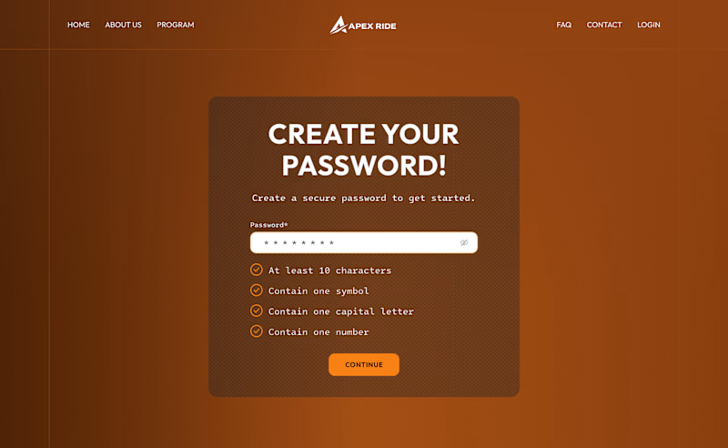
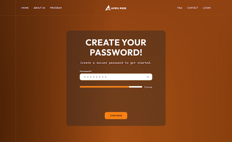
For this desktop sign-up screen, I explored two ways to guide users while creating a password:
A - Detailed. A checklist displays every requirement and updates as the user types.
B - Minimal. A strength indicator provides quick feedback while keeping the interface cleaner.
The checklist offers more clarity, while the strength bar reduces visual noise.
Which approach would you choose - A or B?
39 voted
66%
20 voted
34%
59 votes
Closed

Detailed layout entails a guide to help users create strong passwords. Not everyone is good at crafting passwords, and this approach can makes them find it easy to remember.