The network for creativity
Join 1.25M professional creatives like you
Connect with clients, get discovered, and run your business 100% commission-free
Creatives on Contra have earned over $150M and we are just getting started
Back to feedPost
Taste Test

Explored two different visual directions for the same SaaS landing page.
The structure stays consistent, while the imagery, mood and art direction shift the overall brand feel.
Interested to know which direction feels stronger.

11 voted
73%
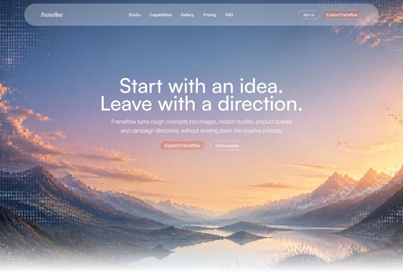
4 voted
27%
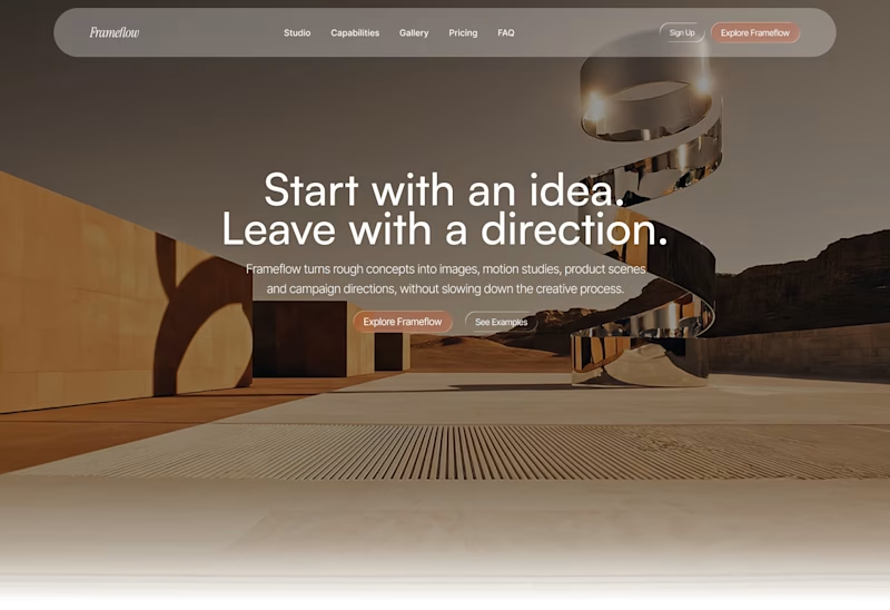
15 votes
Closed

Woww... What a precious design priyansh bro.😍 💯 🔥 🎉
Thanks 🙏🏻


I am kind of inclining towards the warmer one here🧑🎨

Interesting!

The structure is doing the right amount of work here; I’d choose the mountain direction for its stronger sense of momentum, then keep the warmer route as a campaign-specific variant.
Ohh quite an interesting approach, I see your point there 🙌🏻


Option 1

I woould like to go with option one.

Option 1 for me but for Saas I'm not sure


Wonderful design

Option 1 🔥

option one suits the text.

Voted Option 1. The sunset feels more inviting than the desert shot.
The network for creativity
Join 1.25M professional creatives like you
Connect with clients, get discovered, and run your business 100% commission-free
Creatives on Contra have earned over $150M and we are just getting started











Related posts

Design Exploration: Hero Section of Architecture Website. Which one do you think much better?


12 voted
43%
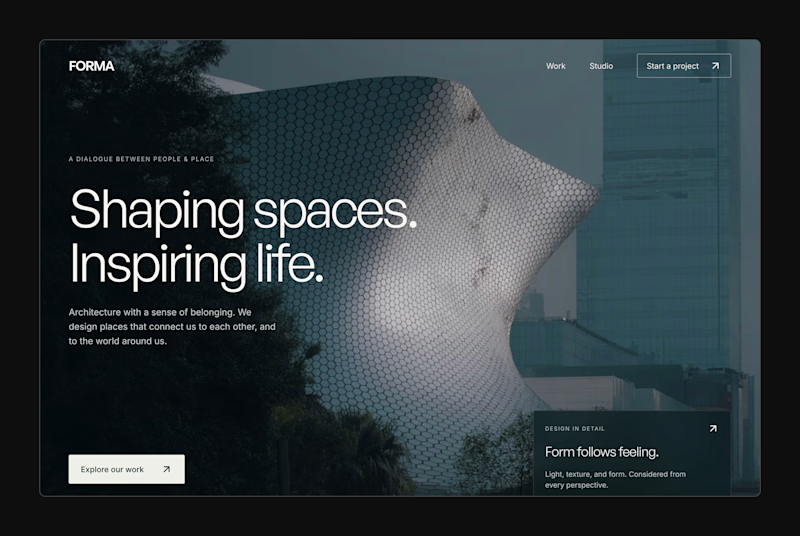
16 voted
57%
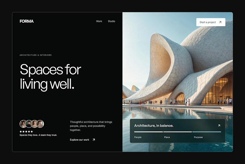
28 votes
Closed


Two visual directions for the same brief. Which do you prefer?
2 voted
29%
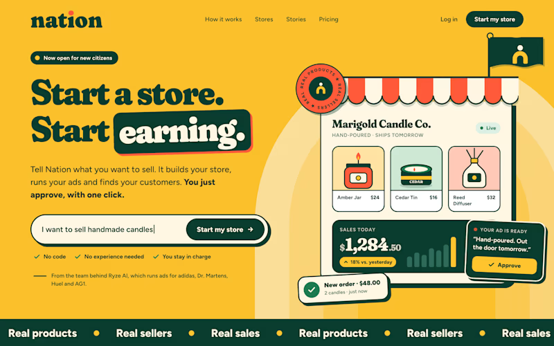
5 voted
71%
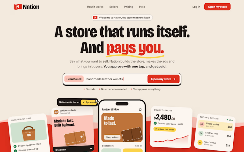
7 votes
Closed

Direction A is more better to me it feels modern professional cartoony style that's impressive ❤️❤️
Great job Ayoub🔥🔥

FOCUS — Creative Portfolio & Digital Art Website 🌸✨
A visually expressive website concept for a creative portfolio, built around digital art, bold imagery, and visual storytelling
The design combines vibrant pink tones, soft gradients, experimental typography, and immersive photography to create a distinctive editorial experience
Special attention was given to:
• Bold editorial hero composition
• Vibrant pink and dark color palette
• Experimental typography and visual details
• Immersive photography and digital artwork
• Creative project gallery and navigation
• Responsive mobile experience
• Clean layouts with a strong visual identity
The result is an expressive digital experience that puts creativity, emotion, and visual storytelling at the center of every screen 💗
Looking to create a standout portfolio or website for a creative brand? Let’s connect 🚀





The vibrant pink against the dark palette gives this such a bold editorial feel. The experimental typography is the star here.