Built with Jitter
Wayve - App Store Screenshot Redesign

Emmanuel Bliss
1 collaborator


Overview
Wayve is a goal-tracking app designed to help people understand whether they’re on pace to achieve their goals, not only whether they’re staying consistent.
I redesigned Wayve’s App Store and Google Play screenshots to communicate the product’s value within the few seconds people typically spend deciding whether to download an app.
The Problem
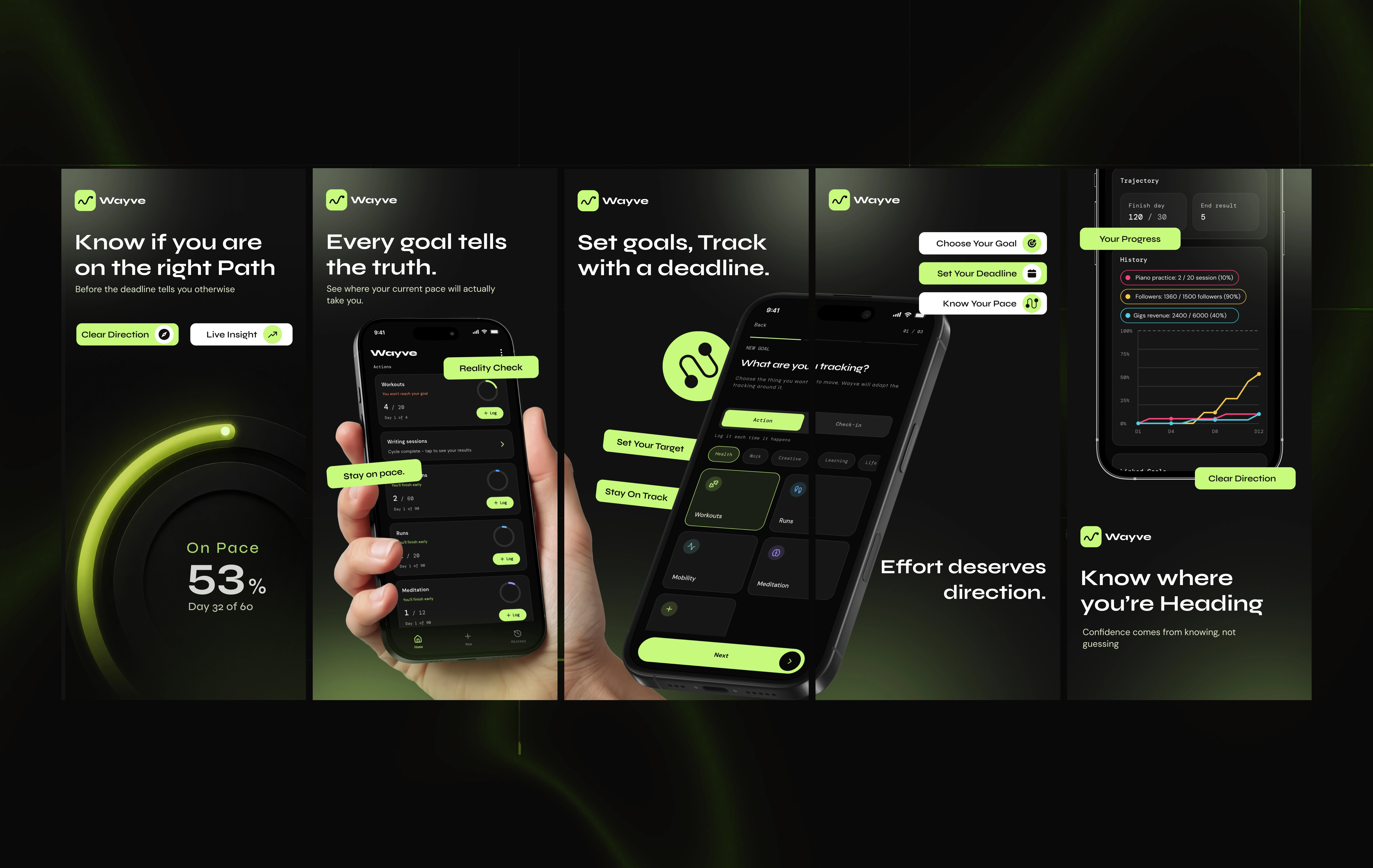
The original store screenshots showed the interface, but they didn’t clearly explain:
Why someone should download Wayve
What set it apart from other goal-tracking apps
The value of knowing whether you’re truly on track
The listing focused on product screens before establishing the product story.

Before I Redesigned
My Approach
Rather than leading with features, I built a narrative across 5 screenshots. Each one answers a key question a potential user may have:
Why should I care?
What problem does this solve?
How does it work?
What makes Wayve different?
What insight will I get?
Design Decisions
Replaced feature-heavy copy with outcome-focused messaging
Used bold typography to improve readability at store-listing scale
Introduced visual cues that reinforce direction and progress
Created a consistent visual system across all 5 screenshots
Reduced clutter so the interface remains the hero
Built a clearer journey from problem to solution
Outcome
The client approved the final designs and was happy with the direction and presentation.
The redesign gives Wayve a more cohesive, premium store presence designed to communicate its core value quickly and clearly.
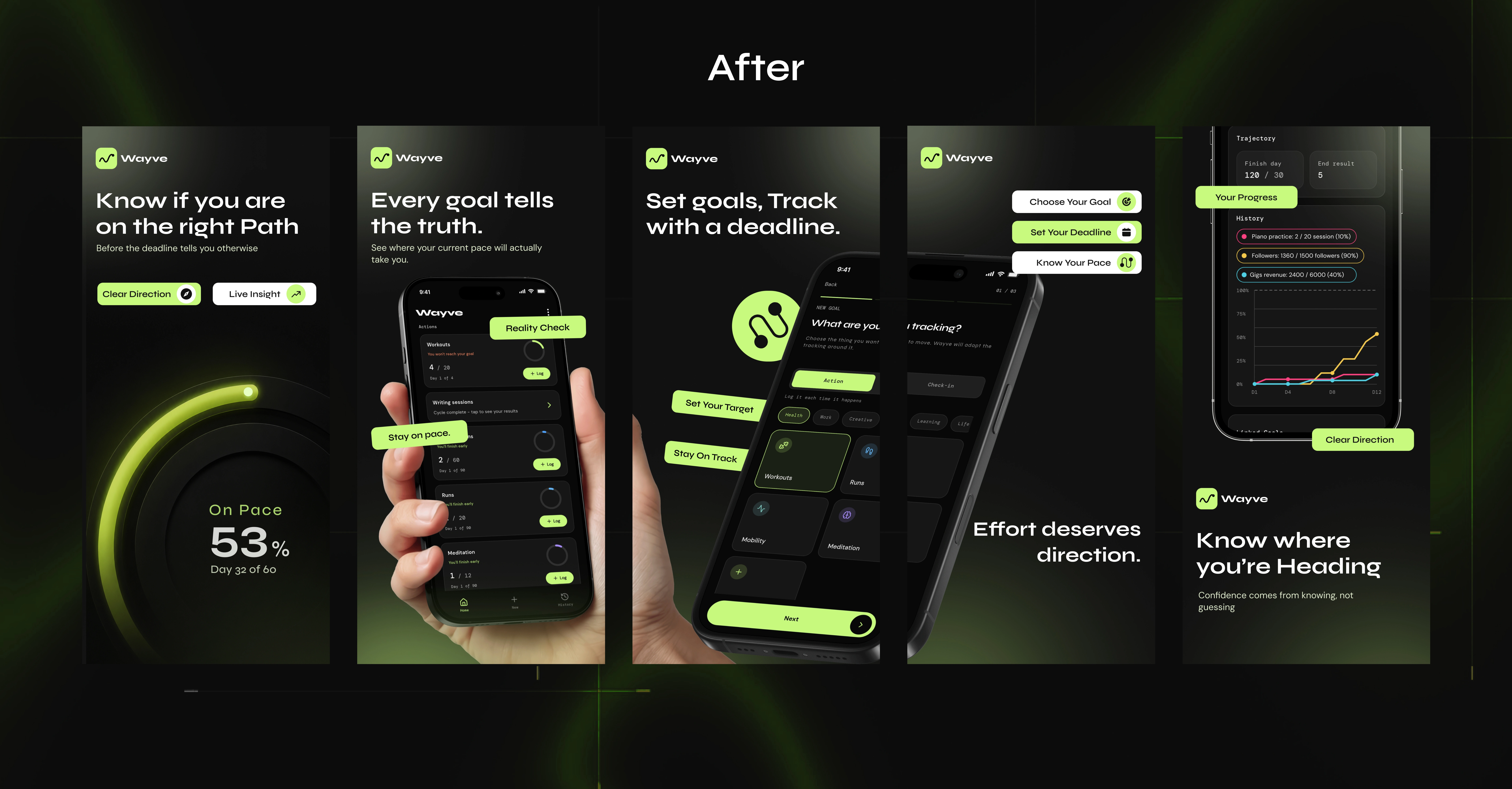
After I redesigned
Key Takeaway
App Store screenshots need to do more than display an interface. They need to answer a simple question before the next listing gets tapped:
Why should I choose this app?
screenshot showcase
Like this project
Posted Aug 7, 2026
A redesign of Wayve’s App Store and Google Play screenshots, built to communicate its goal-tracking value faster and more clearly.
Likes
7
Views
29
Timeline
Aug 6, 2026 - Aug 7, 2026
Collaborators