The network for creativity
Join 1.25M professional creatives like you
Connect with clients, get discovered, and run your business 100% commission-free
Creatives on Contra have earned over $150M and we are just getting started
Back to feedPost

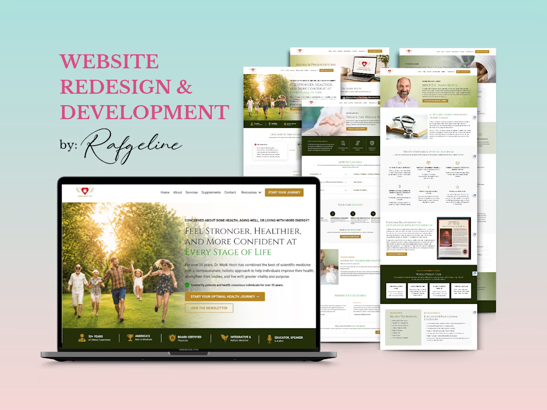
Sharing a website migration and redesign project I completed for Dr. Mark Hoch a few months ago!
His website was migrated from WordPress to Kajabi, with a fresh, streamlined design focused on improving user experience, simplifying content management, and supporting future business growth.
From website migration to Kajabi setup and integrations, every detail was designed with functionality and growth in mind.
Curious to see the finished project? Check it out
#KajabiExpert #WebsiteMigration #KajabiWebsiteDesign #WebDesign


You've done well !

Moving the site and its integrations together makes the handoff worth testing as one journey. I’d include the old WordPress URLs in that check: follow a saved link through to the right Kajabi page, then test its form and confirmation email. Existing visitors can arrive through very different routes from the new homepage.
The network for creativity
Join 1.25M professional creatives like you
Connect with clients, get discovered, and run your business 100% commission-free
Creatives on Contra have earned over $150M and we are just getting started





Related posts


New case study - tash.cards, a Y Combinator backed platform for investing in graded sports cards. Identity design, commissioned by baked.design
The heart of the system is a pattern language taken from security printing. Every letter of the wordmark becomes a guilloché tile, like the engraving on banknotes and certificates, and tiles combine into endless patterns.

Nice!

Some details from my latest redesigns project
🔗 codex.io


Here's something I find fascinating about financial product design: the cleaner the interface becomes, the more authoritative the numbers can appear. But visual confidence and statistical confidence are two very different things.
A beautiful dashboard can make an uncertain...

How do you make a construction brand feel consistent from a business card to a building site?
Brixon’s identity brings angular lettering, an assembled geometric symbol, and a lime, black, and white palette together.
I carried those elements into stationery, brand guidelines, team identification, social graphics, and site signage, then brought the system into motion with Adobe After Effects.
The connecting decision: keep the geometry and layout structure consistent while the logo details, messages, and application previews change within the animated panels.
My contribution covered brand design, graphic design, and motion design.
What draws your attention first: the wordmark, the lime palette, or the rotating symbol?
See the full Brixon case study. If you’re shaping a construction or development brand, I’m available for brand identity and motion projects.

Incomparable work!