The network for creativity
Join 1.25M professional creatives like you
Connect with clients, get discovered, and run your business 100% commission-free
Creatives on Contra have earned over $150M and we are just getting started
Back to feedPost

Some details from my latest redesigns project
🔗 codex.io


great job

The dark UI really suits the subject — a prediction market is data-dense by nature, and this stays readable instead of turning into a wall of numbers. The phone mockup with the coin trail is a nice touch too; it makes the whole thing feel like a product, not just a dashboard. Clean redesign.

This is so good 😍

Nice!
The network for creativity
Join 1.25M professional creatives like you
Connect with clients, get discovered, and run your business 100% commission-free
Creatives on Contra have earned over $150M and we are just getting started



Related posts


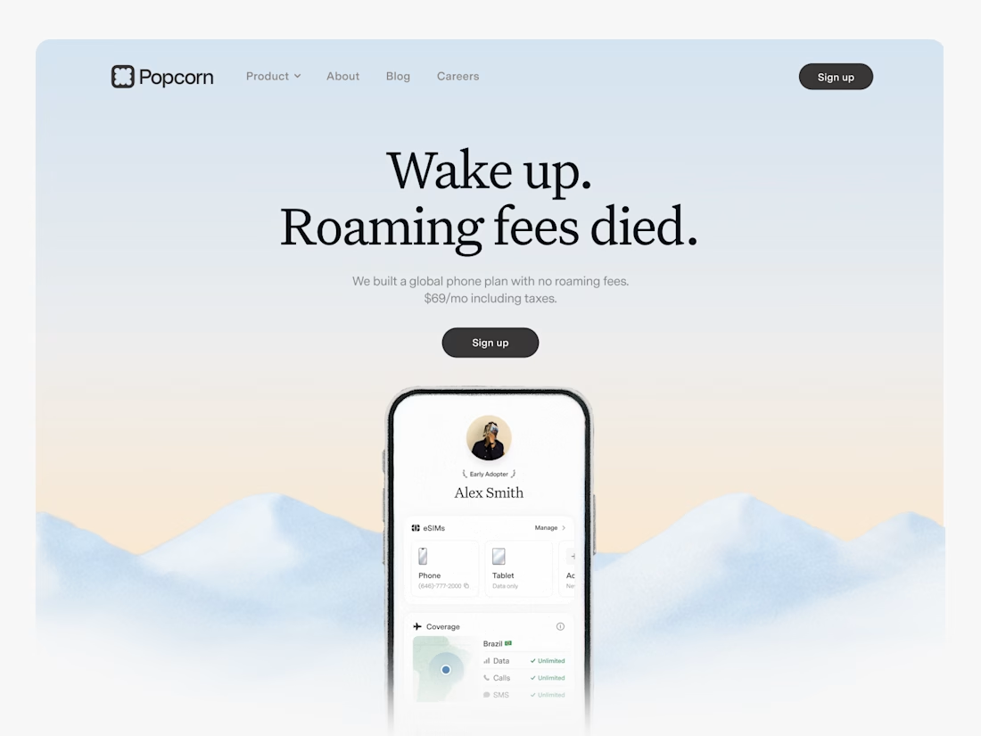

Looks great! What about readability though?
Text seems low contrast to me. Although I have a poor vision and most things seem too small and low contrast to me.

🎨 Brand and web design for Nura, the AI tool for real estate
See Case Study here


Amazing work

Website & Branding for Blockchain Payments Consortium (Mysten Labs)