The network for creativity
Join 1.25M professional creatives like you
Connect with clients, get discovered, and run your business 100% commission-free
Creatives on Contra have earned over $150M and we are just getting started
Back to feedPost
Taste Test
I need your help, which one would you choose A or B?
My only concern with B would be too much white space in the default state 🤔

44 voted
49%
45 voted
51%
89 votes
Closed
B for sure — the white space actually makes it feel premium, not empty
thank you!!
also thinking about doing it like this!
I will prefer the B
thank you!
B looks like a much better animation with easing, A reminds me the early days of pure CSS hover effects, then designers needed to use javascript plugins/codes to create smoother animations, now it's a few clicks in Framer :))
thank you!! and omg I could never lol
Oh if you were a "dinosaur" designer like me, learning web design in 2000s, you would, but I'm glad you can get the outputs of your talent without those technical limitations, thanks to tools like Framer! 🙌 👍
Of course, A is always the predecessor of B. I like A.
would go with B
Going for A, feels more natural for me variant B animation when on hover contradicts user`s intent, because on hovering person wants to see the product closer or do smth, variant B shows photo escaping from the user
Totally understand what you saying and I agree, just wanted to make something a bit different
And it looks super nice and clean 🔥
thank you!!
B - more aesthetic and seamless animation, even though both are great.
thank you!
A - Preferred if the transition was smoother.
B - Better transition, but I feel like there's too much happening at once. I don't really know where to look.
thank you for the feedback!
B because smoth is just right. While A looks like a lag a bit
B because smoth is just right. While A looks like a lag a bit
I like B but I do have a question. Why shift/hide the primary call to actions? I'm wondering if you could do something like keep the CTAs and have that shrink vertically on hover as the image gets bigger?
makes sense, it was just a design idea, not the best ux if being honest though
I would recommend that the options start from A and then B on the right.
I think B is better, elements are jumping around on A and you definitely don't want that for users
I like A😍
B for sure just with a more refined animation would be my preferred 👌
A for me. Hopefully all the product photo is the same dimensions. The B is a bit confusing - if you hover to bookmark, the icon moves to a different location, which is odd.
Def B.. It looks soo smooth 🔥
A looks way better from an interface standpoint but B's Animations make it look more polished, Try adding the same animation in B to A and see
thank you!
You're Welcome🚀
B looks better because the hover effect is smooth and fits the colors and style
Both are fantastic use any of it we support it
thank you!
B looks so much better.
This is top notch
As an animator, I'd choose B, very smooth
The network for creativity
Join 1.25M professional creatives like you
Connect with clients, get discovered, and run your business 100% commission-free
Creatives on Contra have earned over $150M and we are just getting started
Related posts
Fine-tuning is the hardest part of vibe coding. Spent way more time than expected on a small card hover experiment in Claude to prove it.
The updated pricing section for the new UI Flip website - ✅Done
Although I'm quite flexible, I prefer to keep it as simple as possible here.
No packages. No tiers. No "contact for quote."
Built this super customizable capacity chart with Claude Code + Framer MCP 🔥
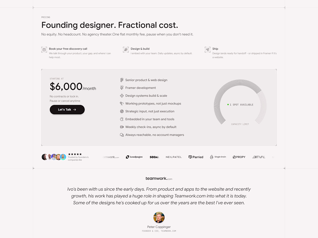
The capacity meter is smart psychologically.
Hey team,
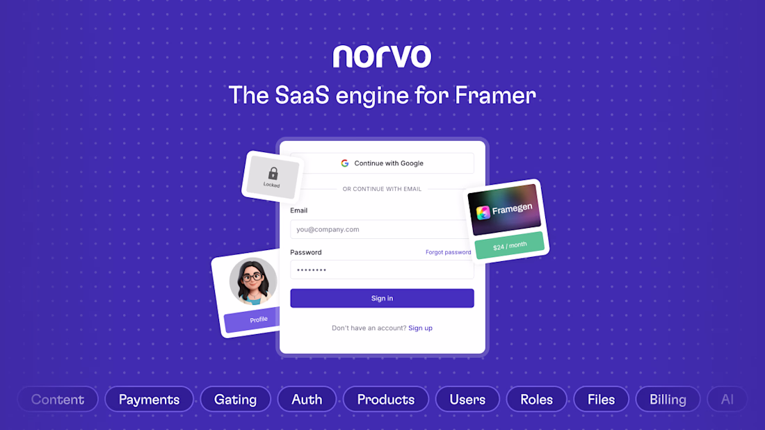
I am looking for a few Framer designers who would be interested in helping to test Norvo – The SaaS engine for Framer, in exchange for a lifetime account.
Every feature your Framer site needs to behave like software — auth, billing, AI, 60+ components, and backend logic — from one platform.
If you regularly use Framer to build templates or client projects, I'd love you to test Norvo & share your feedback.
Comment below or reach out if interested.
Hey Chris,
I saw you’re looking for Framer designers to help test Norvo. Would love to help you because a product like Norvo is special.
I regularly use Framer for client SaaS projects, so I can provide practical feedback from a real-world design workflow perspective.
You...
Trending
Claude
Claude has entered the design space. How are you using Claude Design?
Contra University
Learn from expert creatives how to earn more using next-gen AI tools.
creativeaiflow
Creative AI workflows are evolving. What tools do you use, and what are their strengths and weaknesses?
portfolioreview
The best portfolios tell a story, not just show a grid. Share yours for feedback.
freelancerlife
Freelancer life is wins, pivots, and everything in between. What’s yours right now?