
pro
Emmanuel Bliss
I design products people don't need help using
- 1x
- Hired
- 5.00
- Rating
- 62
- Followers
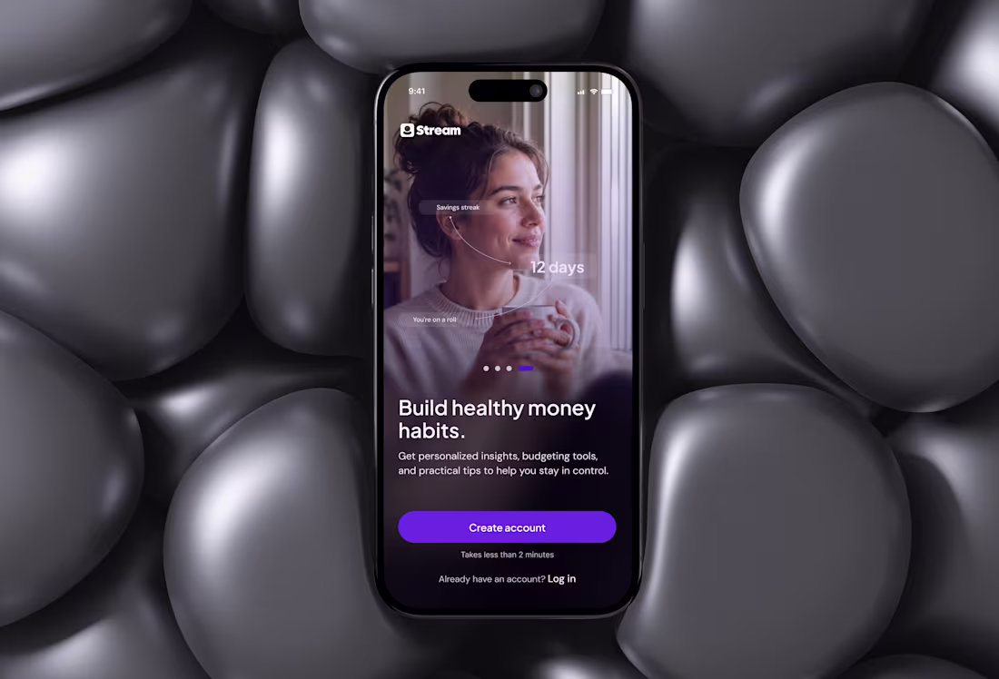
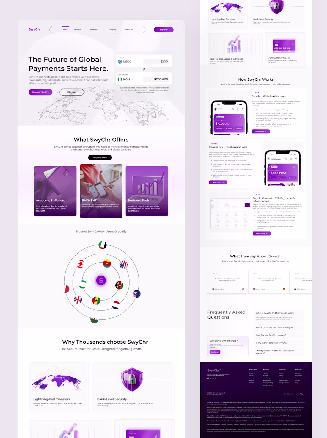
Swychr: Rebuilding a Global Payments Experience
0
0
Health In Tech - Website Redesign (Spec Project)
4
5
Soul & Skin - Skincare Hero Redesign (Spec Project)
1
2
WageStream Onboarding Redesign (Spec Project)
1
1
1P Algorithms - Product-Led Hero (Spec Project)
2
1
1
1
4
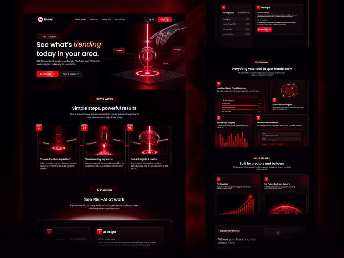
Riki AI - AI-Powered Marketing Platform Landing Page Design
2
3

Auren - Luxury Hero Design (Spec Project)
0
0
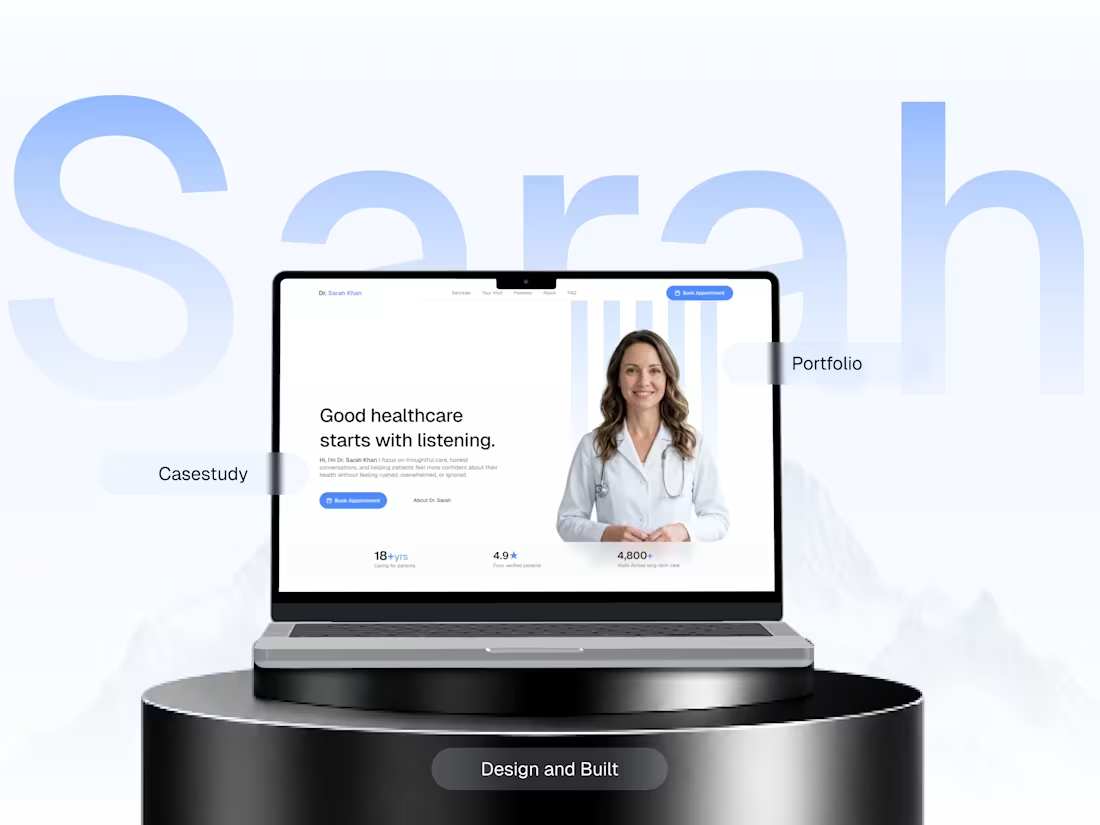
Dr. Sarah Khan - Portfolio Website (Spec Project)
4
3
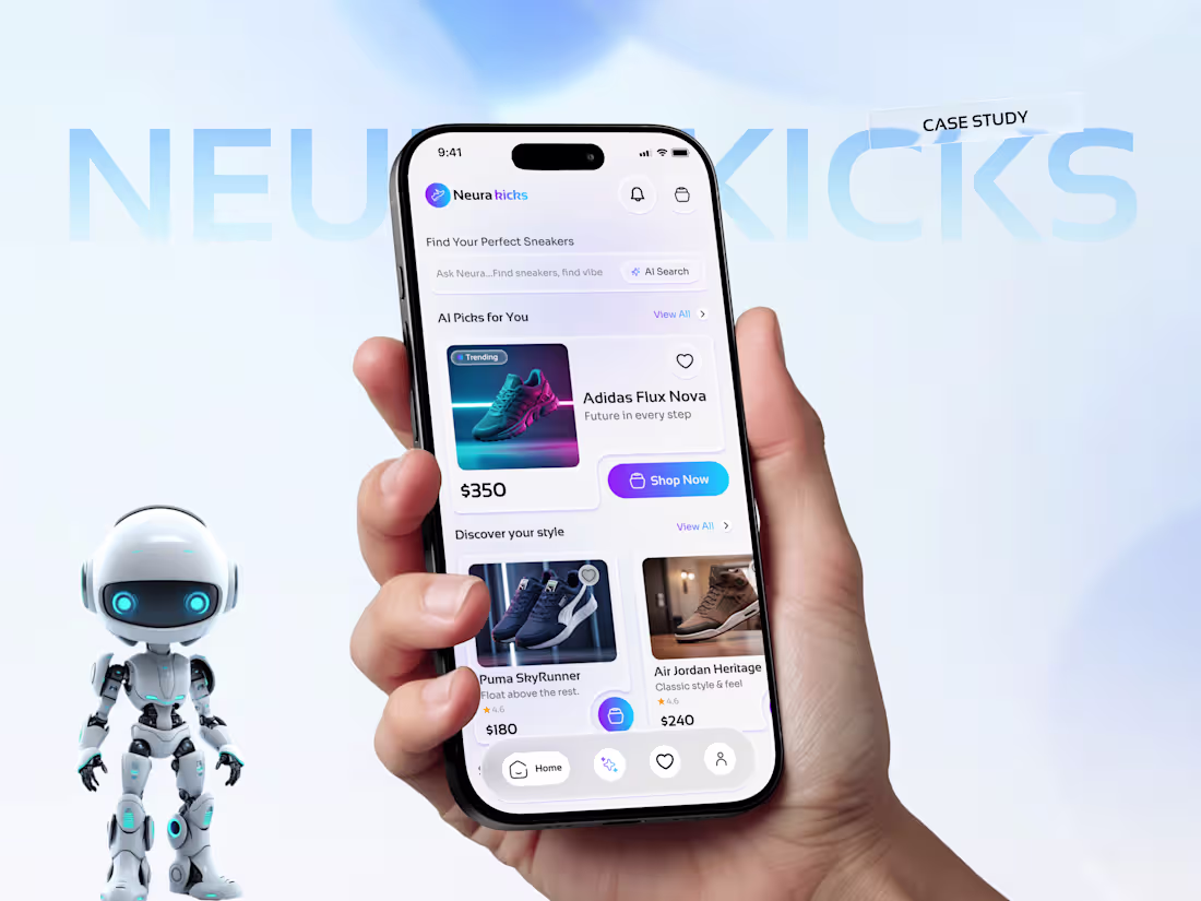
NEURA Kicks - AI Sneaker Shopping App (Spec Project)
3
3
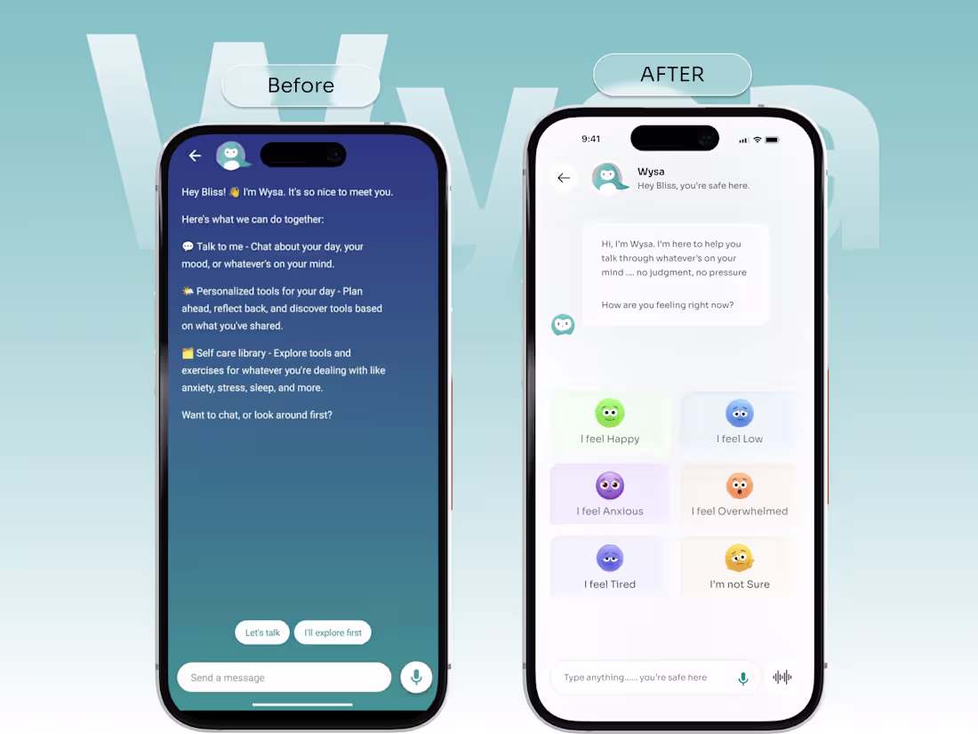
Wysa - Mental Health Chat Redesign (Spec Project)
1
7
This is a fintech app called Swychr, lemme give you a story..
I’ve been working on this product for some time now.
so this is it
They already had an old design, but I noticed the design wasn’t really helping users understand the app or transact without someone explaining it to them.
So I did some research and last year I pitched my findings to the team.
I showed them what users were struggling with, why people were confused, and why the product wasn’t growing the way it should.
After the conversation, they understood the problem and bought into the idea.
Since then, I’ve been working with the company, and the CEO has been really happy that I came on board.
They’re launching Swychr 2.0 this month, a much clearer product that users can actually understand and use without stress.
P.S don't turn blind eyes on your product UI..
2
4
332
Do you agree this is how a High Converting WEBSITE for fintech should look like
1
300