The network for creativity
Join 1.25M professional creatives like you
Connect with clients, get discovered, and run your business 100% commission-free
Creatives on Contra have earned over $150M and we are just getting started
Back to feedPost

CHARGE — Brand Concept
Challenge
The focus gum category is crowded with products that rely on functional claims, lifestyle clichés, or overly clinical branding. CHARGE needed a visual identity that immediately communicated energy, confidence, and momentum while feeling premium enough to compete on modern digital shelves.
Idea
Energy. Focus. Go.
The concept treats focus as movement rather than concentration. Every graphic element—from bold typography and angular compositions to kinetic motion and athletic photography—reinforces the feeling of acceleration.
Rather than telling people they’ll feel energized, the brand is designed to make them feel energized the moment they encounter it.
Visual Language
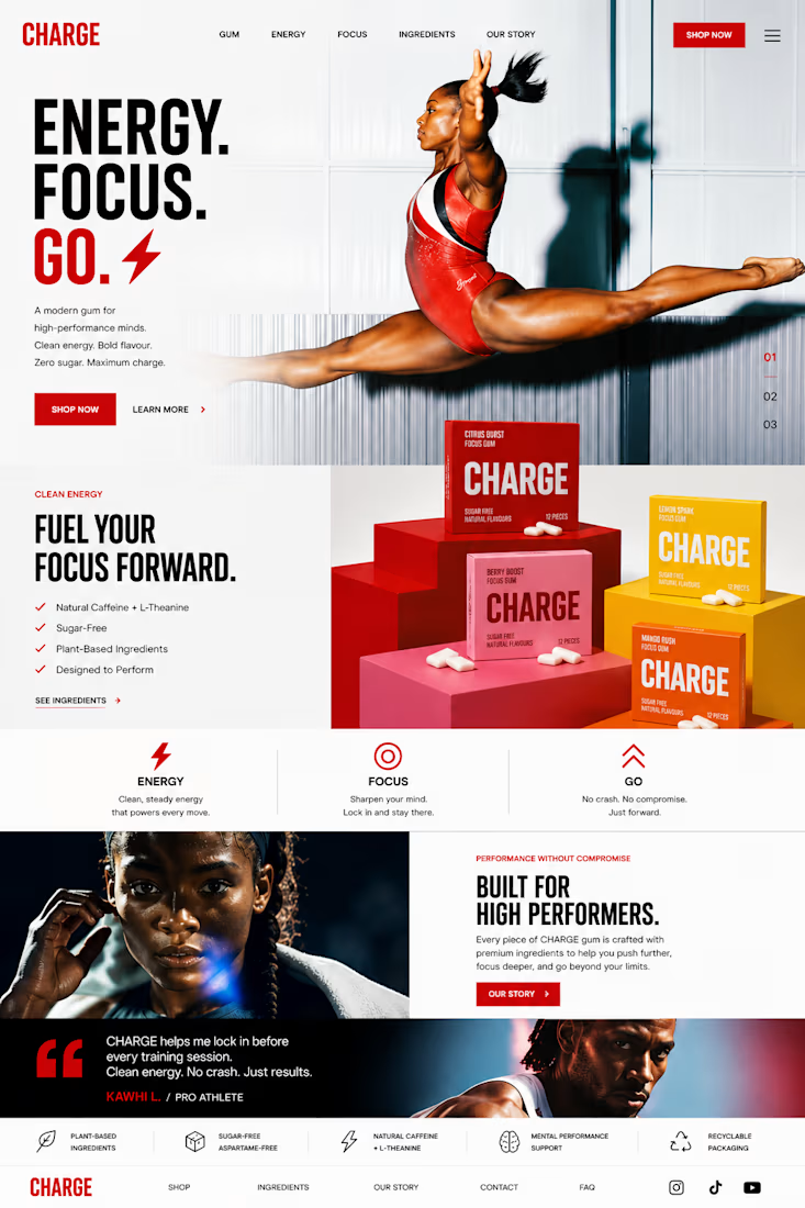
A bold, high-contrast design system built around oversized typography, dynamic geometric forms, clean white space, and vibrant product colors creates an instantly recognizable identity. Bright lifestyle photography captures moments of determination, speed, and achievement, while the colorful packaging becomes a hero element across every touchpoint.
Motion System
The motion language is driven by momentum. Type slides with purpose, products snap into frame, athletes move through fast cinematic cuts, and macro product moments add tactile detail. Every transition is quick, precise, and intentional—mirroring the instant boost associated with the product.
Photography
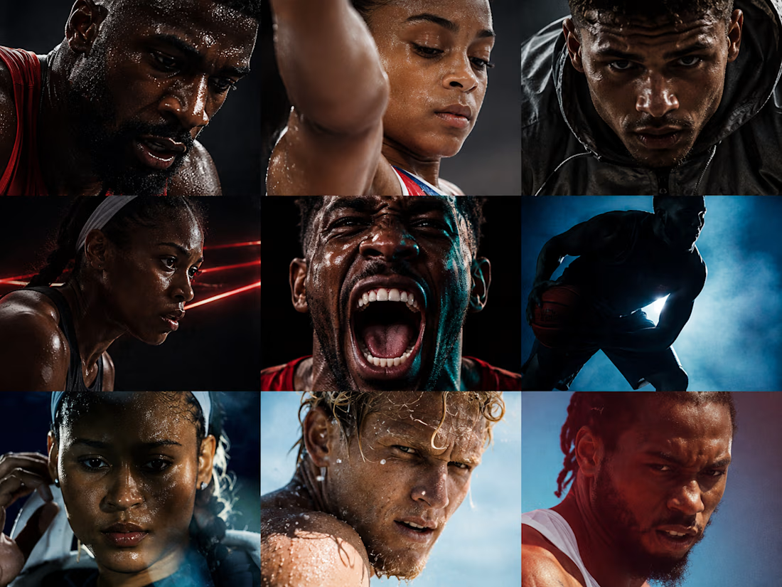
Instead of generic fitness imagery, the photography celebrates peak performance across multiple sports and disciplines. Powerful portraits, dynamic action, and vibrant outdoor environments create a feeling of optimism and forward motion while reflecting a diverse community of high performers.
Outcome
The result is a contemporary consumer brand that feels energetic, premium, and highly scalable. The identity extends seamlessly across packaging, social media, motion graphics, advertising, digital experiences, and retail—creating a cohesive brand system that is memorable both on shelf and on screen.




Awesome work!


Really like the direction here. The idea of making focus feel like movement is such a strong angle. The whole system feels energetic without losing the premium side.

Love the energy!

Brilliant work man 🙌

Stunning attention to detail! Every single element feels intentional and perfectly placed. Great job!

Top tier


Incredible identity, clean work!

Treating focus as movement instead of concentration is a sharp reframe, most gum brands default to clinical or minty-clean visuals instead. The kinetic macro shots are doing a lot of the heavy lifting here. Was that photography direction locked in from the start, or did it come...

Dope but looks like AI, tough the last 2 faces are extremely realistic, good call on those.
The network for creativity
Join 1.25M professional creatives like you
Connect with clients, get discovered, and run your business 100% commission-free
Creatives on Contra have earned over $150M and we are just getting started
Trending

Claude
Claude has entered the design space. How are you using it?

Contra University
Learn from expert creatives how to earn more using next-gen AI tools.
Brand Design
The best brand designers are on Contra. Scroll to see what's trending in brand design. What are you building?
creativeaiflow
Creative AI workflows are evolving. What tools do you use, and what are their strengths and weaknesses?
freelancerlife
Freelancer life is wins, pivots, and everything in between. What’s yours right now?


Related posts

Which label direction would you have chosen?
These are two routes I explored for a refillable cleaning products brand. The brief had two clear goals: make the brand more recognizable on the label, and introduce scent-coded colors so customers could actually tell products apart at a glance.
The difference:
Contained: the label content lives inside a bold border in the brand's primary color, making it more eye-catching. The scent name sits large at the bottom.
Open: the label is wider, cleaner, more minimal. The scent name sits just below the logo.
Which one works best for you and why? Vote below and once the votes are in I'll reveal which direction the client chose. 👇🏽
14 voted
20%
55 voted
80%
69 votes
Closed


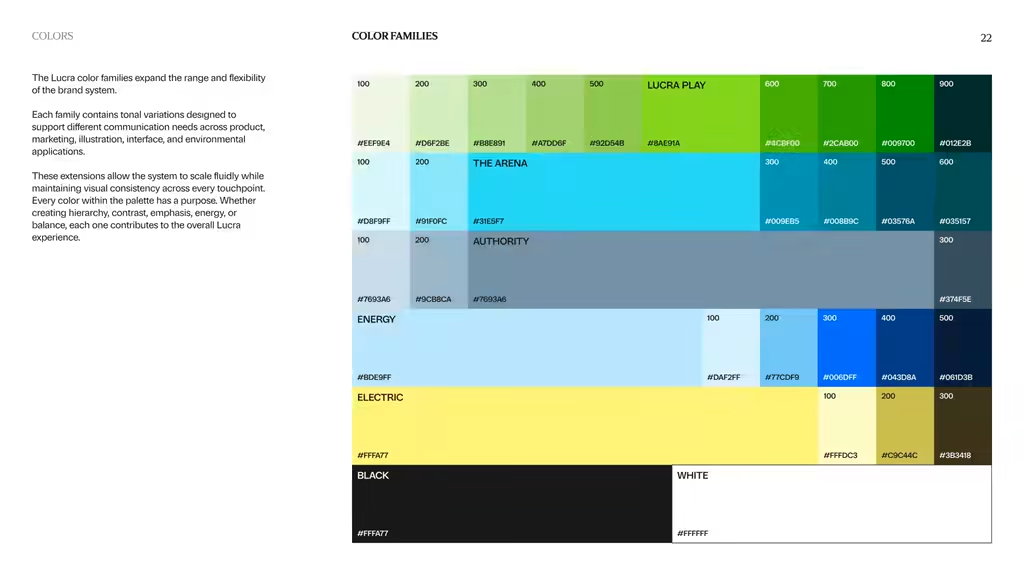
The Lucra Brandbook
The brandbook is the least glamorous deliverable and the most important one.
It's the document that makes every future decision faster, the one a new hire, a freelancer, or an internal marketing team can open and immediately know how the brand should look, sound, and behave. Good brand work isn't just a nice logo. It's a system someone else can run without you in the room.
A look inside a recent brandbook.
PoW - https://contra.com/studioduo
Let's talk about your brand identity and Website design needs
Schedule a 15min Discovery call here https://cal.com/digitalforus/15min?overlayCalendar=true



Love the Colors!

This took a day to edit.
It went fast because we'd already done the hard part. We learned Athena's business and built a narrative spine. One spine spawns fifty assets, and this video is just one of them.
Now we make their content on a rolling basis.
Speed and quality. You can have both.


Great work!