The network for creativity
Join 1.25M professional creatives like you
Connect with clients, get discovered, and run your business 100% commission-free
Creatives on Contra have earned over $150M and we are just getting started
Back to feedPost
Taste Test

Is minimalism doing this label a favor, or losing what made it charming? 🤔
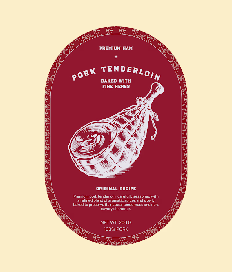
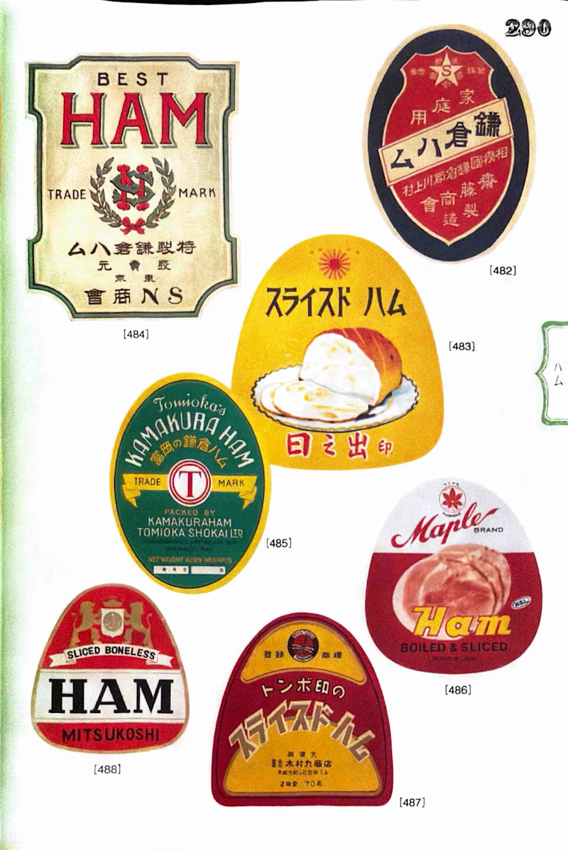
Found this while flipping through a Japanese book of vintage canned food labels and decided to give one a rework. Same ham, completely different shelf presence.
Vintage approach: hand painted illustration, full color, a lot happening at once.
Modern approach: vectorial line work, no color, one pattern and narrow type system holding the whole label together.
I need to know, if these two were sitting next to each other in a store, which one would you actually reach for?

43 voted
61%
27 voted
39%
70 votes
Closed

I prefer the Vintage Approach.
Sort of related: When I was reading your description for the Modern Approach and you wrote "...no color...", I suddenly remembered an article I read some time ago that talked about "how the world has gradually been losing its color" especially in...
Oh I read that article, it's actually really interesting that you brought it up. I agree!

Anita Both are great😊
Well thank you! But which one would you choose if you had to?
Maybe Vintage Approach
Cool!!

vintage wins it for me, It always has

Superb work

I personally prefer Vintage not just because of how it looks, but because of what the product is and the psychological effect it creates. It’s more about how close and familiar it feels to me, not simply that it looks better. It’s what I’m used to.
I always think of it like my...
Awesome input, I really appreciate it!

Both would grab my attention. For food I think it would depend on other details, but there's something so cool about how they used to use typography in the past. 🥹
I agree, and also the illustrated elements look more "crafty" and "home made", do you know what I mean?

I think I agree!!


vintage for me tbh, the hand painted bit is the whole charm

Both approaches work beautifully in their own way.

Modern Approach

this really amazing

I will go for the Vintage. The hand-painted illustration and layers of detail give it so much character. The modern version is beautifully restrained, but the vintage label feels more memorable and has that charm you don’t get from minimalism alone.
The network for creativity
Join 1.25M professional creatives like you
Connect with clients, get discovered, and run your business 100% commission-free
Creatives on Contra have earned over $150M and we are just getting started









Related posts

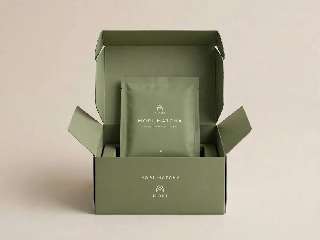
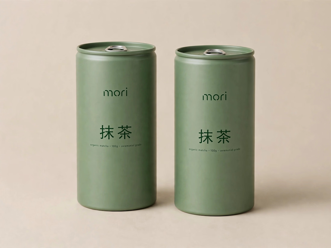
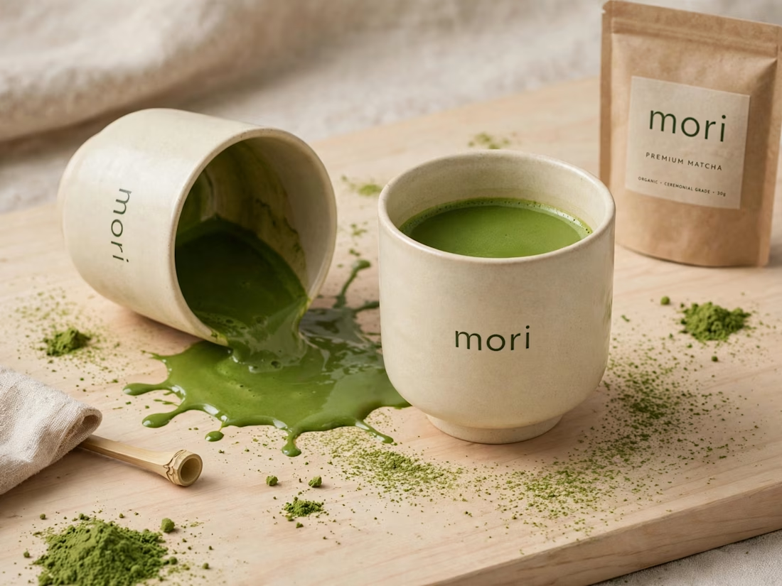
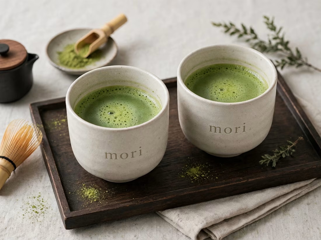
more visuals from my latest project — mori matcha 🍵
explored minimal Japanese packaging with earthy greens and calm typography.
focusing on premium ceramic cups and clean can design.
#branddesign #packagingdesign #visualidentity #brandstrategy #matcha #minimaldesign #japanesedesign #figma #mockup #branding




A little peek at the brand work we did for Elio Mortgage.
A warm, approachable identity full of warm vibrant colors paired with soft sun rising inspired gradients, inner glows and custom illustrations & more. Loved this direction!
Full case study coming soon, from process to final identity.
Plenty of logo explorations to share too!


That color palette takes the whole identity to a different level!! I loove it.

Hey everyone! 👋
Working on Cortiva, an AI-first hospital branding project.
I've already finalized the color direction, but I thought it would be fun to explore two different moods.
Option 01💚 or Option 02? 💜
Both have their own personality, and I'm curious to see which one you prefer!
Let's see which one wins! 👀
5 voted
33%

10 voted
67%

15 votes
Closed

Both directions are strong, but I'm leaning towards Option 01. The green feels instantly like "care" and trust, which is perfect for a hospital. Option 02 looks more techy and premium. Curious, which mood are you aiming for - clinical and calm, or friendly and modern?