The network for creativity
Join 1.25M professional creatives like you
Connect with clients, get discovered, and run your business 100% commission-free
Creatives on Contra have earned over $150M and we are just getting started
Back to feedPost

An unused logo concept exploring the letter N through a clean, geometric construction. The mark balances simplicity with a distinctive silhouette, creating a versatile identity that feels modern, confident and memorable.
Although it never made it into a final brand, it's a reminder that strong ideas don't always need a client to exist. Sometimes the best concepts are the ones waiting for the right opportunity.

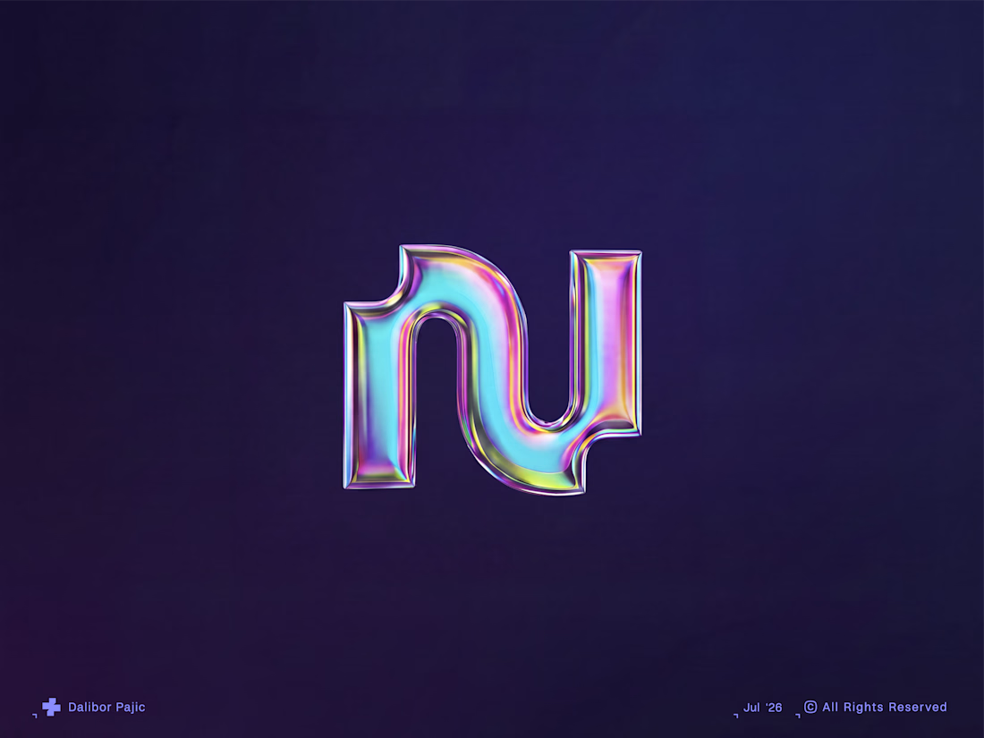

Strong ideas don't always need a client to exist is a great way to frame it, that chrome finish gives it a lot of presence even sitting unused. Do you keep a personal archive of concepts like this to pull from later, or does each one just live and die on its own?
The network for creativity
Join 1.25M professional creatives like you
Connect with clients, get discovered, and run your business 100% commission-free
Creatives on Contra have earned over $150M and we are just getting started
Related posts

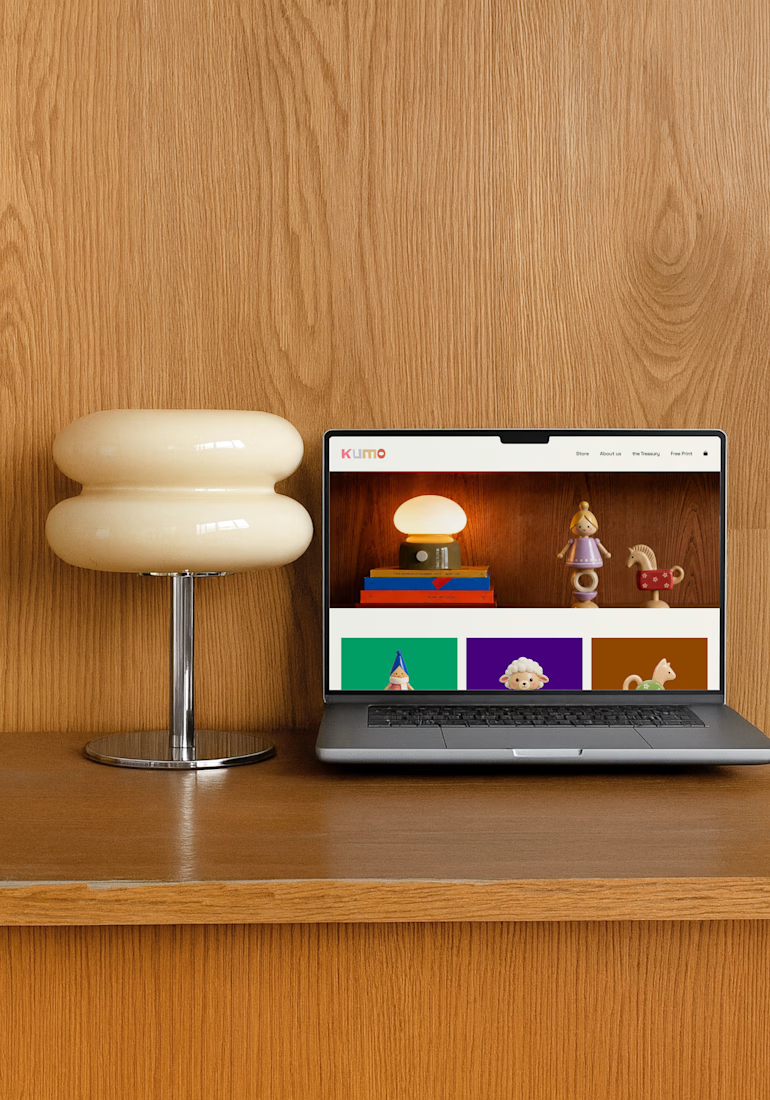
For this challenge, I created KUMO, a playful toy brand from scratch 🧸✨
I designed the toy characters, developed the branding, created custom mockups, and designed a website to bring the whole world together. I used Envato throughout the creative process for visuals, assets, experimentation, and refinement, while Suno helped me create the background music 🎵
From the toys to the website, I wanted every detail to feel playful, cohesive, and part of the same nostalgic world.



so cool!!

What started as friends scheduling weekend classes somehow evolved into a community that partners with studios and hosts events.
Naturally, I couldn't resist giving it a brand identity 🥴
Here's the visual system I created for Pilates Pals, inspired by movement, connection, and making fitness feel a little less intimidating.


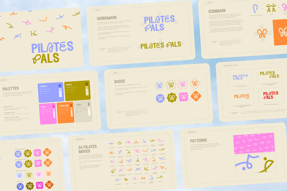
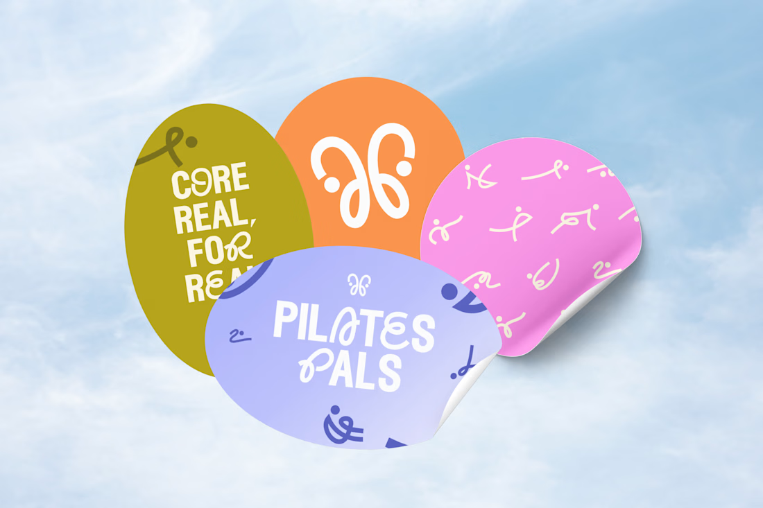
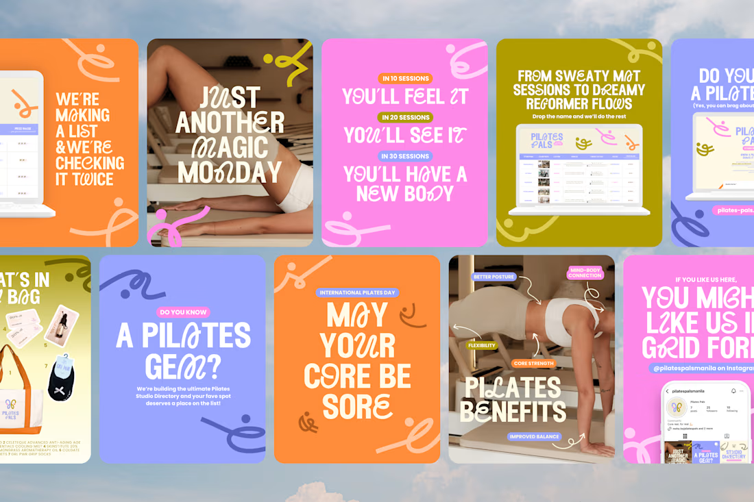

the branding, the posts, the logo, the deck. soo good
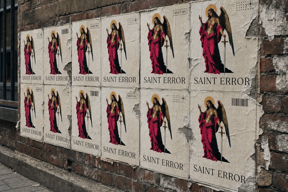
there's a patron saint for every broken export, dropped frame, and corrupted file, I gave him a sword, a halo made of static, and a full brand system to go with it.
saint error is live.
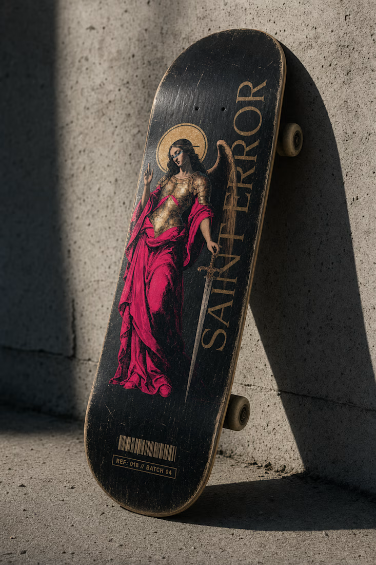

Awesome work man, as an ex skater I had to point out the glitch in the skateboard render since it's flipped upside down. 😅 The wheels and the trucks are supposed to be on the (back) visible side, not on the sandpaper haha.







Trending

Claude
Claude has entered the design space. How are you using Claude Design?

Contra University
Learn from expert creatives how to earn more using next-gen AI tools.
creativeaiflow
Creative AI workflows are evolving. What tools do you use, and what are their strengths and weaknesses?
freelancerlife
Freelancer life is wins, pivots, and everything in between. What’s yours right now?