The network for creativity
Join 1.25M professional creatives like you
Connect with clients, get discovered, and run your business 100% commission-free
Creatives on Contra have earned over $150M and we are just getting started
Back to feedPost
Added a new case study! This was such a fun project: a rebrand for a local cookie company.
Our goal was to transform the brand into something that felt like an everyday celebration through bold typography, playful details, and a fresh visual identity.
Brand DesignCreative DirectionGraphic DesignAdobe IllustratorAdobe Photoshopfoodandbeveragebrandrefreshbranddesigner



wow sharp

This design is a jackpot for the brand 🙌 Nice work


Nice 👍

Amazing work

so cute! i love how intentional & natural the color palette's variety feels. there's clarity as to how more strongly featured shades factor into brand design while recurring smaller motifs keep the subconscious mind of the consumer tuned into the more detailed elements of your work. warm, whimsical, & super functional!


thank you!! the color palette was super well thought out - we explored a lot of different options

Incredible creativity!


Its a nice project

Officially craving cookies now haha - you did your job perfectly!

nice work! this is so fun


Jackpot is such a good name for a cookie brand, it already implies indulgence before you even see the logo. Rebrands for local food businesses are underrated portfolio pieces, they photograph so well.
agreed 🙌 The client did a great job picking her name!


Awesome

Well done! A thoughtful rebrand doesn't just refresh the visuals, it reshapes the entire customer experience.


This is amazing

Great color combination Samantha

stunning!

Fantastic!

Yummy

Lovely work, is that the typeface or custom font?
It's a typeface (Brice - it's a good one!) But I customized it to make it more playful!

wooohhhhh, thats totally outstanding workkkkkkkkk

Great! Any tips to win projects! 😓
Post your work on social media! You never know who will see it

ohhh! this is beautiful
The network for creativity
Join 1.25M professional creatives like you
Connect with clients, get discovered, and run your business 100% commission-free
Creatives on Contra have earned over $150M and we are just getting started
Related posts

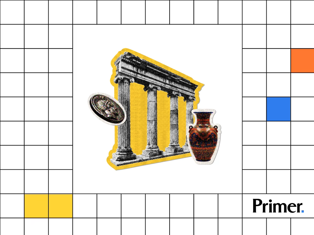
Just posted a new case study featuring the thumbnail artwork I designed for Primer.com. Check it out! 📚


Nice! Thumbnail artwork can make such a difference in how content catches attention. Looking forward to seeing how you approached this project!

Most assistants talk. I wanted one that answers.
Muted Winter: a voice assistant that replies in three words, shows what it is doing with six petals, and dims itself after midnight.
Case study live
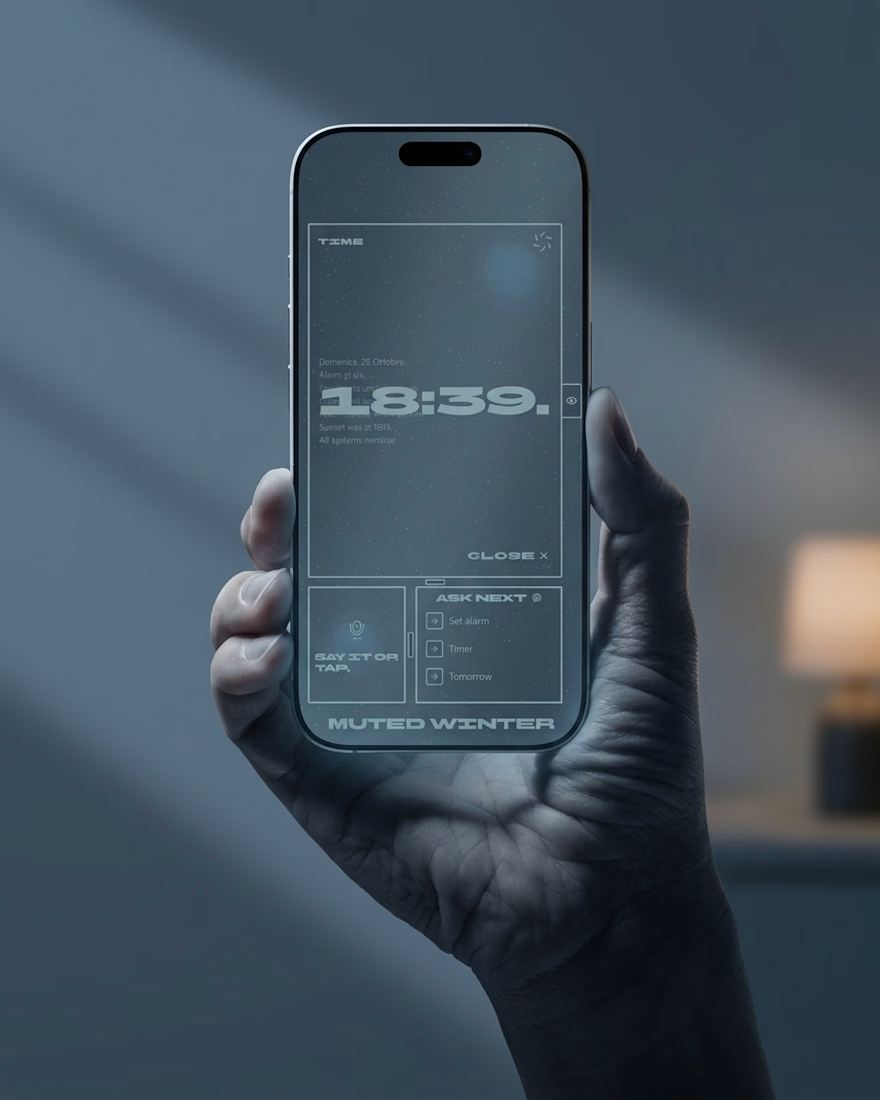
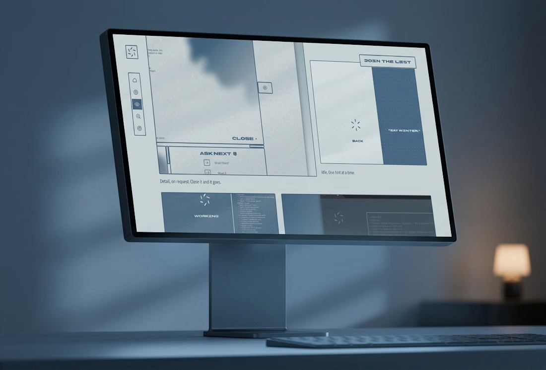
Three word replies is a smart constraint. The petals showing what it's doing is a nice touch.


The Bright Method newsletter just passed 1,000 subscribers on LinkedIn. Didn't expect that when I started it. Thanks to everyone reading.
Read this weeks issue on Linkedin: https://www.linkedin.com/pulse/your-site-said-3-6-7-8-daniel-bright-pvucc

linkedin.com
Your site said 3, 6, 7 and 8
In June, a founder I work with opened his visitor analytics on our call. Qualified enterprise buyers were landing on the site, reading, and leaving.