The network for creativity
Join 1.25M professional creatives like you
Connect with clients, get discovered, and run your business 100% commission-free
Creatives on Contra have earned over $150M and we are just getting started
Back to feedPost

⁕ Full Brand Identity for Trace™
One of the project's greatest challenges was creating an identity that is instantly recognizable and inspires investor confidence, while balancing a futuristic aesthetic with the sense of reliability intrinsic to the brand's values.
The core concept draws inspiration from the cosmos and the brand's drive to transcend boundaries; no matter the distance, the delivery is guaranteed. We translated this visually through patterns forming paths that lead to a destination, a motif that extends to every corner of the visual language.


"The Trace" is one of your best branding works. fantastic execution man

Wonderful craftsmanship! 🚀

Love it!

Balancing futuristic with reliable is the hardest brief in brand, lean too far either way and you lose the excitement or the trust. Trace threads it well, the mark feels engineered rather than trendy. Investors read that as safe hands.

This is awesome!


the path pattern is a neat touch. did it start with the logo?


Awesome work🔥👏👏

Love how minimal yet impactful this is! Truly nice work!

oh the black truck is clean. mockup or full render?

The path motif does more than decorate the system it turns the promise of guaranteed delivery into something structural and repeatable. I especially like how the futuristic direction still feels credible rather than speculative. How did you adapt the path language for very small touchpoints or motion?

Balancing futuristic aesthetics with deep investor trust is absolute top-tier branding execution.

That core concept is so clean. Distance + reliability in one visual idea.

This is brilliant!

The logo just looks and feels so good
Keep it up man!

Really strong hierarchy, the branding know exactly where to go.

stunning work!

the path pattern translating into an actual progress state in motion would be such a clean next step for this system
The network for creativity
Join 1.25M professional creatives like you
Connect with clients, get discovered, and run your business 100% commission-free
Creatives on Contra have earned over $150M and we are just getting started
Related posts


A little throwback to one of our favorite collaborations with Lion Pose! 🧡
We worked with the founders to bring their vision to life through core brand identity, logo, and packaging design, creating a bold, playful visual language that feels fresh in the skincare space.
So lovely to see Lion Pose grow from its early days to the shelves of Sephora, with our packaging work recognized at the 2024 Dieline Awards!


Nice work

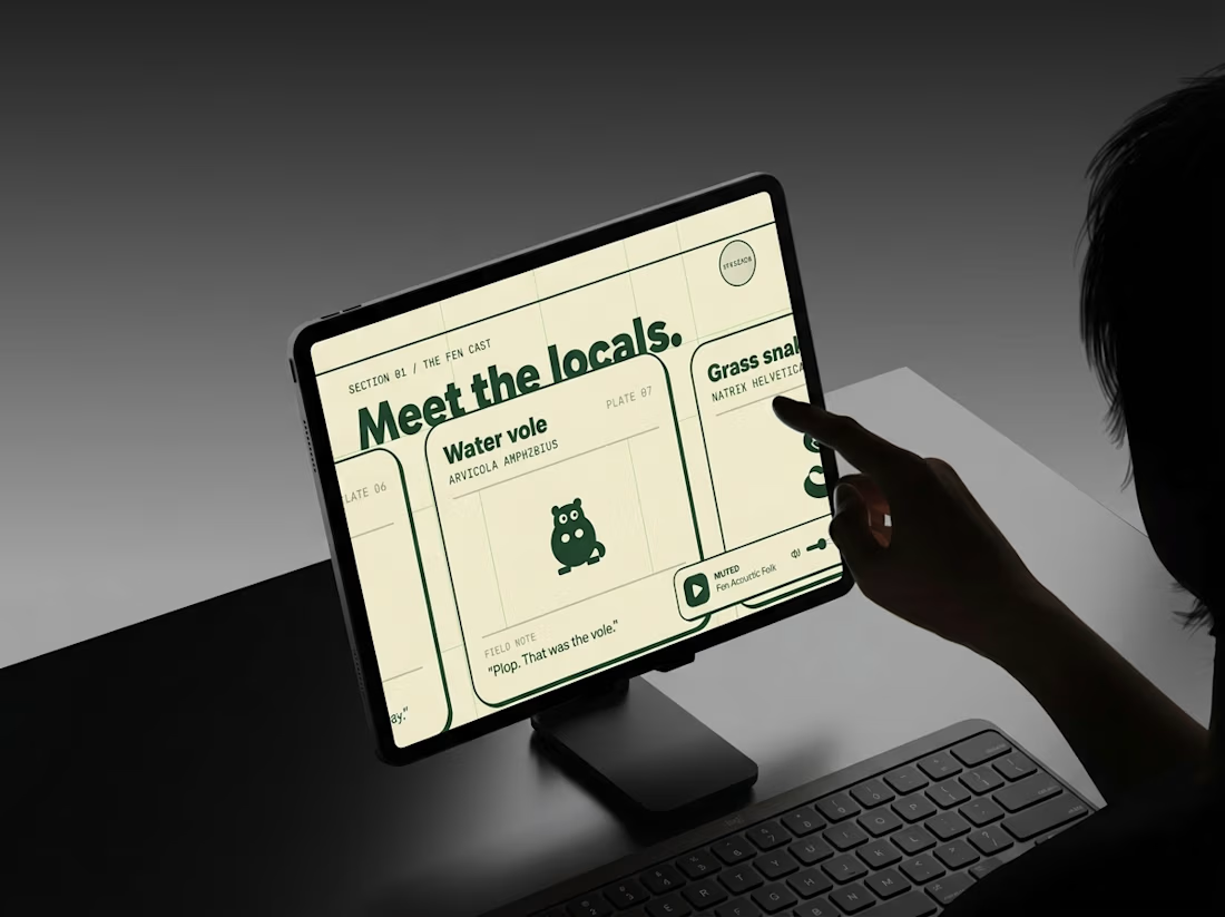
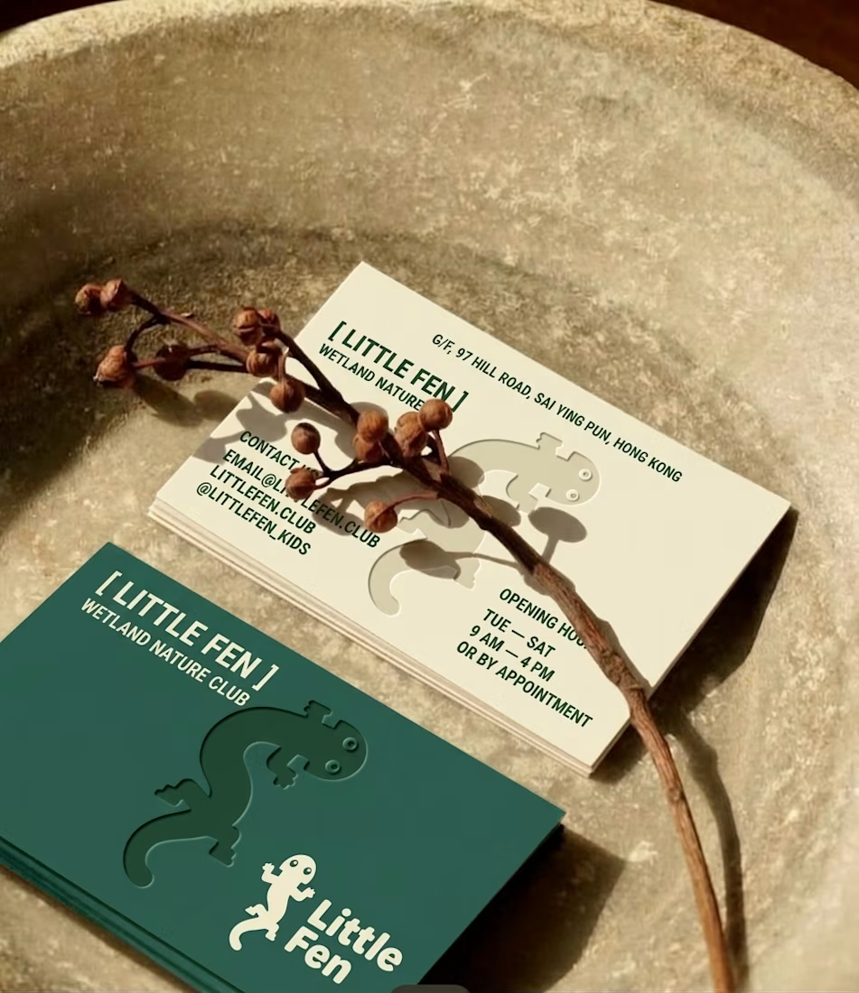
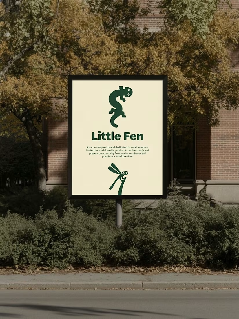
Every creature in this identity is watching you.
Little Fen, a wetland club for kids. 50 creatures. 3 colors. Everyone gets eyes.
Case study drops soon.
Which creature goes first?

Hey Little Fen,
Can you see me?

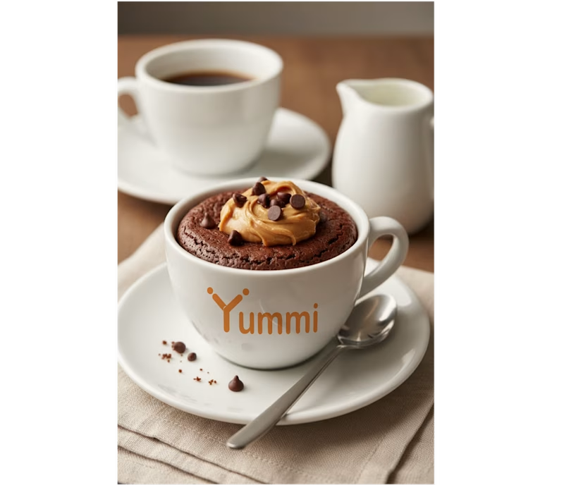
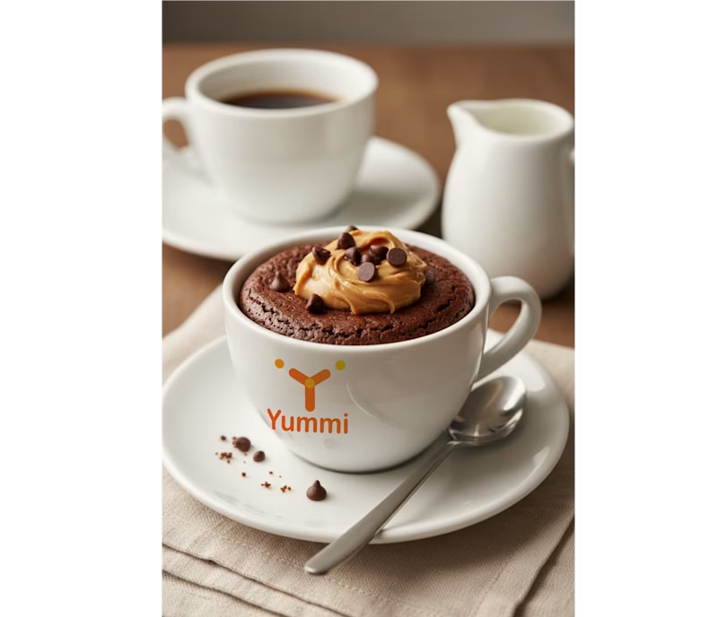
Brand identity concept for Yummi! 🍊 Which presentation do you like more for this brand?
👉 Option A: Clean minimalist log
👉 Option B: Real cafe logo
It's really hard for me to manage which logo is best to look in mokcup designs.
Let me know your thoughts in the comments!
3 voted
43%
4 voted
57%
7 votes
Closed

Smaller is better


