The network for creativity
Join 1.25M professional creatives like you
Connect with clients, get discovered, and run your business 100% commission-free
Creatives on Contra have earned over $150M and we are just getting started
Back to feedPost


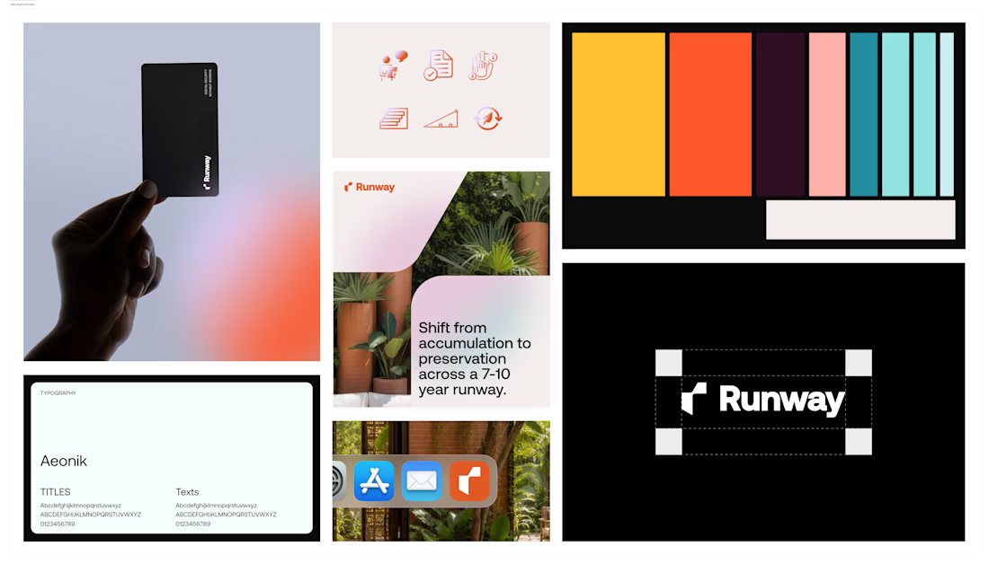

That neon coral-and-teal palette next to the pure black wordmark shot is a strong contrast play. Is the exploration heading toward one direction already, or are you still deciding how far to push the color side versus the minimal black version?


Nice work👏🔥🔥

The orange and purple and Aeonik 😮💨

Amazing work , is Runway a financial technology product?

Cool!

Such a cool iteration of exploration! Really like the palette and logo 👌

Looks Clean! The gradient on the middle post design 😍


curious where this lands, strong start

worth the attention

Pretty good exploration. But why did you think more could be explored about the runway brand system?

Sleek!! love the presentation

Good Work!

Outstanding 👏


Great work, boss!!

The contrast between the bright system and the pure black wordmark is doing a lot of useful work, it lets the colour feel bold without losing the premium feel. If this moved into a website, I would test the black version for the header and keep the colour system for sections and...
The network for creativity
Join 1.25M professional creatives like you
Connect with clients, get discovered, and run your business 100% commission-free
Creatives on Contra have earned over $150M and we are just getting started
Related posts


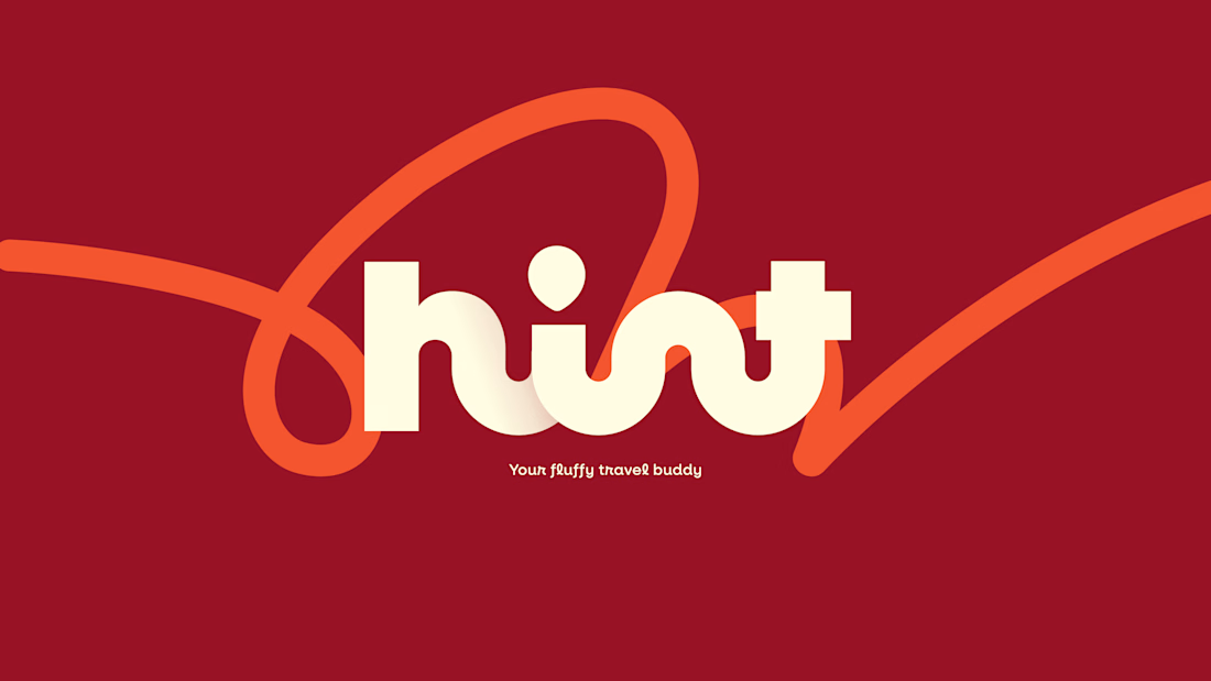

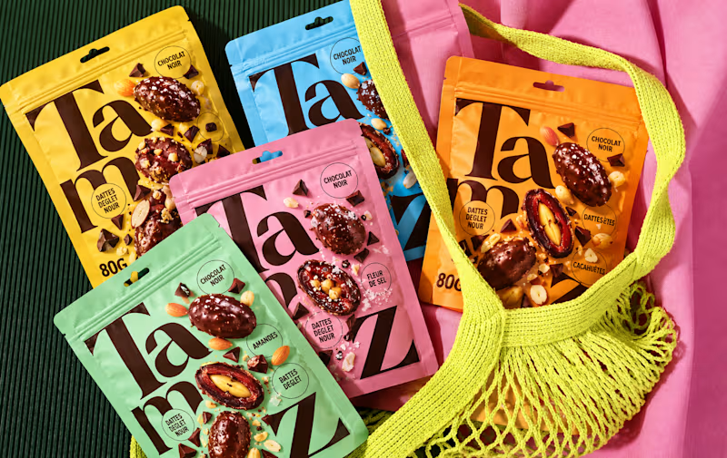
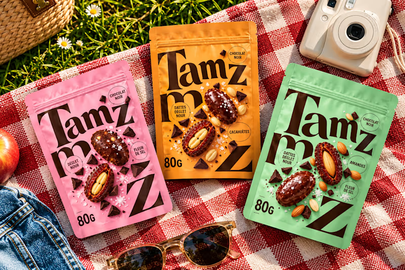
Which option works better? 👀
Option 1: the full lineup with the mesh bag
Option 2: the picnic setup
7 voted
20%
28 voted
80%
35 votes
Closed


option 2 for me, the picnic setup feels like something you would actually want to buy

Inspired by, I'm sharing one of my own concepts that wasn't chosen for the final design, but that I absolutely love.
This idea is so good! We all have concepts hiding in our drafts that never get to see the light of day. I think they deserve their moment, too. ✨
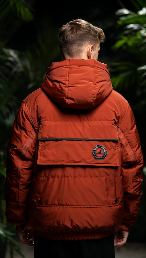
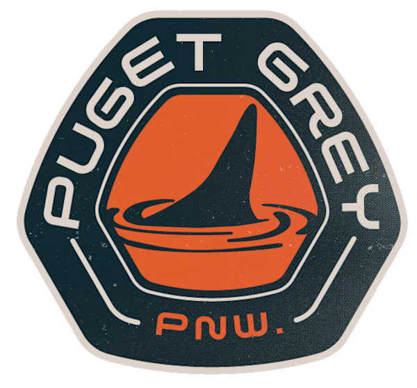
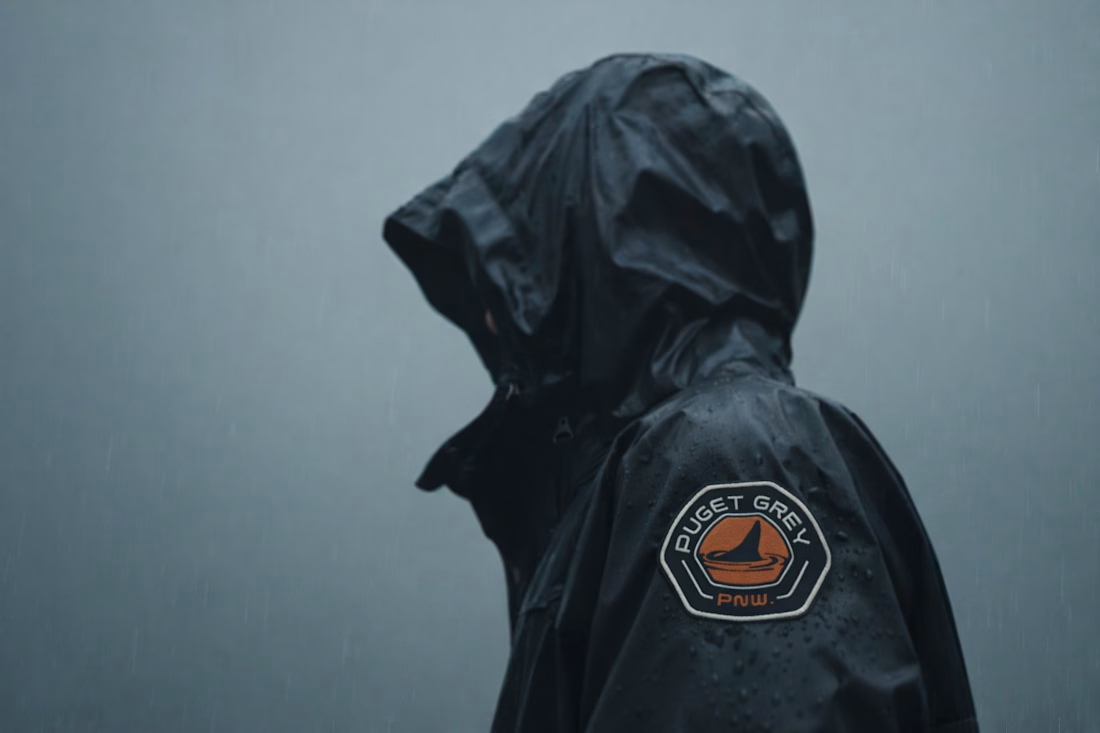

How many concepts die in your drafts folder? 💀
In the spirit of Inktober, a digital sketch that never saw the light.
This was a lettering-inspired brandmark...
