The network for creativity
Join 1.25M professional creatives like you
Connect with clients, get discovered, and run your business 100% commission-free
Creatives on Contra have earned over $150M and we are just getting started
Back to feedPost

New brand!
Antares is a proudly european based industrial production company, and they came to a proud european for their identity! 🇪🇺
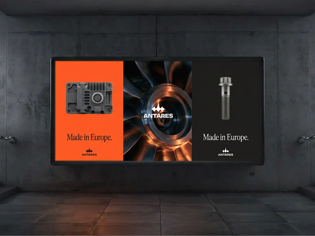
I helped the founder fleshing out a cohesive, modern industrial identity for their initial stealth phase. There is much more to come, but it's gonna stay under wraps for now 👀

A rugged logo—I like it!

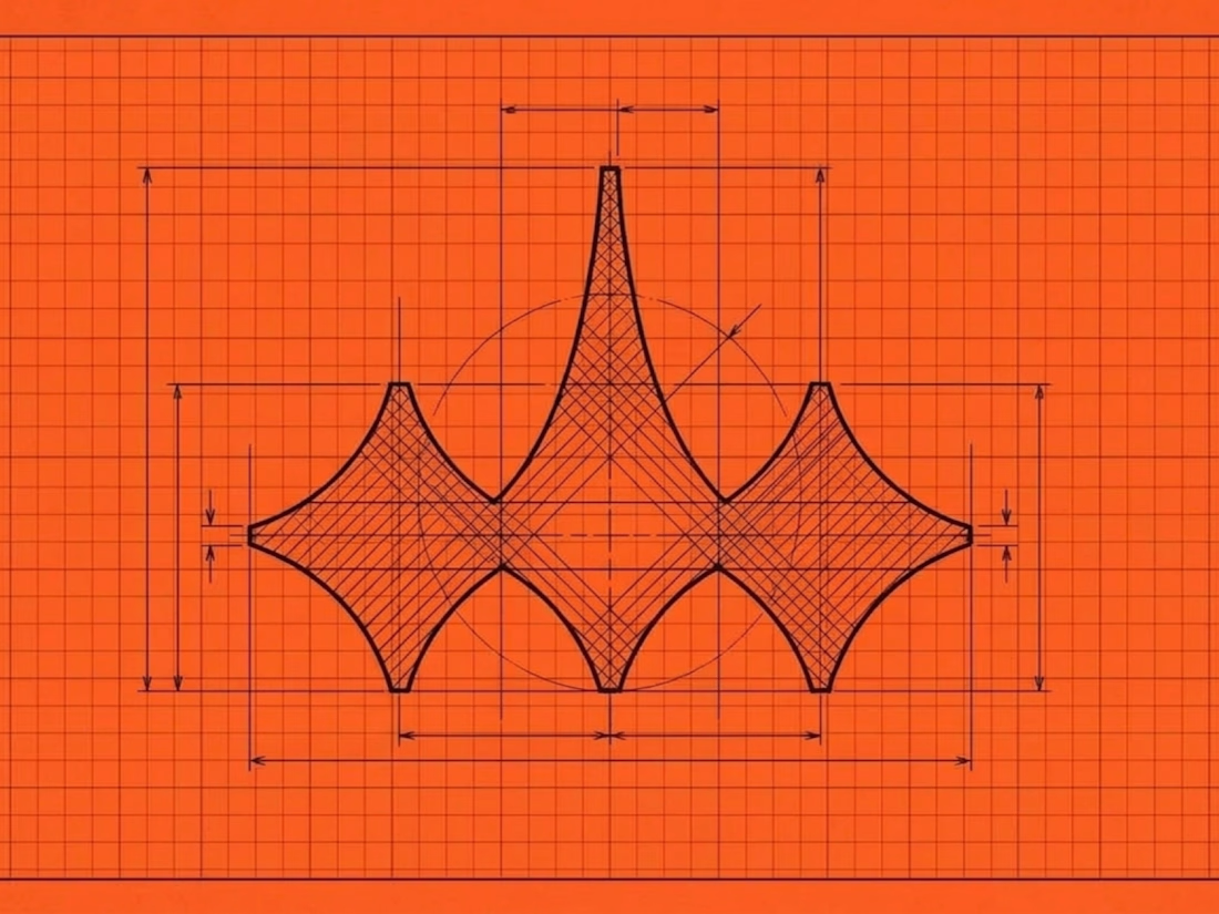
That four-point star mark looks sharp on the orange grid. Built in Europe is a great line too 🇪🇺

The star mark gives Antares strong industrial character.

The construction grid shows the star is built from concave arcs, so it reads as a star and also as a turbine blade, which fits an industrial brand. Did the "Built in Europe" line come from the founder, or out of the mark itself?
AI read this wrong, the mark is the ending shape of the scorpio constellation which is the constellation Antares (a red star) belongs to. the mark is ALSO a scorpio shape. Nothing to do with turbines :)
The network for creativity
Join 1.25M professional creatives like you
Connect with clients, get discovered, and run your business 100% commission-free
Creatives on Contra have earned over $150M and we are just getting started


Related posts

Orjin Mimarlık – Logo Design
Project Overview
A logo design project developed for Orjin Mimarlık, with the aim of creating a distinctive visual identity for an architecture-focused brand.
Services
Logo Design
Brand Identity Concept
Design Approach
The design focuses on establishing a recognizable brand mark that can represent the architectural field and provide a consistent foundation for future brand applications.
Deliverable
Custom Logo Design
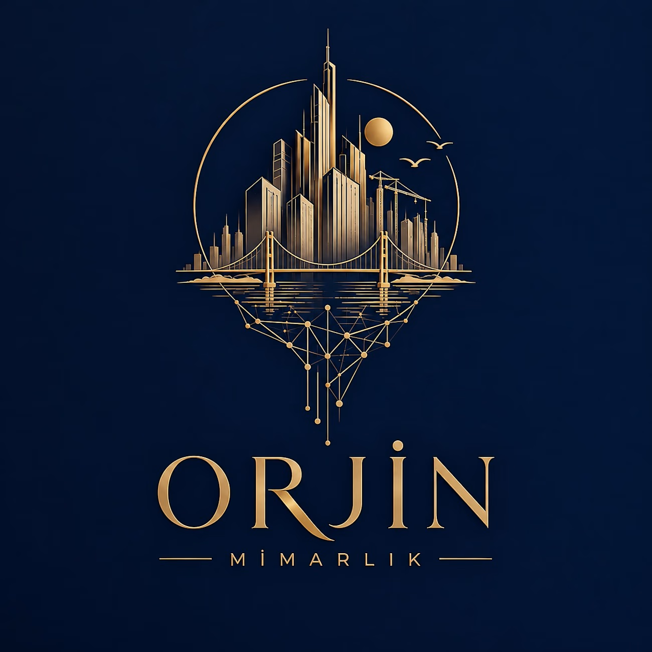


was the circle around the skyline there from the first sketch or added later?


Love a good all round project full of branding, merch, fitouts etc
Always fun!
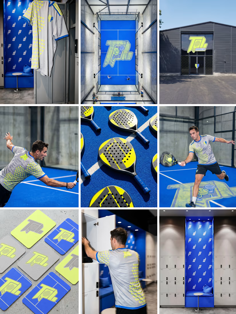
Branding across merch and fitouts looks wonderfully cohesive.

A modern brand identity concept designed for the architecture, interior design, and construction industry.
The visual identity is built around a distinctive geometric symbol, combining four interconnected forms to create an abstract interpretation of the letter “N.”
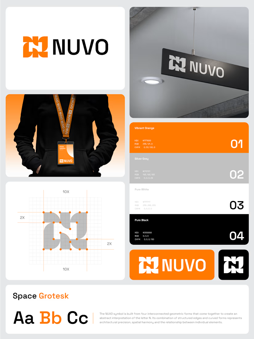
The construction grid with those 2X margins makes the N read as a system, not a one-off mark. Did you test the four-form symbol at favicon or lanyard-badge size, where the gaps between the forms start to close up?