The network for creativity
Join 1.25M professional creatives like you
Connect with clients, get discovered, and run your business 100% commission-free
Creatives on Contra have earned over $150M and we are just getting started
Back to feedPost

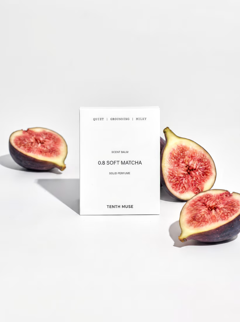
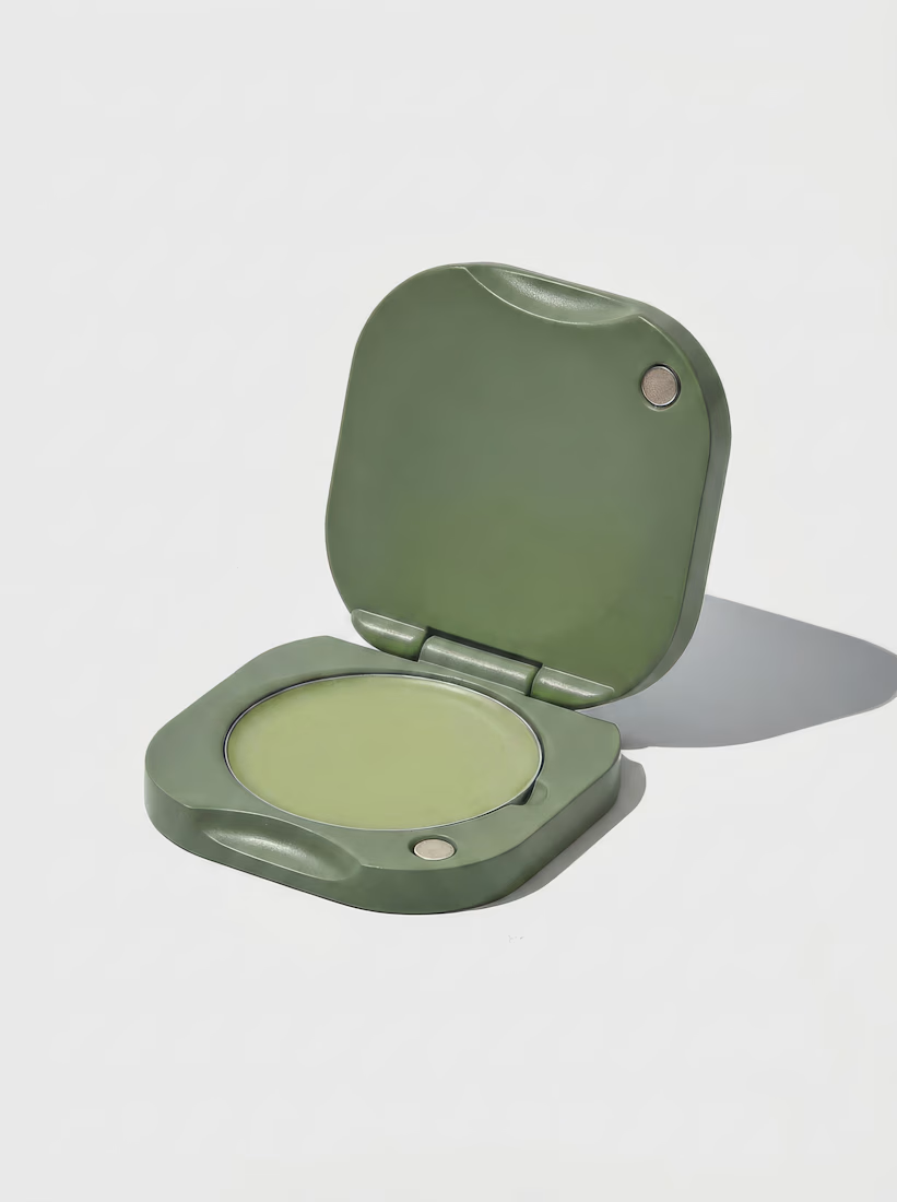
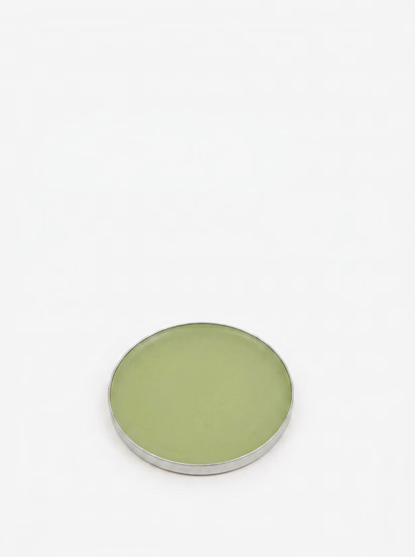
Exploring concepts for an independent, concept campaign project.
Tenth Muse is a London-made, solid perfume brand. One of the vessels is called Matcha. I've started to explore a matching solid perfume balm called Soft Matcha.


these are stunning, the detail alongside the simplicity is such eye candy!
Thank you!

These are beautiful!

Looks great!
Thanks @Jéssica T. ✦

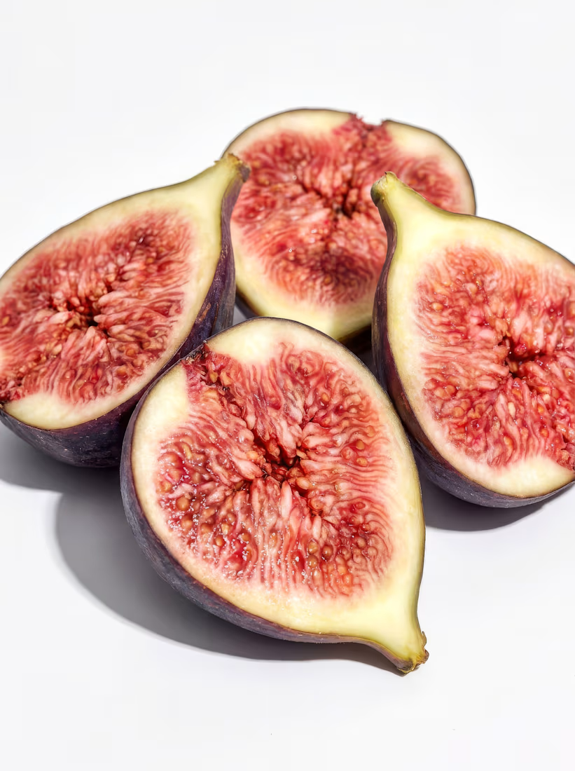
Figs paired with a matcha-toned solid perfume balm is an unexpected combo that somehow makes total sense once you see it laid out. I'd guess the fig shots are doing more of the emotional lifting than the product shots themselves, would you agree or is it more balanced than that in your eyes?
Definitely agree with that! The packaging of the balm is quite minimal, so it's difficult to rely on just the package to build an emotional response. The brand is always using fruit shots for balms.


Spacing is bold, minimalism is loud. Great work Ayberk!
Thank you Abdullah!

The network for creativity
Join 1.25M professional creatives like you
Connect with clients, get discovered, and run your business 100% commission-free
Creatives on Contra have earned over $150M and we are just getting started

Challenges
View all


Related posts



More to come:D

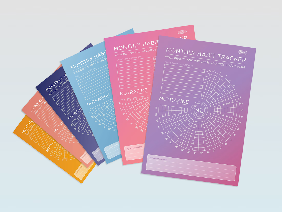
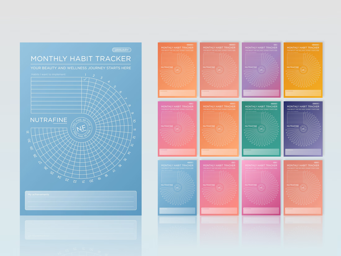
Can a habit tracker feel like a brand experience, not just a table?
For Nutrafine’s corporate gifting, each month is tied to one SKU, using the same colour as its packaging. It’s more colour than I would usually choose, but the depth of the palette, white linework and typography make the system hold together.
The bigger idea was to make the tracker itself feel less expected. Instead of a grid, we built a spiral, turning a practical tool into something more playful, memorable and distinctly Nutrafine.
#BrandDesign #CorporateGift #WellnessBranding #BrandExperience #CreativeDirection


Love these!

Building Hanif's brand identity packaging, mobile, and apparel, unified by one flower and one flavor story.
.
.
.
More conversion tests, UI breakdowns, and real builds: x.com/rightnextstep
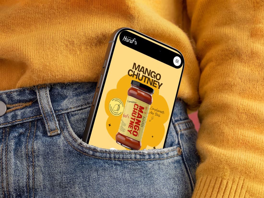
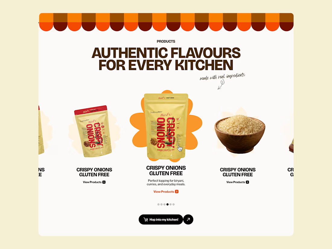
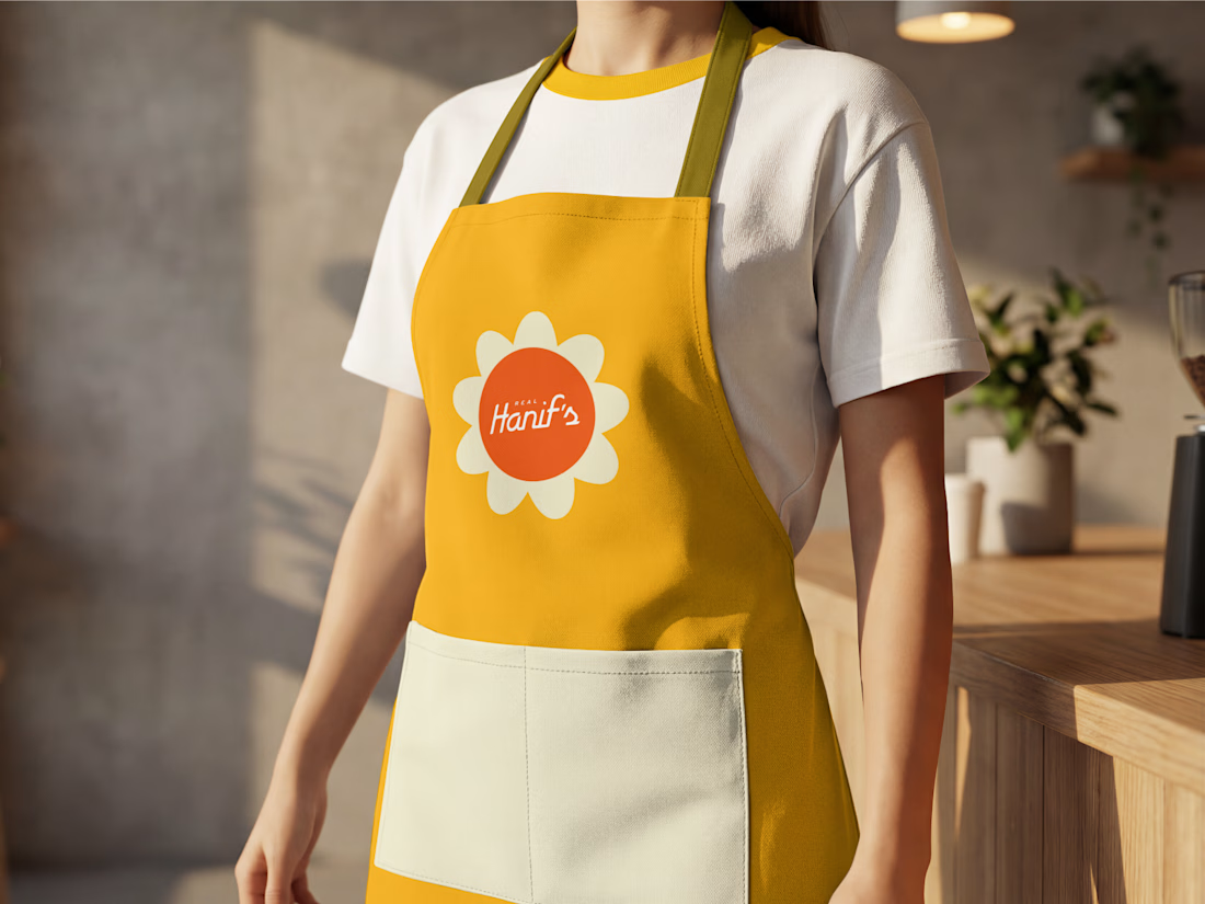
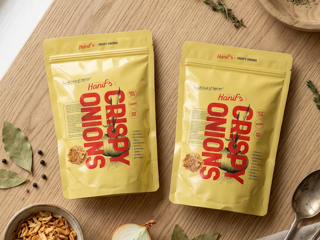

Great work, Anush! Loving the vibrant color palette and how smoothly the identity scales from packaging to apparel. The packaging designs look clean and high-end.