The network for creativity
Join 1.25M professional creatives like you
Connect with clients, get discovered, and run your business 100% commission-free
Creatives on Contra have earned over $150M and we are just getting started
Back to feedPost
Taste Test

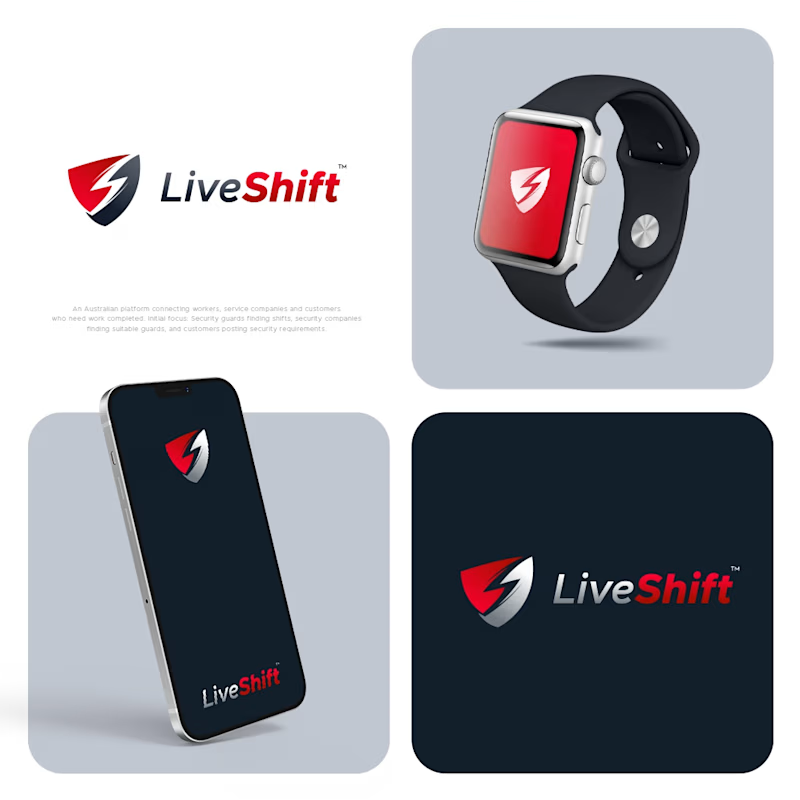
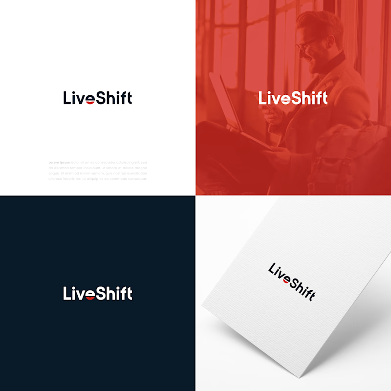
I designed four concepts for this logo. The client likes one of them, while another is my personal choice. I would love to hear your opinion. Which one do you think works better?
1 vote
Ends in 1d

I'd take option a. The shield and bolt still read as LiveShift at watch and phone size, while the plain wordmark on b starts to disappear once it gets small.
The network for creativity
Join 1.25M professional creatives like you
Connect with clients, get discovered, and run your business 100% commission-free
Creatives on Contra have earned over $150M and we are just getting started

Challenges
View all


Related posts

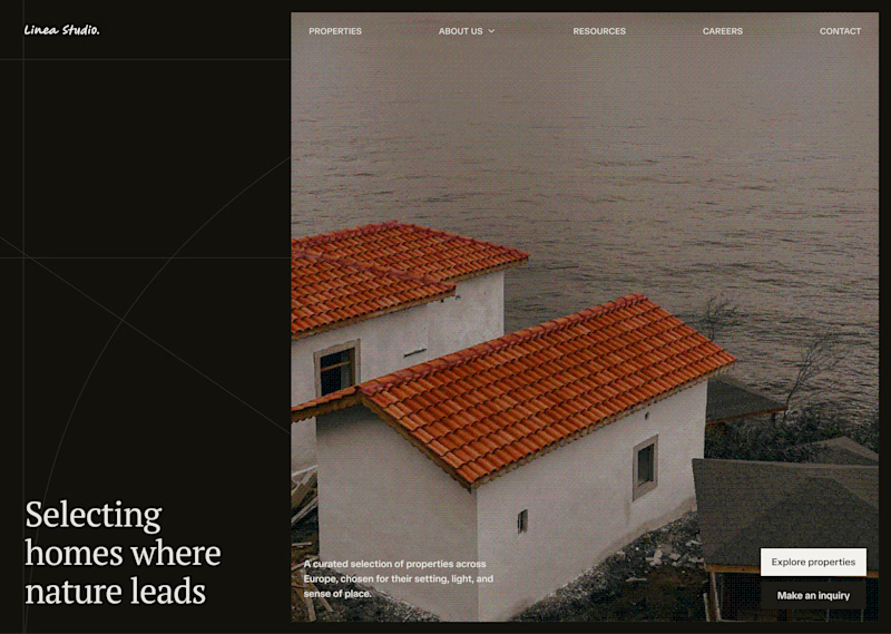
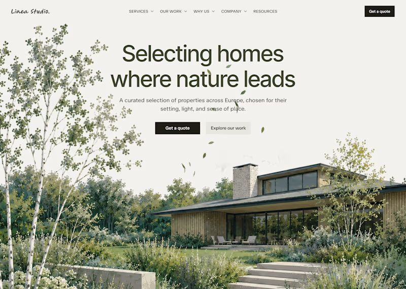
On my profile, you can see which version I chose out of these two, but I'm curious which one would you choose?
19 voted
26%
53 voted
74%
72 votes
Closed

Light hero

We're stuck 😅
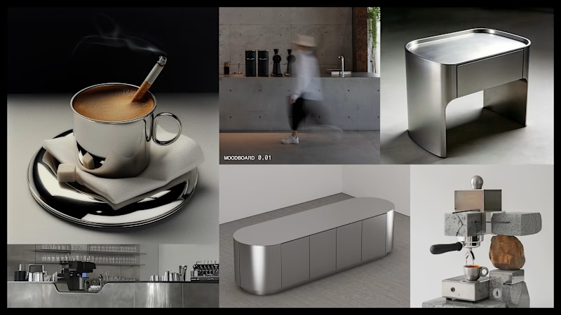
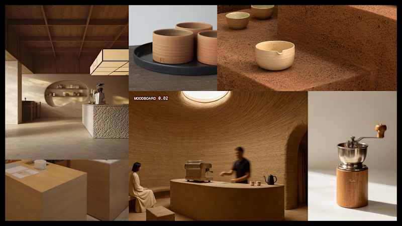
Which one feels more premium and unique to you?
Comment 01 or 02 below your opinion will genuinely help us lock this in.
7 voted
33%
14 voted
67%
21 votes
Closed


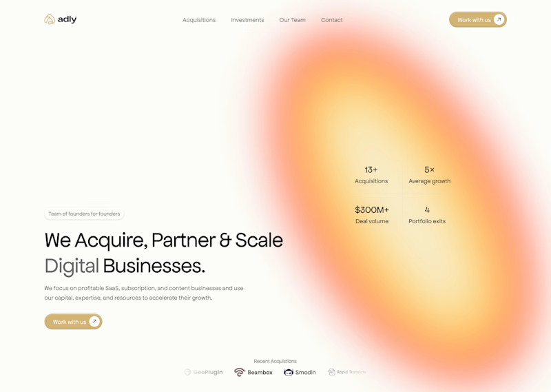
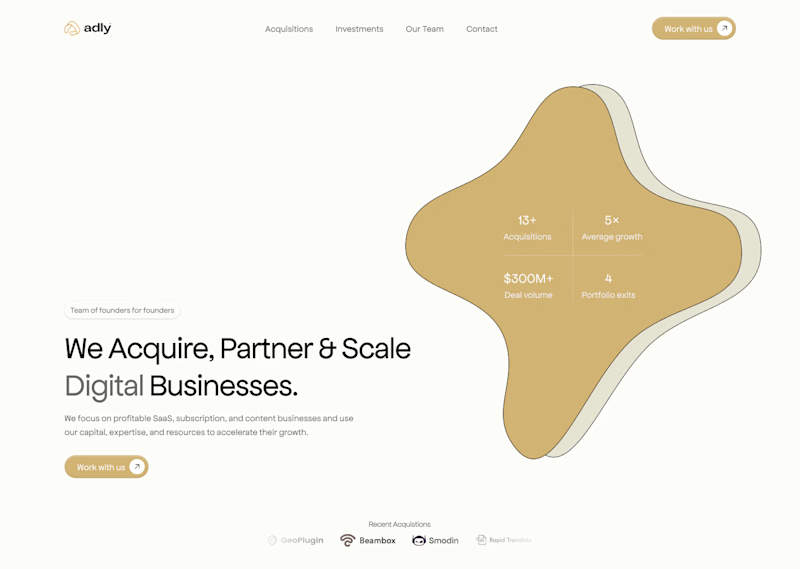

A i think