


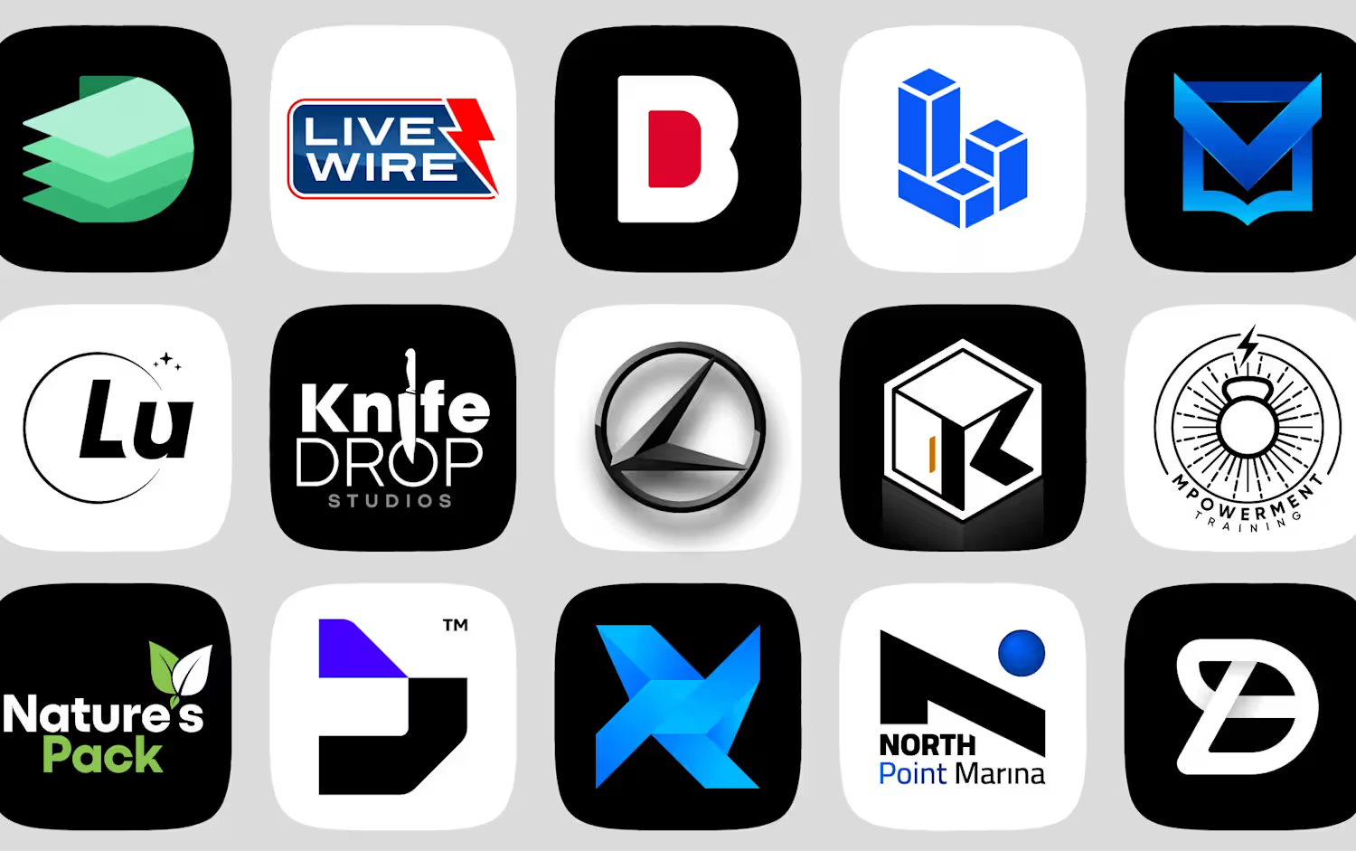
A quick look at some of my logo design work from the past five years (2021–2026).
These are just a few highlights from the projects I have worked on during this period.
Want to see more? Check out my full portfolio here:
https://spiral.soot.com/s/Anis/anis-portfolio
0
18
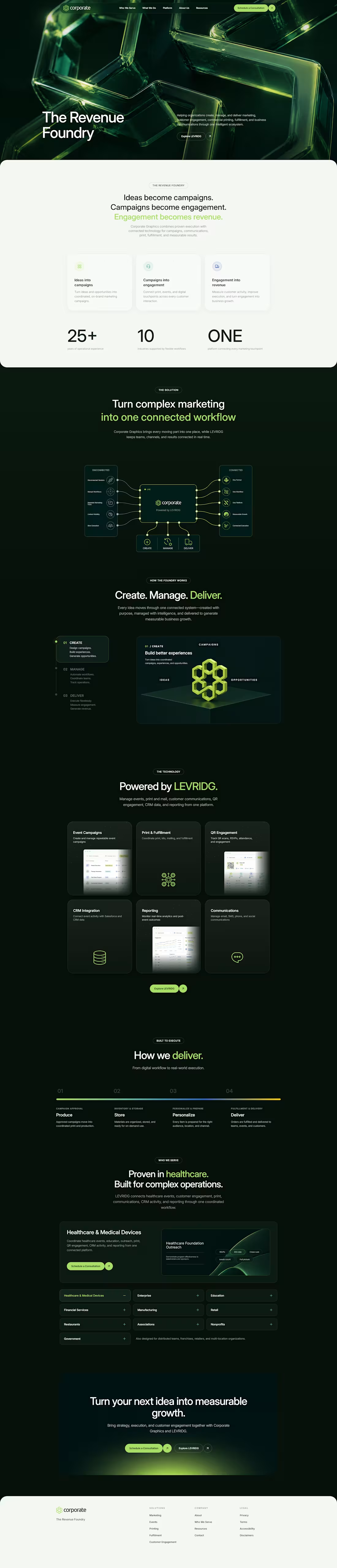
Corporate Website Design
0
17
TNL Connects Logo Design
Project Overview
TNL Connects is a modern brand identity concept built around connection, technology, speed, and strong visual impact. The goal of this logo design was to create a bold and memorable identity that feels professional, digital, and future-focused.
The design uses a sharp custom wordmark, strong contrast, and a vibrant orange accent to create a confident brand presence.
The Challenge
The main challenge was to design a logo that feels modern and connected without becoming too generic. Instead of using common network icons, globe symbols, or simple connection dots, the logo needed a stronger and more ownable visual style.
The identity had to feel bold, clean, and recognizable across digital platforms, brand presentations, social media, and marketing materials.
Design Direction
The visual direction focused on a strong technology-inspired identity with a clean and structured layout.
Key design attributes:
Modern
Bold
Tech-focused
Professional
Energetic
Clean
Sharp
Confident
Memorable
Logo Concept
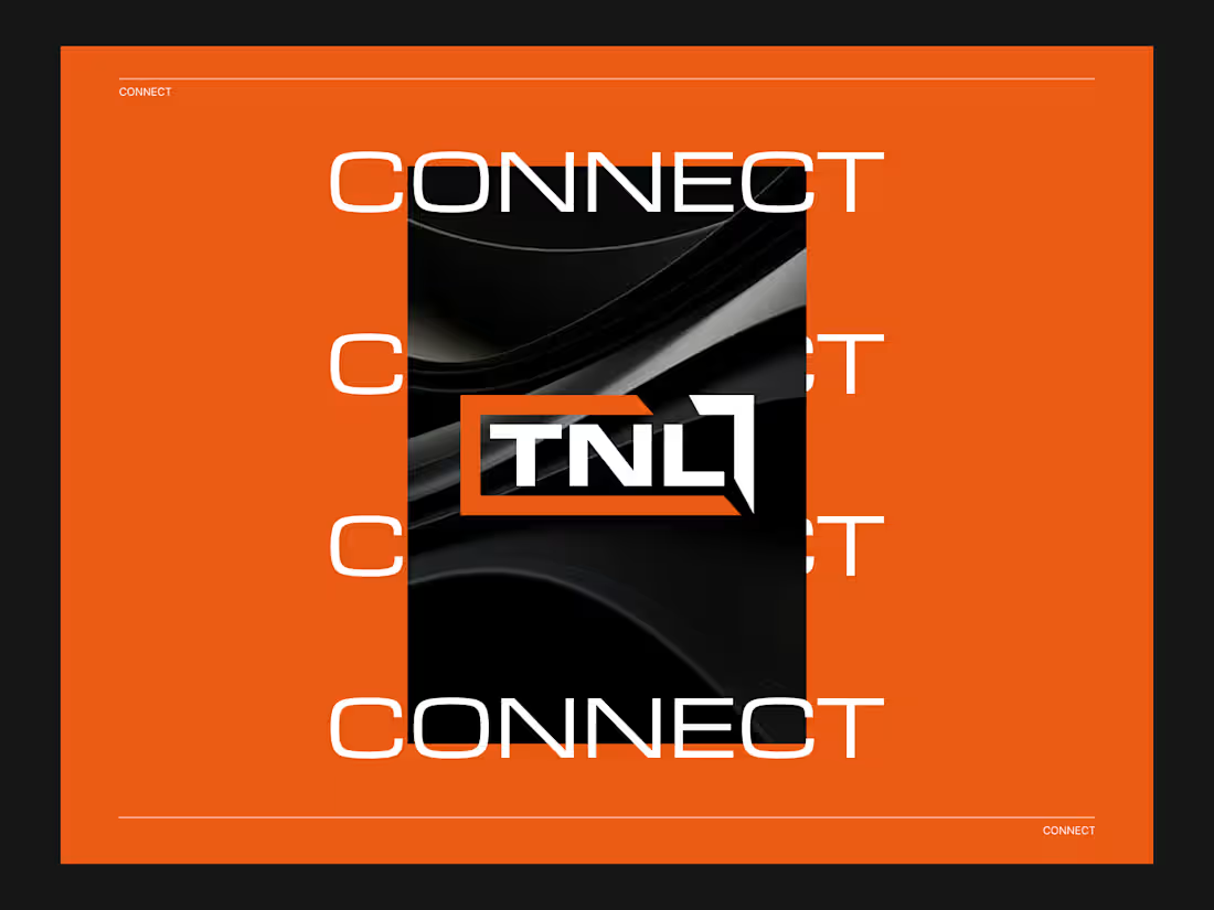
The final logo concept is based on a custom TNL wordmark enclosed within a sharp geometric frame. The frame creates a sense of structure, movement, and connection, while the bold typography gives the identity a strong and professional look.
The orange angular element adds energy and direction, making the logo feel active and forward-moving. Combined with the black and white contrast, the logo creates a premium and technology-driven appearance.
Color Palette
The color palette uses a bold combination of orange, black, and white.
Orange represents energy, innovation, and action.
Black gives the brand a premium, powerful, and professional feel.
White creates clarity, contrast, and modern simplicity.
This color combination helps the logo stand out strongly across both digital and print applications.
Typography
The typography style is sharp, modern, and geometric. The letterforms were designed to feel strong and futuristic without becoming too complex or hard to read.
The custom “TNL” mark gives the brand a unique visual identity and helps it remain recognizable even when used without supporting text.
Visual Presentation
The logo presentation uses a bold orange background, repeated “CONNECT” typography, and a dark central composition to highlight the identity. This creates a strong brand atmosphere and gives the logo a modern, high-impact look.
The overall presentation feels suitable for a tech brand, communication platform, networking business, or digital connection-based company.
Final Outcome
The final TNL Connects logo delivers a bold, sharp, and modern identity. It creates a strong visual impression through custom typography, high contrast, and a confident orange accent.
The result is a clean and scalable logo system that feels professional, energetic, and ready for digital-first brand applications.
1
5
102
North Point Marina Logo Design
Project Overview
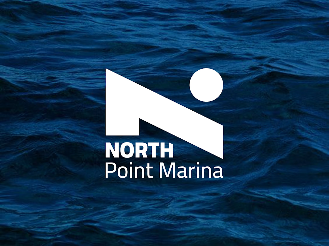
North Point Marina is a marina and hotel brand within the travel and hospitality industry. The brand needed a refined logo identity that could represent both the relaxing waterfront experience of a marina and the premium comfort of a hotel destination.
The client had recently developed a logo, but wanted to improve the identity by incorporating a North Star element into the design while keeping the overall typography direction close to the existing style they liked.
The Challenge
The main challenge was to create a logo that felt elegant, memorable, and suitable for both marina and hotel branding. The design needed to communicate a sense of direction, destination, trust, and coastal hospitality without becoming too literal or overly detailed.
Because the brand name includes “North Point,” the North Star became an important visual symbol. It needed to feel natural within the logo and not appear like an added decoration. The goal was to integrate it in a balanced way that supported the brand story and strengthened the overall identity.
Brand Direction
The visual direction focused on creating a logo that feels:
Modern
Elegant
Professional
Coastal
Welcoming
Premium
Balanced
Memorable
The design needed to work well across hospitality and marina-related applications, including signage, hotel materials, dockside branding, website use, uniforms, stationery, and guest experience touchpoints.
Concept Development
The logo concept was built around the idea of navigation, destination, and refined waterfront hospitality.
The North Star was used as a symbolic element to represent guidance, direction, and a memorable destination point. This connects naturally with both the marina environment and the name “North Point Marina.”
The design avoids unnecessary complexity and keeps the identity clean and versatile. The star element was carefully balanced with the typography so the logo feels cohesive, polished, and professional.
Typography
The typography direction was kept elegant and confident, based on the client’s preference for the existing font style. The letterforms were chosen to feel sophisticated while still remaining clear and readable.
The wordmark supports the hotel and marina personality by giving the brand a premium but approachable appearance. It feels established, trustworthy, and suitable for a destination-based business.
Color Palette
The color direction explored blues, light neutrals, and dark neutrals.
Blue was used to represent water, trust, calmness, and coastal living. Light neutrals add a clean, relaxed hospitality feel, while dark neutrals create contrast and give the identity a more premium and timeless appearance.
This palette allows the logo to feel flexible across different environments, from bright outdoor marina signage to refined hotel stationery and digital brand applications.
Visual Style
The final logo direction combines a classic hospitality feel with a modern visual approach. It balances abstract and literal elements by using the North Star in a clean, simple, and meaningful way.
The design is not overly playful or decorative. Instead, it feels mature, sophisticated, and suitable for a marina and hotel brand that wants to attract guests, travelers, boat owners, and visitors looking for a polished waterfront experience.
Logo Applications
The identity was designed to work across multiple brand touchpoints, including:
Marina signage
Hotel signage
Website header
Social media profile
Business cards
Guest cards
Reservation materials
Dockside branding
Uniform embroidery
Brochures and marketing materials
Merchandise and hospitality items
Final Outcome
The final North Point Marina logo creates a stronger and more meaningful identity by incorporating the North Star into the brand mark. The result is a clean, elegant, and memorable logo that reflects direction, destination, hospitality, and the premium coastal experience of the brand.
The logo gives North Point Marina a refined visual presence that can grow across both marina and hotel applications while remaining timeless, professional, and easy to recognize.
2
6
130