Anis u Rehman's Work | ContraWork by Anis u Rehman
Anis u Rehman

Anis u Rehman

Expert Logo & Brand Guideline Designer

Ready for work

Anis is ready for their next project!

Cover image for North Point Marina Logo Design
Project
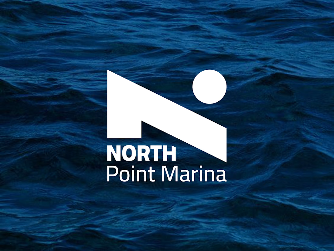
North Point Marina Logo Design Project Overview North Point Marina is a marina and hotel brand within the travel and hospitality industry. The brand needed a refined logo identity that could represent both the relaxing waterfront experience of a marina and the premium comfort of a hotel destination. The client had recently developed a logo, but wanted to improve the identity by incorporating a North Star element into the design while keeping the overall typography direction close to the existing style they liked. The Challenge The main challenge was to create a logo that felt elegant, memorable, and suitable for both marina and hotel branding. The design needed to communicate a sense of direction, destination, trust, and coastal hospitality without becoming too literal or overly detailed. Because the brand name includes “North Point,” the North Star became an important visual symbol. It needed to feel natural within the logo and not appear like an added decoration. The goal was to integrate it in a balanced way that supported the brand story and strengthened the overall identity. Brand Direction The visual direction focused on creating a logo that feels: Modern Elegant Professional Coastal Welcoming Premium Balanced Memorable The design needed to work well across hospitality and marina-related applications, including signage, hotel materials, dockside branding, website use, uniforms, stationery, and guest experience touchpoints. Concept Development The logo concept was built around the idea of navigation, destination, and refined waterfront hospitality. The North Star was used as a symbolic element to represent guidance, direction, and a memorable destination point. This connects naturally with both the marina environment and the name “North Point Marina.” The design avoids unnecessary complexity and keeps the identity clean and versatile. The star element was carefully balanced with the typography so the logo feels cohesive, polished, and professional. Typography The typography direction was kept elegant and confident, based on the client’s preference for the existing font style. The letterforms were chosen to feel sophisticated while still remaining clear and readable. The wordmark supports the hotel and marina personality by giving the brand a premium but approachable appearance. It feels established, trustworthy, and suitable for a destination-based business. Color Palette The color direction explored blues, light neutrals, and dark neutrals. Blue was used to represent water, trust, calmness, and coastal living. Light neutrals add a clean, relaxed hospitality feel, while dark neutrals create contrast and give the identity a more premium and timeless appearance. This palette allows the logo to feel flexible across different environments, from bright outdoor marina signage to refined hotel stationery and digital brand applications. Visual Style The final logo direction combines a classic hospitality feel with a modern visual approach. It balances abstract and literal elements by using the North Star in a clean, simple, and meaningful way. The design is not overly playful or decorative. Instead, it feels mature, sophisticated, and suitable for a marina and hotel brand that wants to attract guests, travelers, boat owners, and visitors looking for a polished waterfront experience. Logo Applications The identity was designed to work across multiple brand touchpoints, including: Marina signage Hotel signage Website header Social media profile Business cards Guest cards Reservation materials Dockside branding Uniform embroidery Brochures and marketing materials Merchandise and hospitality items Final Outcome The final North Point Marina logo creates a stronger and more meaningful identity by incorporating the North Star into the brand mark. The result is a clean, elegant, and memorable logo that reflects direction, destination, hospitality, and the premium coastal experience of the brand. The logo gives North Point Marina a refined visual presence that can grow across both marina and hotel applications while remaining timeless, professional, and easy to recognize.
2
6
56
Cover image for I had the opportunity to design the corporate identity for S...
I had the opportunity to design the corporate identity for St. Pancras Campus, focusing on creating a visual system that reflects its modern, innovative character while preserving its distinguished heritage. The identity combines clean typography, refined colour palettes, and structured layouts to convey professionalism and trust. Every element was crafted to ensure brand consistency and visual harmony across all applications, from print to digital platforms.
1
1
72
Cover image for Decision Labs Logo Identity -
Decision Labs Logo Identity - Data-Driven Technology Brand🧠 Designed a modern logo identity for Decision Labs, a data-driven technology company helping businesses understand and use their data for better decisions. The concept avoids common lab and brain symbols, focusing instead on clarity, structure, mathematics, and data visibility. The final identity feels clean, professional, intelligent, and scalable for a modern technology brand. Project Value: $375 USD
1
1
45
Cover image for Tropolis Logo Design
Project Overview
Tropolis is
Tropolis Logo Design Project Overview Tropolis is a professional insurance broker with a strong focus on innovation, trust, growth, and community. The brand serves individuals, families, businesses, and smaller insurance agencies looking for modern insurance solutions, investment opportunities, or acquisition support. The goal of this project was to design a modern logo identity that feels professional, secure, technology-forward, and fresh without relying on common insurance symbols such as umbrellas, houses, shields, or traditional protection icons. Project: Tropolis Logo Identity Industry: Insurance / Technology Project Value: $450 USD Scope: Logo design, visual direction, color palette, and brand presentation. The Challenge The existing Tropolis logo felt simple but too plain and lacked the stronger visual personality the brand needed for its next stage of growth. The client wanted a logo that could communicate professionalism and trust while also feeling modern, innovative, and scalable for future expansion. The main challenge was to create a distinctive brand mark that felt suitable for the insurance industry but avoided predictable visual clichés. The logo needed to feel secure and established, yet still fresh, advanced, and memorable. Design Direction The design direction focused on creating a clean, modern, and confident identity system. The client preferred the wordmark style with a capital “T” followed by lowercase letters, giving the brand a more approachable and refined appearance. The overall visual style was built around these key attributes: Professional Secure Innovative Technology-advanced Modern Community-oriented Growing Clean and sophisticated Concept The final logo direction was developed around a strong and memorable “T” identity, supported by clean typography and a balanced visual structure. The mark was designed to feel abstract, modern, and flexible, giving Tropolis a more unique presence without using obvious insurance-related imagery. The logo combines simplicity with a strong brand character. Its clean geometry gives it a technology-driven feel, while the balanced proportions help communicate stability, confidence, and trust. Color Palette The selected color palette was based on the client’s preferred brand colors: Primary Blue: #26A9E0 Accent Orange: #BF5002 Dark Background: #262830 Light Background: #F4F6FA White: #FFFFFF The blue represents trust, clarity, and professionalism, which are important qualities for an insurance and financial services brand. The orange accent adds energy, warmth, and a modern touch, helping the identity feel more human and approachable. The dark background option gives the brand a premium and technology-focused appearance, while the light background keeps the identity clean, open, and easy to use across digital and print applications. Typography The wordmark was designed to feel strong, modern, and highly legible. The use of a capital “T” with lowercase letters creates a professional yet approachable balance. The typography supports the brand’s personality by feeling confident and established without becoming too corporate or rigid. It gives Tropolis a polished identity that can work well across websites, presentations, business cards, social media, and marketing materials. Visual System The logo was designed with scalability in mind. It works clearly in full color, single color, light background, dark background, and small-size applications. This makes the identity flexible for different brand touchpoints, including: Website header Social media profile Business cards Presentation decks Email signatures Digital ads Print materials Brand documents Partnership and acquisition materials Final Outcome The final Tropolis logo identity gives the brand a more confident, modern, and memorable presence. It moves away from traditional insurance visuals and introduces a cleaner, more innovative direction that better reflects the company’s technology-forward and growth-focused personality. The result is a professional logo system that feels trustworthy, fresh, scalable, and ready for future brand expansion.
1
3
44
Cover image for DataFile — Brand Identity Case
DataFile — Brand Identity Case Study Overview DataFile is a modern data management and storage brand designed to represent security, accessibility, and structured information flow. The objective was to create a distinctive visual identity that communicates reliability while maintaining a clean, technology-driven aesthetic suitable for SaaS platforms, cloud solutions, and enterprise software products. The final identity combines a custom symbol inspired by layered data architecture with a contemporary wordmark, creating a memorable and scalable brand system. The Challenge The primary challenge was designing a logo that could visually communicate: Data organisation and storage Cloud-based technology solutions Scalability and growth Trust and security A modern SaaS-focused personality Many technology brands rely on generic cloud or database symbols. The goal was to develop a unique visual language that feels innovative while remaining instantly recognisable. Design Strategy The design process focused on simplifying complex data concepts into a clean geometric symbol. Key objectives included: Creating a unique icon that represents structured data layers Maintaining simplicity for digital applications Ensuring strong visibility across different sizes Developing a timeless visual identity Establishing a professional yet approachable brand presence Logo Concept The icon is built around the idea of layered data files stacked within a fluid, modern form. Symbol Meaning Layered Elements Represent organised datasets Symbolise information architecture Reflect scalability and data processing Dynamic Shape Creates a sense of movement and efficiency Suggests continuous data flow Represents innovation and technological advancement Rounded Form Communicates accessibility and user-friendliness Balances the technical nature of the brand Enhances memorability Typography The wordmark uses a modern sans-serif typeface featuring: Strong readability Contemporary appearance Professional character Excellent performance across digital platforms The emphasis on "Data" establishes trust and clarity, while the lighter treatment of "File" creates visual hierarchy and balance. Colour Palette Primary Dark Background Deep Navy Represents security and reliability Creates strong contrast Enhances visibility in digital environments Primary Brand Green Fresh Mint Green Symbolises growth and innovation Reflects modern technology Creates a friendly and approachable personality Supporting Green Tones Multiple gradients were introduced to represent: Data layers Information flow Depth and scalability Brand Attributes The identity was developed around five core values: Reliable Secure Innovative Scalable Efficient These attributes influenced every design decision throughout the branding process. Versatility The logo was designed to perform consistently across various applications: SaaS platforms Mobile applications Cloud software products Website headers Dashboards Marketing materials Business stationery Social media assets Both dark and light versions ensure flexibility across all brand touchpoints. Design Outcome The final DataFile identity successfully transforms the concept of data storage into a clean, memorable visual system. Through a combination of layered geometry, modern typography, and a technology-focused colour palette, the brand conveys trust, innovation, and efficiency while remaining highly scalable for future growth. Result: A modern technology brand identity that visually represents structured data, intelligent organisation, and next-generation digital solutions.
4
5
166
Cover image for Excited to share the new
Excited to share the new logo I designed for Gigpilot — an all-in-one platform created for DJs, artists, and booking agencies to manage everything from bookings and quotes to contracts and payments in one streamlined space. Attached are some concepts I designed. Check the selected logo from this link: https://dribbble.com/shots/26020669-Logo-for-Artists-DJs The goal was to create a modern, tech-driven identity that reflects Gigpilot’s role as the mission control for modern talent. The design combines simplicity, motion, and connectivity, representing how Gigpilot brings every aspect of an artist’s career together seamlessly. 💰 Project Value: $450 Big thanks to the Gigpilot team for trusting me with this creative journey. It was an exciting project that brought together strategy, rhythm, and design.
1
59
Cover image for I am sharing free 4K wallpaper for MacBook and Desktop. Down...
I am sharing free 4K wallpaper for MacBook and Desktop. Download: https://dribbble.com/shots/22687993-Orbital-Wallpaper-Free
0
61
Cover image for Excited to share a selection from my logo design portfolio! ...
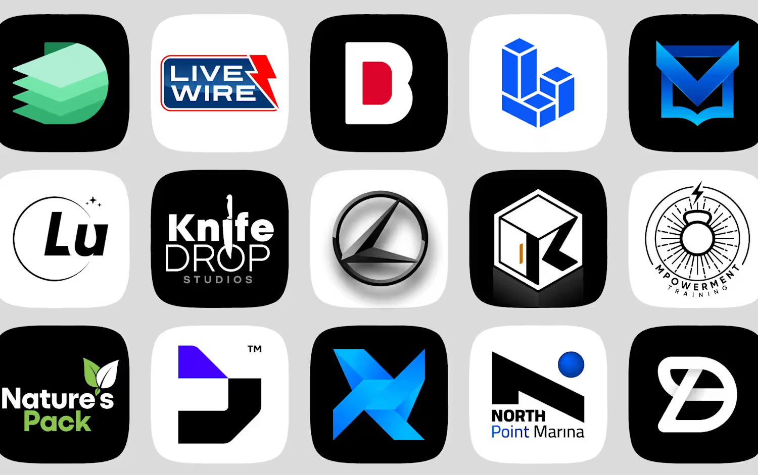
Excited to share a selection from my logo design portfolio! Each logo is crafted to capture the essence of the brand — combining strategy, simplicity, and timeless design. My focus is on creating distinctive, scalable, and memorable identities that work seamlessly across print and digital platforms. Always open to feedback and collaboration opportunities with brands looking to elevate their visual identity. Check out my portfolio: https://dribbble.com/Anis-u-Rehman
1
58
Cover image for Corporate Brochure, Flyer, Report Design
Corporate Brochure, Flyer, Report Design
1
4
Cover image for Website UI Design
Website UI Design
0
3
Cover image for Logo Brand Guideline Design
Logo Brand Guideline Design
0
2
Cover image for Amazon Listing Post Images - Product Pushup Board
Amazon Listing Post Images - Product Pushup Board
0
0
Cover image for Logo Concepts
Logo Concepts
0
1
Cover image for Brand Guideline Book MatchRX
Brand Guideline Book MatchRX
1
0