The network for creativity
Join 1.25M professional creatives like you
Connect with clients, get discovered, and run your business 100% commission-free
Creatives on Contra have earned over $150M and we are just getting started
Back to feedPost
BLAIRE | Brand Identity & Packaging
Blaire was built around the idea of making a minimal brand feel distinctive without relying on excess.
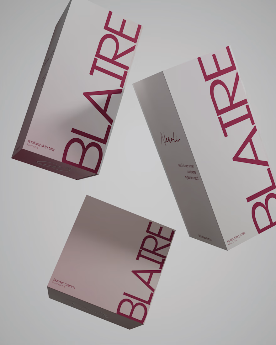
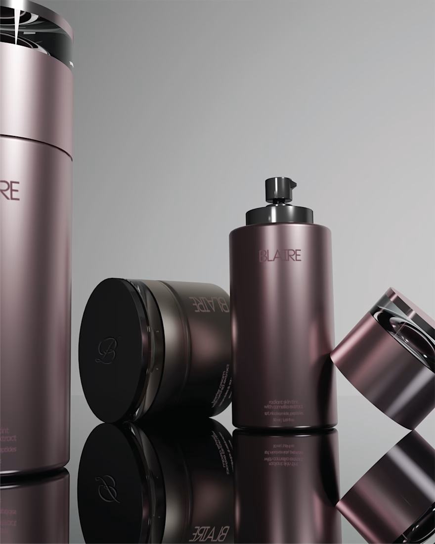
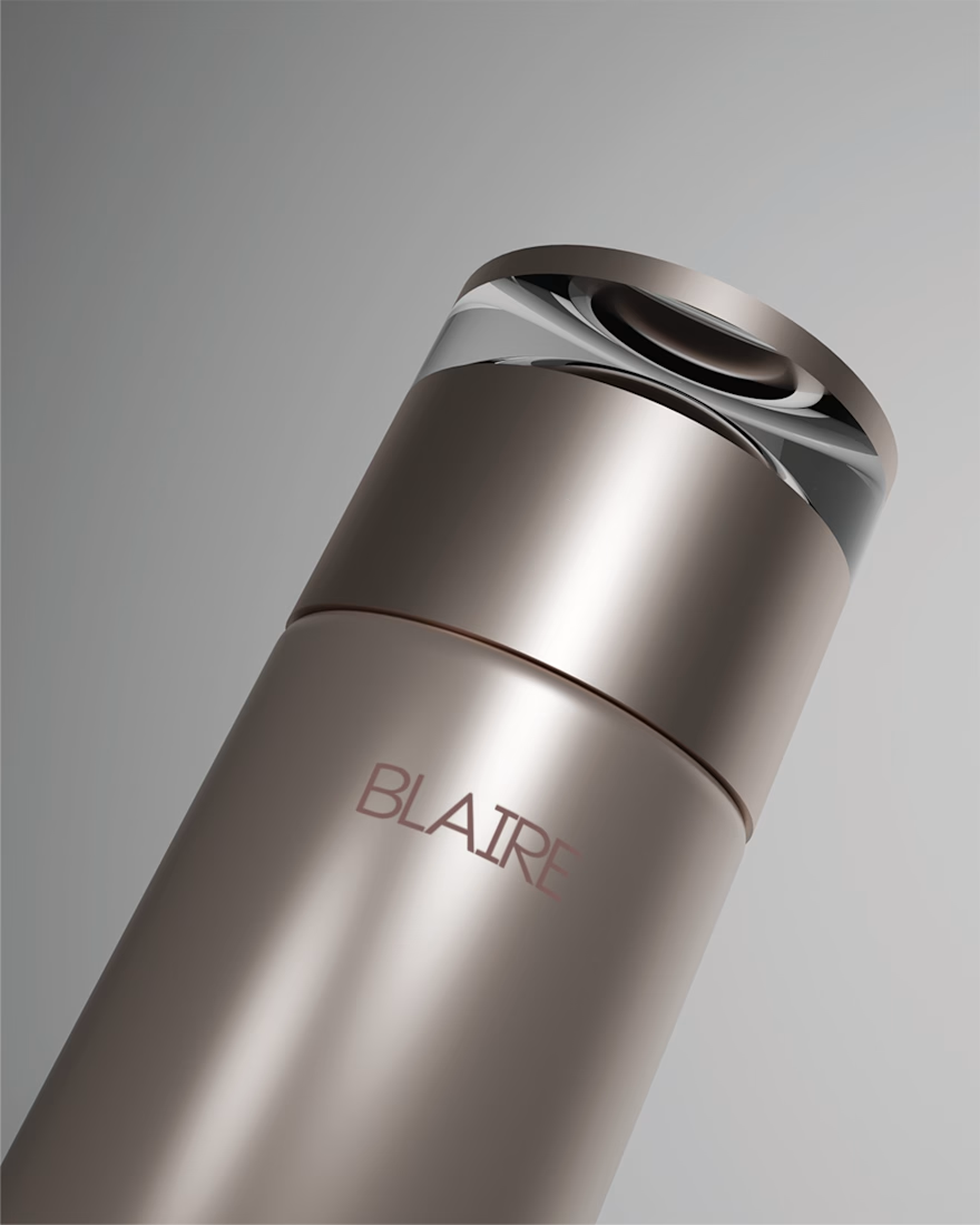
The visual direction combines a restrained palette, confident typography and metallic packaging details to create something that feels clean and elevated, while still carrying enough personality to be recognisable.
Rather than treating the logo, packaging and supporting graphics as separate pieces, the identity was designed as one system. Repetition, scale and typography become part of the brand language, allowing it to stay consistent across both product and communication.
A closer look at some of the applications that brought the Blaire identity together.



Great job. I like it.

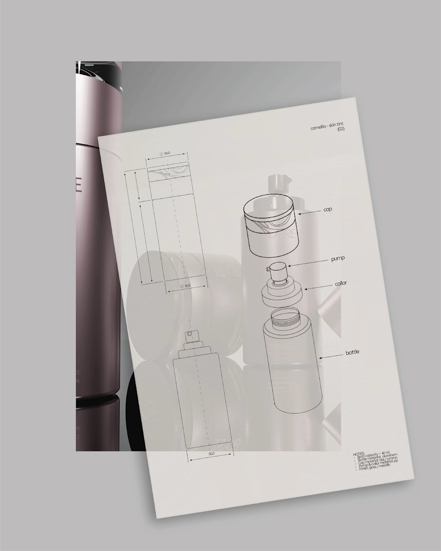
The etched wireframe sketch in that last shot is such a nice touch, shows the system thinking behind the metallic packaging. Was that mockup process built out from the start, or did the physical packaging come first and the rest got designed to match it?

I actually started with the product idea and research first, then built the brand around that foundation. Once the branding system was in place, I moved into the 3D renders and mockups to bring the product and packaging to life. So the physical product thinking came first, but...

Treating the logo, packaging and supporting graphics as one system instead of separate deliverables is exactly why this reads so cohesive, and it's the part that's hardest to pitch to clients upfront. Did Blaire come to you already sold on that approach, or was that a conversation you had to have early on?
This one was actually a personal study, so there wasn’t a real client conversation involved, just me and the client in my head 😂 I approached it as if it were a real project though, starting with the product idea and research, then building the identity, packaging and...
Running it as a full self-directed project instead of a quick logo study is probably why it holds together so well. Do you usually pick imaginary clients like this to practice a specific skill, or was it more just whatever brief sounded fun at the time?
I don’t really treat self-directed projects as quick logo studies or skill exercises. I build them the same way I would a client project, starting with the brand idea and strategy, then developing the full identity and the touchpoints it needs. I usually choose industries I want...

So smooth and kinda crispy. Loove it!!

Nice


Great job

Brilliant work! 🚀

Turning the wordmark itself into the diagonal pattern across the paper goods is a smart way to get repetition without a separate icon or texture - the typography is doing double duty as both the mark and the brand's decorative language.
Exactly! I wanted the wordmark to do more than just sit on the packaging as a logo. Repeating and rotating it gave the system another recognisable layer without having to introduce a separate graphic device just for decoration. Glad that detail came through!

Looks nice

Hmm I love this , great work!

Minimal-but-distinctive usually means one element gets permission to be loud, and here it reads like the metallic finish took that job rather than the type. Does the system still hold its personality in flat print, or is the range built to always ship with the finish?
Definitely. The metallic finish is an important part of the packaging direction, but I didn’t want the identity to depend on it. The typography, repetition, layout and overall visual language were built to carry the personality in flatter applications too. The finish adds...

Amazing

This is nothing short of excellent

Lovely!

I like the colors, materials and composition. Which render engine have you used?
Thank you! I started with hand-drawn sketches on paper, then built the products from scratch in Blender and created the materials, lighting and compositions there as well. So all of the final renders are fully custom-made in Blender.


Looks amazing
Thank you Karan!🔥


Really nice

nice one 🔥

Love how simple and clean this feels. The packaging and typography work really well together.

Great work

Top-notch product visuals😍 The products and lighting are flawless

roof this is stunning

This is such a fresh and innovative take. So inspiring! 😍

Serving!!

This is amazing
Kudos to you May
Thank you!

the mockups are amazing!!
thank you so much!

Amazing

Cool!
The network for creativity
Join 1.25M professional creatives like you
Connect with clients, get discovered, and run your business 100% commission-free
Creatives on Contra have earned over $150M and we are just getting started








Related posts

Ambrosia - Bodycare Brand Identity & Packaging
My favorite part of this branding and packaging project was working with the different materials. The dark glass, aluminum, and soft paper each bring something different, so I kept the typography and labels simple to help everything sit together.


Amazinnnggg

Post
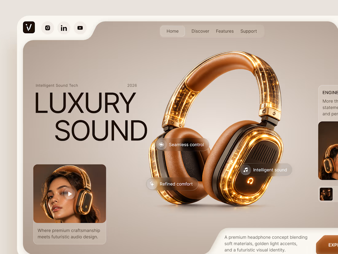
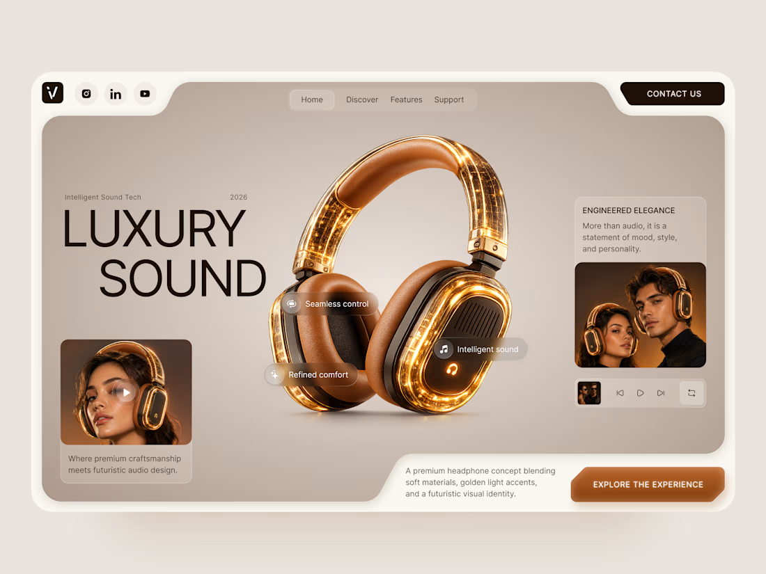
Luxury Sound — Premium Headphones Landing Page 🎧✨
A premium landing page concept for a luxury audio brand, built around a bold headphone design and a refined visual experience
The design combines warm neutral tones, glowing details, oversized product visuals, and minimal typography to create a futuristic yet elegant feel
Special attention was given to:
• Product-first composition
• Premium visual direction
• Feature highlights
• Lifestyle imagery
• Clear CTA placement
• Responsive mobile experience
The result is a clean, immersive product experience that makes the headphones feel like more than tech — they become part of the lifestyle 🔥


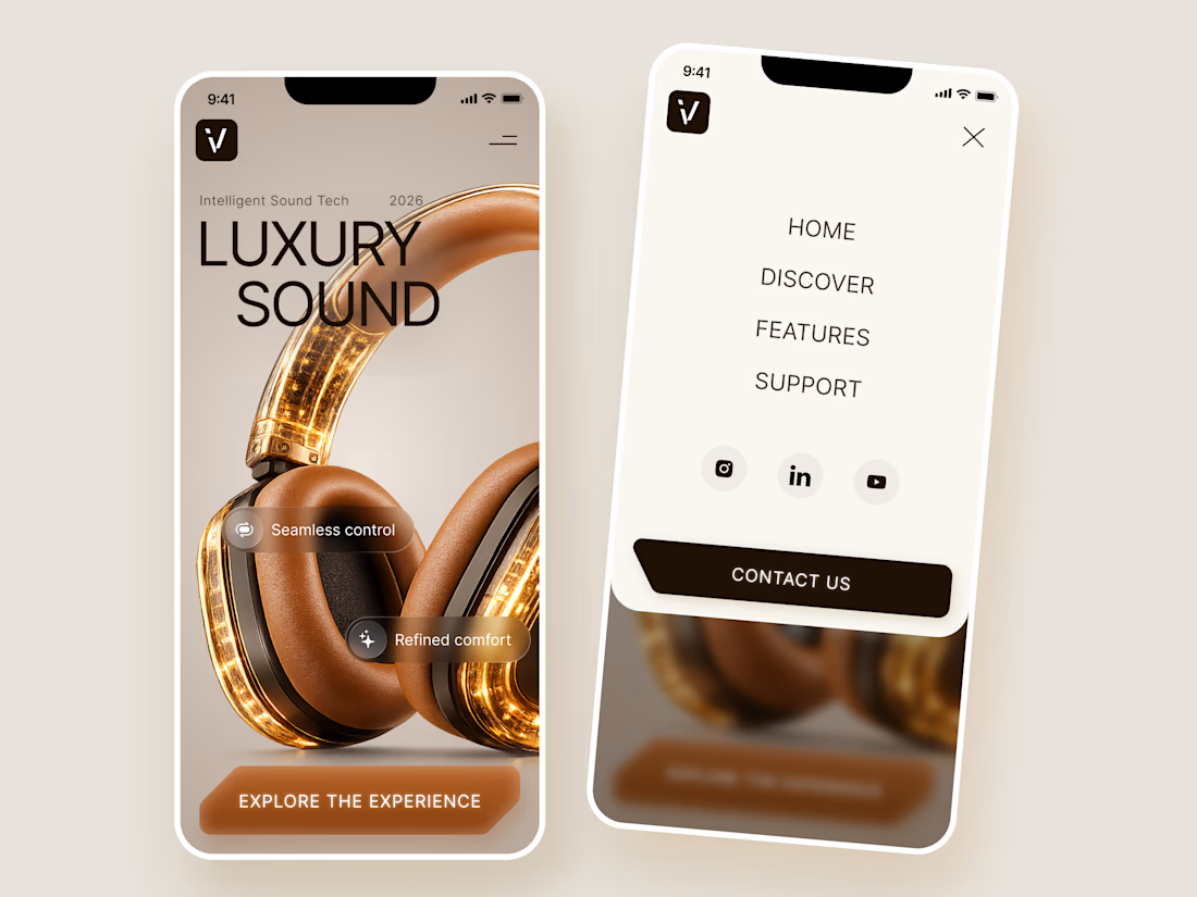

The amber glow on the headphones against that warm beige is lovely. How does the mobile menu handle the product image?


Wow, I love the colors 😍