The network for creativity
Join 1.25M professional creatives like you
Connect with clients, get discovered, and run your business 100% commission-free
Creatives on Contra have earned over $150M and we are just getting started
Back to feedPost

Ambrosia - Bodycare Brand Identity & Packaging
My favorite part of this branding and packaging project was working with the different materials. The dark glass, aluminum, and soft paper each bring something different, so I kept the typography and labels simple to help everything sit together.

The network for creativity
Join 1.25M professional creatives like you
Connect with clients, get discovered, and run your business 100% commission-free
Creatives on Contra have earned over $150M and we are just getting started





Related posts





Great work!

I really love this packaging.
The blue, the metal, the typography… everything just hits 💙
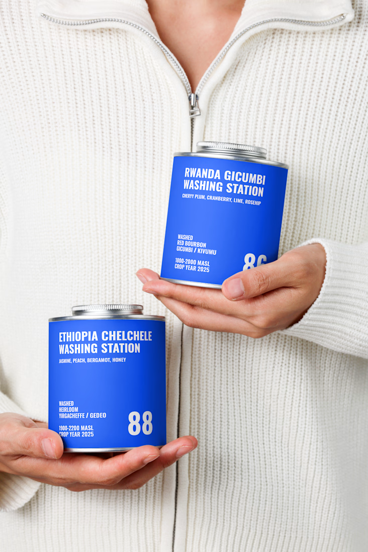
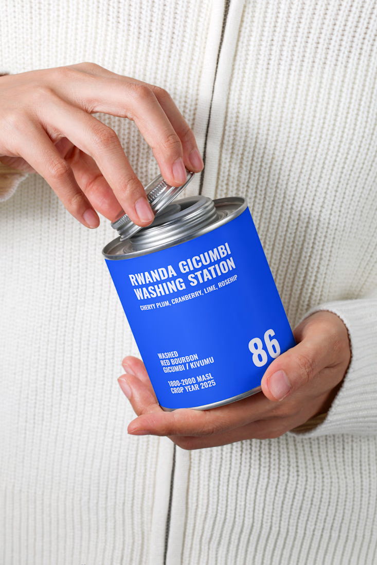

Simple visual but instantly grab attention.

Koparo Clean — Brand Identity Refresh & Packaging Redesign
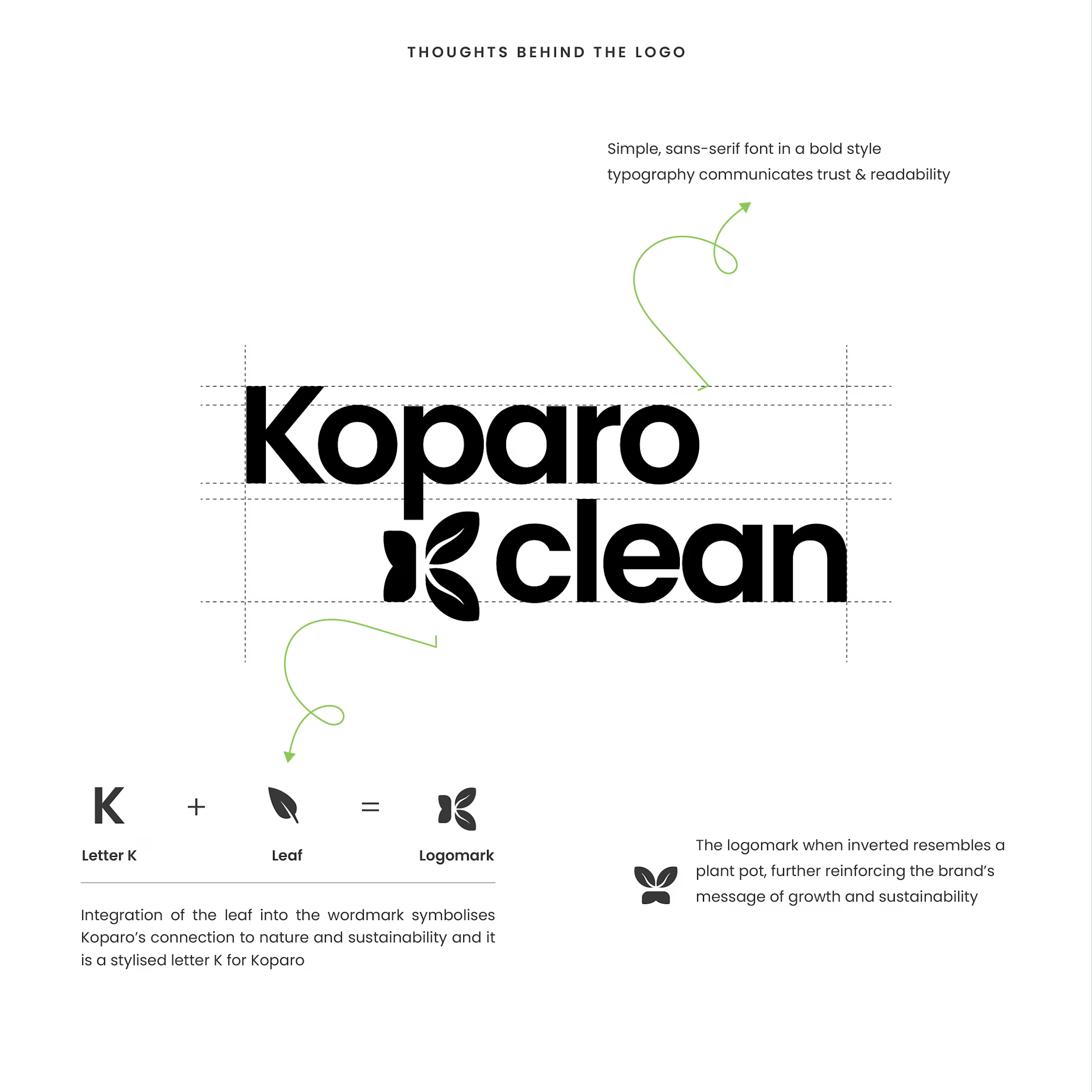
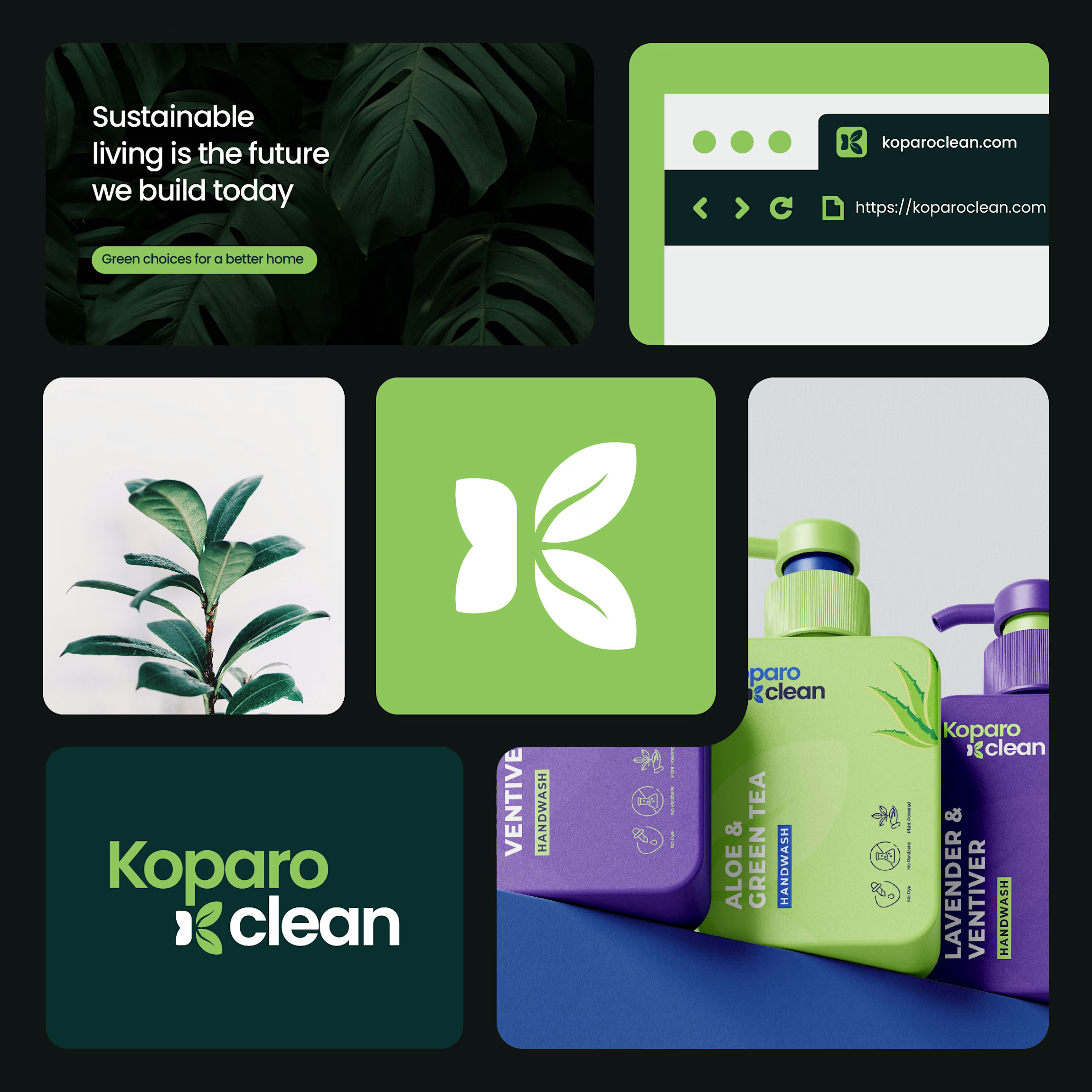
Koparo Clean is an eco-friendly brand delivering non-toxic, plant-based home cleaning and hygiene products. To support their growth and appeal to environmentally conscious, modern consumers, we designed a fresh identity and custom packaging strategy that blends minimal aesthetics with functional utility.
The Goal Craft a unified visual language and packaging system that communicates purity, eco-friendliness, and trust, setting Koparo apart on crowded retail and e-commerce shelves.
What Was Delivered
Identity & Logo System: Designed a custom wordmark featuring an integrated stylized 'K' and leaf logomark that doubles as an emblem for growth and sustainability.
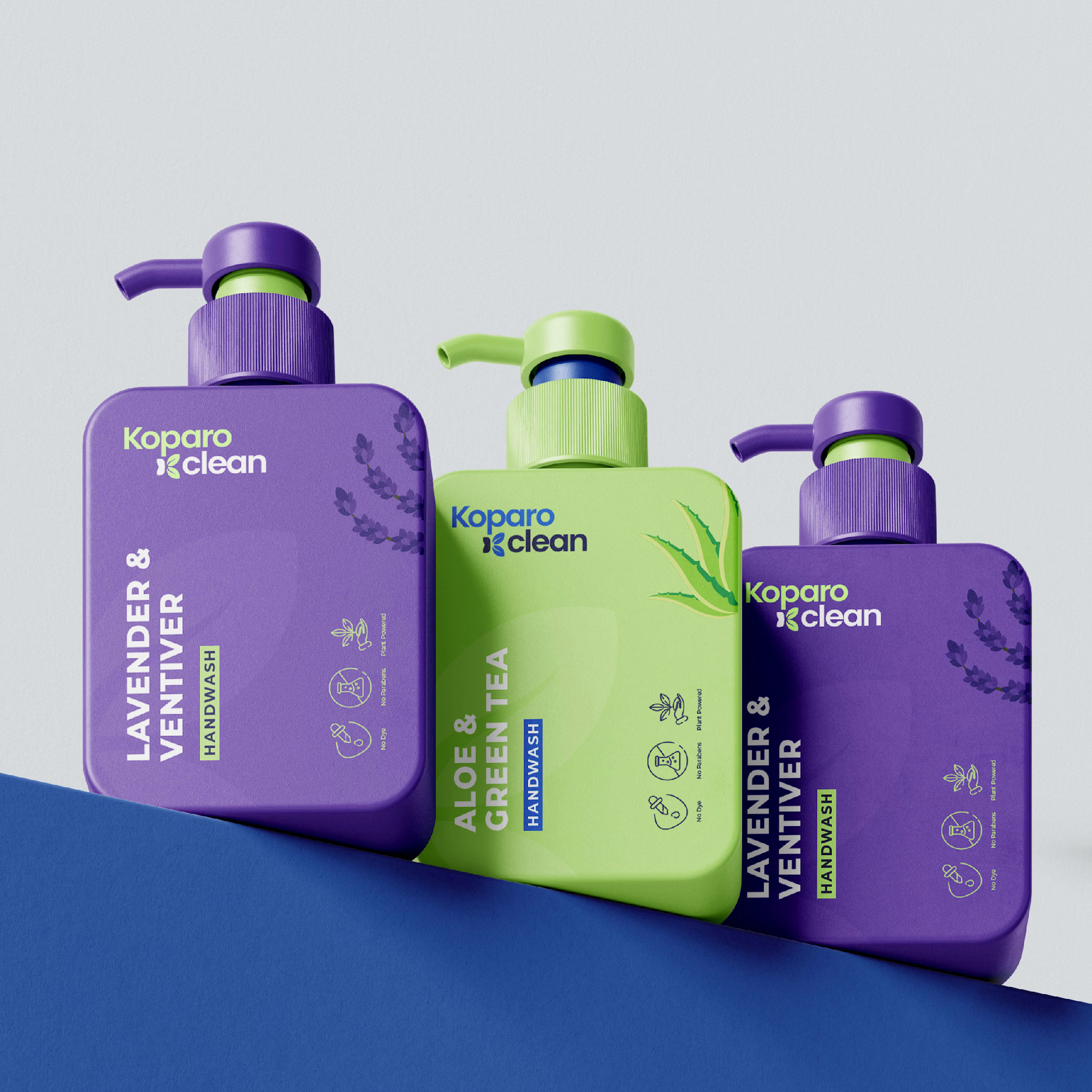
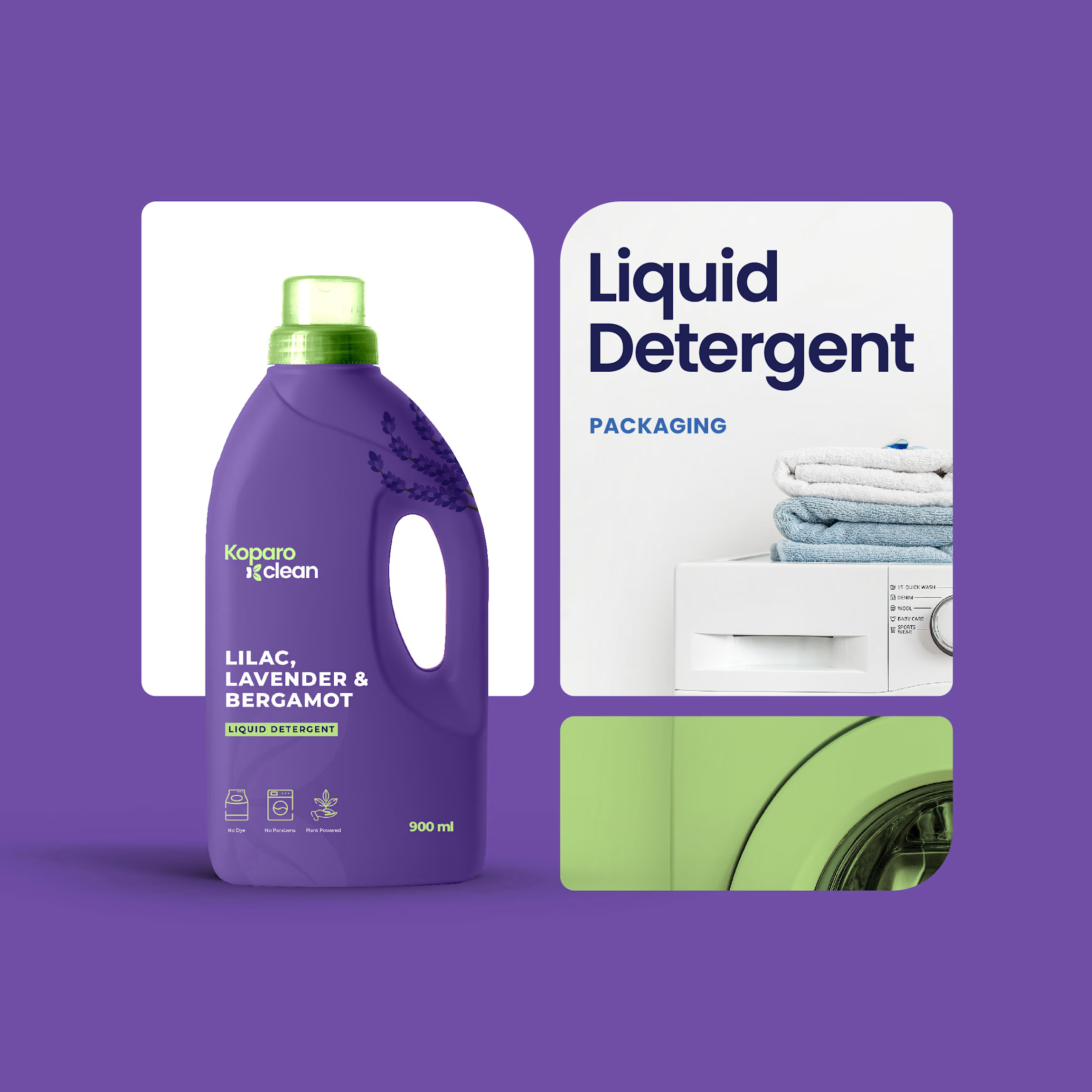
Packaging Design & Architecture: Engineered custom bottle shapes tailored for product utility, sleek rectangular bottles for handwashes to maximize shelf space, ergonomic handle jugs for liquid detergents, and clean cylindrical bottles for all-purpose sprays.
Visual Hierarchy & Labeling: Established a clean sans-serif typography system, product-benefit iconography (non-toxic, eco-friendly, pet-safe), and category-specific color coding for immediate product identification.
The Result
A modern, vibrant, and sustainable brand system that balances consumer usability with a premium, eco-friendly shelf presence.