The network for creativity
Join 1.25M professional creatives like you
Connect with clients, get discovered, and run your business 100% commission-free
Creatives on Contra have earned over $150M and we are just getting started
Back to feedPost
Koparo Clean — Brand Identity Refresh & Packaging Redesign
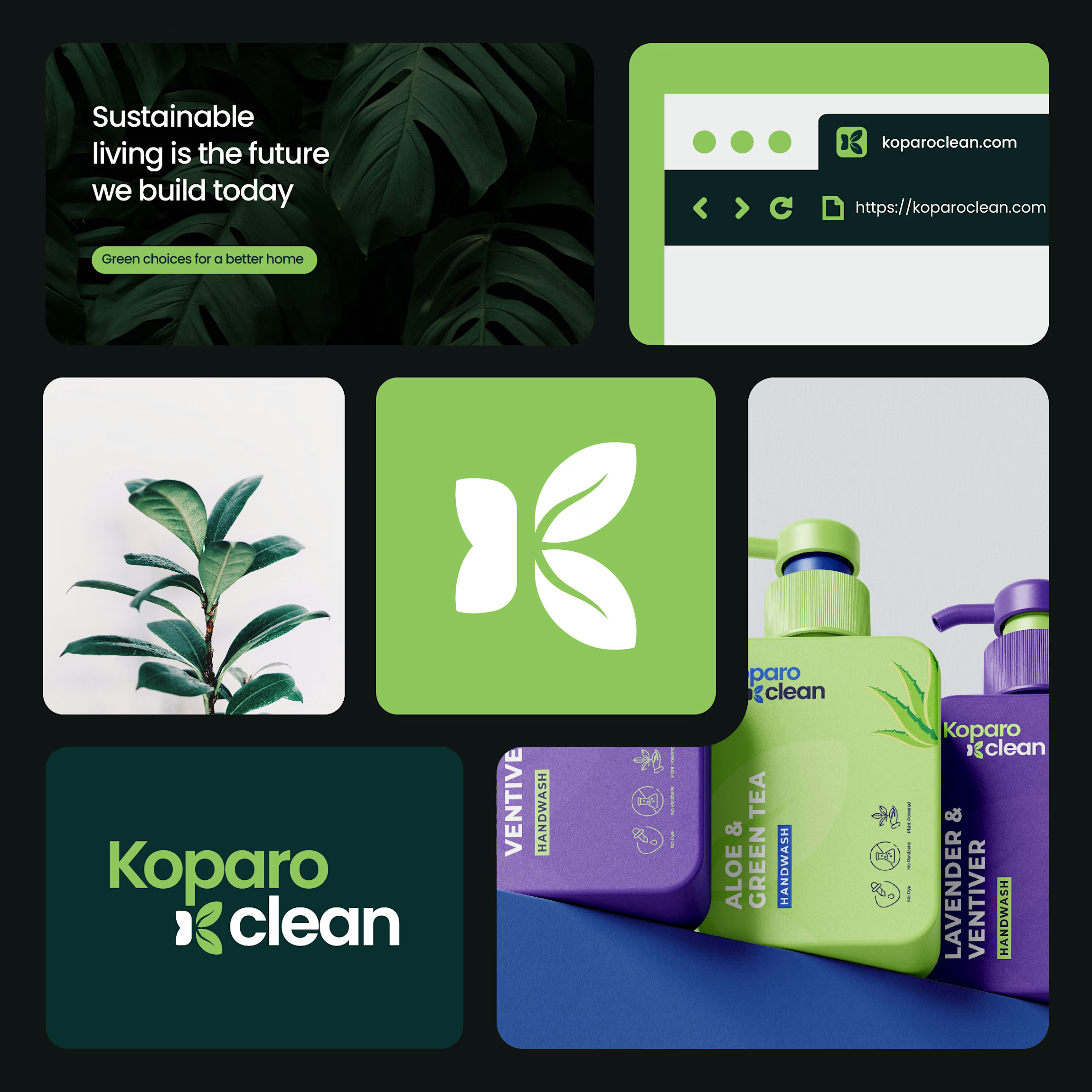
Koparo Clean is an eco-friendly brand delivering non-toxic, plant-based home cleaning and hygiene products. To support their growth and appeal to environmentally conscious, modern consumers, we designed a fresh identity and custom packaging strategy that blends minimal aesthetics with functional utility.
The Goal Craft a unified visual language and packaging system that communicates purity, eco-friendliness, and trust, setting Koparo apart on crowded retail and e-commerce shelves.
What Was Delivered
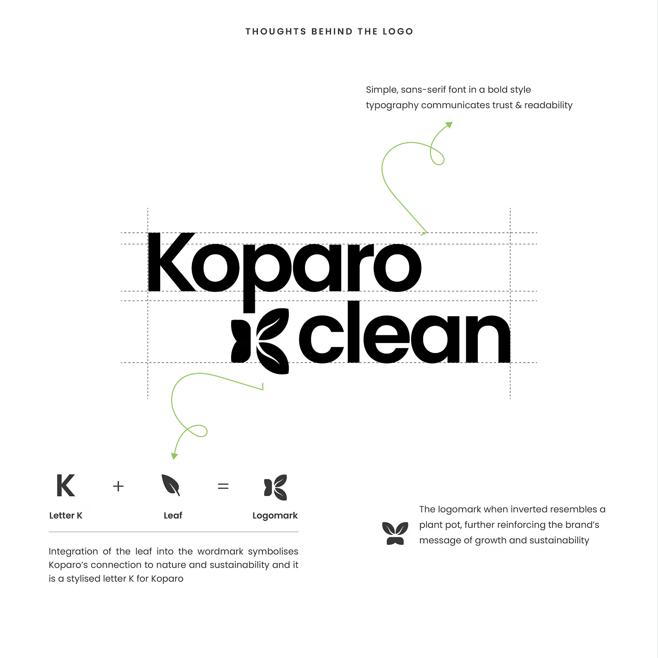
Identity & Logo System: Designed a custom wordmark featuring an integrated stylized 'K' and leaf logomark that doubles as an emblem for growth and sustainability.
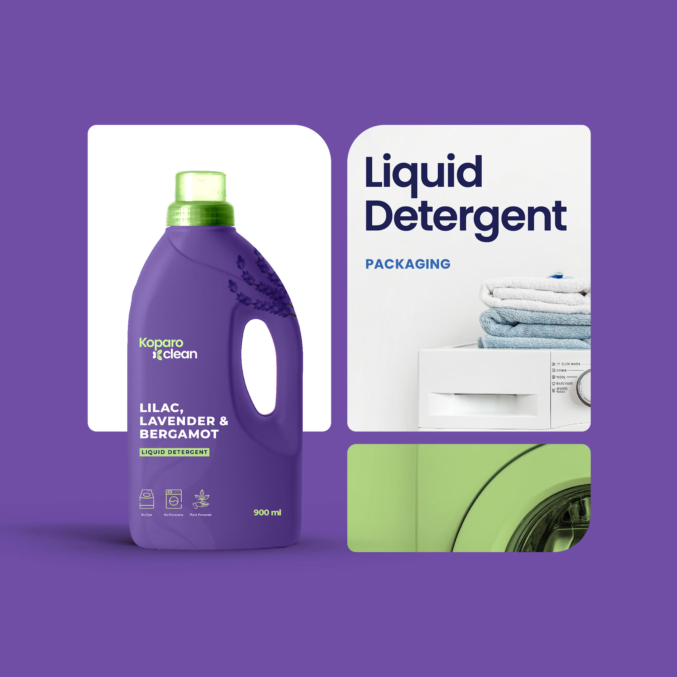
Packaging Design & Architecture: Engineered custom bottle shapes tailored for product utility, sleek rectangular bottles for handwashes to maximize shelf space, ergonomic handle jugs for liquid detergents, and clean cylindrical bottles for all-purpose sprays.
Visual Hierarchy & Labeling: Established a clean sans-serif typography system, product-benefit iconography (non-toxic, eco-friendly, pet-safe), and category-specific color coding for immediate product identification.
The Result
A modern, vibrant, and sustainable brand system that balances consumer usability with a premium, eco-friendly shelf presence.
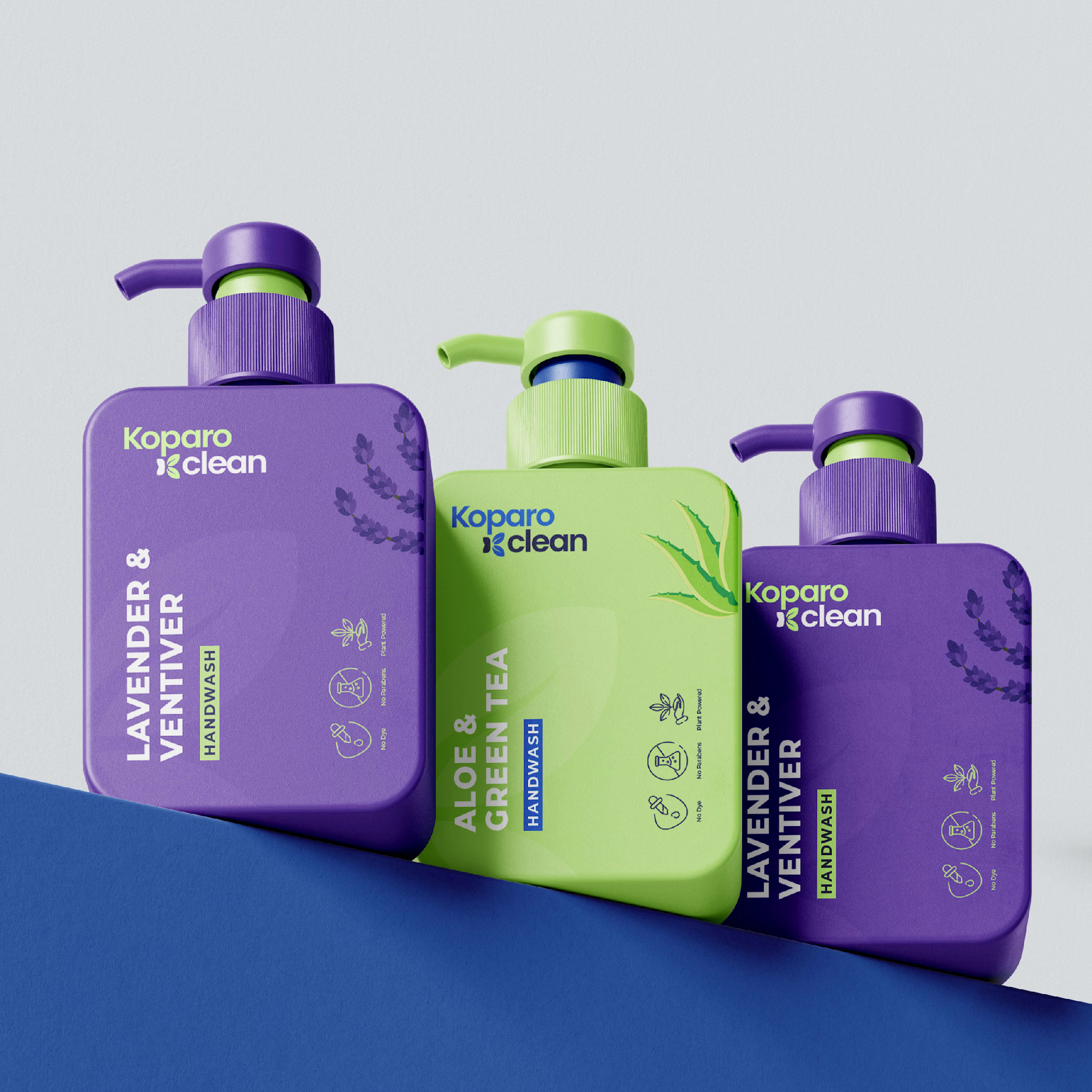

The purple-green palette feels fresh and vibrant! 💜💚

@Zara Designs Thank you.
The network for creativity
Join 1.25M professional creatives like you
Connect with clients, get discovered, and run your business 100% commission-free
Creatives on Contra have earned over $150M and we are just getting started







Related posts

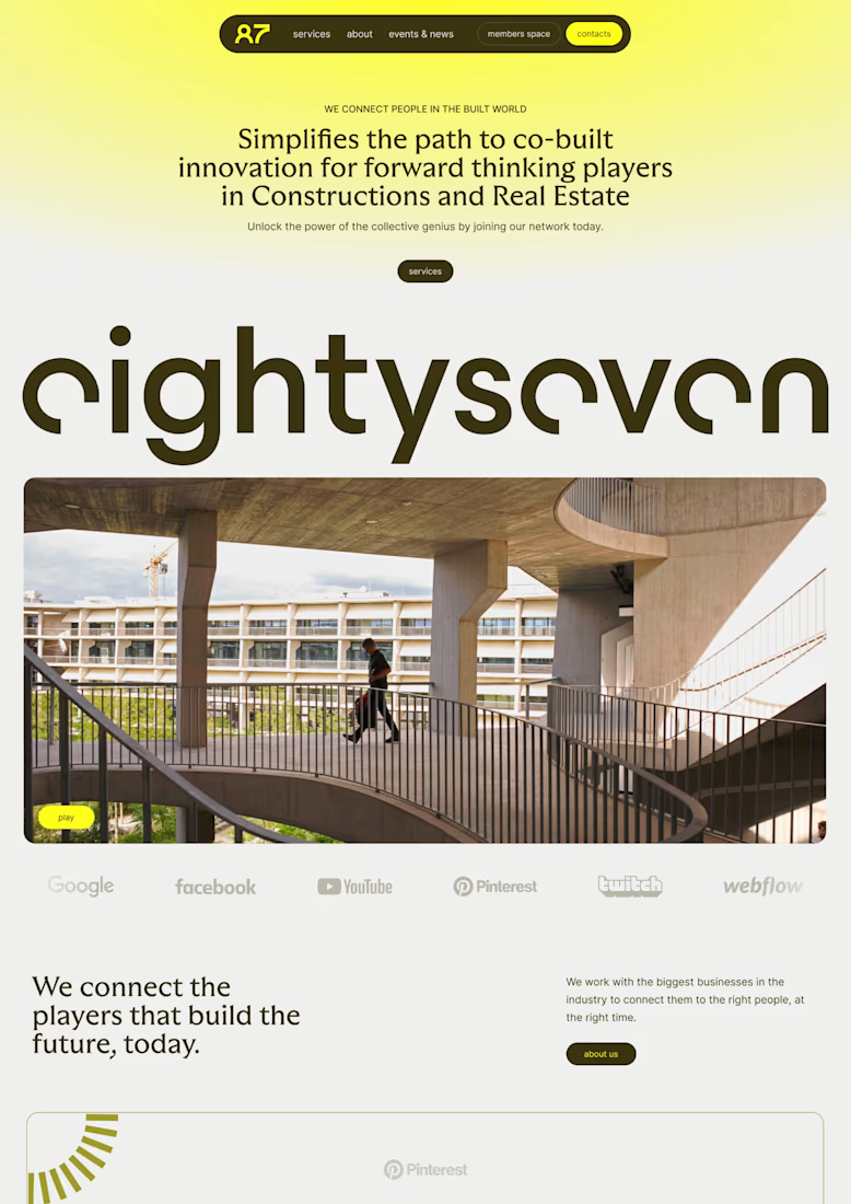
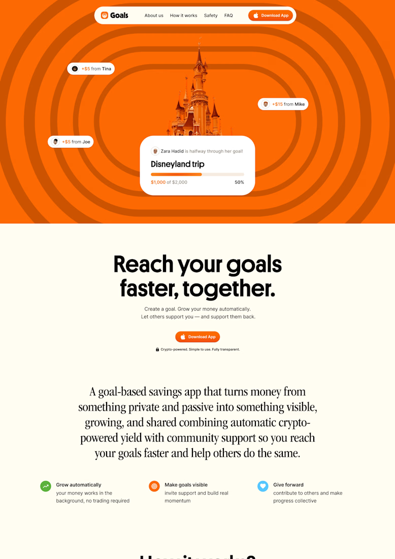
I love building brands, but seeing them come alive on a website might be my favourite part.
some favourite web work from the archive

Great Job, Lucie

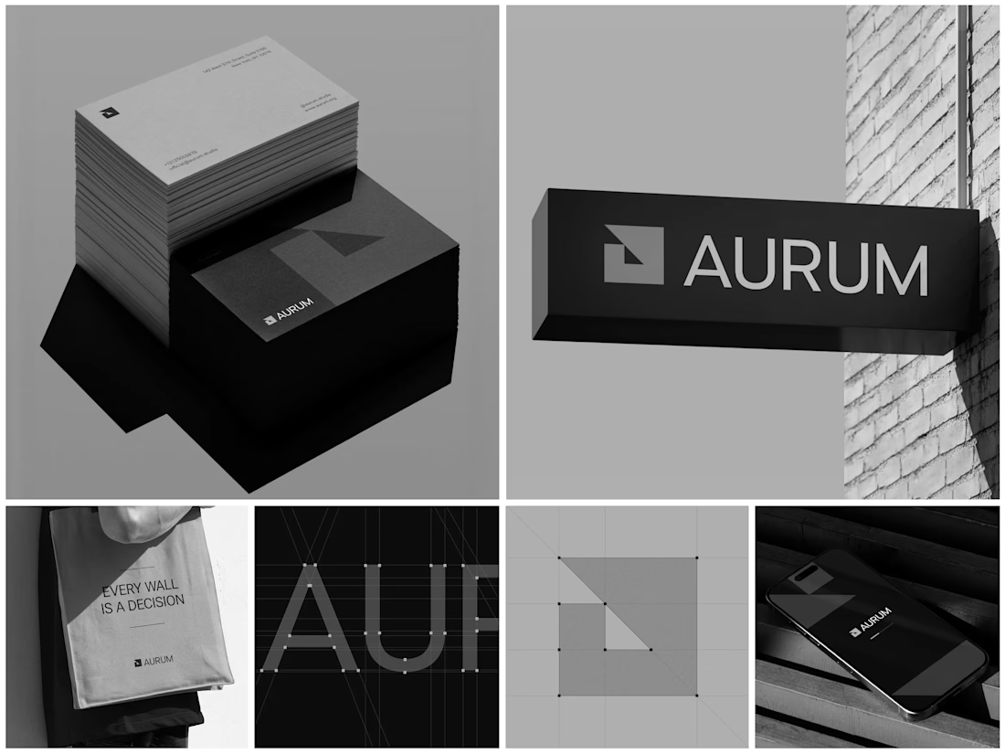
Aurum - Brand Identity System
When Aurum came to me, they had a name and a vision a studio that wanted to feel deliberate, architectural, and unapologetically bold in every space it touched. No logo, no system, just a line that stuck with me from our first conversation: "every wall is a decision."
That phrase became the seed for the entire identity. I started with the simplest possible geometry a square split by a triangle and built the mark from a strict construction grid so it would hold its proportions at any size, from a business card to a building-mounted sign. Once the mark was locked, I stripped the palette down to black, white, and grey. No color to hide behind just contrast, shadow, and negative space doing the work.
From there, the system grew outward: letterpress-style stationery with generous shadow and texture, exterior signage designed to read cleanly against brick and daylight, a minimal mobile app screen, and a tote bag that turned the brand's own tagline into a quiet piece of merchandise. Every touchpoint had to pass the same test does it still feel like Aurum at this scale, in this material, from this distance?
The result is an identity that's confident without shouting restrained enough for a business card, strong enough for a wall.
Curious how I'd approach building out a system like this for your own brand want to talk through it?


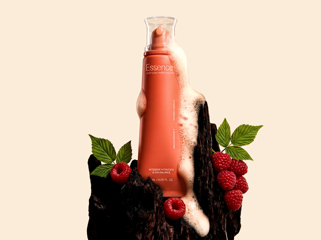
Essence - Cosmetics Brand Packaging


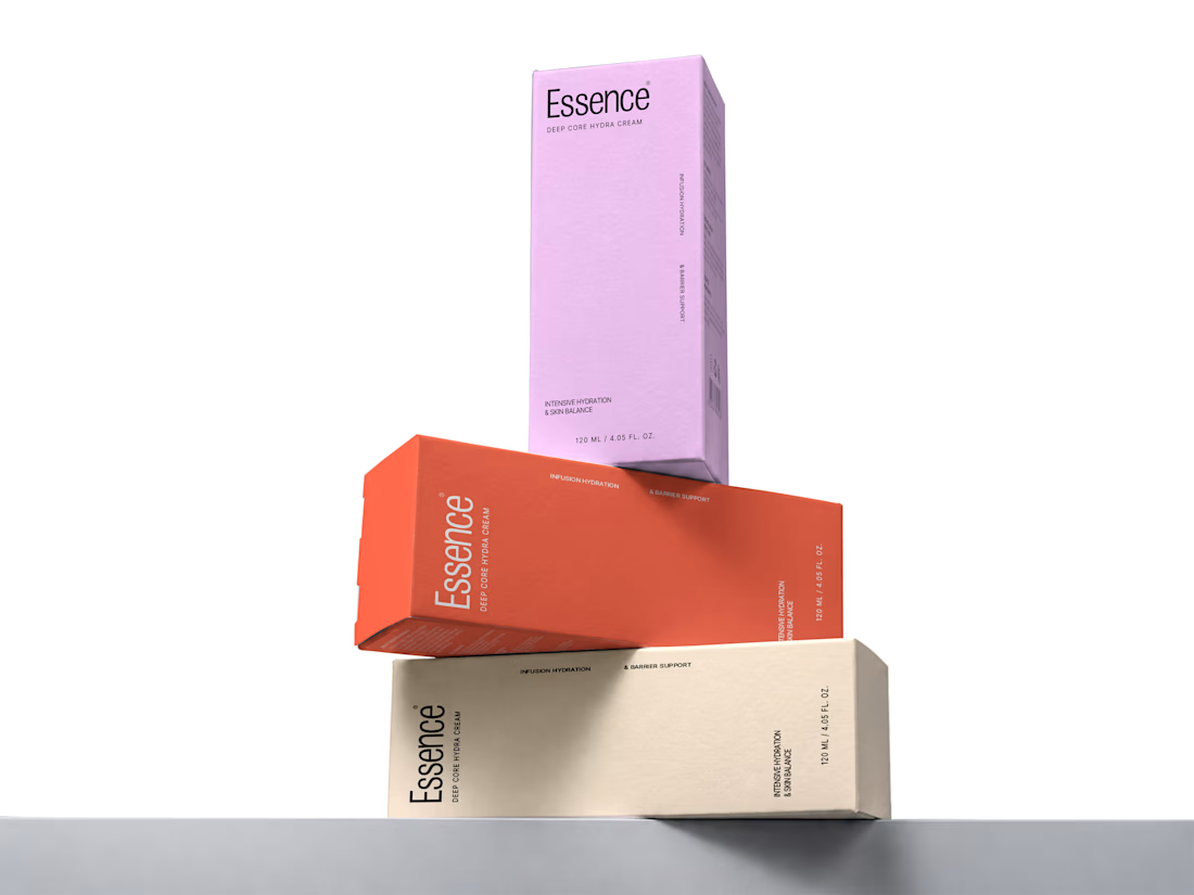
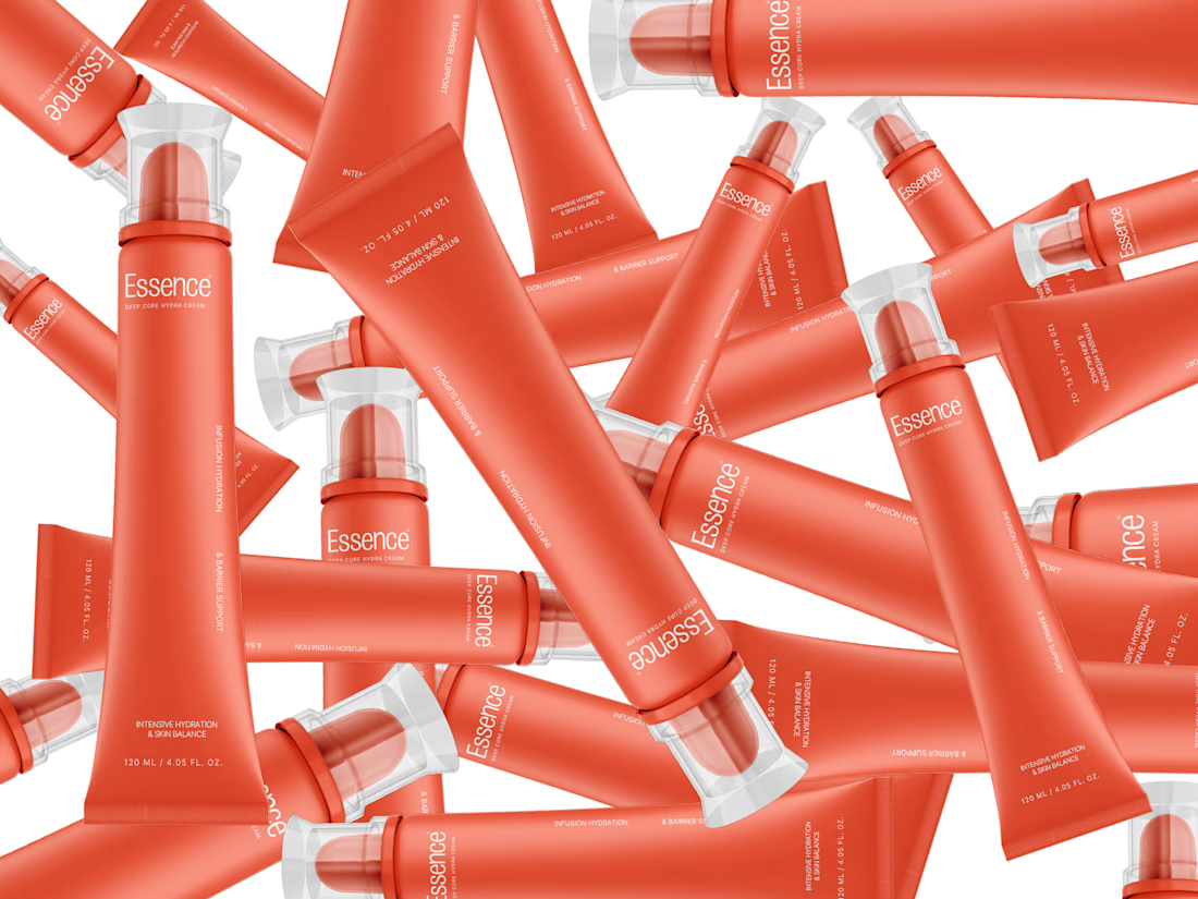

the pile of tubes shot is sick. did you model them or use a mockup?