The network for creativity
Join 1.25M professional creatives like you
Connect with clients, get discovered, and run your business 100% commission-free
Creatives on Contra have earned over $150M and we are just getting started
Back to feedPost
A small curated selection of logomarks for the Instagram Logoarchive wave.
Over two decades of logo and brand identity work leaves you with a lot of forms. Some became the foundation of a company. Some never made it past a sketchbook. All of them taught me something.
What I keep coming back to is simplicity with intent. A mark that works because every decision in it had a reason. That’s the thread running through everything here.


these are great!

Thank you Jason!

inspiring🔥

The network for creativity
Join 1.25M professional creatives like you
Connect with clients, get discovered, and run your business 100% commission-free
Creatives on Contra have earned over $150M and we are just getting started



Related posts

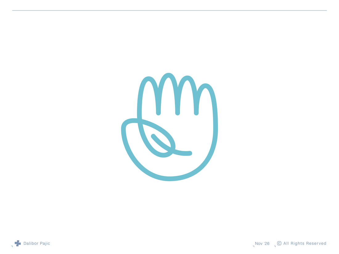
Hello Nature | Hand and Leaf Logo Mark
A throwback to one of my favourite logo concepts, created about 7 or 8 years ago, it was featured in LogoLounge 13.


clever and clean concept


ESE GIN — Between the Dunes | Visual Identity & Packaging
ESE GIN draws its curves from the dunes. The signature S catches the light in sculpted olive glass and leaves its imprint in wax.

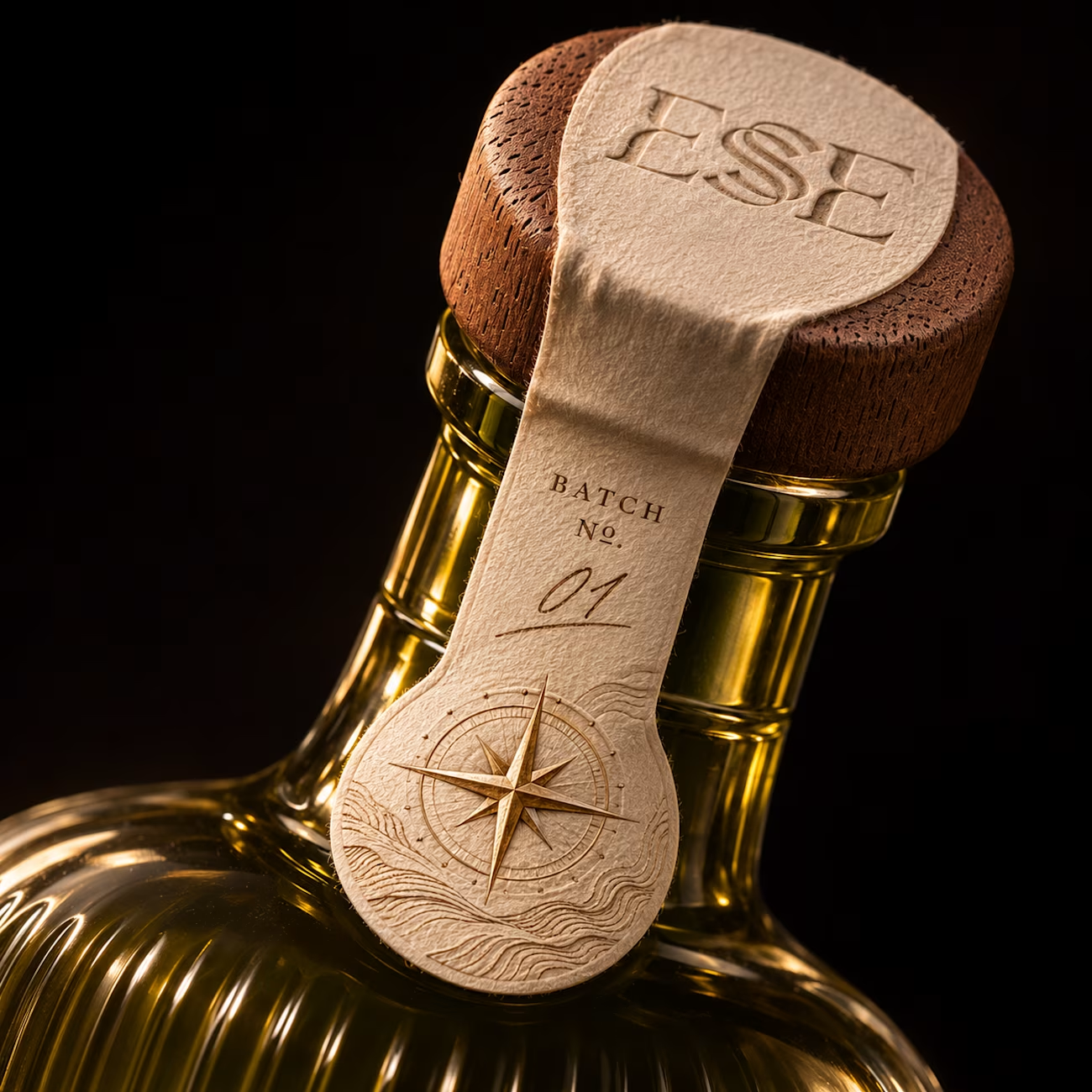
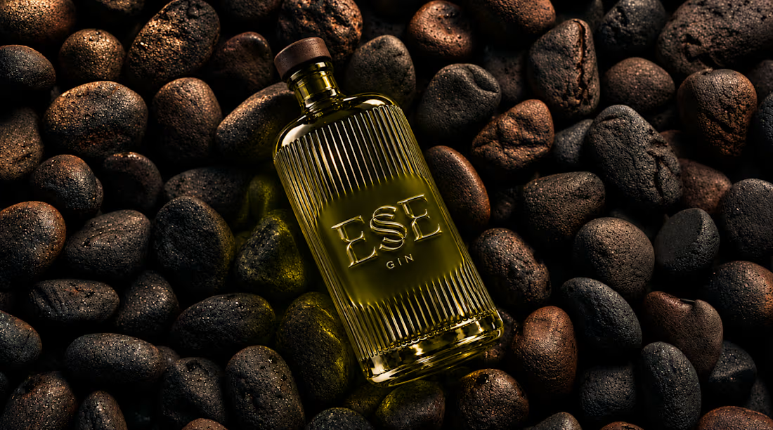
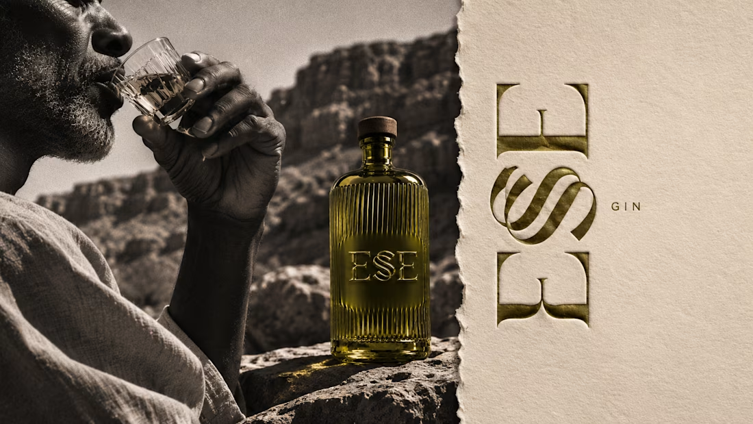
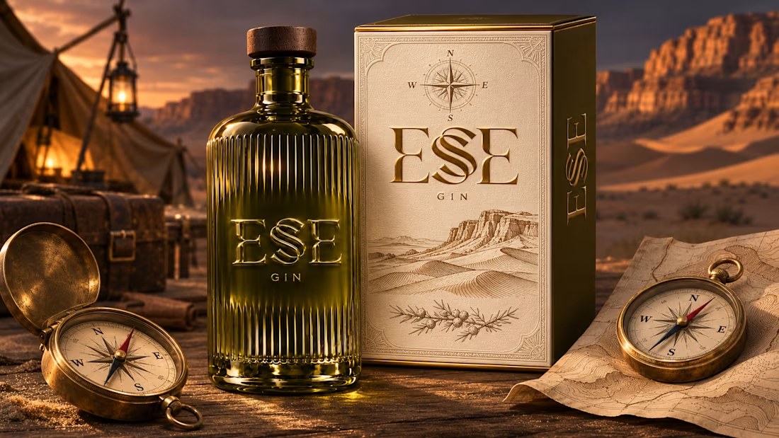

This is gorgeous, Maya — the sculpted olive glass with that S catching the light is such a clever way to carry the dunes into the bottle itself. And the wax seal imprint is a beautiful finishing touch, it gives the whole thing a crafted, almost apothecary feel. Really cohesive...

How do you make a construction brand feel consistent from a business card to a building site?
Brixon’s identity brings angular lettering, an assembled geometric symbol, and a lime, black, and white palette together.
I carried those elements into stationery, brand guidelines, team identification, social graphics, and site signage, then brought the system into motion with Adobe After Effects.
The connecting decision: keep the geometry and layout structure consistent while the logo details, messages, and application previews change within the animated panels.
My contribution covered brand design, graphic design, and motion design.
What draws your attention first: the wordmark, the lime palette, or the rotating symbol?
See the full Brixon case study. If you’re shaping a construction or development brand, I’m available for brand identity and motion projects.

Incomparable work!